
.svg)

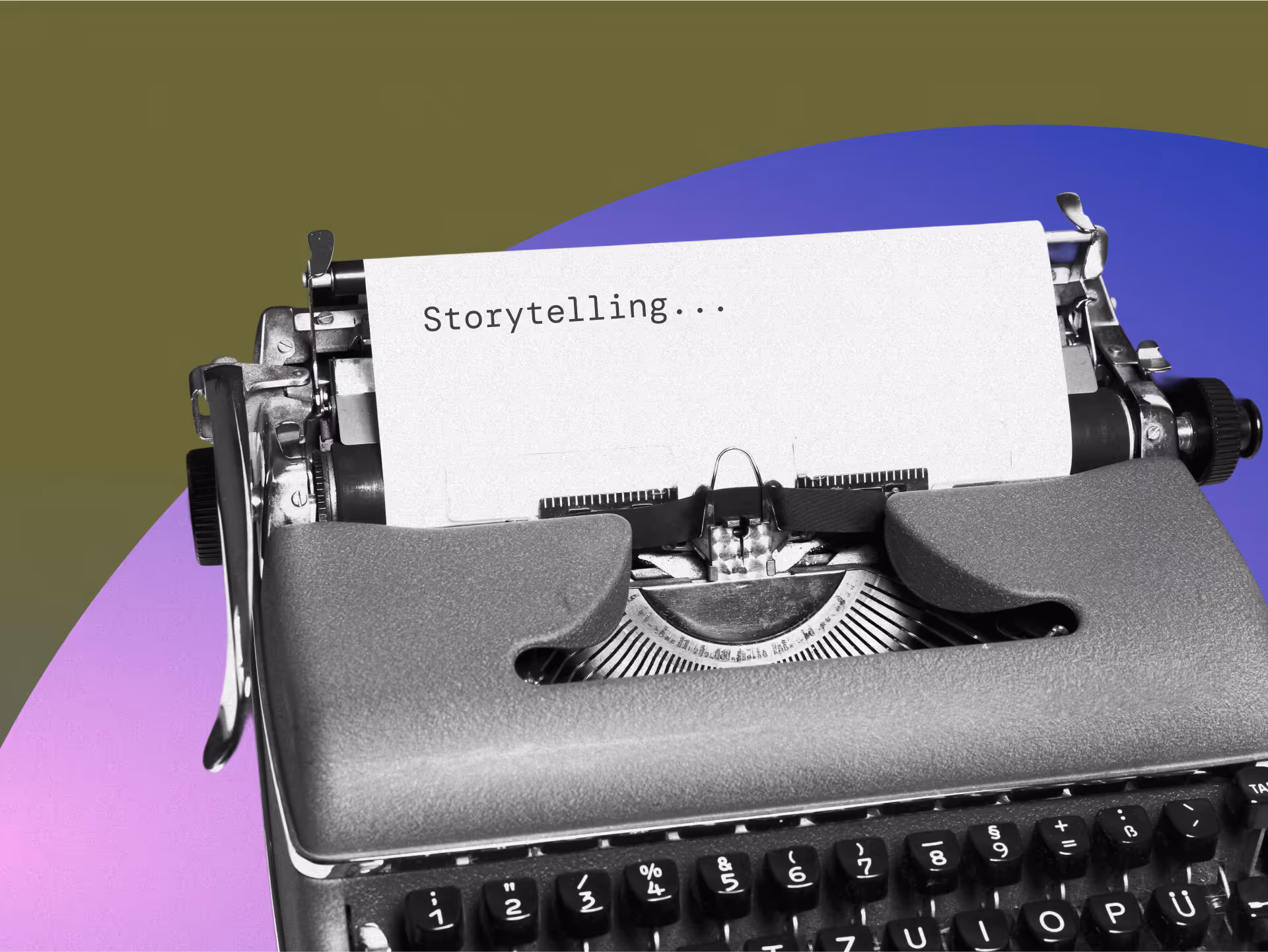
The Complete Guide to Creating A Memorable Facebook Event

A Facebook Event is a built-in marketing tool that lives right where your audience already scrolls, chats, and clicks. It lets you turn a date on the calendar into a full-blown experience, with space for visuals, updates, reminders, and community interaction. Whether you're hosting in-person or online, it's one of the easiest and most effective ways to rally interest and attendance.
Why does it matter? Because visibility equals engagement. A well-created Facebook Event boosts discoverability, keeps your event top-of-mind with automated reminders, and makes it easy for attendees to share the news with others.
In this article, we’ll walk you through how to create Facebook Events that are memorable and perform well. From setting the tone with the right visuals to optimizing for engagement and reach, consider this to be your step-by-step playbook for making an impact that lasts well beyond the RSVP.
The 5 Must-Haves To Create A Facebook Event People Actually Want to Attend
Most Facebook events get ignored because they’re rushed, vague, or forgettable. If you want people to actually show up, you need to treat your event like a product launch: clear, polished, and built for engagement. To achieve this, certain essential elements must be in play. These elements are the baseline for earning attention, building credibility, and making it easy for someone to say yes.
When creating a Facebook event that converts, certain fundamental elements serve as the foundation for all your promotional efforts. Getting these basics right signals professionalism and reliability to potential attendees.
1. Write a Clear and Clickable Title
Your title needs to be attention-grabbing, descriptive, and searchable. Aim for a title that balances SEO-friendly keywords with human appeal. For example, instead of "Annual Company Gathering," try "TechCo's 2025 Innovation Summit: Shaping the Future of AI."
Your event title is your first impression. It needs to captivate and compel action while striking a balance between clarity and intrigue. Try the action word + unique value + event type formula: "Master Data Science: Interactive Workshop with Industry Leaders." Or use the exclusive descriptor + topic + format approach: "Insider's Guide to Crypto: Live Q&A with Industry Experts."
Employing brand positioning strategies helps your event stand out from the crowd. Test your titles by asking, “Would I stop scrolling for this?” Ensure your title sets the right expectations, and that your event meets them. Nothing damages trust more than a spectacular headline followed by a forgettable experience.
2. Cover the When and Where (Without Making People Hunt)
Include the day of the week, date, start time, and end time. For multi-day events, clearly state the whole duration. Nothing frustrates potential attendees more than having to hunt for basic timing information.
For physical events, include the venue name, address, and any relevant parking or transportation details. For virtual events, specify the platform and how attendees will access it. Vague location information makes even the most exciting event seem disorganized.
3. Write a Description That Sells the Experience
Your event description should include a brief overview of what attendees can expect, key speakers or highlights, the value proposition, any special features, and ticket information. This is where you sell the experience, not just the logistics.
Open with a compelling statement or question that communicates the value of attending. Make them feel what they’ll miss out on if they don’t join. Highlight standout features, world-class speakers, interactive sessions, and exclusive takeaways, and use formatting to keep the content scannable, especially for mobile users.
Let your brand’s personality come through. If you’re quirky, lean into it. If you’re buttoned-up and sleek, reflect that. Create urgency without being pushy: “Early bird tickets available until Friday” is far more effective than all-caps hype. End with a clear next step, so your audience knows what to do and why they shouldn’t wait.
4. Choose the Right Privacy Settings
Determine whether your event should be public, private, or invite-only, taking into account your goals and target audience. Each option creates a distinct perception and attracts a different type of attendee.
The technical aspects of your Facebook event significantly affect its discoverability and reach. Public events are discoverable by anyone on Facebook and can be shared widely. Private events are only visible to guests, creating a sense of exclusivity. Select options based on your event's goals and target audience.
5. Optimize Setup for Discoverability and Conversion
Select the most specific categories that fit your event to improve discoverability. Facebook's algorithm uses categories to suggest relevant events to users. Update categories if your event evolves during the planning process.
Use Facebook's recognized venue locations when possible to improve discoverability in location-based searches. This also provides attendees with directions and additional venue information, eliminating the need for extra effort on your part.
Partner with complementary brands or influencers as co-hosts to expand your event's reach and audience. This can significantly increase visibility to new audiences and add credibility to your event through association. Avoiding common branding mistakes is crucial during your event setup to maintain professionalism and trust.
If selling tickets, integrate with Facebook's ticketing partners for a seamless purchase experience. This reduces friction in the conversion process, making it easier for people to commit to attending.
Why Smart Design Makes or Breaks Your Facebook Event
To be honest, poor design doesn't just make your event look unprofessional, it actively convinces people your event isn't worth their time before they even read your description. Every visual choice, from your cover photo to promotional graphics, either builds credibility and excitement or undermines it, and there's no middle ground on a platform where people make split-second decisions. When your design elements work seamlessly with your messaging, they create an experience that transforms casual scrollers into committed attendees.
Make Your Cover Photo Do the Work
Your event's cover photo is often the first visual element people see. To maximize its impact, use the optimal size of 1920 x 1005 pixels with a 16:9 aspect ratio to ensure your image appears crisp on all devices.
Select eye-catching imagery that reflects the tone and purpose of your event rather than generic stock photos. To make your visuals as impactful as possible, consider principles from strategic poster ad design.
Boring visuals = boring event (at least that's what people will assume). Keep the text on the cover image minimal, focusing on essential information such as the event title, date, and location.
Use contrasting colors for text overlays to ensure legibility, especially on mobile devices where most Facebook browsing happens. Consistently integrate your brand's logo, color palette, and fonts to reinforce brand identity and build trust. Utilizing elements like patterns can transform your brand identity. Your visual identity should be as recognizable as your best friend's laugh!
Create Graphic Graphics That Tell Your Story And Build Trust
Beyond the cover photo, develop a suite of visual content that supports your promotional strategy throughout the event timeline. Design graphics that work across different promotional contexts, from Facebook feeds to email campaigns and other social platforms.
Maintain visual consistency with your written voice, whether it's playful, professional, or edgy. Utilizing tools and techniques can help you elevate your brand visually. If your copy is fun and irreverent but your graphics look corporate and stuffy, you're sending mixed signals that confuse potential attendees.
Use graphics to amplify key messages without overwhelming your written content. Consider the power of typography in conveying your brand message. Create visuals that highlight speaker quotes, showcase event highlights, or present key statistics related to your event's theme.
Integrate elements of brand iconography to enhance recognition and appeal. Consider adopting creative approaches to your event design to make a lasting impression and stand out from the crowd.
Consider creating a series of countdown graphics to build anticipation as the event date approaches. Nothing builds excitement quite like seeing "Only 3 days left!" paired with an enticing image of what awaits attendees.
Partner With Design Professionals Who Actually Get Events
Contrary to what you might think, you don't have to figure it out your design solo. Professional designers who understand event marketing know exactly how to translate your vision into visuals that stop the scroll and start conversations, plus they handle all the technical requirements like file sizes and platform-specific dimensions that can make or break how your visuals appear.
The right design partner doesn't just make pretty pictures; they create strategic visual experiences that guide people from curiosity to commitment while you focus on what you do best. Whether you need a complete visual identity for your event or just want to elevate specific pieces, partnering with designers who specialize in event marketing can transform your promotional materials from forgettable to unforgettable.
How To Make Your Facebook Event Buzz Before, During, and After
Most Facebook events die a quiet death with zero engagement and empty seats, while others generate the kind of buzz that makes people genuinely excited to attend. The difference isn't budget or connections, it's treating your event page like the strategic marketing tool it actually is, not just a digital flyer. Your Facebook event becomes your first impression, ongoing conversation starter, and relationship-building platform that transforms casual browsers into committed attendees.
Know What To Say and When To Say It
A well-planned promotional timeline can make the difference between a packed venue and empty seats. Start 3-6 months before the event by creating your Facebook event page with preliminary information. Begin sharing teaser content to build awareness and launch "Save the Date" campaigns to generate early interest.
Two to three months before, increase posting frequency with more detailed event information. Implement early-bird ticket promotions and start engaging with your community through Q&A sessions or polls to gauge interest and gather feedback.
One month before, intensify your messaging with a sense of urgency. Share the finalized agenda and highlight key attractions. Launch retargeting campaigns for users who've shown interest but haven't registered yet.
Two weeks before, focus on last-minute registrations with countdown posts. Share practical information about the event like parking, what to bring, and other logistics. Leverage testimonials from past attendees to build trust and excitement.
During the event, post real-time updates and highlights. Encourage attendees to share their experiences using a specific hashtag. Use Facebook Live to broadcast key moments for those who couldn't attend.
After the event, share highlights and thank attendees. Collect feedback through polls or surveys and begin nurturing the community for future events. This post-event engagement helps maintain momentum and build a loyal following.
Build Recognition That Sticks Through Smart Messaging
Maintaining visual and verbal consistency throughout your promotional period is crucial for building recognition and trust. Develop a visual theme with a cohesive identity that can be adapted across all promotional materials, including a specific color palette, font choices, and graphic elements. Understanding the impact of strategic branding changes can help you maintain consistency.
Establish main themes or messages about your event. Rotate through these themes to maintain consistency while avoiding repetition that could bore your audience. Mix up your content types to keep things interesting—alternate between text posts, images, videos, and interactive content.
Encourage attendees from previous events or early registrants to share their experiences, adding authenticity to your promotion. People trust peer recommendations more than branded messages, so leverage this powerful form of social proof.
Strategically unveil new details about speakers, activities, or special features throughout your timeline to maintain interest. Think of it as a slow, tantalizing reveal that keeps people coming back for more! Develop a unique event hashtag and use it consistently across all promotions, encouraging your audience to use it as well.
Read the Room and Pivot When You Need To
Monitor engagement metrics throughout your promotional period and be prepared to adjust your approach based on what resonates with your audience. Pay attention to which posts generate the most likes, comments, shares, and click-throughs.
If certain content types or messages perform exceptionally well, create more similar content. Conversely, if some approaches fall flat, don't be afraid to pivot. This flexible approach ensures that your promotional efforts remain effective, rather than adhering to a rigid plan that isn't working.
Utilize Facebook's Event Insights to track response rates and attendance commitments. These metrics provide valuable insights into your audience's interests and behaviors, enabling you to refine your messaging for maximum impact.
Tips To Help You Stop Begging for Likes and Start Earning Loyalty
Authentic engagement isn't about tricks, giveaways, or manipulating the algorithm; it's about creating content so genuinely valuable that people can't help but interact with it. When you focus on delivering real value instead of chasing vanity metrics, something powerful happens: your audience stops treating you like just another brand and starts seeing you as a trusted resource they actually want to hear from. The strategies that work best don't feel like strategies at all, they feel like natural conversations between people who share genuine interests and goals.
1. Create Content Worth Sharing Without Asking
Focus on genuine value over explicit sharing requests. Solve real problems, create visually appealing content, offer exclusive behind-the-scenes insights, use compelling storytelling from past attendees, and provide practical resources. When content truly helps your audience, natural sharing follows.
2. Foster Real Connections That Go Beyond the Event Page
Build community through live Q&As, candid behind-the-scenes content, interactive polls for decision-making, user-generated content opportunities, and personalized responses. Make followers feel like insiders and stakeholders by showing the real people behind your event and actively engaging with comments.
3. Keep the Energy Alive Long After the Last Guest Leaves
Maintain post-event momentum with highlight reels, surveys, discussion threads, and personalized thank-you messages. Create recap content showcasing attendee participation while teasing future events. This converts non-attendees for next time and strengthens relationships for ongoing collaboration.
Turn Your Next Facebook Event Into the One Everyone's Talking About
Creating impactful Facebook events requires a strategic blend of compelling content, thoughtful design, and active engagement. The most successful events seamlessly blend professional presentation with authentic connection, creating experiences that begin the moment someone discovers your event online and continue long after they leave.
When you approach event creation as both a writing and design challenge, everything shifts. You're not just announcing details, you're creating complete experiences that begin the moment someone sees your event in their feed and continue long after the last attendee heads home. Your next event could become a defining moment for your brand, creating buzz, engagement, and lasting connections.
Don't let boring visuals convince people your event isn't worth their time, NoBoring Design creates scroll-stopping Facebook event graphics and social media assets that turn casual browsers into committed attendees. Partner with us today!
Key Takeaways
- Successful Facebook events combine compelling copy with strategic design elements to create a complete experience. Together, they guide people from curiosity to commitment.
- Timing your promotional content correctly helps build momentum and maintain interest. Get the timing wrong, and even great events can struggle to fill seats.
- Authentic engagement strategies drive organic sharing and community building. Real value creates natural advocates who share because they want to, not because you asked.
- Visual consistency across all event materials strengthens recognition and trust. Cohesive branding passes the crucial first-impression test that determines whether people take you seriously.

Ever feel like you're drowning in a sea of sameness? Is your brand's voice just one more shout in an endless echo chamber? You're not alone. Traditional branding no longer seems to have the same impact, and staying on top of design trends is crucial.
Strategic illustration cuts through the noise like a hot knife through butter, helping your brand stand out in markets when everything else blurs together. Our brains process visual information much faster than text, enabling the right visuals to create an instant, powerful impact on viewers and enhance comprehension and memory retention.
Illustrations can go beyond decoration to become influential brand ambassadors, embedding your values into every customer interaction for instant recognition and lasting connections.
In this article,we’ll talk about how to use illustrations strategically to strengthen your brand identity.
Understanding the Core Elements of Strategic Illustration
Strategic illustration isn't just about making pretty pictures; it's visual communication with intention behind every brushstroke. Unlike purely artistic work, strategic illustration makes every visual element work for your brand.
Each color choice, character trait, and stylistic decision serves a greater purpose: strengthening your brand identity and amplifying your message.
Make Your Brand Instantly Recognizable Without Saying a Word
Think of traditional illustration as art for art's sake. Strategic illustration, on the other hand, knows exactly what it's doing and why. When your brand develops a distinctive visual language, people instantly recognize you, even before they read a word.
Turn Complex Ideas Into Visual Clarity That Sticks
Attention spans are shrinking faster than ice cream on a hot sidewalk. Strategic illustration distills complicated concepts into visual nuggets that audiences can grasp and remember. When you transform abstract ideas into concrete visuals, you're speaking directly to the brain's pattern-recognition system, making your message stick when words alone might slip away.
Use Emotion-Driven Visuals to Deepen Audience Connection
Colors trigger feelings, characters create empathy, and visual metaphors bridge understanding. Bright strategic illustration taps into these psychological responses, forging emotional bonds between your brand and your audience. When your visuals connect on a feeling level, you're no longer just another option; you're the one that resonates on a deeper wavelength.
Building Your Brand’s Visual Story with Strategic Illustrations: A Step-by-Step Guide
Good brand storytelling hinges on strategic illustrations that authentically reflect your core values, staying consistent and flexible enough to evolve. Before getting into creation, you need a solid foundation. These
Step 1: Define What Guides Your Visual Story
Start by clarifying what makes your brand tick. What's your mission? What tone do you strike? What does your audience expect from you? These fundamentals should guide every visual decision you make.
That's why it's essential to prioritize copy in design to ensure your messaging aligns with your visuals. When REI depicts people scaling mountains, they're not just showing outdoor activities but visually expressing their core value of adventure and exploration. Your illustrations should do the same heavy lifting for your brand values.
Step 2: Build Your Brand’s Visual Vocabulary
Once your brand values are crystal clear, translate them into visual elements that communicate emotional appeal and functional benefits. Choose a color palette that triggers the specific emotions you want associated with your brand.
Decide whether your illustration style should lean into hand-drawn warmth, vector precision, or a hybrid approach. If you use characters, ensure they embody your brand’s personality traits. Develop a consistent system of icons across all touchpoints, and select typography that complements your visual style and enhances readability.
Learning more about typography in design can help you choose fonts that effectively convey your brand’s personality.
Step 3: Test, Gather Feedback, and Refine Your Visual Strategy
Creating your brand's visual story isn't a one-and-done task; it's ongoing work. Gather feedback from your audience and monitor how people respond to your strategic illustrations. Which elements resonate? Which falls flat? Use these insights to refine your approach, strengthening what works and rethinking what doesn't.
Step 4: Transform Your Visual Storytelling Without Losing Your Core Identity
As your brand grows, your visual storytelling should evolve too, without abandoning the core elements that make you recognizable. Look at how Google's illustrations have evolved from simple, primary-colored doodles to more sophisticated visual stories while maintaining their playful essence.
Your illustrations should grow with your brand while preserving the visual DNA that makes you uniquely you.
Overcoming Common Challenges in Strategic Illustration
Even the most thoughtful illustration strategies can encounter friction, whether it’s inconsistent execution, unclear brand alignment, or scaling across teams. But these challenges aren’t dead ends. In the sections below, we’ll discuss the most common pitfalls and how to navigate them with clarity, consistency, and creative confidence.
Maintaining Consistency as You Scale
Keeping a unified illustration style becomes increasingly complex as your brand grows, especially when working with multiple artists. Combat this challenge by creating detailed brand guidelines that specify style, color, character traits, and emotional tone.
Regular visual audits help identify inconsistencies before they fragment your brand identity. Studying successful logo rebranding strategies can provide insights into maintaining cohesion.
Working from a component-based illustration system, where key elements can be recombined differently, gives you flexibility without sacrificing recognition. This approach allows different artists to contribute while maintaining a cohesive look and feel.
Finding Your Authentic Visual Voice
Generic visuals won't help you stand out in a crowded market. Work directly with illustrators who genuinely understand your brand values to create something authentic that reflects your unique personality and proposition.
This process requires exploration and patience. Developing a distinctive illustration style involves trying various approaches before finding one that perfectly supports your brand messaging. The goal isn't to follow trends but to create visuals that only your brand could own.
Building Flexibility Into Your System
Your strategic illustrations need to work everywhere without losing their impact. Build a modular system with components that can be rearranged or resized for different contexts and platforms. This modular approach keeps your assets flexible while ensuring people still recognize your brand at a glance.
Consider how your illustrations must adapt for different uses: social media posts, product packaging, sales presentations, and more. Creating variants that maintain core elements while adapting to different formats gives you consistency and flexibility.
Managing Creative Collaboration
When multiple illustrators or teams work on your brand, miscommunication can cause visual disconnects that confuse your audience. Set up regular feedback sessions and centralized asset management to keep everyone aligned. Team workshops help maintain consistency while encouraging fresh ideas that prevent your visual system from growing stale.
Creating transparent approval processes and integrating new illustrations helps manage growth without sacrificing quality or consistency. A shared visual language among your creative team ensures everyone's pulling in the same direction.
Maximizing Value on Limited Budgets
Quality strategic illustrations can be expensive, but that doesn't mean they're out of reach. Roll out your visual system in phases based on priority touchpoints and reuse key assets across channels to maximize your investment. This phased approach lets you build a robust illustration system over time without breaking the bank.
Start with high-impact, high-visibility touchpoints where strategic illustrations will make the most significant difference, then expand as resources allow. Remember that a few excellent illustrations used consistently will create more impact than many mediocre visuals used haphazardly.
Maximizing the Impact of Strategic Illustrations Across Every Brand Touchpoint
Strategic illustrations aren’t just for your homepage or one-off campaigns; they’re most effective when woven through every touchpoint your audience encounters. In the following sections, we’ll explore how to apply your illustration style across platforms, keeping your message cohesive while adapting to the nuances of each medium.
Breathing Life Into Digital Experiences
Your website and apps often deliver first impressions to potential customers. Design strategic illustrations that look sharp on all screen sizes by utilizing effective responsive design strategies, and consider adding interactive elements that boost engagement. Animation can bring static illustrations to life, creating memorable moments that static visuals can't match.
Headspace exemplifies this approach with simple orange circle illustrations that appear consistently across their website and app. This creates a calm visual experience that aligns perfectly with meditation and mindfulness, making the brand instantly recognizable no matter where users encounter it.
Creating Scroll-Stopping Social Content
Social media demands illustrations tailored to each platform's format and audience expectations. Square designs for Instagram, vertical storytelling for TikTok, and horizontal visuals for Twitter all require thoughtful adaptation of your core illustration system.
Spotify masters this approach by crafting custom illustrations that match its playful voice to promote premium subscriptions across social channels. Its visual style shifts subtly between platforms while maintaining core brand elements, communicating its value proposition in ways that resonate with platform-specific audiences.
Making Physical Touchpoints Memorable
Even in our digital world, physical touchpoints like brochures, packaging, and signage matter enormously for brand perception. Your strategic illustrations must work seamlessly at any size, from tiny labels to large signs, without losing detail or emotional impact. For inspiration, explore these creative brochure ideas.
Casper exemplifies this with dreamlike illustrations featuring consistent blue tones across packaging and print materials. Their illustration style creates a soothing, sleep-focused brand experience that flows naturally from website to product packaging, reinforcing their promise at every touchpoint.
The Power of Strategic Illustration
Strategic illustration does more than decorate; it builds meaning. It helps audiences quickly recognize your brand, grasp complex ideas, and feel something real. When used consistently across touchpoints, illustration becomes a tool for clarity and connection, turning passive viewers into engaged supporters.
The most memorable brands use illustration not as an afterthought but as a key part of their identity. They build visual languages that reflect who they are and evolve with them over time. When illustration aligns with your brand’s core values, it drives recognition, emotion, and long-term loyalty.
Are you wondering how to bring more clarity, personality, and cohesion to your brand design? NoBoring Design creates bold, strategic visuals that elevate your brand and keep it consistent across every platform. We design purposefully, so every asset does more than just look good. Reach out today to see how we can partner with you!
Key Takeaways
- Strategic illustration is a powerful differentiator, helping brands stand out with purposeful visuals that tell cohesive stories.
- Compelling visual storytelling creates emotional bonds with audiences by making complex ideas simple and memorable.
- Consistent illustration systems build recognition across all touchpoints while maintaining flexibility for different contexts.
- Measuring the impact of strategic illustrations helps refine your approach and demonstrates tangible business value.

Let's cut to the chase, choosing between a freelancer and an agency isn't just another box to tick on your to-do list. The fork in the road can lead to either a creative masterpiece or a bureaucratic nightmare.
With 64 million Americans now participating in the freelance economy and pumping $1.27 trillion into the GDP, the talent pool is overflowing with options. Your decision shapes everything from what lands in your inbox to when it arrives and how much cash it leaves.
Ready to make a choice that doesn't keep you up at night? This article breaks down the pros and cons of hiring freelancers and agencies, covering key differences in cost, collaboration, scalability, and creative fit to help you make the right choice.
Freelancers vs. Agencies: Different Gears, Same Drive
Freelancers and agencies are two creative forces, each with its own rhythm. Freelancers are the solo rockstars of the industry, working directly with you. No middlemen, no bureaucracy, just skill, speed, and sharp creative instincts.
Many freelancers on Upwork thrive in specialized roles such as mobile design optimization, creating scroll-stopping visuals, and crafting copy that converts.
Conversely, agencies are creative orchestras, teams of designers, strategists, and developers moving in sync under strong direction. Industry analyses show agencies typically fall into two camps: laser-focused boutique studios or full-service heavyweights.
Agencies operate with refined processes, rigorous quality checks, and layered backup systems that let them confidently handle complex, multi-phase projects. That polish comes at a premium but is often a sound investment for brands chasing scale and cohesion.
Pros and Cons of Hiring a Freelancer for Your Design Needs
Freelancers are independent, versatile professionals who thrive on direct relationships and creative control. However, this model also has challenges that can affect your project’s scope and timelines. This section will explore the key advantages and limitations of hiring a freelancer to guide your next creative endeavor.
Pros of Freelancing: Direct Creative Connection
- Efficient Communication: Freelancers work directly with you, eliminating middlemen like account managers or project coordinators. This often leads to quicker decisions and a streamlined feedback process, resulting in faster project delivery and more precise execution.
- Lean Cost Structure: Without the overhead costs associated with agencies, such as office space, administrative staff, or large teams, freelancers typically offer lower rates for specialized services, making them an attractive option for budget-conscious projects.
- Niche Expertise: Freelancers tend to develop deep expertise in specific areas. Whether you need a specialist in UX design, explainer videos, or custom illustration, freelancers can provide highly focused skills that might be harder to find in a more generalized agency environment.
- Flexibility: With no rigid schedules or team-wide coordination needed, freelancers offer unmatched flexibility. If you need to pivot or make last-minute changes, freelancers can adapt more quickly than a larger agency might be able to.
Cons of Freelancing: The Solo Creative Limitations
- Capacity Constraints: A freelancer is only one person, and while their talents are vast, they have a limited bandwidth. Freelancers may struggle to balance competing demands if they need revisions or additional tasks completed in a tight timeframe.
- Availability Uncertainty: Unlike agencies with backup plans and multiple team members to step in when needed, freelancers may face personal or professional challenges that could disrupt their availability. Unexpected delays can be particularly problematic in time-sensitive projects.
- Inconsistent Output: Freelancers often manage multiple projects simultaneously, which can lead to varying levels of quality. Without the formal processes of an agency, workload and personal circumstances can influence the consistency and quality of work.
Pros and Cons of Hiring Agencies for Your Design Needs
Agencies are full-service powerhouses capable of handling complex, multi-faceted projects with a team of specialists. They bring organization, scale, and extensive resources, but these strengths come at a price. Let’s weigh the upsides and challenges of working with an agency.
Pros of Agencies: Creative Power in Numbers
- Built-in Team Resources: Agencies boast diverse teams of strategists, designers, developers, and project managers, providing a wide range of expertise under one roof. This allows them to handle projects with multiple components seamlessly without the risk of overloading a single person.
- Reliability and Continuity: Agencies typically have systems to ensure project continuity. Others can step in without missing a beat if one team member becomes unavailable. This continuity is invaluable for time-sensitive or critical projects that require dependability.
- Standardized Processes: Established agencies are known for refined workflows and quality control systems. From initial briefings to final deliverables, agencies consistently adhere to high standards, ensuring your project meets expectations every time.
- Scalability: If your project grows in scope, agencies can scale their efforts to match. Whether you need to increase content volume, extend timelines, or adjust for new challenges, agencies can handle change with minimal disruption.
Cons of Agencies: Creative Firepower at a Premium
- Higher Costs: Agencies tend to be pricier than freelancers due to their larger teams, established infrastructure, and overhead costs. Rates may exceed freelancer prices, which can be prohibitive for smaller projects or startups with limited budgets.
- Communication Complexity: Working with an agency often means dealing with multiple touchpoints, account managers, project managers, and various team members.
- Lengthier Onboarding: Agencies may require more time to familiarize themselves with your brand, objectives, and preferences. The onboarding process can take longer than working with a freelancer, especially involving multiple team members and coordination efforts.
However, you also get the bonus of built-in support—often more responsive than a solo freelancer, with the added structure of a dedicated project lead to keep things moving.
Design Freelancer Vs. Agency: Things to Consider When Choosing Your Creative Partner
The freelancer versus agency decision boils down to three critical dimensions: your budget boundaries, your quality expectations, and your growth ambitions.
These factors weigh differently depending on what keeps you up at night, stretching those marketing dollars, maintaining standards that dazzle, or hitting deadlines that seemed reasonable when you set them.
Scalability and Project Scope: Choose Flexibility or Full-Service Growth
Scalability showcases perhaps the most evident distinction between freelancers and agencies.
Freelancers shine like diamonds for focused tasks with clear boundaries. They jump in quickly and turn around fast for specialized projects. But they bump against natural limits. One person can only create so much before either quality suffers or deadlines stretch.
When projects grow beyond initial scope or demand multiple simultaneous workstreams, freelancers must either stretch timelines or bring in reinforcements (essentially creating a makeshift agency), complicating collaboration models.
Agencies thrive in multi-dimensional projects demanding diverse talents. Their talent pool allows them to scale teams up or down as your needs evolve.
For complex initiatives like creating effective nonprofit websites or marketing campaigns spanning web development, content creation, and advertising, agencies can simultaneously deploy specialists across all fronts without the headache of herding multiple freelancers.
This scalability difference becomes particularly crucial in time-sensitive situations. A product launch requiring simultaneous creation of sales materials, website updates, and PR content might overwhelm even the most talented freelancer. Still, it fits naturally into an agency's parallel workflow capabilities.
Quality and Consistency: Ensure Dependability Across All Deliverables
Quality differences between freelancers and agencies aren't about better or worse—they're about different flavors of excellence.
Freelancers offer you the VIP treatment. You work directly with the creative genius behind your project, no telephone game, no layers of interpretation. This direct connection can spark truly exceptional results for focused projects.
However, freelancers face the challenge of being inconsistent across multiple projects or larger scopes. Without peer reviews or standardized workflows, quality can ebb and flow with their availability, health, or simply what's happening in their lives.
Agencies excel at reliability through structure. Their multi-layer review systems, dedicated quality checks, and standardized workflows ensure deliverables hit the mark regardless of who's behind the keyboard. This dependability becomes gold when you need ongoing work maintaining your brand voice across countless touchpoints, ensuring a solid brand identity.
Cost Considerations: Balancing Budget and Creative Expertise
Freelancers typically charge between $25 and $150 per hour for specialized skills, while agency rates start around $100–$149 hourly and can reach $250+ for premium services.
For project work like logo design, freelancers might ask $100–$500, whereas agencies offer similar branding packages starting at $5,000 and scaling up to $50,000 or more, depending on project complexity.
Freelancers charge for their time and expertise, while agency rates reflect teams, infrastructure, and the ability to handle scope changes.
Agencies maintain teams, offices, software libraries, and administrative staff who keep the trains running on time. Their pricing includes all these moving parts alongside profit margins and buffers for when projects throw curveballs (as they inevitably do).
How to Choose Design Freelancer Vs. Agency: Step-ByStep Framework
Choosing between freelancers and agencies demands structured evaluation rather than gut feelings. A systematic decision framework helps ensure your choice aligns with project requirements, business priorities, and future growth plans. Let’s take a look:
Step 1: Define What Your Creative Partnership Must Deliver
Start with a decision matrix reflecting what your business needs from a creative relationship. Rank trade-offs like:
- Budget vs. quality
- Timeline flexibility vs. delivery certainty
- Formal processes vs. creative freedom
- Strategic support vs. tactical execution
- Long-term relationships vs. one-off project focus
- Risk comfort level: Are you okay with creative unpredictability, or do you need structured safeguards?
This is your creative blueprint. If your team thrives in fast-moving, collaborative environments, a freelancer who can jump into a brainstorm may be ideal. But if your process depends on documented steps, formal reviews, and layered approvals, you’re likely better off with an agency built for that structure.
Defining your non-negotiables upfront gives you a clear, objective way to assess creative partners, beyond how impressive their portfolio looks or how well they pitch themselves.
Step 2: Vet Freelancers and Agencies Using Real-World Criteria
Don’t pick based on titles, evaluate actual people and processes. Review portfolios with an eye on execution quality and relevance to your industry. Use exploratory calls to understand how each provider communicates and whether their style matches your culture.
Test them with a small project; it’s the most straightforward way to assess collaboration, flexibility, and delivery. When comparing quotes, standardize the brief with the exact deliverables and timelines. This focuses on how each team works, not just what they charge.
Step 3: Match Your Project Type to the Right Creative Model
Let the nature of your project guide your choice. Freelancers thrive on small, well-defined tasks, like banner ads or landing pages, especially when you’ve already set the creative direction. Agencies are built for scale and coordination, making them ideal for complex campaigns involving multiple channels and deliverables.
For brands that need both strategic vision and tactical execution, hybrid models offer flexibility: agencies can establish the framework, while freelancers handle ongoing creative needs. Consider the shape of your current project and how it may evolve to choose a model that fits now and in the future.
Step 4: Choose a Creative Model That Can Scale with You
Look beyond the immediate project. Remember that even top freelancers have bandwidth limits if your design needs are likely to grow. Some solve this by forming informal teams, but you’ll need clarity around roles to keep things running smoothly.
Conversely, Agencies are designed to handle evolving needs through structured teams and scalable workflows. You can also consider blending both: use an agency for foundational brand work and bring in freelancers for experimental or specialized projects.
For hands-on teams, managing a group of independent creatives directly can offer control and savings, but demands strong systems. However, you build your partnership, the key is choosing a model that won’t limit your growth.
The Perfect Creative Match: Finding Your Ideal Fit
There’s no one-size-fits-all answer when choosing between a freelancer and an agency, each excels in different scenarios. Freelancers offer direct access to specialized skills and are often more budget-friendly, while agencies deliver structured processes, cross-functional expertise, and scalability for larger, more complex initiatives.
The right choice comes down to your project’s scope, timeline, and internal capacity. Many teams find success with a hybrid model, tapping into freelancers for focused tasks and agencies for broader campaigns.
When guided by a clear decision-making process, you can align the right creative support to your goals and consistently deliver work that elevates your brand.
So, have you made your decision? If you're leaning toward an agency, especially for building or refining your brand’s visual identity, NoBoring Design offers the clarity, consistency, and creative direction you need. Reach out today to find out more!
Key Takeaways
- Freelancers offer direct communication and specialized skills at lower costs ($25-150/hour) but face limitations in scalability and consistency.
- Agencies provide robust infrastructure and quality control at premium rates ($100-250+/hour) and have greater capacity for complex, multidisciplinary projects.
- Your ideal choice depends on project complexity, budget constraints, and organizational culture; Many businesses succeed with a hybrid approach.
- The right partnership model should align with your specific needs rather than following industry trends or conventional wisdom.
Disruptive Graphic Design: 9 Bold Brand Shifts
Bold designs cut through noise while traditional approaches fade to background static. Disruptive graphic design doesn't just tweak edges, it makes gutsy choices that redefine possibilities.
Audiences form brand impressions in just 50 milliseconds; bold design makes it count. These rule-breaking visuals capture attention in make-or-break moments, supercharging brand recall and emotional connection.
Audacious typography, bold color choices, and unconventional layouts instantly help brands express complex ideas. The result? Designs don’t just stand out, they create real connections, hold attention longer, and spark the kind of word-of-mouth that builds lasting communities.
Want your brand to speak louder than words? It starts with bold design choices that stop the scroll and spark conversation. Here are 9 disruptive graphic design examples to inspire work that grabs attention and leaves a lasting impression.
Disruptive Graphic Design: 9 Examples That Transformed Brands
These case studies showcase how strategic rule-breaking delivers measurable brand gains, examining the creative approach and business outcomes for each example.
1. Coca-Cola's "Share a Coke"
The campaign replaced Coca-Cola's iconic logo with personalized names, disrupting traditional beverage packaging norms. This bold yet straightforward move transformed bottles into social objects, driving a 2–6% sales lift in key markets and generating massive social media engagement. The campaign proved how disrupting visual tradition could breathe new life into a century-old brand.
2. Apple's Minimalist Packaging
Apple's ultra-simple, whitespace-driven unboxing experience shattered tech industry packaging norms. In contrast to the cluttered, information-heavy boxes typical of the tech sector, Apple's approach reinforced its premium positioning. It significantly boosted the unboxing share culture, extending the brand experience beyond the purchase moment.
3. Burger King's Retro Rebrand
Burger King revived its classic identity with a 2021 rebrand that traded synthetic gloss for nostalgic authenticity. The retro visual system resonated with younger audiences seeking more genuine experiences, sparking widespread social media engagement and reaffirming the brand’s relevance in a saturated fast-food market. The campaign highlighted how revisiting heritage can reconnect a brand with modern values.
4. IKEA’s Sustainable Visuals
IKEA reinforced its commitment to sustainable living through campaigns that blended earthy palettes with eco-conscious messaging. These visual choices supported the brand’s positioning as a leader in accessible sustainability, building stronger emotional resonance with environmentally aware consumers.
5. Instagram’s “Yours to Make” Campaign
Instagram’s “Yours to Make” campaign championed Gen Z self-expression through vibrant 3D visuals and mixed media. The campaign amassed millions of impressions, reinforcing Instagram’s identity as a platform for authentic digital exploration.
6. Notion’s Minimalist Rebrand
Notion introduced a cleaner, more minimalist design system built on refined typography and thoughtful white space. This visual clarity aligned with its functionality-first ethos, establishing a distinctive brand presence in a crowded productivity market.
7. Duolingo’s Character Universe Expansion
Duolingo extended its visual identity by expanding mascot Duo into a whole character universe, enriching its storytelling across social platforms. The playful visual strategy supported significant engagement gains, helping transform Duo into a pop culture symbol while boosting user retention.
8. Discord’s Brand Refresh
In 2024, Discord redesigned its brand to reconnect with its gaming roots. The update featured a refined Clyde mascot, sharper typography, a more vibrant Blurple, and a new Onyx dark mode. A refreshed game overlay introduced in-overlay streaming and performance-optimized widgets.
9. Liquid Death’s Punk Marketing Visuals
Liquid Death carved out a distinct space in the $350 billion beverage industry with aggressive, anti-establishment branding. From viral social content to a cheeky Super Bowl ad, its irreverent identity, centered around the slogan “Murder Your Thirst,” helped it stand out in a saturated market. The strategy paid off: the brand jumped from $2.8 million in revenue in 2019 to a projected $130 million in 2022, proving the power of visual attitude and social virality.
What Makes Disruptive Graphic Design Transform Brands?
Disruptive graphic design captivates audiences and transforms brands through five key elements that challenge visual conventions. These components combine to create memorable brand experiences that traditional approaches simply can't match.
Shatter Visual Conventions with Rule-Breaking Aesthetics
Disruptive graphic design abandons symmetry and harmony, embracing tension, contrast, and unexpected elements to create captivating designs. This visual discord stops viewers, making them pause and process what they see.
From "ugly" typography to intentionally imbalanced compositions, these designs force audiences to linger longer with your message, burning stronger impressions into their minds.
Harness the Power of Experimental Typography
Typography takes center stage in disruptive design through warped letters, radical spacing, and glyphs that slow reading to emphasize key messages. Designers blend global influences, like sci-fi, with Japanese calligraphy to create bold, attention-grabbing visual signatures.
Create Dynamic User Experiences with Innovative Interaction
Disruptive design transforms interfaces from static information displays into dynamic experiences, utilizing innovative web design strategies.
Features like infinite scrolling, micro-interactions, scroll-triggered animations, and parallax effects create game-like experiences that captivate users. These interactive elements surprise and delight, extending engagement time and making brand experiences memorable.
Generate Engagement with Purposeful Friction
While traditional design aims for frictionless use, disruptive graphic design sometimes introduces deliberate friction or ambiguity. This calculated difficulty forces users to work harder to understand the meaning or navigate content.
Stir Emotions with Bold Visuals
The most powerful disruptive designs trigger strong emotional reactions, surprise, discomfort, delight, or intrigue, which make experiences unforgettable. Bold visual metaphors and unexpected interactions, even in formats like email design ideas, spark feelings that create lasting impressions. These emotional connections transform passive viewing into active engagement with your brand.
The Business Impact of Disruption in Graphic Design
Disruptive graphic design delivers tangible business results by transforming first impressions into lasting connections. These strategic visual choices drive measurable outcomes across multiple business metrics.
Make Your Brand Stand Out Visually
Disruptive graphic design crafts visual "mental shortcuts" in as little as 200ms, while conventional visuals blend into background noise. This instant recognition cuts through clutter and captures precious mental real estate with your audience.
Tell Richer Stories Through Bold Visuals
Disruptive visuals pack complex narratives into single, jaw-dropping compositions. By challenging expectations, as seen in the X logo rebranding, brands communicate layered messages that connect on emotional and intellectual levels simultaneously, creating deeper, more meaningful audience relationships that standard approaches can't match.
Signal Innovation with Disruptive Graphic Design
Embracing disruptive graphic design positions brands as forward-thinking mavericks, attracting early adopters and media attention by leveraging marketing design trends. This perception extends beyond visuals to influence how people view products, services, and overall market position, creating a halo effect that benefits the entire brand ecosystem.
Increase Engagement with Interactive Design Elements
Thoughtful friction points and visual surprises increase site time, spark sharing, and generate buzz. When consumers pause to explore unexpected elements, they dive deeper into content and engage more meaningfully with brand messages, creating valuable connections that translate to business results.
Build a Strong Community Through Disruptive Visuals
Bold, disruptive visuals ignite conversation and inspire user-generated interpretations, often shared on creative platforms. Consumers form vibrant communities around brands when they discuss, share, or recreate visual content. These engaged communities become powerful brand advocates, extending reach and influence beyond paid media channels.
Things to Consider When Looking at Disruptive Graphic Design for Your Brand
The most effective disruptive graphic designs share key principles that drive their impact beyond mere attention-grabbing. These core elements make disruptive designs compelling in connecting with audiences and achieving business goals.
Start with What Your Users Care About
Significant disruption starts with deep user understanding, not aesthetic preferences. Successful disruptive designers dig into real user needs, pain points, and aspirations, using these insights to fuel every design choice.
By prioritizing copy, this approach ensures even the wildest visual elements serve a clear purpose for the end user, creating meaningful connections rather than empty visual stunts.
Turn Your Creative Roadblocks Into Design Breakthroughs
Limitations spark creativity when viewed correctly. Whether facing budget restrictions, technical constraints, or tight timelines, disruptive designers transform these challenges into creative opportunities. Working within constraints often leads to breakthrough ideas that wouldn't emerge in unlimited creative environments, proving that boundaries can enhance creative thinking.
Break the Rules Without Breaking Your Brand
Effective disruption amplifies brand essence rather than diluting it. Using unique elements like free fonts, the best disruptive designs break conventions in ways that strengthen core brand values and positioning. This strategic approach ensures designs stand out while remaining authentically aligned with brand identity, creating purposeful, rather than random, visual disruption.
Test Bold Ideas Before Going All In
Testing small-scale disruptions before full implementation minimizes risk while maximizing impact. Quickly prototyping and gathering user feedback allows designers to polish disruptive elements based on real reactions. This iterative approach combines bold, creative thinking with practical validation, resulting in disruptive designs that connect effectively with target audiences.
Make Disruption Feel Like a Better Experience
Every disruptive element should add tangible value through increased utility or emotional connection. Successful disruptions elevate the user experience, making interactions more engaging, memorable, or meaningful. This focus on experience quality ensures disruption serves a purpose beyond mere attention-grabbing, creating lasting positive associations with your brand.
Where to Start? Applying Disruption to Your Brand's Graphic Design
Adopting disruptive principles requires structured, strategic processes rather than random acts of rebellion. These practical approaches help brands implement disruption effectively and meaningfully.
Spot the Gaps Everyone Else Is Ignoring
Mapping industry visual conventions reveals opportunities ripe for disruption. Analyzing competitors' designs uncovers common elements and patterns you can strategically break or reimagine. This groundwork helps identify where disruption can make the most significant impact while still connecting with audience expectations and needs.
Mix Minds, Not Just Mediums
Combining diverse teams, marketing, design, psychology, and tech creates creative collisions that spark innovative thinking. These varied perspectives ensure disruptive elements align with business objectives while benefiting from multiple creative viewpoints.
High-energy workshops and structured brainstorming sessions can ignite cross-disciplinary creativity, leading to breakthrough visual concepts.
Let Real Reactions Shape Your Next Move
Creating quick mockups of disruptive elements and testing with small user groups provides valuable reality checks before full implementation. These tests gauge honest reactions and allow for refinement based on user feedback rather than assumptions. This approach balances creative boldness with practical validation, leading to disruption that resonates with target audiences.
Launch Loud, but Start Smart
Launching core disruptions on main channels before expanding to secondary touchpoints allows for measurement and adjustment. This progressive approach lets you assess impact and refine your strategy based on real-world results. Beginning with primary platforms before extending to other materials creates momentum while effectively managing risk.
Give Your Team Permission to Break Things (Wisely)
Developing "disruption guidelines" defines when and how to break rules while maintaining brand integrity. These frameworks permit creative teams to push boundaries within strategic parameters, ensuring consistency across touchpoints while allowing creative freedom. Transparent governance processes maintain brand coherence during disruptive implementations.
Track What Matters, Then Make It Matter More
Quantitative metrics (dwell time, interaction rates) and qualitative feedback help optimize disruptive elements over time. Regular assessment of your approach's effectiveness enables data-driven refinements that maximize impact. This ongoing optimization creates disruptive designs that continuously evolve to meet changing audience needs and market conditions.
Collaborate with Experts to Amplify Your Disruption
To maximize the impact of disruptive design, it’s essential to collaborate with experienced professionals who can guide your strategy and execution. Partnering with a team of experts ensures your creative decisions are grounded in insights that matter, allowing you to break boundaries while staying true to your brand’s essence.
At NoBoring Design, we specialize in turning bold ideas into actionable, meaningful designs. With a strategic approach, we help brands harness disruption, keep them relevant and resonant with their audiences, and ensure that every move you make in your design journey adds value.
The Power of Strategic Disruption
Disruptive graphic design isn’t about being loud for the sake of it; it’s about standing out with purpose. The best brands use bold visuals not just to catch eyes, but to express who they are in a real and intentional way.
Breaking visual norms while staying true to your brand is a decisive advantage. Brands that get this right don’t just get noticed; they build loyalty, spark conversations, and create lasting impact.
Ready to disrupt the status quo with your brand's visual identity? At NoBoringDesign, we specialize in creating strategic visual disruption that captures attention and drives results.
Our team of creative rebels combines bold thinking with business strategy to craft designs that make your brand unforgettable in all the right ways. Connect with us to discover how!
Key Takeaways
- Disruptive graphic design captures attention in milliseconds, critical in the overcrowded visual landscape.
- Rule-breaking visuals forge deeper emotional connections than traditional design approaches.
- Strategic visual disruption translates to measurable business outcomes across multiple metrics.
- Elements like experimental typography and purposeful friction extend engagement time.
FAQs
Q: What is disruptive graphic design, and how does it help brands stand out?
A: Disruptive graphic design breaks traditional design rules using bold color choices, experimental typography, and unexpected layouts. By capturing attention in milliseconds and creating memorable brand impressions, it helps brands stand out in crowded markets and forges strong emotional connections with audiences that conventional design often cannot achieve.
Q: How can bold visual choices increase customer engagement with your brand?
A: Bold visual choices, such as striking graphics and dynamic layouts, increase customer engagement by encouraging longer interaction times and sparking curiosity. Disruptive graphic design encourages audiences to linger, explore, and share, leading to higher dwell time, greater word-of-mouth, and stronger brand loyalty in today’s competitive landscape.
Q: What are some real-world examples of disruptive graphic design transforming brands?
A: Real-world examples include Coca-Cola’s “Share a Coke” campaign, Apple’s minimalist packaging revolution, and Burger King’s 2021 retro rebrand. Each case shows how disruptive graphic design, through visuals that challenge norms, can revitalize brand identity, boost market relevance, and generate viral customer engagement.
Q: What steps can brands take to effectively apply disruptive graphic design principles?
A: Brands can apply disruptive graphic design principles by researching audience needs, embracing creative constraints, testing bold visuals in small campaigns, and blending diverse perspectives. These steps ensure that disruption is strategic, aligns with brand values, and translates to measurable business results rather than random visual stunts.
Great ad copywriting transforms visuals into results-driving powerhouses. The strategic voice connects stunning design with business growth, turning "nice campaigns" into measurable success stories.
When mastered, ad copywriting becomes the bridge between catching attention and inspiring action, the difference between forgettable advertising and campaigns that generate real returns.
While breathtaking design might stop someone from scrolling, the carefully crafted words convince them to click, sign up, or purchase. Excellent copy doesn't just communicate, it persuades, building the crucial pathway from initial impression to conversion.
Ready to transform your campaigns into conversion machines? Let's learn about the art and science of ad copywriting that drives real results.
What Is Ad Copywriting?
Ad copywriting is more than just writing to sell; it creates focused, fast-impact messages that move people to act. This section will explain what sets ad copy apart from other content formats, how it works with design, and the critical elements that drive performance.
Use this as a roadmap to sharpen your messaging, align it with visual strategy, and ensure every word works toward a measurable goal.
The Action-Oriented Nature of Ad Copy
Think of ad copy as a condensed sales conversation. While blogs and social content build relationships gradually, ad copy operates in a compressed timeframe.
Studies show users form a first impression of a website in as little as 0.05 seconds, and it takes about 2.6 seconds for their eyes to settle on the area that most influences that impression. This reality requires precision, clarity, and persuasive power in every word.
The Critical Partnership Between Copy and Design
Effective ad copywriting is in perfect harmony with design elements. Headlines grab attention and communicate value immediately. Supporting visuals create an emotional connection. Body copy builds desire for the product or service. Calls to action trigger the conversion moment.
When these elements work together, they create a seamless experience that guides prospects naturally toward the desired action.
This synergy creates something greater than either copy or design could achieve alone. Prioritizing copy before design can lead to more cohesive campaigns where the messaging drives the visuals. The visuals might stop the scroll, but strategic copy transforms that initial attention into meaningful engagement and action.
The Fundamentals of Effective Ad Copywriting
Before you can write high-performing ad copy, you need a solid foundation. This means knowing exactly who you're talking to, what you're offering, and how you say it.
The fundamentals below will help you align your messaging with audience needs, sharpen your value proposition, and create a voice that builds recognition and trust over time. Use these principles to guide every line you write.
Know Your Audience
Start by building detailed personas using actual customer data rather than assumptions. What language does your audience use? What problems keep them up at night?
Create a single sentence capturing who your ideal customers are, what they want, and their primary obstacle. For example: "Marketing directors who need to prove ROI but lack reliable analytics."
This depth of understanding ensures your copy speaks directly to genuine needs rather than presumed ones.
Clarify Your Offer
Distill what makes your offer valuable into one compelling sentence. This isn't your slogan; it's why someone should choose you over alternatives.
A strong value proposition answers three key questions: What specific benefit do you provide? Who finds this benefit particularly valuable? How are you uniquely qualified to deliver it?
Writing persuasive copy that converts becomes much easier when your value proposition resonates with clarity and specificity.
Stay Consistent
Develop tone guidelines that reflect your brand's personality across all touchpoints. Whether your brand voice is authoritative, playful, supportive, or straightforward, consistency builds recognition and trust.
This voice should remain recognizable while adapting slightly to different contexts and platforms. The right tone connects emotionally while reinforcing your brand identity, just as consistent typography does, so consider resources like free fonts for commercial use to maintain brand consistency across all materials.
5 Key Strategies for Persuasive Ad Copywriting
Strong ad copy isn’t just about catchy headlines but intentional strategy. These five techniques will help you write purposefully, connect with your audience emotionally, and guide them toward action with clarity and confidence.
1. Write Hooks That Grab Attention
Your first few words determine whether anyone reads the rest. Effective hooks might include questions that target a pain point ("Tired of wasting ad spend?"), surprising statistics ("Only 12% of leads ever convert. Here's why."), or bold statements that challenge assumptions ("Your current landing page is costing you customers.").
The best openers create immediate interest and suggest that valuable information follows. They prompt the reader to continue engaging with your message.
2. Use Emotional Triggers That Move People
Research from Wharton and other leading institutions confirms that emotions influence decision-making, often shaping choices in ways that logic alone cannot explain. Marketers can tap into emotional triggers such as fear of missing out, desire for belonging, and curiosity to drive engagement and action.
Emotional triggers can be especially effective in various channels, such as email marketing campaigns. Utilizing compelling email design ideas along with persuasive copy ensures your message not only reaches your audience but also resonates on an emotional level.
When copy resonates emotionally, it creates connections that purely rational messaging cannot achieve.
3. Build Trust with Social Proof
Remove buying hesitation with evidence. Most consumers regularly read online reviews when considering local businesses, and most rely on Google as their primary tool for evaluating them.
Incorporating customer testimonials with specific results, data on user growth or satisfaction, and recognition from industry authorities builds trust and reduces perceived risk.
4. Write Clearly with Active Voice
Cut through noise with direct, simple language. Short sentences with strong verbs propel readers toward your call to action. The active voice creates a sense of movement and immediacy that passive constructions lack.
Remember that confusion leads to abandonment. When prospects clearly understand what you offer and how to get it, conversion becomes the natural next step.
5. Drive Action with Strong CTAs
The culmination of your ad copy should guide prospects to take a specific action. Effective CTAs create urgency, use action verbs, and remove ambiguity about next steps. They make the desired action seem both valuable and easy to take.
Tailor Your Ad Copy to the Right Channel
No two platforms speak the same language. What gets clicks on Google may flop on TikTok. To write ad copy that performs, you must align your tone, structure, and timing with how people use each channel.
Below, you’ll find practical strategies for optimizing your copy for social platforms, search ads, video, and email, so you can meet your audience where they are and move them to act.
Adapt the Copy for Each Social Media Platform
Different social environments require tailored approaches:
- Facebook posts perform best when benefits and emotional hooks appear within the first 125 characters to capture attention quickly.
- Instagram favors concise captions, typically under 125–180 characters, complementing strong visuals.
- LinkedIn thrives on a professional tone with industry-specific value statements tailored to its business-focused audience.
- Twitter requires front-loaded messaging within the first 40–50 characters to engage users scrolling rapidly through their feeds.
- TikTok resonates with conversational, authentic, and direct copy that matches its informal, personal style.
The key is matching your language to how people use each platform. Someone in "LinkedIn mode" responds differently than when scrolling Instagram or TikTok.
Sharpen Your Search Ad Copy
Google Ads headlines allow up to three headlines of 30 characters each, while descriptions permit two lines of up to 90 characters each. Tight character limits demand extreme precision. Including primary keywords in your headlines improves ad relevance, boosts Quality Score, and potentially reduces cost-per-click.
Headlines should communicate your principal value, while description lines expand on benefits and incorporate secondary keywords. Every search ad should include at least one specific call-to-action that aligns with the search intent to maximize engagement and conversions.
Structure Video Scripts for Immediate Impact
With attention spans averaging 8 seconds, front-loading your key message becomes essential.
The first 5 seconds should hook viewers with a problem statement or a surprising fact. The middle section develops a single core message with supporting visuals. Final frames deliver a clear, actionable CTA that builds on what came before.
Write Email Copy That Feels Personal
Email copy works differently from ads on other platforms. Subject lines must entice the opening without misleading. Preview text should complement rather than repeat the subject line. Opening paragraphs need to deliver on the subject line promise quickly.
Compelling email copy maintains a conversational tone while guiding readers toward a single, explicit action. The copy should feel like a continuation of a relationship rather than an interruption.
What to Avoid in Ad Copywriting
Even experienced writers sometimes make choices that weaken otherwise strong campaigns. These missteps can reduce clarity and stall conversions from unclear messaging to inconsistent tone. The points below will help you stay sharp and write copy that moves your audience to act.
Ditch the Jargon: Use Simple, Clear Language
Technical terms create confusion, not credibility. Research from Nielsen Norman Group shows that even highly educated experts prefer plain language, clear, concise, and easy-to-scan information-over jargon or complex terms.
Plain language improves comprehension and usability for all audiences, including specialists, international users, and those with English as a second language. Writing is not talking down; effective communication builds trust and clarity..
Replace jargon with clear explanations that demonstrate understanding while remaining accessible. The goal is communication, not impression.
Make Your Calls-to-Action Specific
Generic directives like "Learn More" perform worse than specific actions like "Start Your Free Trial" or "See Pricing Plans." Your CTA should tell prospects exactly what happens next and why it matters.
The more specific your CTA, the less mental effort is required to take action, and the higher your conversion rate.
Protect Your Credibility: Proofread to Avoid Errors
Misspellings are common in search queries, making accurate spelling correction essential for improving user experience and search relevance.
A robust proofreading process protects your campaigns from these preventable issues that can silently destroy performance.
Test, Don't Guess: Measure What Works
Don't guess what works, know for sure with methodical testing approaches. Test one variable at a time (headline, CTA, offer). Run tests until you reach statistical significance (typically 100+ conversions per variation). Document learnings in a central playbook for future campaigns.
A disciplined approach to testing can significantly improve conversion rates over time.
How to Align Your Ad Copywriting with Your Brand Strategy
Aligning your ad copy with your brand strategy ensures every message feels intentional and consistent. This section breaks down how to maintain that alignment across tone, visuals, and messaging, so your campaigns build trust and recognition at every touchpoint.
Build a Strong Message Architecture
Create a hierarchy of messages that support your core value proposition. This framework includes your primary claim (what you promise), supporting points (how you deliver on that promise), and evidence statements (why people should believe you).
With this architecture in place, all ad copy reinforces your central message while maintaining flexibility for different contexts and audiences.
Integrate Copy and Design Seamlessly
Establish guidelines for how ad copy and visuals work together harmoniously. Headlines should complement rather than merely describe images. Color psychology should reinforce the emotional triggers in your copy. Typography should reflect the tone of your written message.
When ad copywriting and design tell the same story from different angles, the impact multiplies exponentially.
Adapt Your Brand’s Voice and Tone Across Channels
Develop rules for how your brand voice flexes across different contexts while remaining recognizable. The same brand might be more formal on LinkedIn, more conversational on Instagram, and more direct in search ads, while maintaining consistency in core values and personality.
A recent example of voice and tone adaptation is Twitter's rebranding to 'X', reflecting a shift in brand identity while maintaining recognition.
This adaptive approach ensures your brand remains authentic while meeting audience expectations in each environment.
Ad Copywriting: Focus on Continuous Improvement
Exceptional ad copywriting isn't static; it evolves through deliberate practice and measurement. To keep improving, you must evaluate what’s working and refine what isn’t. Consider these points as guideposts for continuous improvement in your copywriting.
Analyze Your Campaign’s Performance
Develop a structured approach to evaluating what worked and what didn't in each campaign. Consider how responsive and mobile-first web design affect user experience and engagement with your ad copy.
Look beyond simple metrics like clicks to examine the entire conversion journey. Which headlines generated interest? Which body copy created engagement? Which CTAs drove action?
This analysis reveals patterns that inform future campaigns and build institutional knowledge.
Develop a Testing Methodology to Optimize Copy
Create a systematic approach to testing copy variations. A/B test headlines, value propositions, emotional appeals, and calls-to-action. Run tests long enough to achieve statistical significance. Document learnings in a centralized resource.
Over time, this disciplined testing transforms subjective preferences into objective knowledge about what resonates with your audience.
Commit to Skills Development and Stay Current
The best copywriters continuously sharpen their skills. They stay current with platform changes, audience trends, and emerging techniques. They study successful campaigns across industries and practice writing in different voices and formats.
This ongoing development ensures your copywriting remains fresh, relevant, and effective in a changing marketplace.
The Lasting Impact of Exceptional Ad Copywriting
Great ad campaigns go beyond just visuals; they rely on compelling copy that turns attention into action. When messaging is clear, timely, and aligned with audience needs, it bridges design and business outcomes.
Compelling ad copy respects the audience. It avoids fluff, clarifies the value proposition, and builds emotional and rational appeal in equal measure. Rather than just sounding clever, it guides people naturally toward a desired action, without feeling forced.
Want to make your ad copy work even harder? NoBoring Design brings the visual strategy that elevates strong messaging into scroll-stopping campaigns. We create design systems that enhance your copy’s clarity, emotion, and impact, so your ads don’t just get noticed, they get results.
Key Takeaways
- Effective ad copywriting converts attention into action, working in harmony with design elements to create a seamless path to conversion.
- Understanding your audience deeply and crafting clear value propositions form the foundation of persuasive copywriting.
- Different platforms demand tailored approaches to copywriting; what works on LinkedIn may fall flat on TikTok or search ads.
- Testing and refining copy systematically leads to continuous improvement and higher conversion rates.
FAQs
Q: What is ad copywriting, and why is it essential for digital marketing?
A: Ad copywriting is crafting persuasive messages that drive action in digital ads. Effective ad copywriting bridges design and business outcomes, turning initial attention into clicks, sign-ups, or purchases. Mastering ad copy ensures your campaigns generate measurable results.
Q: How does understanding your audience improve ad copywriting results?
A: Understanding your audience helps tailor ad copywriting to speak directly to their needs, language, and pain points. Detailed personas and customer data let you create ad copy that resonates and drives conversions, making your advertising significantly more effective.
Q: What are the key strategies for writing persuasive ad copy?
A: Persuasive ad copywriting relies on compelling hooks, emotional triggers, social proof, clear value propositions, and strong calls-to-action. Using active voice and plain language also increases clarity and boosts engagement, leading to higher conversion rates.
Q: Why should ad copywriting be tailored for each advertising platform?
A: Ad copywriting must be platform-specific because users engage differently on Facebook, Instagram, LinkedIn, Twitter, and TikTok. Tailoring copy ensures your message matches the style, expectations, and attention spans unique to each social media or search platform.

Visual identity is the magnetic face of your brand in today's marketplace. Far more than a logo slapped onto a website, it's an artfully orchestrated visual symphony instantly communicating your story.
When crafted with intention, these visual elements speak volumes before a potential customer reads a single word about your offerings. They create powerful emotional connections that turn casual browsers into devoted brand advocates, building recognition that lasts despite fleeting attention spans.
But what exactly goes into creating a visual identity that stands out and stays consistent? This article breaks it down, so you can design with purpose, not guesswork.
What is Brand Visual Identity?
Visual identity represents the tangible expression of your brand's personality. While your overall brand identity includes your voice, values, and positioning, visual identity focuses on what people see, your logo, colors, fonts, image style, patterns, and layouts.
These visual ingredients form the bedrock of recognition across every touchpoint where customers interact with you. Each element functions as shorthand for your values, creating instant impressions without requiring verbal explanation.
They work together to communicate who you are and what you stand for through visual language alone.
Beyond Aesthetics
Visual identity transcends mere decoration. It is a strategic business asset that shapes perceptions, builds trust, and forges emotional connections with your audience.
These visuals act as the front line of your brand experience, creating immediate impressions that can attract or repel potential customers depending on their alignment with your target market's preferences.
The Complete Package
Your visual identity encompasses everything visible about your brand. From the curves of your logo to the spacing in your layouts, each element contributes to a cohesive whole that becomes greater than the sum of its parts.
When these elements align perfectly with your brand's core essence, they create a visual shorthand that communicates volumes without saying a word.
The 3 Key Benefits of Visual Identity
Powerful visual identities deliver tangible business advantages through recognition, trust, and emotional connection. These benefits impact your bottom line by increasing brand recall, customer loyalty, and purchase decisions.
1. Recognition and Differentiation
Humans process visual information remarkably efficiently. People tend to remember more of what they see than hear, highlighting visual communication's lasting impact.
In crowded markets, distinctive visual elements help you stake your claim to unique territory in customers' minds. When your visuals stand apart from competitors, you can be quickly identified even among similar offerings.
2. Trust and Credibility
Consistent visuals signal competence and attention to detail. When your brand looks unified across all touchpoints, from your website to packaging to office signage, customers instinctively trust you as reliable and thoughtful. This visual harmony reassures them you'll deliver on promises consistently.
Professional, polished visuals also elevate perceived value. Brands that invest in high-quality visual presentation are subconsciously credited with offering higher-quality products and services, allowing them to command premium prices in the marketplace.
3. Emotional Connection
Colors, illustrations, and images bypass rational thought and speak directly to the heart. Whether you use vibrant tones to spark joy or sleek minimalism to convey sophistication, integrating a powerful brand narrative with your visuals creates emotional bonds that outlast any logical argument about features or benefits.
These emotional connections transform transactional relationships into loyalty that withstands price competition and minor setbacks. When customers feel emotionally attached to your visual identity, they become advocates who champion your brand to others.
The Core Elements of Visual Identity
Your visual identity functions like a perfectly balanced recipe; each ingredient matters and must harmonize beautifully to create the desired impression.
Logo Design
Your logo serves as the face that launches your brand. The most effective logos achieve delightful simplicity while conveying deeper meaning. They work across contexts, maintaining legibility whether displayed on a billboard or a favicon.
The best logos occupy that magical middle ground, simple enough to be instantly recognizable yet distinctive enough to be uniquely yours. Their visual clarity enables them to function as influential brand ambassadors even when shrunk to the size of a dime or displayed in black and white.
Color Palette Selection
Colors trigger instant recognition, imagine that distinctive Tiffany blue or Coca-Cola red. Your palette should feature hero colors that capture your personality, supporting hues for versatility, and precise color codes to maintain perfect consistency across all brand touchpoints.
Strategic color selection goes beyond aesthetics to consider color psychology and cultural associations. The right colors signal innovation, trustworthiness, excitement, or calm, depending on your brand positioning and audience preferences.
Typography
In branding typography, font choices reveal your brand's character. Is your organization traditional or cutting-edge? Serious or playfully irreverent? Your letters' thickness, shape, and styling instantly communicate these qualities.
Create a clear visual hierarchy through varied weights and sizes to guide your reader's journey through content.
Imagery and Photography Style
Photos tell your story without words. Apple's minimalist product shots against pristine backgrounds instantly communicate premium simplicity. Your imagery should establish a consistent visual fingerprint through lighting, composition, and subject treatment that feels unmistakably yours.
Define parameters for your visual identity. Will you showcase people or focus on products? Will you use natural lighting or studio setups? Will you use vibrant colors or muted tones? These decisions create a cohesive visual language, reinforcing your brand identity across all materials.
Graphic Elements and Layout
Distinctive patterns, icons, shapes, and even minimalist motion design extend your visual system beyond the basics. Build a treasure chest of complementary elements that support your logo and establish layout principles that flex across formats while maintaining your visual DNA.
These supporting graphics provide the connective tissue between major brand elements, creating a complete visual ecosystem that feels purposeful and unified. When used consistently, they become recognizable brand signatures in their own right.
Collaborating with Professionals for a Stronger Identity
Even the most visionary ideas need expert hands to bring them to life. Collaborating with experienced designers ensures that your visual identity isn’t just appealing, it’s aligned with your business strategy, communicates your values clearly, and adapts across platforms.
A professional team can translate your abstract brand attributes into concrete visual expressions with clarity and impact.
NoBoring Design works with brands at every growth stage to translate vision into resonant design systems. We don’t just create visuals; we design with purpose, clarity, and longevity in mind.
Crafting a 3-Stage Visual Identity System
Creating visual elements that work hard for your brand demands strategy before design execution begins.
1. Setting the Foundation
Start with your brand's heart and soul, not just aesthetic preferences. Your visuals must authentically reflect your organization's values, mission, and personality. Hollow design choices without substance won't resonate with audiences for long.
Define your brand's positioning, unique value proposition, and audience before designing a single element. These strategic underpinnings ensure your visual choices align with business objectives rather than following fleeting design trends.
2. Research and Ideation
Study your competition to carve out a distinctive visual territory. Map the visual landscape in your industry to identify opportunities for differentiation and avoid unintentional similarity to competitors.
Create mood boards that capture your brand's unique personality and explore multiple creative directions aligned with your strategic foundation. This exploratory phase allows you to test different visual approaches before committing to final designs.
3. Testing and Refinement
Put your visual concepts through rigorous evaluation with target audiences. Use A/B testing in digital spaces and gather qualitative insights through focus groups to understand how your visuals resonate in the real world.
Continue refining your visual elements until they communicate effectively with your audience while remaining true to your brand essence. This iterative process ensures your final identity system will perform well across all applications.
Partnering with a professional design team during this phase ensures your identity system is beautiful and strategically aligned. NoBoring Design guides brands through iterative design with precision, guaranteeing every choice earns its place.
Integrating Across Key Platform Types
Your visual identity needs to shine consistently everywhere customers might encounter your brand.
Digital Integration
Your website serves as the flagship for your visual identity. Maintain consistent colors, typography, and logo placement across all digital touchpoints to reinforce recognition and build trust through familiarity.
Adapt your visuals thoughtfully for different social platforms without compromising your core identity. Each environment has unique requirements and constraints, but your brand should remain instantly recognizable regardless of platform. Create email templates and digital assets that feel unmistakably yours across all customer interactions.
Physical Applications
Extend your visual language to printed materials and physical spaces. From business cards to retail environments, your visuals should create seamless experiences, reinforcing brand recognition at every touchpoint.
Physical materials offer tactile dimensions unavailable in digital spaces. Consider how texture, paper weight, and exceptional finishes might enhance your brand experience in the physical world, creating memorable moments that deepen customer connections.
The Hallmarks of Successful Visual Identities
The most powerful visual identity systems share these magnetic qualities:
Simplicity and Clarity
Less truly is more. Memorable visual identities communicate with elegant efficiency, avoiding clutter and unnecessary complexity. They create lasting impressions in customers' minds long after the encounter.
This simplicity makes your brand more accessible and inclusive. When visual elements communicate clearly without requiring complex interpretation, they welcome broader audiences into your brand.
Consistency and Coherence
Visual consistency, often achieved through a brand style guide, builds recognition that compounds over time. Repeatedly seeing the same visual elements creates a cumulative effect that burns your brand into memory, increasing the likelihood of recall when purchase decisions arise.
This consistency doesn't mean rigidity. Well-designed systems provide enough flexibility to address different contexts while maintaining core elements that ensure recognition. The balance between consistency and adaptability separates exceptional visual identity systems from the merely adequate.
Authenticity and Alignment
Successful visual identities genuinely reflect the organizations they represent. When visuals align with a brand's personality, values, and offerings, they create authentic connections that resonate deeply with target audiences.
This alignment extends to audience expectations as well. Visual elements should represent your brand truthfully and appeal to the aesthetic preferences and cultural context of your ideal customers.
More Than a Look, It’s Your Brand’s Signature
Your visual identity is the silent ambassador of your brand, speaking for you in every space your audience encounters you. When done right, it doesn't just represent your business, it becomes an emotional cue, a trust signal, and a memory trigger.
The right visual system doesn’t happen by accident. It’s the result of thoughtful choices grounded in strategy and aligned with the essence of your brand. From typography to layout, every element should be intentional and cohesive.
Are you wondering how to make your visual identity unforgettable? At NoBoring Design, we help brands move beyond basic logos and templates. We create visual systems that differentiate, communicate, and convert through intentional design that reflects your identity.
Reach out today to bring your brand’s identity to life!
Key Takeaways:
- Visual identity encompasses all visual brand elements, including logos, colors, typography, imagery, and layouts.
- Strong visual identities drive business results through recognition, trust, and emotional connection.
- Each visual element should work harmoniously to reflect your brand's authentic personality.
- Consistency across all touchpoints reinforces brand recognition and builds customer loyalty.
FAQs
Q: What is visual identity in branding?
A: Visual identity in branding refers to the collection of visible elements, like your logo, color palette, fonts, imagery, and layout, that express your brand’s personality and values. A consistent visual identity creates instant recognition and helps communicate who you are before a customer reads a word.
Q: Why is visual identity important for building brand trust?
A: Visual identity is crucial for building brand trust because consistency in your visuals signals reliability and professionalism. When your brand’s design elements- colors, logos, and typography- remain uniform, customers instinctively feel your brand is competent and dependable, which leads to stronger trust and loyalty.
Q: How does a strong visual identity help differentiate a brand in the market?
A: A strong visual identity helps differentiate your brand by making it instantly recognizable and memorable among competitors. Using unique colors, typography, and imagery, your brand stands out in crowded markets, increasing the likelihood that customers will remember and choose you.
Q: What are the key elements of a successful visual identity system?
A: The key elements of a successful visual identity system include a distinctive logo, a cohesive color palette, purposeful typography, consistent imagery style, and well-designed graphic elements and layouts. These visual identity components ensure your brand looks unified and makes a lasting impression across all touchpoints.

Your website plays a critical role in business growth. It influences how you're perceived, how easily customers find you, and whether they engage.
The right web design partner doesn’t just make things look good; they build a site that works hard, supports your goals, and drives measurable outcomes. For many visitors, it’s their first interaction with your brand, so it needs to perform.
If you plan to choose a web designer or partner with an agency like NoBoring Design, this article is for you. Here’s what to look for in a partner who can turn your vision into meaningful business results.
Understanding Your Key Web Design Business Needs
Before searching for a web design partner, clearly define what you need and where you want to grow. This groundwork will help you communicate effectively and evaluate potential partners based on their ability to meet your goals.
Setting Clear Digital Growth Goals
Set specific digital growth targets before partnering with any web design company. These goals should cover various aspects of your online presence, from user experience to conversion optimization. Focus on mobile responsiveness and implement website navigation best practices to ensure your website is accessible across all devices. Set targets for lead generation and improvements in conversion rates to drive tangible business results.
Enhancing Brand Presence and Technical Performance
Ensure your website accurately reflects your brand identity and values while prioritizing site speed and accessibility to enhance user satisfaction and search engine rankings. Through strategic SEO planning, aim to improve your organic visibility and attract more qualified traffic. Develop a comprehensive content strategy that educates, engages, and converts visitors effectively.
Turning Strategy Into Actionable Design
These goals create a roadmap for your web design partner. For example, if you want more leads, your design should include strategic contact forms, compelling calls-to-action, and valuable lead magnets positioned throughout the user journey.
Aligning Web Design with Business Strategy
Your website should seamlessly extend your company's broader business strategy. This alignment creates synergy between your online and offline presence while enhancing efficiency by focusing resources on initiatives directly linked to strategic business goals.
It provides clear direction for all stakeholders involved in the web design process. It improves your marketing position by ensuring consistent messaging across all channels, resulting in web design that converts visitors into customers.
Your web design should enable and reinforce all aspects of your business strategy, from marketing campaigns to customer engagement initiatives. Organizations investing in a robust website strategy consistently report greater marketing ROI, with improved efficiency in cost allocation, greater user satisfaction, and a more competitive industry position.
5 Key Factors in Selecting a Web Design Partner
Several critical factors can significantly impact your project's success and drive measurable growth for your business when evaluating potential web design partners, whether in-house or through outsourcing web design.
1. Customization vs. Templates
One of your first decisions is choosing between custom design and pre-designed templates. Custom website design offers complete brand differentiation and uniqueness with unlimited flexibility and scalability. It allows for an optimized user experience tailored to your audience and can create a significant competitive advantage in crowded markets.
However, custom design requires a higher initial investment, takes longer to develop, and demands more expertise for maintenance. Pre-designed templates are more cost-effective, allow for rapid deployment, incorporate proven user experience patterns, and have a lower technical barrier for updates and maintenance.
When choosing, consider your budget, timeline, and long-term growth objectives. Custom websites typically drive more sales and promote business growth, particularly for larger businesses or those with unique functionality requirements.
2. Industry-Specific Expertise
Finding a web design partner who knows your industry offers significant advantages. Designers familiar with your sector can anticipate user expectations and create more intuitive interfaces tailored to your audience's needs and behaviors.
In industries like healthcare and finance, partners with sector knowledge can ensure your website meets strict data protection and accessibility regulations without costly rework. Industry-experienced partners can reduce the learning curve and minimize revisions, potentially saving you significant time and money throughout the project.
Partners with industry knowledge can proactively address sector-specific challenges. Before these become issues, they'll understand the importance of patient data security in healthcare, inventory integration in retail, or lead capture systems in B2B services.
3. Portfolio Assessment
A web design agency's portfolio reveals its true capabilities far better than its marketing claims. When reviewing portfolios, dig deeper than pretty pictures. Examine how the agency approached business challenges through design solutions and whether its work demonstrates versatility across industries and project types.
Evaluate load speeds, mobile responsiveness, and overall functionality across devices and browsers. Look for evidence that they prioritize user experience and conversion rate optimization in their designs, not just visual appeal.
A web design checklist can help ensure you don't overlook critical aspects during your assessment. Watch for red flags like poor space management, grammatical errors, illogical information hierarchy, weak value propositions, and inconsistent design quality across projects. These issues suggest a lack of attention to detail or strategic thinking that could plague your project.
4. Client Testimonials
Client testimonials show you what working with an agency is like. When reviewing them, focus on specific results mentioned rather than vague praise. Find testimonials from businesses similar to yours in size, industry, or goals, and note comments about communication, deadlines, and problem-solving capabilities.
To verify authenticity, request direct client references, check third-party platforms like Google Reviews or Clutch, and look for video testimonials, which are harder to fabricate. Pay special attention to mentions of post-launch support and ongoing relationships, as these indicate the agency's commitment to long-term client success.
5. Post-Launch Support
Your website is never truly "finished." It requires ongoing care to maintain effectiveness and drive growth. A reliable partner should offer clear post-launch support plans aligned with your long-term growth objectives. Organizations that invest in an ongoing website strategy consistently report greater marketing ROI.
Ask about their approach to ongoing SEO optimization, regular security audits, performance monitoring and reporting, user feedback collection and implementation, and conversion rate optimization. These services indicate how the agency approaches long-term partnerships and its commitment to driving measurable growth for your business.
Why the Right Web Designer is an Investment
When investing in web design, the cheapest option rarely delivers the best return. Consider your budget an investment rather than an expense that will pay dividends through increased conversions and brand perception.
Understanding Value-Based Pricing
Several factors influence web design pricing, including project complexity, level of customization, timeline requirements, and desired functionality. Different pricing models offer various trade-offs. Fixed-price projects provide cost certainty but limit flexibility, while hourly rates allow for adaptation but may lead to budget surprises if not carefully managed.
To calculate the true ROI of your web design investment, consider the expected website lifespan before redesign, ongoing maintenance costs, potential revenue increases from improved conversion rates, cost savings from enhanced operational efficiency, and competitive advantage gained through superior user experience.
Long-Term Growth Considerations
A strategic website delivers substantial bottom-line impact over time. When budgeting, remember that a slightly higher upfront investment in a partner with proven growth-driving capabilities often yields substantially better returns over time.
Set aside a budget not just for initial design but also for ongoing optimization. Your website should evolve as your business does, adapting to your evolving business goals and value propositions. The right budget approach balances current financial realities with future growth potential, ensuring your web design investment contributes meaningfully to your business success.
What a Web Designer Can Offer Beyond Design
The best web design partners bring more than just design skills. They offer complementary services that turn your website from a digital brochure into a growth machine.
SEO Integration
Partners with SEO expertise build search optimization into your site architecture from day one, improving your visibility without requiring extensive post-launch fixes. This integrated approach ensures your site structure, metadata, content strategy, and technical elements work together to boost your search presence.
Content Creation
Content creation services ensure your website launches with compelling, on-brand messaging that connects with your audience. Strategic content planning helps guide visitors through their journey, addressing their questions and concerns while positioning your offerings as the ideal solution.
Conversion Optimization
Growth-focused web design partners understand that beautiful designs aren't enough; they need to convert. Look for partners who incorporate data-driven conversion strategies into their design process, creating intuitive purchasing paths that maximize your return on investment.
Analytics and Reporting
Partners offering analytics setup and reporting help you understand your website's performance and make data-driven improvements. This ongoing insight allows for continuous optimization based on real user behavior rather than assumptions, ensuring your website becomes more effective over time.
A Strategic Approach to Choosing Your Web Designer
Selecting the right web design partner requires balancing multiple factors to find a team that will truly drive your digital growth.
Creating a Decision Framework
Use a structured approach to evaluate potential web design partners. Begin by clearly defining your project requirements and growth objectives. Based on initial research, create a shortlist of potential partners and review their websites for usability, design quality, and messaging clarity.
Dive deeper by analyzing portfolios using strategic assessment questions and reviewing case studies for measurable results. Verify testimonials through direct references and request proposals that outline their approach to your specific needs. Conduct interviews with the potential project team to gauge chemistry and communication styles.
Warning Signs to Watch
Be alert to warning signs that might indicate a problematic partnership. Vague or undocumented processes can lead to misunderstandings and project delays. Partners who skip essential steps like discovery or testing may deliver subpar results that fail to meet your business goals.
Beware of rigid processes and an unwillingness to adapt to your needs, as these may lead to a suboptimal solution. Good partners involve clients at key decision points throughout the project and maintain excellent communication from the initial proposal to completion.
Trust and transparent communication form the foundation for successful partnerships. Look for partners who are open about their processes, clear in their communication, and focused on delivering measurable results aligned with your business goals.
Why Strategic Design Partnerships Matter
When making your final decision, choosing a web designer who understands your business strategy as much as your design needs is essential. NoBoring Design’s approach focuses on creating purposeful, strategy-driven websites that align with your business goals, ensuring that every design choice serves a broader objective.
By prioritizing functionality and aesthetics, NoBoring Design works with you to craft digital experiences that drive conversions and engage your target audience. The team combines creative expertise with practical, business-oriented thinking, resulting in websites that do more than look good; they perform.
Whether looking to improve user experience, streamline conversions, or enhance brand presence, NoBoring Design ensures your website delivers long-term growth potential.
Why Brand Agencies Outperform Traditional Web Designers
Traditional web designers can sometimes focus solely on aesthetics and functionality, missing the bigger picture of how your website drives business growth. This limited approach creates beautiful but underperforming digital assets that fail to deliver meaningful results.
The Brand Agency Advantage
Brand agencies offer significant advantages over conventional web designers:
- Strategic Integration: Brand agencies approach web design as one component of your overall brand strategy, ensuring your website amplifies your business objectives rather than existing in isolation.
- Cross-Disciplinary Expertise: These teams combine design talent with marketing intelligence and business strategy, creating websites that not only look impressive but also drive measurable outcomes.
- Data-Driven Design: Brand agencies make design choices supported by performance data and conversion research, ensuring websites actively generate business growth.
- Growth Partnership: Brand agencies view website launches as the beginning of relationships, not the end. This ongoing partnership continuously optimizes digital presence as businesses evolve.
- Brand Consistency: As specialists in brand development, these agencies ensure websites perfectly align with your identity across all customer touchpoints, building trust and recognition.
NoBoring Design embodies these brand agency advantages, offering a strategic approach that strengthens your market position and drives sustainable business growth beyond what traditional web designers can provide.
Your Next Steps For Driving Growth
Choosing the right web design partner isn't about finding a talented designer; it's about discovering a digital growth ally who crafts powerful experiences that captivate your audience and drive real results. The perfect partner transforms your brand essence into an irresistible online presence while tackling your industry's unique challenges.
Ready to find a web design partner who will drive genuine growth for your business? Look no further! At NoBoring Design, your website should work as hard as you do. Reach out today to learn how our strategic approach combines stunning visuals with conversion-focused functionality, creating digital experiences that look amazing and deliver measurable results.
Key Takeaways
- The right web design partner aligns creative talent with your business strategy.
- Strategic websites directly impact your bottom line and market reach.
- Look beyond aesthetics to find partners who deliver measurable results.
- Your choice of web design partner will significantly influence your digital growth.
FAQs
Q: How do I determine my business's web design needs before selecting a partner?
A: Before selecting a web design partner, clearly define your business objectives and growth targets. This helps ensure the partner understands your needs and can develop a strategy that aligns with your goals. Focus on areas like user experience, conversion optimization, and mobile responsiveness. Understanding your needs will streamline the process and help you evaluate potential partners effectively.
Q: Why is aligning web design with business strategy important?
A: Aligning web design with business strategy ensures your website supports broader business goals, driving better results. It creates consistency between online and offline efforts, improving marketing efficiency. A website that integrates well with your business strategy helps optimize resource allocation and enhances customer engagement, ultimately increasing conversions and market positioning.
Q: How can I assess a web design partner’s expertise in my industry?
A: Look for a web design partner with experience in your industry. Industry expertise ensures they understand sector-specific challenges like compliance and user expectations. By reviewing their portfolio and talking to past clients, you can confirm their ability to deliver tailored, intuitive designs that meet regulatory standards and effectively engage your target audience.
Q: What should I look for in post-launch support from a web design partner?
A: Post-launch support is critical for ongoing website optimization. A reliable partner should offer continuous SEO improvements, security audits, and performance monitoring. Regular updates, user feedback collection, and conversion rate optimization are also key. This ensures your website remains effective, adapting to evolving business goals and providing long-term value.


.avif)

.avif)
.avif)
.avif)

