
.svg)

The Complete Guide to Creating A Memorable Facebook Event

A Facebook Event is a built-in marketing tool that lives right where your audience already scrolls, chats, and clicks. It lets you turn a date on the calendar into a full-blown experience, with space for visuals, updates, reminders, and community interaction. Whether you're hosting in-person or online, it's one of the easiest and most effective ways to rally interest and attendance.
Why does it matter? Because visibility equals engagement. A well-created Facebook Event boosts discoverability, keeps your event top-of-mind with automated reminders, and makes it easy for attendees to share the news with others.
In this article, we’ll walk you through how to create Facebook Events that are memorable and perform well. From setting the tone with the right visuals to optimizing for engagement and reach, consider this to be your step-by-step playbook for making an impact that lasts well beyond the RSVP.
The 5 Must-Haves To Create A Facebook Event People Actually Want to Attend
Most Facebook events get ignored because they’re rushed, vague, or forgettable. If you want people to actually show up, you need to treat your event like a product launch: clear, polished, and built for engagement. To achieve this, certain essential elements must be in play. These elements are the baseline for earning attention, building credibility, and making it easy for someone to say yes.
When creating a Facebook event that converts, certain fundamental elements serve as the foundation for all your promotional efforts. Getting these basics right signals professionalism and reliability to potential attendees.
1. Write a Clear and Clickable Title
Your title needs to be attention-grabbing, descriptive, and searchable. Aim for a title that balances SEO-friendly keywords with human appeal. For example, instead of "Annual Company Gathering," try "TechCo's 2025 Innovation Summit: Shaping the Future of AI."
Your event title is your first impression. It needs to captivate and compel action while striking a balance between clarity and intrigue. Try the action word + unique value + event type formula: "Master Data Science: Interactive Workshop with Industry Leaders." Or use the exclusive descriptor + topic + format approach: "Insider's Guide to Crypto: Live Q&A with Industry Experts."
Employing brand positioning strategies helps your event stand out from the crowd. Test your titles by asking, “Would I stop scrolling for this?” Ensure your title sets the right expectations, and that your event meets them. Nothing damages trust more than a spectacular headline followed by a forgettable experience.
2. Cover the When and Where (Without Making People Hunt)
Include the day of the week, date, start time, and end time. For multi-day events, clearly state the whole duration. Nothing frustrates potential attendees more than having to hunt for basic timing information.
For physical events, include the venue name, address, and any relevant parking or transportation details. For virtual events, specify the platform and how attendees will access it. Vague location information makes even the most exciting event seem disorganized.
3. Write a Description That Sells the Experience
Your event description should include a brief overview of what attendees can expect, key speakers or highlights, the value proposition, any special features, and ticket information. This is where you sell the experience, not just the logistics.
Open with a compelling statement or question that communicates the value of attending. Make them feel what they’ll miss out on if they don’t join. Highlight standout features, world-class speakers, interactive sessions, and exclusive takeaways, and use formatting to keep the content scannable, especially for mobile users.
Let your brand’s personality come through. If you’re quirky, lean into it. If you’re buttoned-up and sleek, reflect that. Create urgency without being pushy: “Early bird tickets available until Friday” is far more effective than all-caps hype. End with a clear next step, so your audience knows what to do and why they shouldn’t wait.
4. Choose the Right Privacy Settings
Determine whether your event should be public, private, or invite-only, taking into account your goals and target audience. Each option creates a distinct perception and attracts a different type of attendee.
The technical aspects of your Facebook event significantly affect its discoverability and reach. Public events are discoverable by anyone on Facebook and can be shared widely. Private events are only visible to guests, creating a sense of exclusivity. Select options based on your event's goals and target audience.
5. Optimize Setup for Discoverability and Conversion
Select the most specific categories that fit your event to improve discoverability. Facebook's algorithm uses categories to suggest relevant events to users. Update categories if your event evolves during the planning process.
Use Facebook's recognized venue locations when possible to improve discoverability in location-based searches. This also provides attendees with directions and additional venue information, eliminating the need for extra effort on your part.
Partner with complementary brands or influencers as co-hosts to expand your event's reach and audience. This can significantly increase visibility to new audiences and add credibility to your event through association. Avoiding common branding mistakes is crucial during your event setup to maintain professionalism and trust.
If selling tickets, integrate with Facebook's ticketing partners for a seamless purchase experience. This reduces friction in the conversion process, making it easier for people to commit to attending.
Why Smart Design Makes or Breaks Your Facebook Event
To be honest, poor design doesn't just make your event look unprofessional, it actively convinces people your event isn't worth their time before they even read your description. Every visual choice, from your cover photo to promotional graphics, either builds credibility and excitement or undermines it, and there's no middle ground on a platform where people make split-second decisions. When your design elements work seamlessly with your messaging, they create an experience that transforms casual scrollers into committed attendees.
Make Your Cover Photo Do the Work
Your event's cover photo is often the first visual element people see. To maximize its impact, use the optimal size of 1920 x 1005 pixels with a 16:9 aspect ratio to ensure your image appears crisp on all devices.
Select eye-catching imagery that reflects the tone and purpose of your event rather than generic stock photos. To make your visuals as impactful as possible, consider principles from strategic poster ad design.
Boring visuals = boring event (at least that's what people will assume). Keep the text on the cover image minimal, focusing on essential information such as the event title, date, and location.
Use contrasting colors for text overlays to ensure legibility, especially on mobile devices where most Facebook browsing happens. Consistently integrate your brand's logo, color palette, and fonts to reinforce brand identity and build trust. Utilizing elements like patterns can transform your brand identity. Your visual identity should be as recognizable as your best friend's laugh!
Create Graphic Graphics That Tell Your Story And Build Trust
Beyond the cover photo, develop a suite of visual content that supports your promotional strategy throughout the event timeline. Design graphics that work across different promotional contexts, from Facebook feeds to email campaigns and other social platforms.
Maintain visual consistency with your written voice, whether it's playful, professional, or edgy. Utilizing tools and techniques can help you elevate your brand visually. If your copy is fun and irreverent but your graphics look corporate and stuffy, you're sending mixed signals that confuse potential attendees.
Use graphics to amplify key messages without overwhelming your written content. Consider the power of typography in conveying your brand message. Create visuals that highlight speaker quotes, showcase event highlights, or present key statistics related to your event's theme.
Integrate elements of brand iconography to enhance recognition and appeal. Consider adopting creative approaches to your event design to make a lasting impression and stand out from the crowd.
Consider creating a series of countdown graphics to build anticipation as the event date approaches. Nothing builds excitement quite like seeing "Only 3 days left!" paired with an enticing image of what awaits attendees.
Partner With Design Professionals Who Actually Get Events
Contrary to what you might think, you don't have to figure it out your design solo. Professional designers who understand event marketing know exactly how to translate your vision into visuals that stop the scroll and start conversations, plus they handle all the technical requirements like file sizes and platform-specific dimensions that can make or break how your visuals appear.
The right design partner doesn't just make pretty pictures; they create strategic visual experiences that guide people from curiosity to commitment while you focus on what you do best. Whether you need a complete visual identity for your event or just want to elevate specific pieces, partnering with designers who specialize in event marketing can transform your promotional materials from forgettable to unforgettable.
How To Make Your Facebook Event Buzz Before, During, and After
Most Facebook events die a quiet death with zero engagement and empty seats, while others generate the kind of buzz that makes people genuinely excited to attend. The difference isn't budget or connections, it's treating your event page like the strategic marketing tool it actually is, not just a digital flyer. Your Facebook event becomes your first impression, ongoing conversation starter, and relationship-building platform that transforms casual browsers into committed attendees.
Know What To Say and When To Say It
A well-planned promotional timeline can make the difference between a packed venue and empty seats. Start 3-6 months before the event by creating your Facebook event page with preliminary information. Begin sharing teaser content to build awareness and launch "Save the Date" campaigns to generate early interest.
Two to three months before, increase posting frequency with more detailed event information. Implement early-bird ticket promotions and start engaging with your community through Q&A sessions or polls to gauge interest and gather feedback.
One month before, intensify your messaging with a sense of urgency. Share the finalized agenda and highlight key attractions. Launch retargeting campaigns for users who've shown interest but haven't registered yet.
Two weeks before, focus on last-minute registrations with countdown posts. Share practical information about the event like parking, what to bring, and other logistics. Leverage testimonials from past attendees to build trust and excitement.
During the event, post real-time updates and highlights. Encourage attendees to share their experiences using a specific hashtag. Use Facebook Live to broadcast key moments for those who couldn't attend.
After the event, share highlights and thank attendees. Collect feedback through polls or surveys and begin nurturing the community for future events. This post-event engagement helps maintain momentum and build a loyal following.
Build Recognition That Sticks Through Smart Messaging
Maintaining visual and verbal consistency throughout your promotional period is crucial for building recognition and trust. Develop a visual theme with a cohesive identity that can be adapted across all promotional materials, including a specific color palette, font choices, and graphic elements. Understanding the impact of strategic branding changes can help you maintain consistency.
Establish main themes or messages about your event. Rotate through these themes to maintain consistency while avoiding repetition that could bore your audience. Mix up your content types to keep things interesting—alternate between text posts, images, videos, and interactive content.
Encourage attendees from previous events or early registrants to share their experiences, adding authenticity to your promotion. People trust peer recommendations more than branded messages, so leverage this powerful form of social proof.
Strategically unveil new details about speakers, activities, or special features throughout your timeline to maintain interest. Think of it as a slow, tantalizing reveal that keeps people coming back for more! Develop a unique event hashtag and use it consistently across all promotions, encouraging your audience to use it as well.
Read the Room and Pivot When You Need To
Monitor engagement metrics throughout your promotional period and be prepared to adjust your approach based on what resonates with your audience. Pay attention to which posts generate the most likes, comments, shares, and click-throughs.
If certain content types or messages perform exceptionally well, create more similar content. Conversely, if some approaches fall flat, don't be afraid to pivot. This flexible approach ensures that your promotional efforts remain effective, rather than adhering to a rigid plan that isn't working.
Utilize Facebook's Event Insights to track response rates and attendance commitments. These metrics provide valuable insights into your audience's interests and behaviors, enabling you to refine your messaging for maximum impact.
Tips To Help You Stop Begging for Likes and Start Earning Loyalty
Authentic engagement isn't about tricks, giveaways, or manipulating the algorithm; it's about creating content so genuinely valuable that people can't help but interact with it. When you focus on delivering real value instead of chasing vanity metrics, something powerful happens: your audience stops treating you like just another brand and starts seeing you as a trusted resource they actually want to hear from. The strategies that work best don't feel like strategies at all, they feel like natural conversations between people who share genuine interests and goals.
1. Create Content Worth Sharing Without Asking
Focus on genuine value over explicit sharing requests. Solve real problems, create visually appealing content, offer exclusive behind-the-scenes insights, use compelling storytelling from past attendees, and provide practical resources. When content truly helps your audience, natural sharing follows.
2. Foster Real Connections That Go Beyond the Event Page
Build community through live Q&As, candid behind-the-scenes content, interactive polls for decision-making, user-generated content opportunities, and personalized responses. Make followers feel like insiders and stakeholders by showing the real people behind your event and actively engaging with comments.
3. Keep the Energy Alive Long After the Last Guest Leaves
Maintain post-event momentum with highlight reels, surveys, discussion threads, and personalized thank-you messages. Create recap content showcasing attendee participation while teasing future events. This converts non-attendees for next time and strengthens relationships for ongoing collaboration.
Turn Your Next Facebook Event Into the One Everyone's Talking About
Creating impactful Facebook events requires a strategic blend of compelling content, thoughtful design, and active engagement. The most successful events seamlessly blend professional presentation with authentic connection, creating experiences that begin the moment someone discovers your event online and continue long after they leave.
When you approach event creation as both a writing and design challenge, everything shifts. You're not just announcing details, you're creating complete experiences that begin the moment someone sees your event in their feed and continue long after the last attendee heads home. Your next event could become a defining moment for your brand, creating buzz, engagement, and lasting connections.
Don't let boring visuals convince people your event isn't worth their time, NoBoring Design creates scroll-stopping Facebook event graphics and social media assets that turn casual browsers into committed attendees. Partner with us today!
Key Takeaways
- Successful Facebook events combine compelling copy with strategic design elements to create a complete experience. Together, they guide people from curiosity to commitment.
- Timing your promotional content correctly helps build momentum and maintain interest. Get the timing wrong, and even great events can struggle to fill seats.
- Authentic engagement strategies drive organic sharing and community building. Real value creates natural advocates who share because they want to, not because you asked.
- Visual consistency across all event materials strengthens recognition and trust. Cohesive branding passes the crucial first-impression test that determines whether people take you seriously.

Typography shapes how your brand is seen, felt, and remembered. In a world where consumers make split-second judgments about businesses, your choice of typeface can be the difference between capturing attention and being ignored entirely. Selecting the right typeface can significantly influence how your audience perceives you, reflecting the critical role of typography in branding.
Every letter, curve, and spacing decision sends a message about who you are as a brand. A sleek sans-serif suggests modern innovation, while a classic serif conveys tradition and reliability. A playful script hints at creativity and approachability, whereas bold condensed letters shout confidence and urgency. When chosen intentionally, typefaces become powerful allies in communicating your brand's unique personality, values, and market position—often before your audience even reads a single word.
The numbers don't lie: Research indicates that consistent use of brand fonts can increase brand recognition by up to 80%. This isn't just about making your logo memorable; it's about creating a cohesive visual language that builds trust and familiarity across every touchpoint. Think of how instantly recognizable Coca-Cola's flowing script is, or how Netflix's custom typeface has become synonymous with premium streaming content.
At the same time, typographic missteps risk confusing or alienating the very audience you're trying to woo. A luxury brand using Comic Sans would undermine its credibility, just as a children's toy company using austere corporate fonts might seem cold and uninviting. The stakes are real, and the margin for error is slim.
This article shows 20 typefaces you should consider for your brand's success—each carefully selected to help you navigate the complex relationship between form, function, and brand identity.
The Top 20 Typefaces for Brand Success
1. Helvetica

Clean, modern, and neutral in tone, Helvetica is ideal for corporate branding and tech companies. Its balanced proportions and clear letterforms have made it one of the most widely used typefaces in the world, with applications ranging from signage to digital interfaces.
Helvetica was created in 1957 by Swiss typeface designer Max Miedinger and Eduard Hoffmann at the Haas Type Foundry in Switzerland. Originally named "Neue Haas Grotesk," it was later renamed Helvetica (meaning "Swiss" in Latin) when it was licensed internationally. The typeface emerged during the peak of the Swiss International Style movement, embodying the era's principles of clarity, objectivity, and functional design. Helvetica's development was part of a broader modernist movement that sought to create universal, neutral forms of communication that could transcend cultural and linguistic barriers.
The typeface's incredible versatility has made it a cornerstone of corporate identity design across virtually every industry. Major technology companies have embraced Helvetica for its clean, no-nonsense appearance that conveys reliability and innovation. Apple famously used Helvetica throughout its early branding and continues to use variants in its marketing materials. The New York City Metropolitan Transportation Authority adopted Helvetica for its subway signage system, creating one of the most recognizable applications of the typeface in urban environments. Other notable users include BMW, Lufthansa, and American Airlines, all of whom leverage Helvetica's neutral authority to communicate professionalism and trustworthiness. The typeface's enduring popularity has even inspired documentaries and design exhibitions, cementing its status as perhaps the most influential typeface of the modern era.
2. Garamond

Garamond is classic, elegant, and refined in aesthetic, perfect for publishing and luxury brands. Rolex benefits from its excellent readability and timeless appeal. This old-style serif typeface dates back to the Renaissance, lending historical gravitas and sophistication to brands seeking to convey tradition and quality.
Claude Garamond, the French punch-cutter and type designer, created the original Garamond typeface in the 16th century during the Renaissance period. His work was revolutionary for its time, moving away from the heavy, Gothic letterforms that dominated medieval typography toward more refined, humanist designs inspired by classical Roman inscriptions. Garamond's designs were characterized by their excellent readability, elegant proportions, and subtle contrast between thick and thin strokes. The typeface became the foundation for what we now call "old-style" serif fonts, influencing centuries of type design that followed. Multiple revivals and interpretations of Garamond have been created over the years, with notable versions by Frederic Goudy, Jan Tschichold, and Robert Slimbach, each bringing their own interpretation to the classical forms.
Luxury brands have consistently turned to Garamond for its ability to communicate heritage, sophistication, and timeless elegance. Rolex employs Garamond in much of its marketing and documentation, leveraging the typeface's classical associations to reinforce the brand's positioning as a manufacturer of prestigious timepieces with centuries of craftsmanship behind them. Major publishing houses, including many university presses and literary publishers, rely on Garamond for both display and text applications because of its exceptional readability and scholarly associations. Apple has used custom versions of Garamond in various marketing campaigns and product documentation, particularly when seeking to convey elegance and premium positioning. The typeface's Renaissance origins make it particularly appealing to brands in the arts, culture, and luxury goods sectors, where historical legitimacy and cultural sophistication are valued brand attributes.
3. Bodoni

Sophisticated, dramatic, and high-contrast in presence, Bodoni is suited for fashion and luxury goods. Giorgio Armani showcases their striking serifs and vertical stress. The sharp contrast between thick and thin strokes creates a visually arresting effect that commands attention and communicates luxury and high culture.
Giambattista Bodoni, an Italian typographer and type designer, created the Bodoni typeface in the late 18th century during the height of the Enlightenment. Working in Parma, Italy, Bodoni was inspired by the neoclassical movement and sought to create letterforms that embodied the period's ideals of reason, clarity, and mathematical precision. His designs represented a dramatic departure from traditional old-style serifs, featuring extreme contrast between thick and thin strokes, perfectly vertical stress, and unbracketed serifs. This "modern" or "Didone" style of typography was revolutionary, reflecting the era's fascination with geometric perfection and rational design. Bodoni's work was heavily influenced by the typography of John Baskerville and Firmin Didot, but he pushed the contrast and geometric precision to new extremes, creating letterforms that were both beautiful and functionally effective for the printing technologies of his time.
The fashion and luxury goods industries have long embraced Bodoni for its ability to communicate sophistication, drama, and high-end positioning. Giorgio Armani has built much of its visual identity around Bodoni, using the typeface's dramatic contrast and elegant proportions to reinforce the brand's association with Italian craftsmanship and timeless style. Vogue magazine has used Bodoni for its masthead since 1955, making it one of the most recognizable applications of the typeface in fashion media. The typeface's high contrast and geometric precision make it particularly effective for large display applications, where its dramatic character can be fully appreciated. Other luxury brands, including Calvin Klein and Donna Karan, have incorporated Bodoni into their branding to leverage its associations with sophistication and premium positioning. The typeface's theatrical quality makes it especially suitable for brands that want to create a sense of drama and exclusivity in their communications.
4. Futura

Progressive, geometric, and avant-garde in feel, Futura works for forward-thinking brands. Based on simple geometric forms, Futura expresses efficiency, functionality, and a forward-looking perspective that resonates with innovative companies.
Paul Renner designed Futura in 1927 in Germany, during the height of the Bauhaus movement and the broader modernist revolution in design. Renner, influenced by the Bauhaus school's principles of functional design and geometric simplicity, sought to create a typeface that would embody the modern age's technological optimism and rational approach to problem-solving. Futura was constructed using basic geometric shapes—circles, triangles, and straight lines—with minimal variation in stroke width, representing a radical departure from traditional serif typefaces and even from earlier sans-serif designs. The typeface was part of a broader movement to create "universal" design languages that could transcend national and cultural boundaries. Despite being created in Germany, Futura quickly gained international acceptance and became synonymous with progressive, forward-thinking design philosophy.
Major corporations and innovative brands have consistently chosen Futura to communicate their commitment to progress, efficiency, and modern thinking. Volkswagen adopted Futura for its corporate identity, using the typeface's geometric precision to reinforce the brand's engineering excellence and German design heritage. IKEA famously used Futura for decades before switching to Verdana, leveraging the typeface's association with democratic design and functional aesthetics. The typeface gained cultural significance through its use in Stanley Kubrick's "2001: A Space Odyssey," where its futuristic appearance perfectly complemented the film's vision of technological advancement. NASA has used Futura in various applications, including signage for space missions, capitalizing on the typeface's association with exploration and scientific progress. Fashion brands like Supreme have also adopted Futura, using its clean, geometric forms to create a distinctive visual identity that stands out in contemporary culture. The typeface's enduring appeal lies in its ability to communicate both reliability and innovation, making it suitable for brands spanning technology, automotive, and consumer goods sectors.
5. Avenir

Modern, friendly, and versatile, Avenir is ideal for technology, finance, and healthcare. Designed to be rational and human, Avenir blends geometric precision with subtle organic touches that make it approachable yet professional.
Adrian Frutiger designed Avenir in 1988, drawing inspiration from both the geometric sans-serifs of the 1920s (particularly Futura) and his own extensive experience in creating highly functional typefaces for signage and wayfinding systems. The name "Avenir" means "future" in French, reflecting Frutiger's intention to create a typeface that would be both contemporary and enduring. Unlike purely geometric typefaces, Avenir incorporates subtle optical corrections and humanist touches that improve readability and give the letterforms a more organic, approachable quality. Frutiger's design philosophy emphasized the importance of legibility and functionality, principles he had developed through his work on airport signage systems and other large-scale typography projects. Avenir represented a synthesis of geometric modernism with practical considerations for everyday use, making it both visually sophisticated and highly functional across various applications.
The technology sector has widely adopted Avenir for its ability to communicate innovation while maintaining approachability and trustworthiness. Apple has used various weights of Avenir throughout its marketing materials and product documentation, particularly during periods when the company wanted to emphasize both technological sophistication and user-friendly design. Financial institutions have found Avenir particularly effective for digital applications, where its clean geometry and excellent screen readability help communicate professionalism and reliability. Bloomberg has incorporated Avenir into various digital interfaces, leveraging the typeface's clarity and modern appearance to enhance user experience in complex financial applications. Healthcare organizations have also embraced Avenir for its ability to convey both authority and approachability, qualities essential in medical communications where trust and clarity are paramount. The typeface's comprehensive family of weights and styles makes it particularly versatile for brands requiring consistent visual identity across multiple touchpoints, from digital interfaces to printed materials. Its balanced character—neither too corporate nor too casual—makes it suitable for brands seeking to appear professional yet accessible.
6. Times New Roman

Traditional, authoritative, and familiar in presence, Times New Roman is perfect for academic institutions and legal firms. This ubiquitous serif typeface conveys respectability and reliability, making it a safe choice for conservative brands and formal communications.
Times New Roman was commissioned by The Times of London in 1931 and designed by Stanley Morison and Victor Lardent. The project aimed to create a more efficient and readable typeface for newspaper production while maintaining the authority and gravitas expected of a major publication. The design was based on Plantin, a 16th-century typeface, but was adapted for the technical requirements of high-speed newspaper printing and the need for maximum readability in small sizes. The typeface was revolutionary in its economical use of space while maintaining excellent legibility, allowing newspapers to fit more text on a page without sacrificing readability. After its successful implementation at The Times, the typeface was made available for general use and quickly became one of the most widely adopted serif typefaces in the world, particularly after its inclusion in early computer operating systems.
Academic institutions and legal organizations have made Times New Roman virtually synonymous with scholarly and professional authority. Major universities, including Harvard, Yale, and Oxford, have used Times New Roman in their official publications and communications, leveraging the typeface's associations with serious scholarship and intellectual rigor. Legal firms across the globe have adopted Times New Roman as their standard typeface for contracts, briefs, and official correspondence, capitalizing on its authoritative appearance and excellent readability in dense text settings. Government agencies, including various departments of the U.S. Government, have specified Times New Roman for official documents, reinforcing its status as a typeface of institutional authority. The typeface's widespread use in Microsoft Word as a default font has further cemented its association with formal, professional communication. Publishing houses, particularly those specializing in academic and reference materials, continue to rely on Times New Roman for its proven track record in extended reading applications and its ability to convey credibility and trustworthiness to readers.
7. Avant Garde

Bold, geometric, and futuristic in appeal, Avant-Garde works for creative industries and contemporary brands. Adidas showcases its distinctive letterforms and substantial visual impact. Its unique geometric forms and tight spacing create a distinctive look that feels retro and modern.
Herb Lubalin and Tom Carnase created ITC Avant Garde Gothic in 1970, developing it from lettering originally designed for the masthead of Avant Garde magazine. The typeface was born from the experimental typography movement of the 1960s and 70s, when designers were pushing the boundaries of traditional letterform construction and exploring new ways to combine text and image. Lubalin, known for his innovative approach to typography and his ability to make letters work as both text and graphic elements, designed Avant Garde to be a display typeface that would make a strong visual statement. The design featured perfectly geometric letterforms based on circles and straight lines, with characters designed to fit together in tight, almost interlocking arrangements. This approach was revolutionary for its time, challenging traditional concepts of letter spacing and word formation while creating a distinctly modern aesthetic that captured the optimistic, space-age spirit of the era.
Fashion and lifestyle brands have consistently embraced ITC Avant Garde Gothic for its ability to communicate boldness, innovation, and contemporary style. Adidas has built its entire visual identity around the typeface, using its geometric precision and strong character to reinforce the brand's position as a leader in athletic innovation and street culture. The three-stripe logo itself echoes the typeface's emphasis on geometric simplicity and bold visual impact. Calvin Klein has also utilized Avant Garde Gothic in various campaigns, leveraging its association with cutting-edge design and contemporary fashion. Technology companies, particularly those in the entertainment and media sectors, have adopted the typeface for its futuristic appearance and strong screen presence. The typeface's tight letterspacing and geometric construction make it particularly effective for logos and headlines where maximum visual impact is desired. Record labels and music industry brands have frequently chosen Avant Garde Gothic for album covers and promotional materials, appreciating its association with the experimental and avant-garde culture from which it emerged. Its retro-futuristic character makes it appealing to brands seeking to communicate both innovation and a connection to design history.
8. Gill Sans

Humanist, versatile, and rich in British heritage, Gill Sans is suited for cultural institutions. This typeface strikes a delicate balance between mechanical and calligraphic influences, creating a distinctly British character with global appeal.
Eric Gill designed Gill Sans in 1928, drawing from his background as both a stone carver and calligrapher to create a sans-serif typeface that combined geometric structure with humanist warmth. Gill was commissioned by Stanley Morison of Monotype to create a British answer to the geometric sans-serifs emerging from Germany, particularly Futura. However, rather than embracing pure geometric construction, Gill infused his design with the flowing, organic qualities he had developed through his stone carving and calligraphic work. The result was a typeface that maintained the clarity and modernity of geometric sans-serifs while incorporating subtle variations in stroke width and character proportion that made it more readable and approachable. Gill Sans represented a uniquely British approach to modernist typography, combining continental European modernist principles with traditional British craftsmanship and attention to detail.
British cultural institutions and organizations have made Gill Sans virtually synonymous with quality British design and heritage. The BBC adopted Gill Sans as its corporate typeface for decades, using it across everything from television graphics to printed materials, making it one of the most recognizable typefaces in British media. Penguin Books used Gill Sans for many of its classic book covers, particularly during the publisher's golden age, helping to establish the typeface's association with intellectual accessibility and quality publishing. The London Underground incorporated Gill Sans into its signage system, making it a fundamental part of London's visual landscape and reinforcing its status as a typeface of British institutional authority. British Airways has used Gill Sans in various applications, leveraging its British heritage and international recognition to communicate both national pride and global sophistication. Museums and cultural institutions throughout the UK continue to rely on Gill Sans for its ability to convey both authority and approachability, making complex cultural content accessible to diverse audiences. The typeface's success has extended beyond Britain, with international organizations choosing it when they want to communicate the values associated with British design: quality, heritage, and understated elegance.
9. Franklin Gothic

Strong, impactful, and no-nonsense in presence, Franklin Gothic works for newspapers, advertising, and signage. Its heavy weight and compact proportions make it highly visible even at a distance, perfect for brands wanting to make a clear, straightforward statement.
Morris Fuller Benton designed Franklin Gothic for American Type Founders in 1902, creating what would become one of America's most enduring and influential sans-serif typefaces. Named after Benjamin Franklin, the typeface was designed during the early 20th century's industrial boom, when American commerce demanded clear, efficient communication tools that could cut through the visual noise of rapidly expanding urban environments. Franklin Gothic represented a distinctly American approach to sans-serif design, emphasizing strength, practicality, and immediate impact over European refinement. The typeface's condensed proportions and heavy weight made it ideal for newspaper headlines and advertising applications, where space was at a premium and maximum visibility was essential. Benton's design philosophy prioritized functionality and economic efficiency, creating letterforms that were both highly legible and space-efficient, qualities that made Franklin Gothic indispensable for commercial printing applications.
The newspaper and publishing industries quickly adopted Franklin Gothic as a workhorse typeface for headlines and advertising, establishing it as a fundamental tool of American commercial communication. The New York Times used various weights of Franklin Gothic for headlines and subheadings for many years, appreciating its ability to create clear hierarchy and strong visual impact in news layouts. Major advertising agencies embraced Franklin Gothic for its bold, authoritative character that could command attention in competitive media environments. IBM incorporated Franklin Gothic into various applications during its classic corporate identity period, using the typeface's industrial strength to reinforce the company's positioning as a reliable technology provider. Government agencies, including various departments of the U.S. Military, have specified Franklin Gothic for signage and documentation where clarity and visibility are critical. The typeface's no-nonsense character has made it popular with brands seeking to communicate directness, reliability, and American industrial heritage. Its condensed proportions continue to make it valuable for applications where space efficiency is important, from highway signage to packaging design, where its strong character ensures visibility even under challenging viewing conditions.
10. Baskerville

Refined, transitional, and intellectual in tone, Baskerville is perfect for book publishing and universities. Yale University Press demonstrates its elegant italics and increased contrast from old-style serifs. This typeface communicates authority and intelligence while maintaining excellent readability for extended text.
John Baskerville, an English businessman and type designer, created the Baskerville typeface in the 1750s as part of his quest to improve upon existing printing standards. Working in Birmingham, England, Baskerville was not just a type designer but also a printer and papermaker who approached typography from a holistic perspective, considering every aspect of the printing process from ink to paper quality. His typeface represented a significant evolution from old-style serifs toward what would later be called "transitional" design, featuring increased contrast between thick and thin strokes, more vertical stress, and sharper, more refined serifs. Baskerville's innovations weren't limited to letterform design; he also developed new printing techniques, higher-quality paper, and specially formulated inks that allowed his typeface to be reproduced with unprecedented clarity and elegance. His work influenced later type designers, including Giambattista Bodoni and Firmin Didot, who would push Baskerville's transitional principles toward the high-contrast "modern" styles of the late 18th century.
Academic institutions and scholarly publishers have consistently chosen Baskerville for its ability to communicate intellectual authority while maintaining excellent readability in extended text settings. Yale University Press has made Baskerville central to its visual identity, using the typeface's scholarly associations and elegant character to reinforce the press's reputation for academic excellence and literary quality. Harvard University Press has similarly relied on Baskerville for many of its publications, appreciating the typeface's ability to convey both tradition and contemporary relevance. The typeface's transitional character—bridging old-style and modern serif designs—makes it particularly appropriate for institutions that value both historical continuity and progressive thinking. Cambridge University Press has used Baskerville extensively, leveraging its British origins and scholarly associations to communicate the press's commitment to rigorous academic standards. Literary magazines and cultural publications have embraced Baskerville for its ability to create an atmosphere of intellectual sophistication without appearing overly formal or intimidating. The typeface's excellent readability characteristics make it particularly valuable for publications that require sustained reading, while its elegant proportions and refined details communicate the quality and care that readers expect from serious scholarly and literary works.
11. Univers
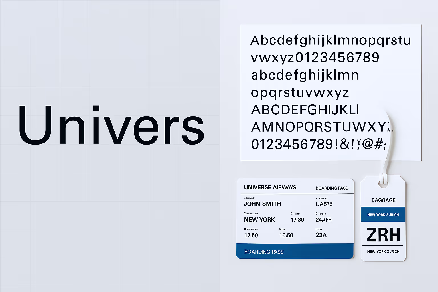
Neutral, systematic, and adaptable, Univers is ideal for corporate communications and wayfinding systems. Its comprehensive system of weights and widths allows for diverse applications while maintaining visual coherence.
Adrian Frutiger designed Univers in 1957 as part of his vision to create a complete typographic system that would meet the diverse needs of modern communication. Working for the Deberny & Peignot foundry in Paris, Frutiger developed an innovative numbering system for Univers that organized the typeface family by weight and width rather than traditional naming conventions, creating one of the first truly systematic approaches to type family design. The typeface itself was designed to be completely neutral, avoiding the geometric rigidity of typefaces like Futura while maintaining maximum clarity and legibility across all applications. Frutiger's design philosophy emphasized functionality and universal applicability, creating letterforms that would work equally well in corporate communications, signage systems, and editorial design. The comprehensive nature of the Univers system, with its carefully coordinated weights and widths, represented a new paradigm in type design that influenced how designers thought about typography as a systematic tool for visual communication.
Corporate clients and institutional organizations have embraced Univers for its systematic approach and neutral professionalism that enhances rather than competes with brand messaging. Deutsche Bank adopted Univers as its primary corporate typeface, using the family's comprehensive range of weights and widths to create a cohesive visual identity across all touchpoints from business cards to building signage. Swiss International Air Lines has used Univers extensively, appreciating both its Swiss origins and its systematic organization that allows for clear communication hierarchy in complex travel-related information. Transportation authorities worldwide have specified Univers for wayfinding and signage systems, where its neutral character and excellent legibility help travelers navigate complex environments without distraction. Apple used Univers during certain periods of its corporate evolution, particularly when the company wanted to emphasize systematic thinking and universal design principles. The typeface's modular system has made it particularly valuable for organizations requiring extensive documentation and communications materials, where consistency across diverse applications is essential. Government agencies and international organizations have found Univers especially suitable for multilingual applications, where its neutral character helps ensure that no particular cultural bias is communicated through typographic choices.
12. Gotham

Gotham is an American, straightforward, and versatile typeface that became iconic through its use in Barack Obama's 2008 presidential campaign, where its geometric structure and approachable character conveyed honesty and modern sensibilities. Inspired by mid-century New York architectural signage, Gotham projects authority and accessibility qualities that have made it a favorite for urban branding and political messaging.
Tobias Frere-Jones designed Gotham in 2000 for Hoefler & Co., drawing inspiration from the lettering he observed on buildings around New York City, particularly the architectural signage from the 1930s through 1960s. The typeface was originally commissioned by GQ magazine, which wanted a masculine, authoritative sans-serif that would appeal to contemporary men while avoiding the European associations of typefaces like Helvetica. Frere-Jones studied vernacular American lettering, particularly the work of sign painters and architects who created bold, geometric letterforms for building facades and civic signage. Gotham was designed to capture the optimistic, can-do spirit of mid-20th century American design while providing the technical sophistication required for contemporary typography. The typeface's geometric structure is softened by subtle optical corrections and humanist touches that make it approachable and highly readable across various applications, from small text to large-scale environmental graphics.
The political world took notice of Gotham when it became the primary typeface for Barack Obama's 2008 presidential campaign, where its combination of authority and approachability perfectly captured the campaign's message of change and hope. The success of this application launched Gotham into the mainstream, making it one of the most recognizable typefaces in contemporary American culture. New York City adopted Gotham for its official communications and signage, creating a visual connection between the typeface and its architectural inspiration. Major corporations, including Spotify and National Geographic, have embraced Gotham for its ability to communicate both innovation and trustworthiness. Fashion brands like GQ Magazine (its original client) continue to use Gotham for its masculine, sophisticated character that appeals to contemporary audiences. The typeface has also found favor with technology companies and startups seeking to communicate American innovation and democratic accessibility. Its versatility across different media—from digital screens to large-scale installations—has made it particularly valuable for brands requiring consistent identity across diverse touchpoints.
13. Rockwell

Sturdy, distinctive, and attention-grabbing in presence, Rockwell is well-suited for headlines and branding. Its bold, rectangular serifs create a solid, trustworthy impression that stands out in competitive visual environments.
Rockwell was designed by the Monotype Design Studio in 1934, during the height of the geometric slab serif revival that characterized much of 1930s typography. The typeface belongs to the "Egyptian" or slab serif category, featuring heavy, rectangular serifs that give equal weight to both horizontal and vertical strokes. This design approach was part of a broader movement in 1930s graphic design that embraced bold, geometric forms as symbols of industrial progress and modern efficiency. Rockwell's design was influenced by earlier 19th-century slab serifs but refined for 20th-century printing technologies and aesthetic sensibilities. The typeface's name evokes American industrial strength and reliability, reflecting the era's confidence in technological progress and mass production. Its geometric construction and heavy serifs made it particularly suitable for advertising and display applications, where maximum visual impact and immediate recognition were essential for cutting through the increasingly complex visual landscape of modern commerce.
Advertising agencies and brands seeking immediate visual impact have consistently turned to Rockwell for its ability to command attention and communicate reliability. Reader's Digest used Rockwell for many years in its masthead and throughout its publications, leveraging the typeface's trustworthy character and excellent readability to appeal to its broad, mainstream audience. The typeface's substantial presence made it particularly effective for magazine covers and headlines where it needed to compete for attention on crowded newsstands. Nissan has incorporated Rockwell into various marketing campaigns, using its solid, dependable character to reinforce messages about vehicle reliability and engineering quality. Retail brands have found Rockwell effective for signage and packaging applications where its bold character ensures visibility and its geometric structure communicates modern efficiency. Archer Daniels Midland, a major agricultural processing company, has used Rockwell to communicate industrial strength and American agricultural heritage. The typeface's slab serif construction makes it particularly suitable for brands in manufacturing, construction, and other industrial sectors where strength and reliability are key brand attributes. Its ability to maintain legibility even when reproduced at small sizes or under challenging conditions has made it valuable for packaging and labeling applications across various consumer goods categories.
14. Clarendon

Clarendon is bold, authoritative, and versatile, ideal for signage, headlines, and book covers. Sony and Wells Fargo utilize their bracketed serifs and good contrast. This slab serif typeface combines authority with warmth, making it suitable for brands wanting to project confidence without seeming cold.
Robert Besley designed the original Clarendon for the Fann Street Foundry in London in 1845, creating what would become the first trademarked typeface in history. The design emerged during the Industrial Revolution when there was a growing need for bold, attention-grabbing typefaces that could compete in increasingly crowded commercial environments. Clarendon represented a significant evolution in slab serif design, featuring bracketed serifs that connected more gracefully to the main strokes than the harsh, rectangular serifs of earlier Egyptian typefaces. This innovation made Clarendon both more readable and more aesthetically pleasing while maintaining the visual impact that made slab serifs popular for advertising and display purposes. The typeface's design struck a balance between the geometric boldness required for commercial applications and the readability needed for extended text settings, making it versatile enough for both headlines and body text applications.
Financial institutions and technology companies have embraced Clarendon for its ability to communicate both authority and approachability in consumer-facing communications. Wells Fargo has built much of its visual identity around Clarendon, using the typeface's combination of strength and warmth to communicate financial stability while remaining accessible to diverse customer bases. The bank's use of Clarendon helps project trustworthiness and reliability while avoiding the cold, impersonal character often associated with financial institutions. Sony has incorporated Clarendon into various brand applications, particularly in entertainment and media contexts where the typeface's bold character helps cut through visual clutter while maintaining sophisticated appeal. Publishing houses have long relied on Clarendon for book covers and marketing materials, where its literary associations and excellent display characteristics make it effective for communicating both commercial appeal and editorial authority. Martha Stewart Living has used Clarendon extensively, leveraging its combination of authority and warmth to communicate expertise while maintaining an approachable, domestic character. The typeface's versatility has made it popular with lifestyle brands that need to communicate both professionalism and personal connection, from home improvement retailers to food and hospitality companies.
15. Calibri

Modern, clean, and approachable in feel, Calibri is perfect for digital communications and office documents. Microsoft made it their default font, optimized for screen reading with soft, rounded edges. Its slightly condensed proportions and open counters ensure excellent legibility even at small sizes on screens.
Lucas de Groot designed Calibri in 2004 as part of Microsoft's ClearType Font Collection, specifically created to take advantage of ClearType rendering technology that improved text display on LCD screens. The typeface was developed during a period when computer typography was transitioning from print-optimized fonts to designs specifically engineered for screen display. De Groot's challenge was to create a sans-serif typeface that would be highly legible at small sizes on screens while maintaining enough character to avoid the blandness often associated with system fonts. Calibri's design incorporates subtle humanist touches, including slight variations in stroke width and softly rounded terminals that make it more approachable than purely geometric sans-serifs. The typeface's slightly condensed proportions help maximize screen real estate while its open counters and generous x-height ensure that individual letterforms remain clear and distinct even at small sizes or low screen resolutions.
Microsoft's adoption of Calibri as the default font in Office applications beginning in 2007 gave it unprecedented global exposure and made it one of the most widely used typefaces in business communication. This massive deployment established Calibri as the de facto standard for professional correspondence, reports, and presentations across virtually every industry. LinkedIn has incorporated Calibri into various interface elements, leveraging its professional associations and excellent screen readability to enhance user experience in professional networking contexts. Healthcare organizations have found Calibri particularly effective for patient communications and digital interfaces, where its approachable character helps make medical information more accessible while maintaining professional credibility. Skype used Calibri during certain periods of its interface design, appreciating the typeface's clarity in video conferencing applications where text legibility across different devices and screen qualities was essential. Educational institutions have widely adopted Calibri for digital learning platforms and administrative communications, where its combination of professional appearance and high legibility supports effective knowledge transfer. The typeface's success in digital environments has made it a standard choice for organizations transitioning from print-based to digital-first communication strategies, where its proven performance across different devices and platforms provides reliability and consistency.
16. Optima

Elegant, timeless, and versatile in presence, Optima is suited for beauty products and healthcare. Estée Lauder and Aston Martin showcase their sans-serif design with subtle stroke modulation. This unusual typeface combines the clarity of sans-serif with the grace of serif designs, creating a uniquely sophisticated character.
Hermann Zapf designed Optima between 1952 and 1955, creating what he considered his masterpiece and one of the most successful attempts to bridge the gap between serif and sans-serif typography. Zapf's inspiration came from lettering he observed on ancient Roman inscriptions during a visit to Italy, particularly those in the Santa Croce church in Florence. He sought to capture the elegance and proportional harmony of classical Roman letterforms while creating a modern typeface suitable for 20th-century typography. Optima's distinctive character comes from its subtle stroke modulation—the letters aren't uniformly weighted like typical sans-serifs, but instead feature gentle variations in stroke width that give them warmth and elegance without actual serifs. This approach was revolutionary, creating a new category of typeface that Zapf called "serifless Roman." The design process took several years as Zapf refined the balance between classical proportions and modern functionality, resulting in a typeface that works equally well for display and text applications.
Luxury brands and premium service providers have consistently chosen Optima for its ability to communicate sophistication and timeless elegance without appearing overly formal or traditional. Estée Lauder has built much of its visual identity around Optima, using the typeface's elegant character and subtle sophistication to reinforce the brand's positioning in the luxury cosmetics market. The typeface's classical proportions and refined details communicate the quality and heritage that luxury beauty consumers expect while maintaining contemporary relevance. Aston Martin has incorporated Optima into its branding, leveraging the typeface's combination of elegance and strength to communicate British luxury and automotive excellence. Healthcare organizations, particularly those in cosmetic and elective medical procedures, have found Optima effective for communicating both medical authority and aesthetic sensibility. The Vietnam Veterans Memorial in Washington, D.C., uses Optima for the names of fallen soldiers, where its dignified character and excellent readability create an appropriately solemn and respectful presentation. Architectural firms and design consultancies have embraced Optima for its association with sophisticated design thinking and its ability to communicate both creativity and professionalism. The typeface's unique character—neither fully serif nor sans-serif—makes it particularly suitable for brands that want to stand apart from conventional typographic choices while maintaining broad appeal and timeless elegance.
17. Palatino

Palatino is warm, organic, and readable, ideal for book typography and branding. Designed by Hermann Zapf, this typeface draws inspiration from Renaissance letterforms while adapting them for modern printing technologies.
Hermann Zapf designed Palatino in 1948, naming it after the 16th-century Italian master of calligraphy, Giovanni Battista Palatino. Zapf's goal was to create a typeface that would combine the best qualities of Renaissance typography with the technical requirements of modern printing and typesetting. Working in post-war Germany, Zapf had access to limited resources but unlimited ambition to create typefaces that would stand alongside the great classical designs. Palatino was designed to be both beautiful and functional, incorporating the organic flow and humanist proportions of Renaissance letterforms while ensuring excellent performance in machine composition and printing. The typeface's design reflects Zapf's deep knowledge of calligraphy and his belief that the best typography should capture the rhythm and flow of skilled handwriting. Palatino's generous proportions, open counters, and slightly condensed character make it exceptionally readable in both text and display applications, while its warm character and organic details give it a distinctly human quality that sets it apart from more mechanical typeface designs.
Publishing houses and cultural institutions have made Palatino a cornerstone of quality typography, particularly for applications requiring extended reading and intellectual engagement. Penguin Classics has used Palatino for many of its literary publications, leveraging the typeface's scholarly associations and excellent readability to enhance the reading experience of classic literature. The typeface's Renaissance origins make it particularly appropriate for literary and cultural content, where its historical resonance adds depth to contemporary presentations. National Geographic incorporated Palatino into various editorial applications, using its warm character and excellent readability to make complex scientific and cultural information accessible to broad audiences. Academic publishers have consistently chosen Palatino for scholarly journals and textbooks, where its combination of authority and readability supports serious intellectual discourse. Adobe used Palatino during certain periods of its corporate communications, appreciating the typeface's association with quality typography and creative excellence. Museums and cultural organizations worldwide have adopted Palatino for exhibition catalogs and educational materials, where its classical associations and warm character help make cultural content more approachable. The typeface's success in both print and digital applications has made it valuable for organizations transitioning between media while maintaining consistent brand character and excellent readability across all platforms.
18. Cooper Black

Friendly, retro, and bold in feel, Cooper Black is perfect for food packaging and casual brands. Its exaggerated weight and distinctive roundness create a recognizable personality that communicates warmth and approachability.
Oswald Bruce Cooper designed Cooper Black in 1922 as an extreme weight extension of his Cooper Old Style family, creating what would become one of the most recognizable and beloved display typefaces of the 20th century. Cooper was a Chicago-based designer who believed that typography should be both functional and expressive, capable of conveying personality and emotion as well as information. Cooper Black emerged during the jazz age, reflecting the era's optimism, boldness, and love of distinctive style. The typeface's exaggerated weight and rounded forms were revolutionary for their time, pushing the boundaries of what was considered acceptable in commercial typography. Cooper's design philosophy emphasized personality and memorability over classical proportions, creating letterforms that would stick in viewers' minds and create strong brand associations. The typeface's friendly, almost cartoon-like character made it immediately popular for advertising applications where brands wanted to appear approachable and memorable rather than formal or intimidating.
Food and beverage brands have consistently embraced Cooper Black for its ability to communicate warmth, friendliness, and appetite appeal in packaging and marketing applications. Beach Boys used Cooper Black for the "Pet Sounds" album cover, where its playful character perfectly captured the band's sunny, optimistic musical style. The typeface became synonymous with 1970s pop culture through its use in advertising, television graphics, and album covers, making it a shorthand for fun, casual, and approachable communication. Tootsie Roll has used Cooper Black in its branding, leveraging the typeface's sweet, friendly character to appeal to both children and adults in the confectionery market. Fast-casual restaurant chains have found Cooper Black effective for creating welcoming, unpretentious brand identities that communicate quality comfort food without fine-dining formality. Lubalin, Burns & Co. used Cooper Black extensively in advertising campaigns throughout the 1960s and 70s, helping establish it as a go-to choice for brands wanting to appear friendly and accessible. The typeface's retro associations have made it popular with contemporary brands seeking to evoke nostalgia and authenticity, particularly in artisanal food and craft beverage categories where handmade quality and traditional values are important brand attributes. Its bold, unmistakable character ensures high visibility and memorability across all applications, from packaging to signage to digital marketing.
19. ITC Avant Garde Gothic

Modern, geometric, and distinctive in presence, ITC Avant Garde Gothic is suited for fashion and technology. Adidas and Apple (historically) showcase their unique letterforms and strong geometry. Its perfectly circular rounds and straight lines create a futuristic, precise appearance that feels creative and structured.
Herb Lubalin and Tom Carnase developed ITC Avant Garde Gothic in 1970, expanding on lettering originally created for the masthead of Avant Garde magazine. The typeface emerged from the experimental typography movement of the late 1960s, when designers were challenging traditional conventions and exploring new ways to integrate typography with graphic design. Lubalin, known for his innovative approach to combining text and image, designed the original lettering to embody the magazine's avant-garde editorial philosophy and attract readers interested in cutting-edge culture and design. The development of a complete typeface family allowed these distinctive letterforms to be used more broadly, spreading Lubalin's experimental aesthetic beyond the magazine into commercial and corporate applications. The typeface's perfectly geometric construction, based on circles and straight lines, represented a radical departure from traditional letterform proportions and created new possibilities for tight, almost interlocking letter arrangements that became a signature of 1970s graphic design.
Fashion and lifestyle brands quickly recognized ITC Avant Garde Gothic's potential for creating distinctive, memorable brand identities that would stand out in competitive markets. Adidas built its iconic three-stripe logo and wordmark around the typeface, using its geometric precision and bold character to communicate athletic performance and street credibility. The typeface's association with both high fashion and athletic wear made it particularly versatile for lifestyle brands targeting style-conscious consumers. Apple used ITC Avant Garde Gothic during its early corporate period, leveraging the typeface's futuristic character to communicate technological innovation and forward-thinking design philosophy. Record labels throughout the 1970s and 80s embraced the typeface for album covers and promotional materials, where its experimental character resonated with progressive music and avant-garde cultural movements. Calvin Klein incorporated the typeface into various campaigns, using its geometric perfection to communicate minimalist design philosophy and contemporary sophistication. Fashion magazines and cultural publications continue to use ITC Avant Garde Gothic when they want to communicate cutting-edge style and experimental thinking, while technology companies appreciate its association with innovation and its strong performance in digital applications where geometric clarity translates well across different screen types and resolutions.
20. Neutraface

Architectural, modern, and balanced in character, Neutraface is ideal for design-focused brands and real estate. Inspired by the lettering of modernist architect Richard Neutra, this typeface communicates clean design with a sophisticated edge.
Christian Schwartz designed Neutraface in 2002, drawing inspiration from the architectural lettering and signage created by Richard Neutra, the influential Austrian-American modernist architect. Neutra's approach to typography was part of his broader design philosophy that emphasized clean lines, functional beauty, and the integration of architecture with its natural and social environment. Schwartz studied Neutra's original lettering from building signage, particularly from projects like the Kaufmann House in Palm Springs and various commercial buildings throughout Los Angeles, extracting the essential character of these architectural letterforms and developing them into a complete typeface system. The challenge was to maintain the distinctive character of Neutra's original lettering while creating a typeface that would work effectively in contemporary graphic design applications. Neutraface captures the optimistic modernism of mid-century California architecture, combining geometric clarity with subtle humanist touches that reflect Neutra's belief in architecture's power to improve human experience through thoughtful design.
Architecture firms and design-focused businesses have embraced Neutraface for its ability to communicate sophisticated modernist thinking and attention to design detail. Richard Meier & Partners and other prominent architectural firms have used Neutraface in their communications, leveraging its architectural origins and modernist character to reinforce their design philosophy and professional expertise. Real estate developers, particularly those specializing in luxury residential and commercial properties, have found Neutraface effective for communicating design quality and architectural sophistication to affluent clients who value modernist aesthetics. West Elm has incorporated Neutraface into its branding, using the typeface's mid-century modern associations to appeal to consumers interested in contemporary design and lifestyle products. Museums and cultural institutions focusing on modern art and architecture have adopted Neutraface for exhibitions and publications where its historical connections to important modernist work add authenticity and depth to contemporary presentations. Dwell Magazine has used Neutraface extensively, leveraging its architectural associations and clean character to communicate the publication's focus on modern living and design excellence. Technology companies, particularly those in creative software and design tools, have found Neutraface appealing for its association with creative thinking and its performance in digital applications where its clean geometry and sophisticated character help communicate both innovation and design expertise to professional creative audiences.
Applying Typography Strategically in Branding
Typeface choice is about alignment with audience, voice, and context, not mere preference. When applying typography strategically, consider key factors to ensure your choices effectively reinforce your brand identity.
Aligning Typeface with Brand Personality
Start by defining your brand's personality traits. Are you precise and professional, or imaginative and warm? Understanding the role of font choices in brand identity is essential.
Matching these traits with appropriate typefaces can project similar attributes, highlighting the critical nature of typography in brand design. A tech startup aiming for innovation might choose a clean, modern sans-serif like Avenir, while a luxury brand could opt for an elegant serif like Garamond to convey sophistication.
Considering Context and Platform
Different applications demand different typographic characteristics. Digital UI needs high legibility on screens, especially at smaller sizes. Sans-serif fonts like Helvetica often excel here due to their clean lines. Print calls for durability and character at scale.
Serif and sans-serif fonts can work well depending on your brand's personality. Signage and mobile require clarity from a distance or at small sizes, so focus on fonts with distinct letterforms and adequate spacing.
Technical factors such as x-height, kerning, and font rendering can significantly affect performance across different media. A font that looks great in print might not translate well to digital screens, so thorough testing is crucial.
Font Pairing Principles
To create a cohesive brand identity, you'll likely need multiple fonts. Choose contrasting types (e.g., serif + sans-serif) rather than fonts that clash. Limit your choices to 2-3 complementary fonts per identity. Use hierarchy (weight, size, spacing) to organize content, reinforcing the role of typography. Ensure your pairings work across all brand applications.
Successful font pairings used in real-world brand systems include Helvetica with Garamond for a blend of modern and classic, Futura with Bodoni for a bold, sophisticated look, and Roboto with Merriweather for a clean, readable combination. These combinations enhance the effectiveness in engaging audiences by providing visual harmony.
Typography Accessibility Considerations
Typography should serve all audiences, including those with visual impairments or reading disabilities. Consider adequate text and background contrast, spacing between characters and lines, and appropriate font sizes. Highly decorative fonts may look attractive, but can pose readability challenges for some users.
Web Content Accessibility Guidelines (WCAG) provide specific recommendations for text presentation to ensure content remains accessible. Following these guidelines expands your brand's reach and demonstrates social responsibility and inclusivity. This underscores the importance of typography in branding, ensuring it is accessible to all.
Maintaining Typographic Consistency
Consistency in typography builds recognition and trust, emphasizing typography's role as a branding ambassador. Create comprehensive typography guidelines specifying font usage across different platforms and applications, detailing which fonts to use for headings, subheadings, body text, and specialized content.
Specify exact sizes, weights, and spacing values to maintain visual coherence.
Document these guidelines in an accessible brand style guide that all team members can reference. This resource ensures typographic decisions remain consistent even as your brand grows and new team members join the creative process.
Bring in Professionals to Elevate Typography Strategy
Strategic typography is part art, part system. While making sound typographic choices with internal resources is possible, aligning every decision, from font pairing to accessibility, with your brand’s broader goals often requires deeper design experience.
Professionals bring a practiced eye to nuances like how a typeface performs across screen types, how spacing choices shape tone, and how hierarchy influences user flow.
Collaborating with a team that understands the technical and emotional weight of typography can help move a brand from functional to unforgettable.
NoBoring Design works with growing businesses to turn design choices, like typography, into consistent, scalable systems that reinforce brand identity without overwhelming internal teams. The goal isn’t just to choose a font; it’s to build trust and recognition across every brand touchpoint.
Typography as Brand Expression
Typography isn't just aesthetics; it's your brand's visual voice, emphasizing typography as a key branding element. The right font builds trust, expresses identity, and creates an emotional connection.
Think of these typefaces not as prescriptions but as proven launching pads for your brand's unique expression. Great typography separates unforgettable brands from forgettable ones. It's a craft worthy of attention, not just another checkbox. Ask yourself: What do we want people to feel when encountering our brand, and does our typeface deliver that emotional punch?
So, are you ready to transform your brand's visual communication? Let NoBoringDesign help you discover the perfect typeface combination to capture your unique brand personality and connect with your audience on a deeper level. Reach out today to find out how!
Key Takeaways
- Typography directly influences brand perception, with consistent use boosting recognition by up to 80%.
- Different typeface categories (serif, sans-serif, script, display) convey distinct brand personalities.
- The top 20 typefaces offer proven success across various industries and applications.
- Strategic implementation requires aligning typeface choices with brand personality and context.

The rapid evolution of IoT, AI, and 5G is unprecedentedly reshaping circuit design. With 27–29 billion connected IoT devices projected worldwide by 2025, the need for new circuit strategies is more pressing than ever.
This evolution isn’t just technical; it’s reshaping how technology integrates into our lives. As devices become smaller and more powerful, circuit design is pivotal in making them intuitive, responsive, and seamlessly embedded in everyday use.
In this article, we explore why innovation in circuit design matters and what it means for the future of intelligent technology.
What is Circuit Design?
Circuit design is the process of creating the electronic "blueprints" that make devices tick—literally. Whether it’s your smartphone, a coffee maker, or a space probe, every electronic gadget relies on a carefully planned network of components like resistors, capacitors, and microchips, all wired together to do a specific job.
Circuit designers figure out how to make all those parts talk to each other and work in harmony, kind of like the conductor of a tiny electrical orchestra.
It starts with an idea (like “let’s build a smart doorbell”) and moves into schematics, simulations, and eventually, a real physical layout that can be printed onto a circuit board. Great circuit design isn’t just about making something work—it’s about making it efficient, reliable, and ready to be built at scale. In short, it’s where imagination meets engineering.
For companies and brands, understanding circuit design matters when you're creating tech-driven products or need to communicate how your innovation works. Whether you're launching hardware, pitching to investors, or simplifying the tech behind your brand, clear, visual storytelling around circuit design can turn complexity into confidence.
The 3 Major Forces Driving Circuit Design Innovation
1. Evolving Consumer Demands
Today’s consumers expect more than just fast devices; they want smart ones. They expect real-time responsiveness, adaptive behavior, and intuitive and personal interfaces.
These expectations place new demands on circuit design. Performance and personalization must now coexist at the silicon level, driving the need for architectures to support seamless, low-latency experiences while adapting to user behavior in real time.
2. Technological Advancement Catalysts
Several key technologies are transforming circuit design strategies. The Internet of Things has triggered demand for circuits that combine minimal energy consumption with innovative communication capabilities. These components must operate reliably for years, often in challenging environmental conditions, while maintaining constant connectivity.
Artificial Intelligence integration presents its unique challenges. As AI weaves into everyday gadgets, circuits must support intense computational workloads while maintaining reasonable energy profiles. This balancing act has prompted entirely new architectural approaches to circuit design.
The rollout of 5G technology adds another dimension of complexity. These networks demand components capable of handling higher frequencies and bandwidth while preserving signal integrity. The technical hurdles have shattered conventional limits, inspiring creative minds to reimagine circuit design from first principles.
This technological evolution influences device functionality and impacts how brands develop communication strategies to connect with consumers through advanced technology.
3. Competitive Market Dynamics
Companies with cutting-edge circuit design strategies gain significant market advantages in today's crowded technology landscape. Innovative approaches deliver products with differentiated features that capture consumer attention and imagination. Paired with on-demand marketing strategies, these innovations enable performance benchmarks that competitors struggle to match.
Circuit design innovation creates ripple effects throughout product development and manufacturing. Optimized designs can reduce production costs while accelerating time-to-market for groundbreaking technologies. They also enable new product categories that establish companies as market leaders rather than followers.
For example, the emergence of flexible electronics has revolutionized wearable technology in ways rigid circuits simply couldn't achieve. This innovation didn't just improve existing products; it created new possibilities for how technology integrates with our lives.
Companies that prioritize innovation in circuit design strategies position themselves as market participants and trendsetters who define what's possible. By addressing the unique challenges technology companies face, they can stay ahead in the competitive market. This forward-thinking approach proves especially valuable in the technology sector, where yesterday's breakthrough quickly becomes tomorrow's standard feature.
The Essential Strategies for Circuit Design Innovation
Embracing Multidisciplinary Approaches
Innovation thrives when disciplines intersect. When material scientists, digital designers, and UX experts collaborate, circuits become technically advanced, intuitive, and visually appealing. Strong visual identity enhances usability, ensuring tech progress is matched by design clarity.
This approach is efficient in RF product development. By combining mechanical, electrical, and software expertise early, teams solve multiple challenges simultaneously, including durability, thermal management, and adaptability, leading to more refined outcomes.
Cross-disciplinary collaboration also accelerates innovation. Developers align power algorithms with hardware limits, while engineers design enclosures that balance form and function. The result is faster, more efficient product development with a stronger user focus.
Understanding how to choose a web design agency is crucial in fostering effective collaboration for innovation, and strategic partners can amplify these results. Agencies like NoBoring Design contribute by aligning product identity with usability and technical goals, helping teams move from functional prototypes to engaging, brand-aligned experiences.
Leveraging Advanced Design Tools
AI and machine learning are transforming circuit design. These tools automate complex tasks, such as component layout, signal analysis, and thermal modeling, improving speed, precision, and design confidence.
What once took months now takes weeks, with better outcomes. Automation reduces manual effort, letting designers focus on problem-solving and innovation rather than repetitive work.
The impact isn’t just efficiency, it’s creative freedom. With AI managing technical details, designers can explore bolder concepts and user-centered solutions that might otherwise go unrealized.
The Key Challenges in Implementing Innovative Circuit Strategies
Financial Constraints
Budget limitations remain a significant obstacle to innovative circuit design. Advanced strategies often demand costly materials, tools, and expertise. Teams must weigh the potential of new approaches against immediate financial realities.
This becomes more challenging with novel materials or architectures, which have high upfront costs. Strategic partnerships and alternative funding models can help offset these investments.
Organizations that succeed in this space typically use structured frameworks to evaluate technical feasibility and commercial value, allowing them to focus limited resources on high-impact innovations.
Learning Curve Complexities
Advanced design tools powered by AI and machine learning can significantly improve design efficiency but introduce steep learning curves. Engineers accustomed to traditional methods may face challenges adapting to new workflows, temporarily affecting productivity.
To address this, organizations invest in structured training programs and mentorship, recognizing the long-term benefits of skill development. Creating communities of practice where engineers can share knowledge accelerates the learning process and helps teams adapt more quickly, enhancing both productivity and innovation potential over time.
Organizational Resistance
One of the most overlooked barriers to innovation is organizational resistance. Design teams often hesitate to adopt new methodologies, not because of their technical shortcomings but because they are comfortable with established routines, skeptical about new technologies, or concerned about job security.
Successfully overcoming this resistance requires more than introducing new tools; it demands a cultural shift. Organizations that foster a culture of continuous learning and experimentation create an environment where employees feel safe to explore new approaches.
By allowing teams to experiment with low-risk projects and celebrating early successes, organizations can build momentum, reduce fear of failure, and encourage broader adoption of innovative methods.
The Future of Circuit Design: Novel Approaches to Consider
Exploring Advanced Materials
The quest for more efficient and powerful circuits has researchers exploring materials that completely redefine what's possible. Graphene stands out as perhaps the most exciting of these materials. Its remarkable properties include strength greater than steel at the same thickness, electrical conductivity that exceeds copper, ultra-high carrier mobility outperforming traditional silicon, and single-atom thickness enabling unprecedented miniaturization.
These characteristics make graphene a game-changer for next-generation electronics. Graphene could deliver exceptional processing speeds in circuit design while consuming minimal energy. Research shows graphene-based circuits can match silicon's performance with lower power requirements, addressing one of electronics' most significant challenges.
However, graphene faces hurdles on its path to mainstream adoption. One major challenge is its lack of a natural band gap, making it difficult to turn off transistors completely. This limitation particularly affects digital circuit applications.
Researchers continue developing solutions like graphene nanoribbon FETs and engineered bandgaps. In contrast, hybrid approaches combining graphene with conventional silicon CMOS technology demonstrate how graphene can enhance existing technologies rather than replacing them entirely.
Prioritizing Sustainability
As environmental concerns grow across industries, circuit design strategies are evolving to embrace eco-friendly materials and energy-efficient solutions. This shift improves ecological impact while driving innovations that boost performance and reduce costs.
Sustainable innovations include lead-free solder compositions with improved reliability, biodegradable substrate materials, reduced use of rare earth elements, energy-efficient manufacturing techniques, and designs optimized for recyclability.
These sustainable practices deliver tangible benefits. Bio-based composites increasingly replace traditional FR-4 substrates in non-critical applications, reducing circuit manufacturing's carbon footprint. These eco-friendly alternatives address environmental concerns while often improving performance and lowering costs.
In power electronics, wide-bandgap semiconductor devices like silicon carbide and gallium nitride components transform circuit design by slashing power conversion losses by up to 50%, operating at higher temperatures, enabling higher switching frequencies, and dramatically reducing the size of power components.
The trend toward electrification across industries has accelerated development in this field, affecting everything from renewable energy systems to electric vehicles.
Balancing Theory and Practice in Circuit Design
The Art of Practical Constraints
While theoretical innovation drives the field forward, practical implementation requires navigating real-world constraints. Circuit designers must balance cutting-edge techniques with manufacturing capabilities, cost considerations, and reliability requirements.
This balance represents the true art of circuit design, knowing when to push boundaries and when to embrace proven approaches. Companies that master this balance create products that showcase technical excellence and succeed in the marketplace.
The journey from concept to production often reveals unforeseen challenges that require creative problem-solving. Temperature fluctuations, electromagnetic interference, and physical stress can all impact circuit performance in ways difficult to predict during simulation.
Successful designers anticipate these challenges by incorporating margin for variability while maintaining overall design integrity. They understand that the most elegant solution on paper may not be the most practical solution in production.
Building Bridges Between Research and Application
The gap between academic research and commercial application represents one of the biggest challenges in circuit design innovation. Groundbreaking ideas often languish in research papers without finding their way into products. Closing this gap requires focused efforts to translate theoretical advances into practical implementations.
Companies that build effective pathways between research institutions and product development teams gain significant advantages in bringing innovations to market. Effective brand messaging also plays a crucial role in communicating these innovations to the market, ensuring that breakthroughs are developed and appreciated by consumers.
Successful translation requires understanding production environments' theoretical foundations and practical constraints. It means identifying which innovations offer the most promising returns on investment and focusing resources on those areas. Companies that excel at this process create feedback loops where practical implementation challenges inform research priorities, accelerating the pace of meaningful innovation that delivers real-world benefits.
Embracing the Circuit Design Revolution
Innovation in circuit design strategies has evolved from optional to essential. The convergence of consumer expectations, technological advancement, and competitive pressures creates challenges and opportunities for designers willing to explore new approaches.
By embracing multidisciplinary collaboration and advanced design tools, professionals can overcome traditional limitations and create solutions that seemed impossible years ago.
Ready to revolutionize your circuit design strategy? At NoBoring Design, we're passionate about helping companies transform their design approaches. Our team combines technical expertise with creative thinking to develop solutions that stand out in crowded markets. Contact us today to discover how!
Key Takeaways
- Circuit design innovation is driven by IoT, AI, and 5G technologies, requiring compact, energy-efficient solutions.
- Consumer expectations for smaller, faster, and more energy-efficient devices challenge designers to balance functionality with reliability.
- Multidisciplinary approaches and advanced design tools transform how circuits are conceptualized and created.
- Novel materials like graphene and sustainability-focused innovations represent the next frontier in circuit design evolution.
FAQs
Q: Why is innovation important in circuit design strategies today?
A: Innovation in circuit design strategies is essential to meet the demands of IoT, AI, and 5G technologies. These advancements require faster, more compact, and energy-efficient circuits, enabling real-time responsiveness and seamless integration into everyday devices.
Q: How are AI and machine learning transforming circuit design?
A: AI and machine learning transform circuit design by automating complex tasks like layout optimization and signal analysis. These tools speed up development and allow designers to focus on more strategic, user-centric innovations in circuit architecture.
Q: What role do sustainable materials play in modern circuit design innovation?
A: Sustainable materials play a crucial role in circuit design innovation by reducing environmental impact and improving efficiency. Eco-friendly substrates, lead-free components, and energy-efficient semiconductors support high-performance designs with lower carbon footprints.
Q: What are the biggest challenges in implementing innovative circuit design strategies?
A: Implementing innovative circuit design strategies can be challenging due to budget limitations, steep learning curves with advanced tools, and organizational resistance to change. Overcoming these barriers requires cultural shifts, targeted training, and smart resource allocation.

Video dominates our digital landscape, commanding attention where text falls short. People remember 95% of a message delivered through video, compared to just 10% when reading text. Explainer videos are your beacon in the attention battlefield, transforming complex ideas into digestible stories that captivate audiences and drive action.
These aren't just pretty animations; they're conversion powerhouses that clarify confusion and prompt decisions. They translate your message into visual narratives that stick, turning bewildered prospects into enlightened customers who understand your value proposition in seconds rather than minutes.
Ready to harness this visual storytelling magic? This article reveals the secrets behind effective explainer videos and shows how partnering with creative teams can transform professional storytelling into your sustainable competitive edge.
What is an Explainer Video?
An explainer video is a short, snappy video that breaks down a single idea, like how your product works or why your service matters, in a way that’s easy to understand and forget. Instead of overwhelming people with information, it uses visuals, voiceover, and storytelling to make things click fast. Think of it as your elevator pitch… but animated, narrated, and way more engaging.
These videos are perfect for grabbing attention, answering big questions quickly, and helping your audience "get it" without digging through pages of text. Whether animated, live-action, or somewhere in between, an explainer video turns complex stuff into clear, memorable messages that stick.
Choosing the Right Style for Your Explainer Video
Explainer videos are short narratives crafted to communicate a single idea clearly and memorably. Unlike tutorials that teach skills, product demos that showcase features, or testimonials that build credibility, explainer videos make concepts instantly understandable.
Let’s explore the styles you want to consider when creating your explainer video.
2D Animation
As a key element of animation in storytelling, this style transforms abstract concepts into visual stories. It is perfect for startups, services, and complex systems that need simplification. The flat aesthetic focuses on the message rather than the medium, making it ideal for concept-heavy explanations where understanding trumps spectacle.
Whiteboard Animation
The whiteboard creates a teacher-student connection through progressive revelation, which is ideal for logical sequences and educational material. The drawing process mirrors how we learn, with each new element building on previous understanding, creating natural momentum and retention.
3D Animation
This approach brings physical products to life, making it excellent for hardware, spatial concepts, or anything requiring depth to appreciate fully. The three-dimensional rendering helps viewers mentally engage with objects they can't physically touch, bridging the gap between imagination and reality.
Live-Action
Live action creates an immediate human connection, which is best for emotion-driven messages where authenticity matters most. Seeing real people adds credibility and emotional resonance, particularly effective when testimonial elements enhance your explanation.
Isometric Style
This perspective shows relationships between components, making it suitable for systems thinking, platform explanations, or layered processes. The angled view offers more information than a flat 2D without the complexity of full 3D, making it excellent for visualizing interconnected elements.
Research by Wyzowl shows that 94% of people have watched an explainer video to learn about a product or service, and 84% say they have been convinced to buy a product or service after watching a brand’s video. The key isn’t picking the prettiest style, but choosing what best serves your message.
Core Ingredients of Effective Explainer Video Design
Great explainer videos combine essential elements that maximize attention and recall, turning passive viewers into active participants in your story.
Strategic Length
Keep it tight, attention drops dramatically after 60 seconds. Brief videos (60-90 seconds) force clarity and boost completion rates. This constraint isn't limiting, it's liberating, pushing you to distill your message to its purest form. When you eliminate everything unnecessary, what remains speaks with remarkable power.
Narrative Architecture
Start with a problem your viewer recognizes, introduce your solution, then explain why they should act now. This problem-solution-urgency approach creates emotional investment by acknowledging pain before offering relief. This structure works because it mirrors how we naturally process information: recognize a challenge, seek a solution, and evaluate the urgency.
Script-First Approach
Scriptwriting for explainer videos is strategic communication, not creative writing. Crafting engaging narratives that resonate with your audience is crucial. Open by acknowledging the viewer's challenge, and name their pain point directly to establish relevance. Present your solution early and reinforce its unique value throughout.
Write in natural conversational language, always reading your script aloud to test flow. Aim for roughly 150 words per minute of video and choose clarity over cleverness. Complex wordplay often gets lost in visual translation.
Structure your script in four parts: Hook (grab attention), Problem (establish relevance), Solution (introduce your answer), and Call-to-Action (direct next steps). This framework guides viewers through a logical progression that culminates in explicit action.
Sensory Synchronization
Visual elements, narration, and sound must dance together perfectly. Your brain processes these channels simultaneously, so misalignment creates mental friction. Professional voiceover isn't a luxury; it's the backbone of comprehension. When sight and sound work in harmony, your message transcends the sum of its parts.
Audience Alignment
Language, examples, and visual metaphors should match your viewer's familiarity. Meeting viewers where they are creates instant rapport and builds emotional connections, enabling effective message communication. An explainer for software developers can use technical terms that would leave general consumers scratching their heads. Misjudging their knowledge level creates barriers to understanding.
5 Steps to Designing an Explainer Video from the Ground Up
Creating an effective explainer video starts long before opening animation software. Whether you do it yourself or work with designers, these steps ensure your video delivers results rather than just looks pretty.
1. Start With Research, Your Goals, and a Brief
Start by establishing your video's strategic intent. Define your primary purpose: Is this for customer awareness, user onboarding, sales enablement, or internal training? Create audience personas with specific roles, pain points, and knowledge gaps.
Audit existing materials to identify clarity gaps your video can address, then develop a creative brief outlining objectives, tone, core message, and success metrics. This prep work prevents costly mid-project changes and ensures stakeholder alignment before committing resources.
2. Script Development
Scriptwriting for explainer videos is strategic communication, not creative writing. Crafting engaging narratives that resonate with your audience is crucial. Open by acknowledging the viewer's challenge, and name their pain point directly to establish relevance. Present your solution early and reinforce its unique value throughout.
Write in natural conversational language, always reading your script aloud to test flow. Aim for roughly 150 words per minute of video and choose clarity over cleverness. Complex wordplay often gets lost in visual translation.
Structure your script in four parts: Hook (grab attention), Problem (establish relevance), Solution (introduce your answer), and Call-to-Action (direct next steps). This framework guides viewers through a logical progression that culminates in explicit action.
3. Visual Storyboarding
Through storyboarding, turn your script into visual logic. Sketch key scenes that illustrate main points from your script and plan transitions to show how concepts connect and flow. Select a visual style that matches your message tone and content type while ensuring visual branding consistency with your established identity.
Create mood boards to capture the feeling and aesthetic direction of your video. Storyboarding isn't about artistic skill; it's about planning. Simple sketches or written descriptions work fine if they communicate visual intent.
4. Production Process
With planning complete, production begins. The animation process typically involves importing storyboard assets into your chosen tool, creating motion sequences for each scene, synchronizing movement with narration timing, and building transitions between concept segments.
This phase demands patience and attention to detail. Rushing animation leads to quality compromises that viewers instantly notice.
Post-production adds a professional voiceover that matches your brand tone, incorporates music and sound effects to create emotional depth, and includes captions for accessibility and silent viewing (85% of Facebook videos are watched without sound, according to Digiday research). These elements are crucial in effective video production.
Final testing should verify platform compatibility across devices and aspect ratios to ensure your message reaches everyone, everywhere, precisely as intended.
5. Work with Creative Partners
While DIY tools can help you get started, effective explainer videos demand more than templates. They require a deep understanding of storytelling, brand voice, and audience psychology.
Partnering with professionals like NoBoring Design ensures your video is visually appealing and strategically aligned with your goals. From scripting and storyboarding to visual identity and platform optimization, experienced collaborators help turn your message into something memorable and conversion-focused.
Common Pitfalls in Explainer Video Design
Watch out for these frequent mistakes that undermine explainer video effectiveness and learn how to avoid them.
Excessive Length
Viewer drop-off increases dramatically after 90 seconds. Edit mercilessly to respect your audience's time. Each additional second demands justification; if it doesn't advance understanding, it should be cut regardless of how clever or visually appealing it might be.
Information Overload
Focus on explaining one concept well instead of multiple ideas poorly. Cognitive load theory teaches us that our working memory has limited capacity; overloading it prevents retention. When viewers struggle to process too much information, they retain almost nothing.
Narrative Dissonance
Make sure your narration and visuals tell the same story simultaneously. When words and images compete, comprehension suffers. This alignment isn't just about matching what's said to what's shown; it's about ensuring they enhance rather than contradict each other.
Ambiguous Conclusion
End with a specific, actionable next step rather than a vague suggestion. Viewers who understand your message but don't know what to do with that understanding represent missed opportunities. Clear direction converts comprehension into action.
Style Inconsistency
Maintain visual coherence throughout. Jumping between animation styles creates mental friction that distracts from your message. Consistency creates comfort, allowing viewers to focus on content rather than adjusting to changing visual languages.
Mobile Neglect
With over 60% of video views happening on mobile, ensure your text is legible and details are visible on small screens. Testing on multiple devices isn't optional; reaching most of your audience effectively is necessary.
Poor Audio Quality
Viewers will forgive visual limitations before audio issues. Clean sound is non-negotiable. Our brains process audio input differently from visual information; audio disruptions create disproportionate comprehension disruptions compared to visual glitches.
These challenges have straightforward solutions if addressed early in the design process rather than discovered during final review.
Breaking Through with Explainer Videos
The best explainer videos don't just animate concepts; they transform complexity into clarity through strategic explainer video storytelling. Their effectiveness stems from empathy, structure, and consistency rather than flashy techniques.
When creating your explainer video, focus on one core concept that matters most to your audience. Apply these principles: understand your viewers, clarify your message, plan your visual flow, and execute with quality. Remember that the goal isn't just to explain, it's to be understood, remembered, and acted upon.
Ready to transform your complex ideas into captivating visual stories? At NoBoring Design, we believe explainer videos should do more than just look good; they should communicate, feel on-brand, and move people to act. Our team blends strategic storytelling with thoughtful design to turn complexity into clarity and browsers into believers. Let's create something remarkable together.
Key Takeaways
- Explainer videos condense complex ideas into 60-90-second visual stories that boost comprehension and retention.
- The right animation style should match your message's purpose rather than just aesthetic preferences.
- Strong scripts form the foundation of successful videos; visuals enhance but can't rescue poor messaging.
- Professional production elements like voiceover, sound design, and visual consistency dramatically impact effectiveness.
FAQs
Q: What is an explainer video, and how does it help businesses?
A: An explainer video is a short, engaging video designed to simplify complex concepts and communicate a single idea. Businesses use explainer videos to clarify offerings, boost comprehension, and convert prospects into customers. If you’re wondering what an explainer video is and how it helps, the answer lies in its ability to transform confusion into clarity in under 90 seconds.
Q: What are the most effective styles of explainer video design?
A: The most effective styles of explainer video design include 2D animation, whiteboard animation, 3D animation, live-action, and isometric visuals. Choosing the right style depends on your message, not just aesthetics. If you’re asking what styles work best in explainer video design, select the one that best enhances understanding and connects with your audience.
Q: How long should an explainer video be for maximum impact?
A: The ideal length for an explainer video is 60 to 90 seconds. Viewer attention drops rapidly after the first minute, so keeping your message concise is crucial. If you're asking how long an explainer video should be, the answer is short enough to hold attention, long enough to make your message stick.
Q: What are the common mistakes to avoid in explainer video design?
A: Common explainer video mistakes include making it too long, cramming in too much information, misaligned visuals and narration, inconsistent styles, and poor audio quality. If you’re wondering what to avoid in explainer video design, the key is simplicity, clarity, and cohesion; each element should serve your core message, not distract from it.
Urban fonts don’t whisper, they shout. Born from the grit of street signs, subway scrawls, and mural-sized declarations, these typefaces carry the rhythm of city life into brand identities that demand attention.
Urban typography taps into cultural cues: rebellion, resilience, identity. It reflects the raw energy of the streets and transforms it into design systems that feel authentic, expressive, and impossible to ignore.
The right urban font can ground your brand in a specific place, attitude, or movement, whether used in fashion, tech, media, or hospitality. This article explains how to inject your branding with urban typography's edge, energy, and credibility.
What is Urban Typography?
Urban typography isn't just about slapping some Helvetica on a street sign and calling it a day. It's the living, breathing textual DNA of our cities that tells us where to go, what to do, and sometimes who we are.
Cities are massive text installations when you think about it:
- Those impossibly tiny street signs you squint at when lost
- The neon storefronts screaming for your attention (and wallet)
- Transportation signage is trying desperately to make sense of the chaos
- Building numbers that somehow never follow logical sequences
But then there's the unauthorized typographic conversation happening:
- Graffiti tags reclaiming forgotten corners
- Stencil manifestos appearing overnight on construction barriers
- Hand-painted shop signs that Instagram influencers can't resist
- Political wheat-paste posters layered like urban archaeology
Urban typography is where function crashes headfirst into expression. It's the tension between municipal order and street-level reality. The most interesting cities don't just use typography as information—they let it become a platform for dialogue between official voices and everyone else.
When done right, urban typography doesn't just tell you where you are—it tells you what kind of place you're in. That's powerful stuff wrapped in something as simple as a letterform. Next time you're walking around, look up from your phone. The city is talking to you through its typography. And what it's saying is way more interesting than your Instagram feed. Keep reading, and we’ll dive in even deeper.
How Urban Typography Shapes Brand Identity
Urban fonts make bold statements through their distinctive characteristics that embody city life. These typefaces draw inspiration from architecture, cultural expressions, and city signage, not just graffiti styles as commonly assumed. Understanding these elements and the importance of font selection relevant to branding helps brands create memorable, culturally relevant visual identities.
Geometric structure and clarity
Urban typography often relies on strong geometric foundations, clean lines, consistent proportions, and grid-based logic. These characteristics lend clarity in environments filled with visual noise, helping brands stand out while signaling a sense of structure and reliability. Whether used in storefronts or subway ads, geometry reinforces legibility and order.
Textural elements and layering
Many urban fonts mimic the tactile qualities of the city itself, such as brick textures, concrete stencils, and faded signage. These textured characteristics add visual depth, helping brands feel grounded in place. When layered strategically, this texture evokes history and presence, giving brands a gritty, lived-in quality that’s hard to digitally replicate.
Handcrafted appeal and authenticity
Urban type often has a handcrafted or imperfect edge, letterforms that feel drawn, painted, or stamped rather than computer-generated. This sense of human touch makes brands feel more relatable and authentic. This imperfection becomes a strength, especially for small businesses or grassroots organizations, symbolizing community over corporation.
Dynamic movement and adaptability
City branding needs to move. Fonts that appear in motion, condensed, slanted, or otherwise visually kinetic, echo the energy of the streets. These dynamic qualities give brands flexibility: they work on murals, billboards, apps, and T-shirts. Movement suggests relevance and adaptability, signaling a brand alive to change.
Creating instant recognition
In crowded environments, you don’t get a second glance. Urban fonts are built to be visually distinctive through bold shapes, unexpected serifs, or high contrast. Recognition isn’t a luxury in urban branding; it’s the baseline. The right font becomes a visual shortcut, helping people remember and return.
Communicating brand values
Beyond style, typography can express a brand’s voice and ethos. A sharp, all-caps sans serif might communicate ambition and modernity. A quirky serif with brushstroke details may evoke creativity or rebellion. In urban branding, where identity is contested and curated block by block, typography must speak clearly and purposefully.
Designing with Cultural Awareness in Urban Typography
Historical context in letterforms
Urban typography is often steeped in local history, graffiti styles shaped by political resistance, signage fonts carried over from industrial boom eras, or lettering inspired by migration patterns. Designers who study these typographic legacies gain access to a deeper, more honest visual language. These fonts aren’t just decorative; they tell stories.
Community expression and visibility
Fonts can become a voice for underrepresented communities. Hand-painted market signs, neighborhood murals, or DIY zines all showcase typography rooted in lived experience. When brands tap into these styles without erasing their origin, they amplify rather than appropriate. Typography, in this way, becomes a tool for representation and pride.
Cross-cultural influence and collaboration
Urban type rarely exists in isolation. It blends languages, aesthetics, traditions, Arabic calligraphy, Latin scripts, and East Asian brushstrokes next to Blackletter tags. This cross-pollination reflects the layered realities of city life. Designers in this space must balance respect with experimentation, always crediting the cultures that shape the work.
Evolution of typographic traditions
Urban type evolves fast. What once appeared only in alleyway graffiti might now define a global sneaker brand. Styles move from underground to mainstream and back again. Cultural awareness means staying attuned to these shifts, understanding how a typeface looks, where it comes from, and where it’s headed.
Adaptation without appropriation
There’s a fine line between homage and exploitation. Urban fonts often carry social, cultural, and even political weight. Designers need to ask hard questions before borrowing: Who created this style? What does it mean in its original context? Can I involve someone from that culture in the design process? Awareness, here, is ethical design in action.
7 Top Adobe Fonts for Urban Branding
Adobe's font library offers exceptional options for urban-inspired branding. These seven standout typefaces deliver street credibility and professional quality for brands seeking to connect with metropolitan audiences.
1. Futura Bold
Futura Bold stands as a timeless geometric sans serif with unmistakable urban appeal. Its perfectly circular forms and balanced proportions make it a favorite for modern branding that needs to communicate confidence without sacrificing sophistication. The font's clean lines and mathematical precision echo contemporary architectural principles while maintaining excellent legibility across applications.
2. Neue Haas Grotesk
This modernized version of the classic Helvetica maintains clean lines with slightly more character, making it perfect for urban brands that want professional appeal with an edge. Its versatile weight range allows for expressive headlines and readable body text from the same family, creating cohesive brand communications across all touchpoints.
3. Mostra Nuova
Mostra Nuova delivers vintage urban appeal with its distinctive deco-inspired forms. This display typeface captures the energy of mid-century city signage while remaining thoroughly contemporary. Its bold geometry and unique details make it ideal for headline applications where brands want to make memorable impressions without sacrificing urban authenticity.
4. Urbane
Urbane is a versatile sans serif with a modern, metropolitan feel. Its large x-height and broad range of styles make it perfect for urban branding that balances approachability and edge. Urbane’s clean geometry and subtle personality echo the energy of city life, ensuring your brand stands out in any urban context.
5. Bebas Neue
This condensed sans serif has become an urban branding staple thanks to its commanding presence and excellent space efficiency. The all-caps typeface delivers maximum impact in minimal space, making it perfect for signage, packaging, and headlines where vertical room is limited but visual impact remains essential. Its clean, uniform structure ensures readability even at a distance.
6. Acumin
Acumin is a contemporary sans serif that thrives in urban branding. Its crisp, neutral forms and extensive weight range provide flexibility for everything from bold headlines to subtle captions. Acumin’s clarity and modernity make it ideal for brands looking to project sophistication and urban professionalism.
7. Novecento
Novecento's geometric construction and distinctive capital forms deliver urban sophistication with a touch of retro appeal. Available in multiple weights, this versatile typeface works equally well for headlines and supporting text elements. Its balanced proportions and careful construction ensure excellent legibility while its subtle character details prevent it from feeling generic.
Best Practices for Urban Fonts in Branding
Implementing urban fonts effectively requires strategic thinking about their application across various contexts. These practical approaches help brands maximize the impact of their typographic choices while maintaining consistency and readability, which are crucial for creating a cohesive visual identity.
Balance Impact with Legibility
While urban fonts make powerful statements, successful designs balance boldness with readability, often requiring effective font pairing strategies. Consider how these typefaces perform across different media and sizes to ensure your message remains clear and impactful. Reserve the most expressive urban fonts for headlines and short phrases, while choosing more readable options for longer text blocks.
Create Complementary Pairings
Strong urban fonts often work best when paired with complementary typefaces that balance their distinctive character, utilizing effective font pairing techniques. Consider combining expressive urban display fonts for headlines with more neutral sans serif options for body copy. This pairing approach maintains visual interest while ensuring comfortable reading experiences for longer content.
Adapt Across Applications
Urban fonts must work across diverse applications from digital interfaces to environmental signage. Test your selections across all relevant contexts to confirm they maintain their impact and legibility regardless of scale or medium. Consider developing modified versions for specific applications where standard forms might present challenges.
Maintain Consistent Implementation
Consistency builds recognition and strengthens brand associations. Develop guidelines for urban font usage, including spacing, sizing, and color applications to ensure coherent implementation across all touchpoints. This systematic approach helps brands build recognition through repeated, consistent typography that audiences come to associate with their cohesive visual identity.
Work with professionals who understand structure
Expressive type demands discipline. Designers specializing in branding systems can help translate urban fonts into consistent, usable assets across channels.
At NoBoring Design, the focus lies in building identity systems where expressive fonts don't just look good, they work hard. With the proper structure, urban typography becomes more than visual flair; it becomes a functional asset that moves with the brand.
Emerging Trends in Urban Typography
Typography for metropolitan audiences continues evolving alongside cultural and technological developments. Understanding current directions helps brands stay relevant while connecting authentically with urban communities, and can be instrumental in enhancing eBook design.
Variable Font Innovation
Variable font technology has revolutionized urban typography by allowing single font files to contain infinite variations along multiple axes. This technology gives brands unprecedented flexibility while maintaining file efficiency and visual consistency. Designers can fine-tune weight, width, and other attributes to perfectly match specific contexts without switching between separate font files.
Inclusive Design Approaches
Urban typography increasingly embraces inclusive design principles that consider diverse audience needs. This approach ensures that typefaces work well for readers with different visual abilities and reading requirements. Brands that prioritize accessibility in their typography demonstrate their commitment to serving all community members, an important consideration for socially conscious urban audiences.
Cultural Authenticity
Urban typography has shifted toward greater authenticity as audiences become more sophisticated about cultural references. Brands seek deeper connections to specific cultural expressions rather than generic "urban" aesthetics. This trend requires more research and community engagement, resulting in more meaningful, resonant typographic choices that build genuine audience connections.
Digital-Native Optimization
Typography explicitly designed for digital environments continues gaining prominence in urban branding. These fonts address technical challenges of screen display while maintaining distinctive character and readability. Their optimized construction ensures consistent performance across devices and platforms, which is critical for brands whose primary touchpoints exist in digital spaces, such as eBooks, thus enhancing eBook design.
Why Urban Fonts Matter in Modern Branding
Urban fonts transform ordinary branding into powerful visual storytelling that resonates with metropolitan audiences. These typefaces do more than catch attention; they forge authentic connections by speaking the visual language of city life.
When selected thoughtfully, urban typography becomes the perfect translator between brand values and audience experience, creating instant recognition and emotional resonance.
Ready to transform your brand with typography that captures authentic urban energy? At NoBoring Design, we transform ordinary typography into extraordinary brand experiences. Our team selects and implements urban fonts that perfectly capture your brand's unique personality while building meaningful connections with your target audience. Contact us today to discover how!
Key Takeaways
- Urban fonts create instant emotional connections with metropolitan audiences through their bold, distinctive character.
- Successful urban typography balances visual impact with legibility across different media platforms.
- Adobe offers outstanding urban font collections that blend street credibility with professional quality.
- Strategic font selection communicates brand values like innovation and authenticity without saying a word.
FAQs
Q: What are urban fonts, and why are they important in branding?
A: Urban fonts are typefaces inspired by city life, street signs, graffiti, and architectural lettering. They are essential in branding because they communicate cultural relevance, energy, and authenticity. When brands ask what urban fonts are and why they are necessary, the answer lies in their ability to evoke emotion, identity, and recognition in fast-paced, metropolitan environments.
Q: How do urban fonts influence brand identity design?
A: Urban fonts influence brand identity design by infusing type with boldness, cultural cues, and street-level authenticity. When asking how urban fonts influence brand identity, consider their expressive letterforms, geometric precision, and textured feel that mirror real-world environments. These help brands stand out and connect meaningfully with urban audiences.
Q: What are the best Adobe fonts for urban branding?
A: The best Adobe fonts for urban branding include Futura Bold, Bebas Neue, Mostra Nuova, and Neue Haas Grotesk. These typefaces balance visual impact with professional polish, making them ideal for street-inspired yet highly legible brand communication across platforms.
Q: How can brands use urban typography without cultural appropriation?
A: Brands can use urban typography responsibly by understanding its cultural roots, crediting sources, and involving communities in the design process. Suppose you're asking how brands can use urban typography without cultural appropriation. In that case, the key is honoring the origin of styles through research, collaboration, and ethical design choices that elevate rather than exploit.

Animation breathes life into static designs, transforming ordinary visuals into captivating stories that resonate across screens. Pencil2D offers a gateway to this without the complexity that often gatekeeps creative expression.
Pencil2D’s streamlined interface keeps the focus where it belongs: on your art. With minimal clutter, tools are logically arranged around the canvas, and the consistent layout across platforms (Mac, Windows, Linux) means you can jump between devices without missing a beat.
This article will show you how Pencil2D can elevate your creative projects with this simple yet powerful animation tool.
What is Pencil2D?
Pencil2D is a free, open-source 2D animation software that specializes in traditional hand-drawn animation through its intuitive bitmap and vector drawing capabilities. It's best suited for beginners, students, hobbyists, and independent animators who want to create simple but expressive animations without the complexity or cost of professional animation suites.
Its straightforward interface, cross-platform availability, and focus on the fundamentals of frame-by-frame animation make it particularly valuable for those learning animation basics, creating quick sketches or storyboards, or working with limited computing resources.
5 Essential Animation Techniques Using Pencil2D
1. Getting Started with Your First Project and Timeline Basics
Setting up your first animation in Pencil2D is refreshingly simple. After downloading the appropriate version for your system, you'll find a clean interface centered around your canvas, with essential tools arranged logically and a timeline anchoring the bottom.
This timeline acts as the control center of your animation, letting you manage layers, create and organize frames, and preview playback with precision. Each layer and frame is represented, making it easy to visualize the structure of your project from the outset.
2. Creating Magic with Keyframes
Keyframes form the foundation of efficient animation in Pencil2D. Rather than drawing every frame, you'll create defining moments in your animation's movement and keyframes, then fill in the transitions between them.
This approach, known as keyframing, is one of the essential motion graphics techniques. It saves time while ensuring smooth motion. Select your desired frame in the timeline to create a keyframe and draw your content.
Then move forward several frames, create another keyframe with your subject in a different position, and fill in the intermediate frames to smooth the transition.
3. Seeing Through Time with Onion Skinning
Onion skinning provides x-ray vision into your animation's past and future frames. This feature displays ghostly outlines of adjacent frames. At the same time, you work on the current one, helping you create fluid movement by showing exactly how your subject is positioned in surrounding frames.
Pencil2D's onion skinning controls let you adjust the number of frames appearing before and after your current frame and their opacity. This visual guide proves invaluable for traditional animation techniques, where maintaining consistent motion between frames makes the difference between choppy movement and silky-smooth animation.
4. Managing Layers for Complex Animations
As your animations become more sophisticated, Pencil2D's layer system becomes essential. Think of layers as transparent sheets stacked on each other, containing different elements of your scene. Your character might exist on one layer, background elements might occupy another, and special effects might occupy another.
This separation allows you to edit each component independently without affecting others. You can temporarily hide layers, adjust their transparency, or rearrange their stacking order. This organization keeps complex animations manageable and makes revisions much simpler.
5. Bridging DIY Animation with Brand-Level Impact
While Pencil2D offers an accessible entry into animation, translating sketches into brand-aligned visuals still requires a strategic touch. That’s where design partners like NoBoring Design come in, not to take over, but to help elevate.
Whether integrating hand-drawn animations into marketing campaigns, creating consistent visual languages across channels, or fine-tuning motion to align with your brand voice, collaboration ensures your animated assets don’t just move, they move with purpose.
Exploring Pencil2D’s Advanced Animation Capabilities
Bitmap and Vector Workflow Flexibility
Pencil2D’s dual-mode canvas lets you switch seamlessly between bitmap and vector drawing. Bitmap layers are ideal for textured, hand-drawn effects, while vector layers provide clean, scalable lines.
This hybrid approach supports a wide range of artistic styles, whether you're sketching freely or refining outlines. Use bitmap for shading and detail, then shift to vector for crisp structure, all without disrupting your workflow.
Cinematography with Camera Layer Controls
Beyond creating moving characters, Pencil2D's camera layer functionality lets you become your own cinematographer. This powerful feature allows you to pan across scenes, zoom in for dramatic effect, or create the illusion of 3D space through camera movements.
The camera layer effectively turns your static scene into a dynamic viewing experience, adding professional polish to your animations. These camera movements can draw attention to specific elements, create emotional impact, or add visual interest to otherwise static scenes.
Sound Synchronization Techniques
Animation reaches its full potential when paired with sound, and Pencil2D supports this crucial dimension. You can import audio files to help time your animations to dialogue, music, or sound effects. The waveform display in the timeline provides visual cues for syncing precise movements to specific sounds.
This audio-visual coordination transforms good animations into compelling experiences, whether matching lip movements to dialogue or choreographing movement to musical beats. While the sound editing capabilities remain straightforward, they provide everything needed for effective audio-visual synchronization.
Custom Brushes and Drawing Tools
Pencil2D allows you to personalize your creative toolset with customizable brushes. Adjust size, opacity, and pressure sensitivity to create tools that match your drawing style perfectly. This customization also extends to the color palette, letting you create and save collections for different projects or scenes.
These personalized tools help develop a distinctive visual style for your animations while making your workflow more efficient. The software strikes a balance between providing enough customization to serve your creative needs without overwhelming you with endless adjustment options.
Optimizing Your Workflow Strategies
Breaking Down Complex Projects
Animation ambitions often exceed technical limitations, especially for beginners. Break your projects into manageable scenes rather than struggling with performance issues on massive files. This approach keeps Pencil2D running smoothly and makes your workflow more manageable.
Create separate files for scenes, sequences, or complex movements, or collaborate with creative partners like us at NoBoring Design to refine key segments and ensure each part aligns with your brand’s visual identity. This modular approach lets you focus on perfecting each element before combining them in post-production, leading to higher-quality animation without the usual technical headaches.
Effective Rendering and Exporting
Proper rendering becomes crucial when your animation masterpiece nears completion. Pencil2D offers various export options, including image sequences and video files. For optimal results, keep individual scene files under 1,500 frames; larger files may cause performance issues during export.
For longer animations, export each scene separately, then combine them using video editing software. Always export at your target resolution to maintain quality, and consider rendering overnight for complex projects. Testing your export settings with a short segment before committing to a full render can save hours of frustration.
Performance Optimization Techniques
Keep your creative engine running smoothly with strategic performance enhancements. Set up keyboard shortcuts for frequently used tools to accelerate your workflow dramatically. Regular saving and backup routines protect your work from unexpected crashes or power outages.
For extended animation sessions, periodically restart Pencil2D to free up system memory. Close resource-intensive applications while working to give Pencil2D more processing power. Work on a single layer at a time with others hidden to reduce rendering demands during the creation process.
Creating Practical Design Projects
Animated Social Media Content
Static social media posts struggle to capture attention in crowded feeds. Animated logos, text reveals, and simple character animations cut through the noise, dramatically increasing engagement rates.
Simple movement, like a subtle bounce effect or color transition, can transform ordinary content into scroll-stopping visuals. Pencil2D's straightforward workflow makes creating these animations accessible even to designers new to animation, whether for social media content or animation in presentations.
Focus on short, looping animations under ten seconds that deliver your message efficiently while maintaining visual interest throughout multiple viewings.
Dynamic Brand Identity Elements
Transform static brand assets into charismatic visual ambassadors. Animated logos create memorable impressions in digital environments where movement naturally draws attention. By applying dynamic logo animation principles, consider how your client's logo might reveal itself, transform, or interact with other elements, enhancing brand identity through animation.
These animations need not be complex. Often, the most effective animated logos employ subtle, sophisticated movements and thoughtful use of typography that enhance rather than overwhelm the core design.
Pencil2D's ability to work with vector and bitmap graphics makes it particularly suited for brand identity animation, maintaining crispness while adding personality.
Explanatory Visual Sequences
Some concepts resist explanation through static images or text alone. Animation bridges this gap by showing processes, relationships, and transformations with clarity impossible to achieve in still photos, enhancing animation in presentations.
Thoughtful animation benefits educational content, product demonstrations, and abstract concept explanations. Pencil2D's layer system proves especially valuable here, allowing you to isolate and animate different components of complex systems independently.
Focus on clear visual communication rather than flashy effects, using movement deliberately to guide the viewer's understanding.
Character Development and Storytelling
Animated characters connect with audiences on an emotional level unmatched by static imagery. Even simple characters with basic expressions and movements can establish influential brand personalities.
Start with character design sheets that explore different poses and expressions, incorporating emerging illustration styles. Then, bring these elements to life through targeted animation of key features—perhaps just the eyes, mouth, or hands.
Pencil2D's onion skinning feature makes creating consistent character animations much more approachable, even for designers without extensive animation experience. These character animations can become the centerpiece of broader brand storytelling efforts.
Pencil2D Learning Resources and Development Paths
Community Forums and Knowledge Sharing
The Pencil2D community offers a wealth of knowledge through active forums and discussion groups. Fellow animators share techniques, troubleshoot common challenges, and provide feedback that can elevate your work. These community spaces welcome beginners and experienced animators alike, creating an encouraging environment for growth.
Regular participation connects you with potential collaborators while exposing you to diverse animation approaches and solutions, including discussions on AI in animation. When technical questions arise, these community resources often provide faster, more practical answers than official documentation.
Tutorials: Exploration and Skill Building
A rich ecosystem of tutorials supports your Pencil2D learning journey. The official documentation provides foundational knowledge, while user-created tutorials on video platforms and blogs offer specialized techniques.
Begin with basic animation principles like squash and stretch, anticipation, and follow-through before progressing to more advanced topics. Structured learning through completing small, focused projects builds skills more effectively than attempting complex animations immediately.
No matter how simple, each completed project adds to your animation vocabulary and technical confidence.
Artistic Development Through Constraints
Creative growth often comes through embracing limitations rather than fighting them. Pencil2D's streamlined feature set encourages focusing on animation fundamentals instead of getting lost in technical complexities.
Challenge yourself with projects that deliberately limit tools or techniques, perhaps using only bitmap brushes, working in monochrome, or creating animations within strict frame limits. These self-imposed constraints force creative problem-solving and often yield unexpected creative breakthroughs.
The simplicity of Pencil2D becomes an advantage, pushing you to find creative solutions rather than technical workarounds.
Expand Your Creative Process with Professional Support
While self-led learning builds strong fundamentals, collaborating with creative professionals can accelerate your growth and elevate project outcomes. Professionals like our team at NoBoring Design can help you bridge the gap between design and animation by ensuring visual consistency, aligning motion with brand identity, and transforming raw ideas into polished experiences.
Whether you're refining a brand animation, exploring motion for marketing assets, or seeking creative direction on storytelling, professional input can push your animation practice further without compromising your vision.
The Pencil2D Advantage for Designers
Animation transforms static designs into living communications that capture attention, convey information, and evoke emotion in ways still images cannot. By mastering Pencil2D, you expand your creative toolkit to include motion, the element that most naturally draws human attention.
This animation capability differentiates your services in a marketplace saturated with static designs, offering clients communication tools with demonstrably higher engagement rates.
The software's approach makes animation accessible without requiring specialized hardware or extensive technical training, letting you focus on the creative aspects of movement rather than wrestling with complex interfaces.
At NoBoring Design, we believe animation represents the next essential skill for designers seeking to create effective visual communications. Connect with us to discover how animation can transform your design practice and deliver more compelling results for your clients.
Key Takeaways
- Pencil2D is a free, open-source animation tool that supports bitmap and vector graphics.
- The software features an intuitive interface with essential animation tools like onion skinning and timeline management.
- Pencil2D runs on multiple platforms (Windows, Mac, Linux), making it accessible regardless of your operating system.
- The tool balances simplicity with powerful features, making animation approachable without sacrificing creative potential.
FAQs
Q: What is Pencil2D, and why is it suitable for animation beginners?
A: Pencil2D is a free, open-source 2D animation software ideal for beginners due to its clean interface and easy-to-use timeline tools. If you're asking what Pencil2D is and why it's great for animation beginners, the answer lies in its simplicity, no bloated features. These essential tools help you focus on mastering core animation techniques without overwhelming complexity.
Q: How do keyframes work in Pencil2D animation?
A: If you're wondering how keyframes work in Pencil2D, they allow you to define major motion points in your animation. By setting a keyframe at the start and another later in the timeline, Pencil2D helps you build smooth transitions between frames, reducing the need to draw every movement. It’s one of the most effective animation techniques for beginners.
Q: Can I use Pencil2D for brand identity animations like logos or social media content?
A: Pencil2D is well-suited for brand identity animations such as logo reveals and social media content. If you're asking whether Pencil2D can support professional branding projects, its vector/bitmap support and layer management make it ideal for crafting dynamic visuals that reinforce brand recognition across digital platforms without requiring advanced software.
Q: What are the best techniques to optimize performance in Pencil2D?
A: To optimize performance in Pencil2D, use keyboard shortcuts, break large projects into smaller scenes, and hide unused layers while animating. If you’re asking what techniques help Pencil2D run smoothly, these workflow adjustments prevent lag and crashes, especially on longer animations, making your creative process faster and more reliable.

Your brand narrative isn't fluff, it's your story with a pulse. It captures who you are, why you exist, and what drives you forward. In a world full of generic messaging, a strong narrative cuts through the noise and builds a real connection.
When your mission, values, and vision come together in a story worth telling, customers don’t just notice, they remember. This article will help you uncover your personal brand narrative so you can make sure it moves people and drives meaningful engagement.
Understanding the Core Elements of Brand Narrative
Defining Your Narrative Essence
Your brand narrative is the story that ties everything together. It answers who you are, what drives you, and why your work matters. Unlike a brand story or positioning statement, it runs deeper, connecting every message across every channel.
It combines your origin, mission, values, and vision into a story that evolves with you. Strong brand narratives are authentic, emotionally engaging, consistent, and flexible enough to grow without losing their core.
Strategic Purpose in Branding
Your brand narrative aligns your team and unifies your message across every channel. It brings clarity and personality to your brand, making even technical services feel human and relatable.
For design-led businesses, a straightforward narrative reflects their creative philosophy and builds trust, especially when offering models like subscription-based design. A design partner (like NoBoring Design) can help you translate your narrative into consistent visuals, messaging, and digital experiences, reinforcing your identity at every touchpoint.
Narrative vs. Other Brand Elements
Brand narratives go deeper than other branding components. While mission statements declare purpose and positioning statements stake market territory, narratives weave these elements into a cohesive, emotional tapestry. They transform facts into feelings and features into benefits that matter to your audience.
Your logo, color palette, and typography are visual expressions of your narrative, not the narrative itself. Following logo design best practices, these elements should reflect and reinforce your story, creating a consistent experience across touchpoints that reinforces who you are and what you stand for.
The Strategic Advantages of Compelling Brand Narratives
Standing Out in Crowded Markets
Let's face it, the design world is packed. Everyone claims to be creative, and everyone promises results. So what makes you the one clients choose? Getting your brand narrative right cuts through the noise by revealing your personality, values, and process, not just listing service features.
Clients gravitate toward firms whose stories mirror their aspirations and challenges.
A bold design philosophy isn't just about aesthetics, and it's a statement about who you are and how you see the world. When your narrative articulates your unique perspective, it becomes a powerful differentiator in a sea of sameness.
Creating Emotional Resonance
Storytelling that resonates personally creates trust and loyalty by making your brand feel like a friend, not just another vendor. Authentic narratives that tap into your clients' values and pain points create deeper bonds, highlighting the importance of storytelling.
For design firms, building emotional connections could mean sharing the origin stories that reveal the fire behind your creative vision, crafting client success stories that transform challenges into triumphant opportunities, or illustrating your firm's tangible impact on clients' businesses and industries.
Fostering Lasting Client Relationships
A consistent, authentic narrative creates a shared language that transforms transactions into relationships. Clients who feel emotionally invested don't just stick around; they become your biggest champions. They eagerly continue working with you, rave about you to their network, and get into everything you offer.
Having a crystal-clear story about deliverables and collaboration sets the stage for smoother partnerships and higher retention. When clients don't just understand your story but feel part of it, their commitment to your relationship deepens dramatically.
Building Internal Alignment
Your narrative engages external audiences and aligns your team around a common purpose and vision. When everyone understands and believes in your story, decision-making becomes intuitive, communication flows naturally, and the client experience remains consistent across touchpoints.
A shared narrative creates cultural cohesion, turning individual contributors into a unified force moving toward common goals. This internal alignment becomes a competitive advantage, enabling faster response times and more consistent delivery of your brand promise.
Crafting Your Narrative: 4 Essential Development Steps
1. Discovering Your Authentic Identity
Your narrative starts with who you are, not just what you do. Use founder interviews and team workshops to uncover your origin, mission, vision, and values. Document how your creative philosophy shapes decisions and reflects your purpose. These core elements become the backbone of a story that resonates and endures.
2. Analyzing Your Audience Deeply
A compelling narrative depends on deep audience insight. Use client interviews, surveys, social listening, and journey mapping to understand their needs and frustrations, especially with traditional design workflows. Position your brand as the solution by showing how your approach removes friction and helps them succeed. Your clients are the heroes; your narrative should show how you support their journey.
3. Articulating Your Unique Value
Define the transformation you deliver: speed, flexibility, or strategic design that drives results. Tie features like fast turnarounds or unlimited revisions to real client benefits. Don’t just list services, show how they solve problems and create impact. Your narrative should communicate what makes you different and why it matters to your clients.
4. Structuring Your Storytelling Framework
Organize your narrative using proven structures like the Three-Act Structure, StoryBrand, or Before-After-Bridge (BAB). These help you frame your origin, client challenges, and the transformation you enable. Use them in case studies, messaging, and marketing to keep the client at the center and position your brand as the expert guide.
The Critical Components of Effective Brand Narratives
Authenticity That Rings True
Nothing kills a narrative faster than phoniness. Authentic brand narratives spring from genuine values, real experiences, and honest assessments of strengths and weaknesses. They acknowledge struggles alongside successes, showing the human side of your business.
Authenticity creates trust, which is the foundation of all lasting client relationships. When your narrative feels genuine rather than manufactured, audiences connect with it on a deeper level. They see themselves in your story and imagine a partnership based on shared values and mutual understanding.
Emotional Depth That Resonates
Emotions drive decisions more than logic. Compelling narratives tap into universal feelings, aspirations, belonging, security, and accomplishment, creating connections that transcend rational feature comparisons. They make audiences feel something, not just think something.
For design firms, emotional narratives might highlight the frustration of working with uninspired creatives, the anxiety of missed deadlines, or the thrill of seeing a perfect design solution that captures exactly what a client envisioned but couldn't articulate.
Clarity That Cuts Through Complexity
The best narratives simplify complex ideas without dumbing them down. They use accessible language, relatable metaphors, and clear progression to guide audiences through their story. Each element serves the core message, eliminating distractions and confusion.
Clarity doesn't mean oversimplification; it means thoughtful distillation of what matters most. Your narrative should be immediately understandable while still honoring the sophistication of your work and your audience's intelligence.
Consistency Across Touchpoints
Your narrative should feel familiar, whether someone encounters it on your website, in a pitch meeting, or through a social media post. Establishing a consistent visual identity builds recognition and reinforces your message through repetition across different contexts and platforms.
This doesn't mean robotic repetition of the exact phrases; it means maintaining the soul of your story while adapting its expression to different formats and audiences. Consistent use of visual elements, such as effective fonts, color schemes, and imagery, helps maintain this familiarity across all platforms. The core themes remain constant even as their specific expression evolves.
Adaptability for Long-Term Relevance
The strongest narratives evolve without losing their essence. They incorporate new chapters as your business grows, respond to market shifts, and remain culturally relevant while staying true to foundational values and purpose.
Build flexibility into your narrative framework from the start. Create space for new developments, achievements, and offerings while maintaining the throughline that makes your brand immediately recognizable and consistently meaningful.
Implementing Your Brand Narrative
Embedding Across Marketing Channels
Your narrative should infuse every marketing touchpoint, not just your website's "About" page. Weave narrative elements into social media content, email campaigns, presentations, and advertising. Each channel offers unique opportunities to express different facets of your story.
Visual content should reinforce your narrative through consistent imagery, color palette, and design elements that evoke the emotional core of your story. Utilizing the best motion graphics software can further elevate your visual storytelling. Video content excels at bringing narratives to life, combining visual storytelling with emotional music and authentic voices.
Training Teams on Narrative Delivery
Your team members are your narrative ambassadors. Equip them to tell your story confidently and consistently through comprehensive onboarding that covers narrative foundations, regular workshops that refresh storytelling skills, and clear guidelines that maintain message consistency.
Create accessible reference materials that help team members incorporate narrative elements into client conversations, presentations, and deliverables. Develop messaging hierarchies that help them emphasize the most relevant aspects of your narrative for different client needs and situations.
Measuring Narrative Effectiveness
Track your narrative's performance through brand perception surveys, platform engagement metrics, and qualitative feedback from clients and prospects. Look for signs that your story is resonating, including increased sharing, deeper engagement, and clients who reference elements of your narrative in their own words.
Establish baseline metrics before launching or refreshing your narrative, then measure changes over time. Pay particular attention to shifts in client quality, retention rates, and the language clients use when describing your brand to others.
Refining Through Continuous Feedback
Your narrative should never stagnate. Create feedback loops through regular client interviews, team insights, and market intelligence. Schedule periodic narrative reviews to assess whether your story still resonates with your evolving audience and business direction.
When feedback suggests your narrative isn't performing as intended, don't abandon it entirely; refine it thoughtfully. Minor adjustments often yield significant improvements while maintaining the consistency that builds recognition and trust over time.
Overcoming Common Brand Narrative Challenges
Differentiating from Similar Competitors
When competitors tell similar stories, the details make all the difference. Focus on what truly separates you, your specific process, unique combinations of services, or distinctive company culture that shapes the client experience.
Go deeper than surface-level differentiators like "quality" or "creativity"; every design firm claims these. Instead, articulate exactly how your approach to quality or creativity differs, using specific examples and methodologies that competitors can't easily replicate or claim.
Maintaining Authenticity While Evolving
As your brand grows, you'll face pressure to adapt your narrative to new markets or changing conditions. The key is to evolve while preserving your core identity. Update expressions of your narrative without abandoning the fundamental truths that made it compelling originally.
Document your narrative foundations clearly so they can guide future adaptations. Distinguish between your unchanging core (values, purpose, vision) and flexible expressions (language, examples, applications) that can evolve with your business and audience.
Balancing Aspiration with Reality
Every brand wants to present its best self, but narratives that overpromise create disappointed clients. Craft a story that stretches toward your aspirations while honestly reflecting your current capabilities and authentic personality.
The most compelling narratives acknowledge challenges alongside strengths, showing how your values guide you through both success and difficulty. This vulnerability creates trust and sets realistic expectations you can consistently exceed rather than struggle to meet.
Narrative Blind Spots? Get Backup
Sometimes, you’re too close to your story to see what separates you. An outside perspective can help surface the nuances that make your brand memorable and ensure your narrative is grounded and forward-looking.
Working with experienced design professionals adds clarity, structure, and consistency across every touchpoint. Whether defining your story for the first time or adapting it as you scale, a creative partner like NoBoring Design can help translate your narrative into visuals, messaging, and experiences that feel unmistakably yours.
Building Your Brand Narrative: The Next Chapter
A compelling brand narrative transforms forgettable vendors into trusted partners by weaving mission, values, and client transformations into captivating stories. Infusing your creative ethos into this narrative will set your offerings apart, deepen client relationships, and fuel unstoppable growth.
Start by defining your true identity, understanding your audience, and applying structured storytelling frameworks to craft a narrative that evolves with your brand. This approach turns every project into the next exciting chapter of your story.
This approach helps you stand out in a crowded marketplace. It also creates the emotional foundation for lasting client relationships built on shared values and ongoing creative collaboration.
Ready to craft a brand narrative that makes your business unforgettable? NoBoringDesign helps you tell your story in a way that connects deeply with your ideal clients and sets you apart from the competition. Reach out today to discover how!
Key Takeaways
- Brand narratives blend your origin story, mission, values, and future vision into a cohesive story that resonates with your audience.
- Compelling narratives build emotional connections, distinguish you from competitors, and transform clients into advocates.
- Getting your narrative right requires understanding your authentic identity, knowing your audience deeply, and crafting a story that evolves with your brand.
- Consistency across all touchpoints while allowing for adaptation keeps your narrative fresh yet recognizable.
FAQs
Q: What is a brand narrative and why is it important?
A: A brand narrative is the story that encapsulates your company’s mission, values, and vision. It's more than just a marketing tool; it's a way to connect emotionally with your audience. By crafting a compelling narrative, you stand out from competitors and create lasting relationships with clients who identify with your story, rather than just your services.
Q: How can a strong brand narrative set my business apart from competitors?
A: A strong brand narrative highlights your unique values and creative philosophy, distinguishing you from others in your industry. Instead of focusing solely on services or features, your narrative communicates your perspective, positioning your brand as more than just a vendor. Clients resonate with your story, helping them form emotional bonds and ultimately choose you over competitors.
Q: What are the core components of a compelling brand narrative?
A: A compelling brand narrative combines authenticity, emotional depth, clarity, and consistency. It must be true to your brand, resonate emotionally with your audience, simplify complex ideas, and remain consistent across all touchpoints. When all these elements come together, your story feels real and relatable, creating lasting engagement with your clients.
Q: How do I ensure my brand narrative evolves without losing its essence?
A: To keep your brand narrative relevant, allow room for growth while maintaining its core values. Regular feedback from clients, internal teams, and market trends can guide necessary updates. By ensuring flexibility in your narrative framework, you can integrate new developments while preserving the story that initially resonated with your audience.


.avif)

.avif)
.avif)
.avif)

