.svg)
Cloud Coach
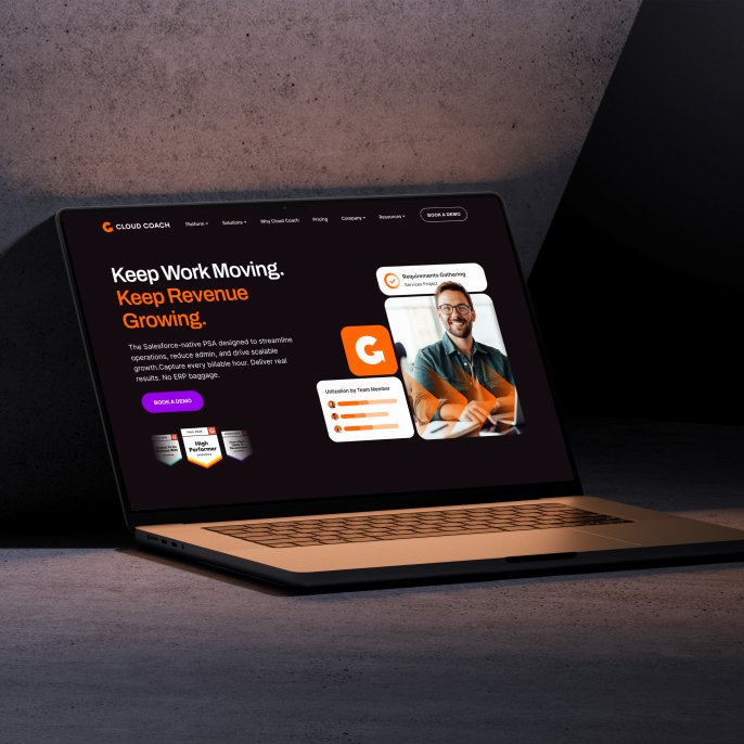
Keep work moving, keep revenue growing. That’s what Cloud Coach is all about.
Cloud Coach is the best-in-class PSA (Professional Services Automation) for teams who want momentum, and are tired of the mess left behind by legacy systems. Their PSA solutions are all about efficiency and not letting another billable hour slip away.
And if you know us by now, you know that we love giving powerful brands a visual identity worthy of their offering.
When Cloud Coach came to us, there was a noticeable gap between what the product actually delivered and how it looked and felt in the market. The experience didn’t fully reflect the clarity, reliability, and forward motion that customers got once they were inside the platform.
So we set out to change all of that.
.avif)
the challenge
Cloud Coach wanted to be seen as a serious, dependable player in the PSA space, without losing approachability.
The tricky part was working with what already existed. We needed to find meaning inside the current visual language, give purpose to color, and introduce new elements that added personality and flexibility while honoring the existing brand elements. The logo needed to stay, but it definitely needed less clutter. Too many details were getting in the way of a product built around simplicity.
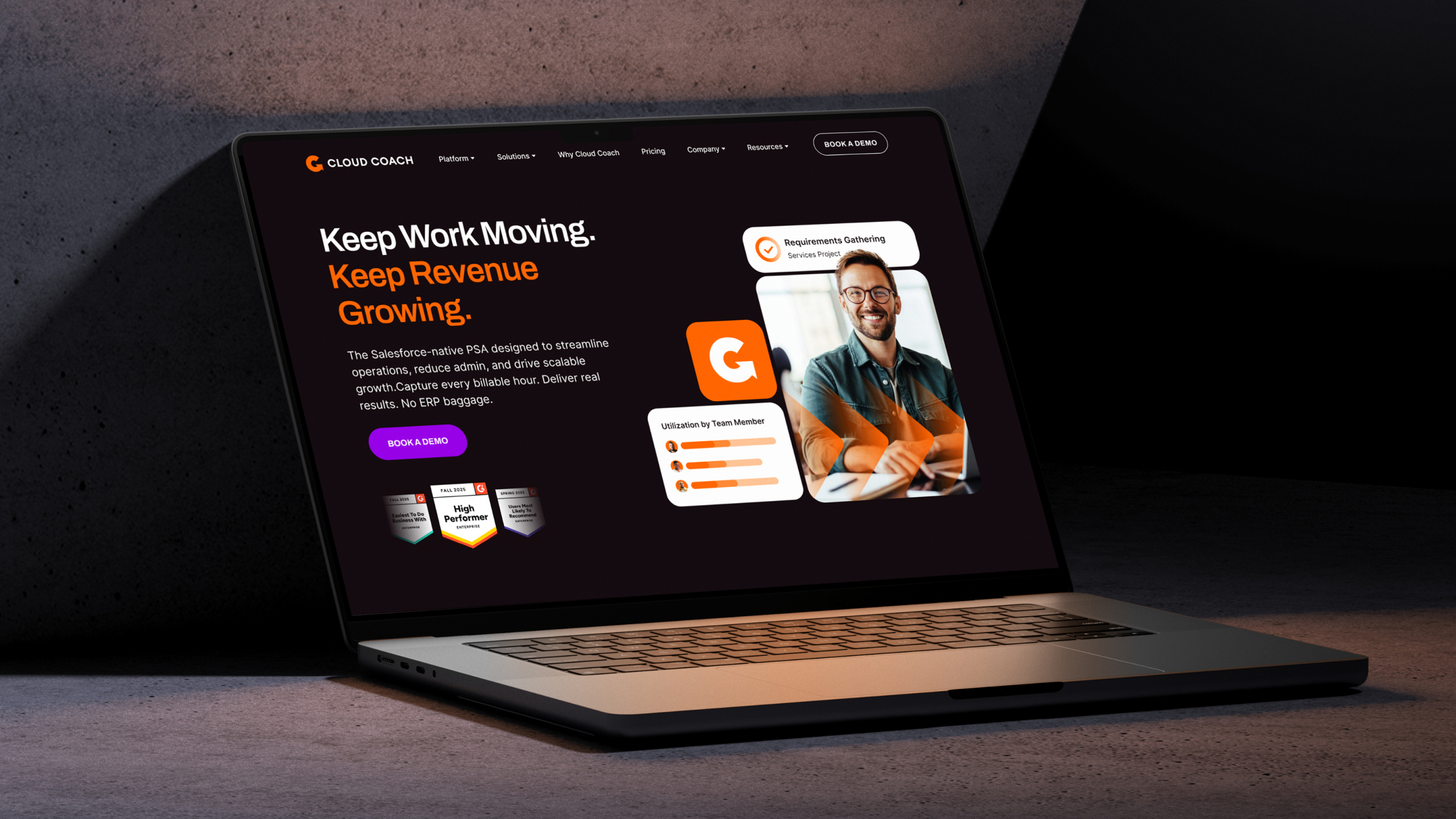
On top of that, the website and the product UI weren’t fully aligned. The brand felt fragmented across touchpoints, which made the experience feel less cohesive than it should have.
Our job was to simplify, unify, and inject direction without harming the brand’s recognition.
the solution
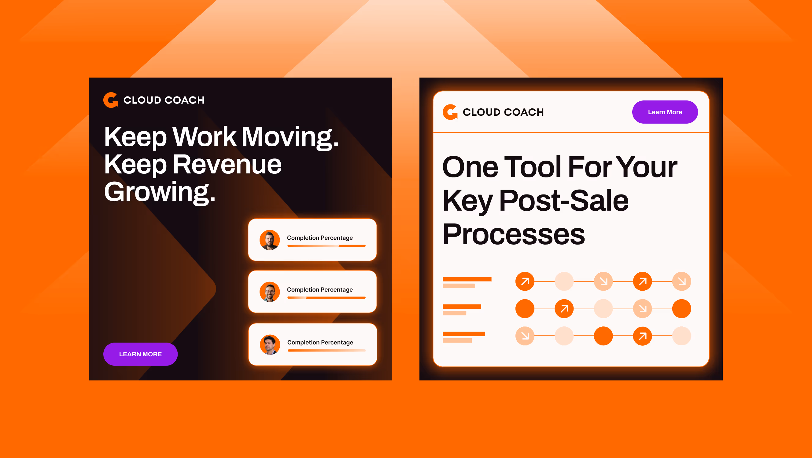
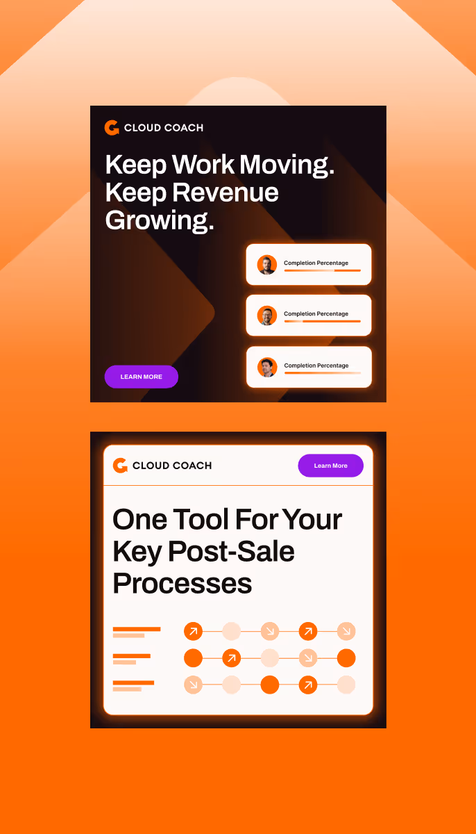
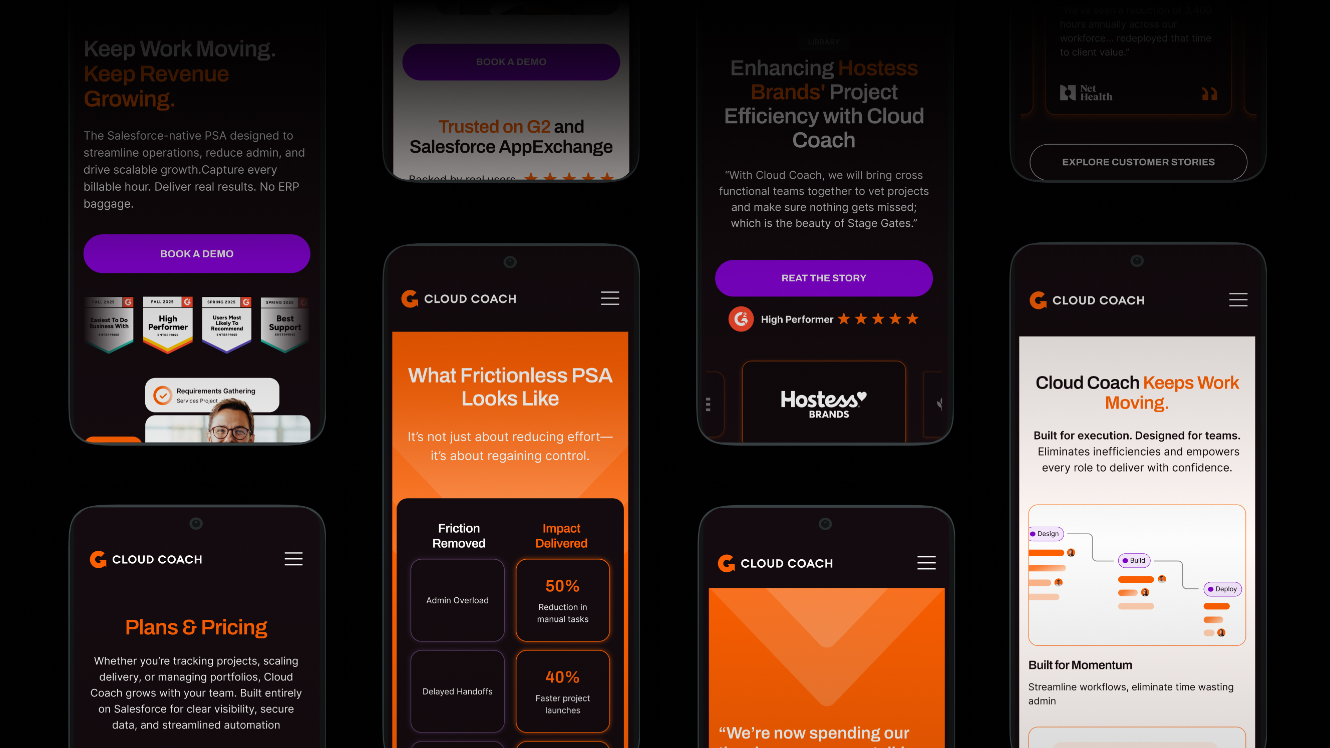
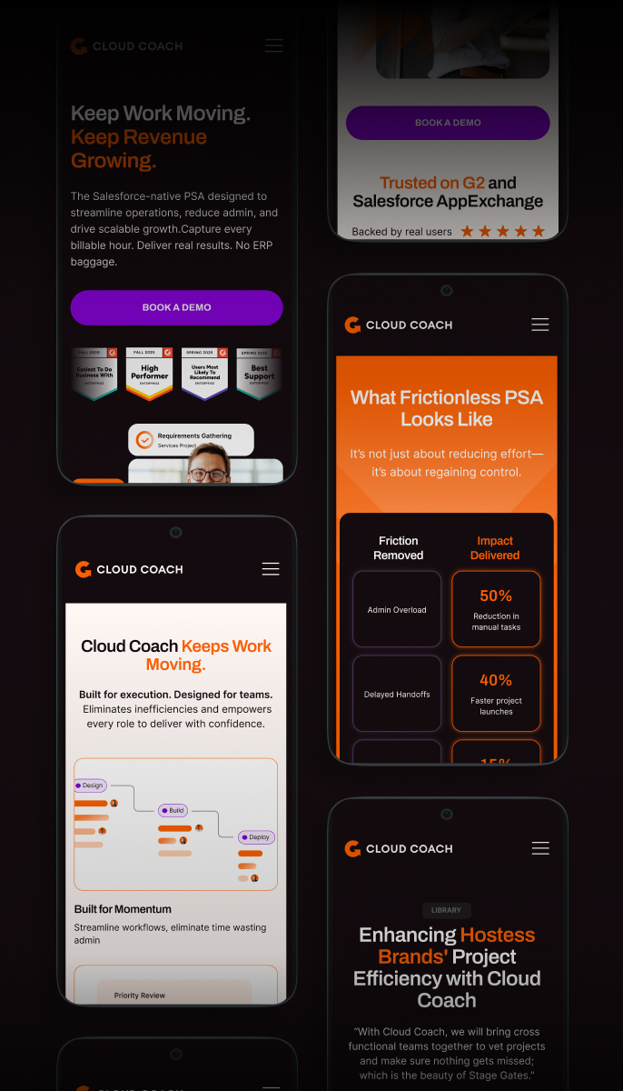
We anchored everything around one clear idea, which was momentum.
The arrow in the Cloud Coach icon became the heart of the new visual system. A simple, instantly understood shape that communicates progress, direction, and movement. From there, the rest of the visual language fell into place.
We refined the logo to remove unnecessary complexity and let the core idea breathe. We turned the color from a mere decoration to a purposeful element that accentuates the key messaging and values of Cloud Coach. This created rhythm, hierarchy, and flexibility across the brand.
Of course, we wanted the web experience to feel as focused and fluid as the product itself. So we focused on clear paths, calm layouts, and thoughtful details that reinforce Cloud Coach’s personality. We designed the graphic elements and the photography to make sure they coexist and reinforce that thinking on every page of the website.
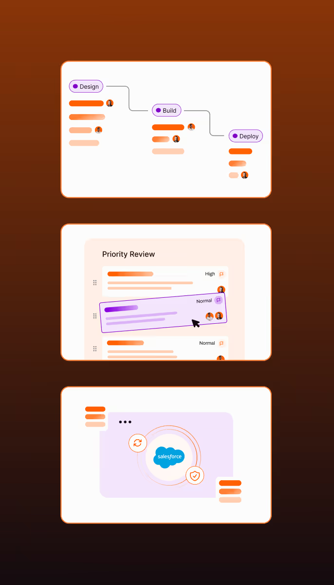
We also redesigned the platform’s communicational UI so the product and the brand finally spoke the same language.


%20desktop.avif)


.avif)

.avif)
.avif)
.avif)

