
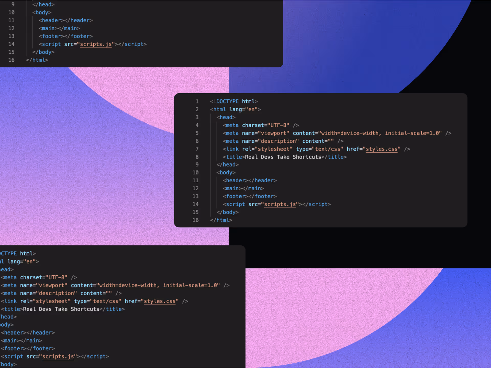
.svg)

The Complete Guide to Creating A Memorable Facebook Event

A Facebook Event is a built-in marketing tool that lives right where your audience already scrolls, chats, and clicks. It lets you turn a date on the calendar into a full-blown experience, with space for visuals, updates, reminders, and community interaction. Whether you're hosting in-person or online, it's one of the easiest and most effective ways to rally interest and attendance.
Why does it matter? Because visibility equals engagement. A well-created Facebook Event boosts discoverability, keeps your event top-of-mind with automated reminders, and makes it easy for attendees to share the news with others.
In this article, we’ll walk you through how to create Facebook Events that are memorable and perform well. From setting the tone with the right visuals to optimizing for engagement and reach, consider this to be your step-by-step playbook for making an impact that lasts well beyond the RSVP.
The 5 Must-Haves To Create A Facebook Event People Actually Want to Attend
Most Facebook events get ignored because they’re rushed, vague, or forgettable. If you want people to actually show up, you need to treat your event like a product launch: clear, polished, and built for engagement. To achieve this, certain essential elements must be in play. These elements are the baseline for earning attention, building credibility, and making it easy for someone to say yes.
When creating a Facebook event that converts, certain fundamental elements serve as the foundation for all your promotional efforts. Getting these basics right signals professionalism and reliability to potential attendees.
1. Write a Clear and Clickable Title
Your title needs to be attention-grabbing, descriptive, and searchable. Aim for a title that balances SEO-friendly keywords with human appeal. For example, instead of "Annual Company Gathering," try "TechCo's 2025 Innovation Summit: Shaping the Future of AI."
Your event title is your first impression. It needs to captivate and compel action while striking a balance between clarity and intrigue. Try the action word + unique value + event type formula: "Master Data Science: Interactive Workshop with Industry Leaders." Or use the exclusive descriptor + topic + format approach: "Insider's Guide to Crypto: Live Q&A with Industry Experts."
Employing brand positioning strategies helps your event stand out from the crowd. Test your titles by asking, “Would I stop scrolling for this?” Ensure your title sets the right expectations, and that your event meets them. Nothing damages trust more than a spectacular headline followed by a forgettable experience.
2. Cover the When and Where (Without Making People Hunt)
Include the day of the week, date, start time, and end time. For multi-day events, clearly state the whole duration. Nothing frustrates potential attendees more than having to hunt for basic timing information.
For physical events, include the venue name, address, and any relevant parking or transportation details. For virtual events, specify the platform and how attendees will access it. Vague location information makes even the most exciting event seem disorganized.
3. Write a Description That Sells the Experience
Your event description should include a brief overview of what attendees can expect, key speakers or highlights, the value proposition, any special features, and ticket information. This is where you sell the experience, not just the logistics.
Open with a compelling statement or question that communicates the value of attending. Make them feel what they’ll miss out on if they don’t join. Highlight standout features, world-class speakers, interactive sessions, and exclusive takeaways, and use formatting to keep the content scannable, especially for mobile users.
Let your brand’s personality come through. If you’re quirky, lean into it. If you’re buttoned-up and sleek, reflect that. Create urgency without being pushy: “Early bird tickets available until Friday” is far more effective than all-caps hype. End with a clear next step, so your audience knows what to do and why they shouldn’t wait.
4. Choose the Right Privacy Settings
Determine whether your event should be public, private, or invite-only, taking into account your goals and target audience. Each option creates a distinct perception and attracts a different type of attendee.
The technical aspects of your Facebook event significantly affect its discoverability and reach. Public events are discoverable by anyone on Facebook and can be shared widely. Private events are only visible to guests, creating a sense of exclusivity. Select options based on your event's goals and target audience.
5. Optimize Setup for Discoverability and Conversion
Select the most specific categories that fit your event to improve discoverability. Facebook's algorithm uses categories to suggest relevant events to users. Update categories if your event evolves during the planning process.
Use Facebook's recognized venue locations when possible to improve discoverability in location-based searches. This also provides attendees with directions and additional venue information, eliminating the need for extra effort on your part.
Partner with complementary brands or influencers as co-hosts to expand your event's reach and audience. This can significantly increase visibility to new audiences and add credibility to your event through association. Avoiding common branding mistakes is crucial during your event setup to maintain professionalism and trust.
If selling tickets, integrate with Facebook's ticketing partners for a seamless purchase experience. This reduces friction in the conversion process, making it easier for people to commit to attending.
Why Smart Design Makes or Breaks Your Facebook Event
To be honest, poor design doesn't just make your event look unprofessional, it actively convinces people your event isn't worth their time before they even read your description. Every visual choice, from your cover photo to promotional graphics, either builds credibility and excitement or undermines it, and there's no middle ground on a platform where people make split-second decisions. When your design elements work seamlessly with your messaging, they create an experience that transforms casual scrollers into committed attendees.
Make Your Cover Photo Do the Work
Your event's cover photo is often the first visual element people see. To maximize its impact, use the optimal size of 1920 x 1005 pixels with a 16:9 aspect ratio to ensure your image appears crisp on all devices.
Select eye-catching imagery that reflects the tone and purpose of your event rather than generic stock photos. To make your visuals as impactful as possible, consider principles from strategic poster ad design.
Boring visuals = boring event (at least that's what people will assume). Keep the text on the cover image minimal, focusing on essential information such as the event title, date, and location.
Use contrasting colors for text overlays to ensure legibility, especially on mobile devices where most Facebook browsing happens. Consistently integrate your brand's logo, color palette, and fonts to reinforce brand identity and build trust. Utilizing elements like patterns can transform your brand identity. Your visual identity should be as recognizable as your best friend's laugh!
Create Graphic Graphics That Tell Your Story And Build Trust
Beyond the cover photo, develop a suite of visual content that supports your promotional strategy throughout the event timeline. Design graphics that work across different promotional contexts, from Facebook feeds to email campaigns and other social platforms.
Maintain visual consistency with your written voice, whether it's playful, professional, or edgy. Utilizing tools and techniques can help you elevate your brand visually. If your copy is fun and irreverent but your graphics look corporate and stuffy, you're sending mixed signals that confuse potential attendees.
Use graphics to amplify key messages without overwhelming your written content. Consider the power of typography in conveying your brand message. Create visuals that highlight speaker quotes, showcase event highlights, or present key statistics related to your event's theme.
Integrate elements of brand iconography to enhance recognition and appeal. Consider adopting creative approaches to your event design to make a lasting impression and stand out from the crowd.
Consider creating a series of countdown graphics to build anticipation as the event date approaches. Nothing builds excitement quite like seeing "Only 3 days left!" paired with an enticing image of what awaits attendees.
Partner With Design Professionals Who Actually Get Events
Contrary to what you might think, you don't have to figure it out your design solo. Professional designers who understand event marketing know exactly how to translate your vision into visuals that stop the scroll and start conversations, plus they handle all the technical requirements like file sizes and platform-specific dimensions that can make or break how your visuals appear.
The right design partner doesn't just make pretty pictures; they create strategic visual experiences that guide people from curiosity to commitment while you focus on what you do best. Whether you need a complete visual identity for your event or just want to elevate specific pieces, partnering with designers who specialize in event marketing can transform your promotional materials from forgettable to unforgettable.
How To Make Your Facebook Event Buzz Before, During, and After
Most Facebook events die a quiet death with zero engagement and empty seats, while others generate the kind of buzz that makes people genuinely excited to attend. The difference isn't budget or connections, it's treating your event page like the strategic marketing tool it actually is, not just a digital flyer. Your Facebook event becomes your first impression, ongoing conversation starter, and relationship-building platform that transforms casual browsers into committed attendees.
Know What To Say and When To Say It
A well-planned promotional timeline can make the difference between a packed venue and empty seats. Start 3-6 months before the event by creating your Facebook event page with preliminary information. Begin sharing teaser content to build awareness and launch "Save the Date" campaigns to generate early interest.
Two to three months before, increase posting frequency with more detailed event information. Implement early-bird ticket promotions and start engaging with your community through Q&A sessions or polls to gauge interest and gather feedback.
One month before, intensify your messaging with a sense of urgency. Share the finalized agenda and highlight key attractions. Launch retargeting campaigns for users who've shown interest but haven't registered yet.
Two weeks before, focus on last-minute registrations with countdown posts. Share practical information about the event like parking, what to bring, and other logistics. Leverage testimonials from past attendees to build trust and excitement.
During the event, post real-time updates and highlights. Encourage attendees to share their experiences using a specific hashtag. Use Facebook Live to broadcast key moments for those who couldn't attend.
After the event, share highlights and thank attendees. Collect feedback through polls or surveys and begin nurturing the community for future events. This post-event engagement helps maintain momentum and build a loyal following.
Build Recognition That Sticks Through Smart Messaging
Maintaining visual and verbal consistency throughout your promotional period is crucial for building recognition and trust. Develop a visual theme with a cohesive identity that can be adapted across all promotional materials, including a specific color palette, font choices, and graphic elements. Understanding the impact of strategic branding changes can help you maintain consistency.
Establish main themes or messages about your event. Rotate through these themes to maintain consistency while avoiding repetition that could bore your audience. Mix up your content types to keep things interesting—alternate between text posts, images, videos, and interactive content.
Encourage attendees from previous events or early registrants to share their experiences, adding authenticity to your promotion. People trust peer recommendations more than branded messages, so leverage this powerful form of social proof.
Strategically unveil new details about speakers, activities, or special features throughout your timeline to maintain interest. Think of it as a slow, tantalizing reveal that keeps people coming back for more! Develop a unique event hashtag and use it consistently across all promotions, encouraging your audience to use it as well.
Read the Room and Pivot When You Need To
Monitor engagement metrics throughout your promotional period and be prepared to adjust your approach based on what resonates with your audience. Pay attention to which posts generate the most likes, comments, shares, and click-throughs.
If certain content types or messages perform exceptionally well, create more similar content. Conversely, if some approaches fall flat, don't be afraid to pivot. This flexible approach ensures that your promotional efforts remain effective, rather than adhering to a rigid plan that isn't working.
Utilize Facebook's Event Insights to track response rates and attendance commitments. These metrics provide valuable insights into your audience's interests and behaviors, enabling you to refine your messaging for maximum impact.
Tips To Help You Stop Begging for Likes and Start Earning Loyalty
Authentic engagement isn't about tricks, giveaways, or manipulating the algorithm; it's about creating content so genuinely valuable that people can't help but interact with it. When you focus on delivering real value instead of chasing vanity metrics, something powerful happens: your audience stops treating you like just another brand and starts seeing you as a trusted resource they actually want to hear from. The strategies that work best don't feel like strategies at all, they feel like natural conversations between people who share genuine interests and goals.
1. Create Content Worth Sharing Without Asking
Focus on genuine value over explicit sharing requests. Solve real problems, create visually appealing content, offer exclusive behind-the-scenes insights, use compelling storytelling from past attendees, and provide practical resources. When content truly helps your audience, natural sharing follows.
2. Foster Real Connections That Go Beyond the Event Page
Build community through live Q&As, candid behind-the-scenes content, interactive polls for decision-making, user-generated content opportunities, and personalized responses. Make followers feel like insiders and stakeholders by showing the real people behind your event and actively engaging with comments.
3. Keep the Energy Alive Long After the Last Guest Leaves
Maintain post-event momentum with highlight reels, surveys, discussion threads, and personalized thank-you messages. Create recap content showcasing attendee participation while teasing future events. This converts non-attendees for next time and strengthens relationships for ongoing collaboration.
Turn Your Next Facebook Event Into the One Everyone's Talking About
Creating impactful Facebook events requires a strategic blend of compelling content, thoughtful design, and active engagement. The most successful events seamlessly blend professional presentation with authentic connection, creating experiences that begin the moment someone discovers your event online and continue long after they leave.
When you approach event creation as both a writing and design challenge, everything shifts. You're not just announcing details, you're creating complete experiences that begin the moment someone sees your event in their feed and continue long after the last attendee heads home. Your next event could become a defining moment for your brand, creating buzz, engagement, and lasting connections.
Don't let boring visuals convince people your event isn't worth their time, NoBoring Design creates scroll-stopping Facebook event graphics and social media assets that turn casual browsers into committed attendees. Partner with us today!
Key Takeaways
- Successful Facebook events combine compelling copy with strategic design elements to create a complete experience. Together, they guide people from curiosity to commitment.
- Timing your promotional content correctly helps build momentum and maintain interest. Get the timing wrong, and even great events can struggle to fill seats.
- Authentic engagement strategies drive organic sharing and community building. Real value creates natural advocates who share because they want to, not because you asked.
- Visual consistency across all event materials strengthens recognition and trust. Cohesive branding passes the crucial first-impression test that determines whether people take you seriously.

Your bakery's website is how customers decide whether to walk through your doors. Before anyone tastes your croissants or smells your fresh bread, they're googling your bakery name. What they find determines whether you get foot traffic or they drive to your competitor down the street.
A professional website builds trust, showcases your products, and handles orders 24/7 when your physical location is closed. It's your hardest-working employee, converting curious browsers into paying customers while you sleep.
Your website should make visitors eager to visit your shop before they even arrive. When someone lands on your homepage, they should immediately understand not just what you bake, but why choosing your bakery makes them part of something authentically delicious.
This article will help you create a bakery website that tells your brand's story, turning your online presence into a compelling narrative that builds both emotional connections and drives business growth.
How to Build a Bakery Website
Building a bakery website that tells your brand's story involves systematically uncovering and presenting the authentic elements that make your bakery unique. These steps guide you through the process of transforming your passion into a digital presence that turns browsers into loyal customers, creating emotional connections that justify premium prices and build lasting relationships with people who truly value what you create.
1. Find the Story Your Bakery Should Be Telling
Your compelling narrative already exists; it lives in your founding moments, daily rituals, and the passion behind every loaf. The trick is finding those genuine details that make customers feel a genuine connection to you. Creating a bakery website that tells your brand's story starts with uncovering these authentic elements.
Start with your origin story. What made you open a bakery? A family recipe that needed to be shared? A moment when flour and water became your calling? Authentic origin stories create the emotional foundation customers remember.
Look at your signature creations next. Which product represents your bakery's soul? Think about your bestseller, the failed attempts, the breakthrough moment, the first customer who truly "got it." Brookie Bakehouse's founder built her brand around her "traveler-turned-baker" story, turning personal growth into millions of engaged followers.
Son of a Baker shows heritage storytelling done right. Their narrative, "a baker's son who branched out on his own, taking generations of experience," instantly builds credibility while showing personal independence.
Consider your customer impact stories. When were you proudest as a baker? The wedding cake that brought tears? The regular who plans their week around your fresh croissant days? These reveal your deeper purpose.
Remember, it's through compelling storytelling that you breathe life into your bakery's authentic story, connecting with customers on a meaningful level.
2. Create Visuals That Bring Your Story to Life
Your bakery's story means nothing if your visuals are telling a different tale. People eat with their eyes first, especially online, where they can't smell the fresh bread or hear the satisfying crunch of your croissants. Your website visuals are doing the heavy lifting, convincing visitors that your bakery is worth the drive, the wait, and the premium prices. When your visual storytelling aligns with your brand story, you create an experience that turns website visitors into customers before they've even tasted your first bite.
- Color Palettes That Bring Your Story to Life: Choose colors that authentically reflect your story. Warm tones, such as browns, oranges, and reds, emphasize comfort for heritage bakeries, while pastels create celebratory vibes for cupcake specialists, and earth tones support artisanal narratives. Modern bakeries benefit from bold, contemporary palettes that signal creativity. While staying true to your core story, the strategic incorporation of disruptive design elements helps your bakery stand out without chasing fleeting trends.
- Typography That Speaks Your Character: Select typefaces that match your bakery's personality, using traditional serifs for heritage craftsmanship or clean sans-serif fonts for innovative precision. Then, apply font weights strategically to create an information hierarchy that communicates your values, even when customers are quickly scanning your content.
- Photography That Captures Your Essence: Develop consistent photography guidelines that cover lighting, composition, and styling, ensuring a cohesive visual treatment across products, processes, and people. This approach intentionally matches your story, whether rustic or polished modern, rather than randomly mixing incompatible styles.
- Visual Consistency Across All Touchpoints: Create mood boards combining your chosen colors, fonts, and photo styles as reference for every visual decision, ensuring your Instagram posts, packaging, and website feel connected because memorable bakery brands aren't the flashiest, they're the most consistent, with every visual element working in harmony rather than competing for attention.
How to Build Your Website Foundation to Support Your Story
The most compelling bakery story falls flat if your website can't deliver it properly. Your website's foundation isn't just about code and hosting; it's about creating a seamless experience that lets your story shine through. The proper structure guides visitors naturally from discovering your story to placing orders, while poor foundations create friction that sends potential customers straight to competitors. Think of it as the difference between a beautifully decorated bakery with a solid building versus gorgeous displays in a structure that's falling apart.
- Choose a Domain That Reflects Your Personality: Your domain creates expectations before visitors see your homepage. A heritage bakery might pick "GrandmasKitchenBakery.com," while an innovative artisan operation could use "RiseBreadCo.com." This first touchpoint sets the tone for your entire story.
- Design Mobile-First for Real Customer Behavior: Most customers find bakeries through mobile searches, making responsive design critical for driving foot traffic. Adopt a mobile-first approach to ensure your story works seamlessly on phones, where customers make purchasing decisions. Additionally, understanding mobile ad design can help you reach a broader audience on their devices.
- Optimize for Lightning-Fast Loading: Slow websites can kill emotional connections before they even begin. Compress images, enable caching, and minimize code bloat. Speed determines whether visitors stay long enough to connect with your narrative.
- Integrate E-Commerce That Feels Personal: Customize your ordering system and checkout flow to match your brand personality. Generic shopping carts undermine the authentic connection you've built through storytelling.
- Set up Local Delivery Systems: Configure delivery zones, scheduling, and local payment options to effectively serve your community. Smooth local service reinforces your neighborhood-focused narrative and turns digital visitors into regular customers.
- Build Trust Through Security: SSL certificates, secure payment processing, and transparent privacy policies lay the foundation for customer confidence. Technical security issues destroy emotional connections instantly, no matter how compelling your story.
- Install Analytics to Measure Story Performance: Set up Google Analytics, heat mapping, and conversion tracking to understand which narrative elements resonate most. Data shows how visitors engage with your story, allowing you to refine it for maximum emotional impact and sales results.
Your technical foundation should be invisible to users while providing strong support for the storytelling experience that makes your bakery memorable.
How To Design a Bakery Website Homepage That Captures The Attention Of Visitors
Your homepage has exactly three seconds to grab a visitor's attention before they decide whether to stay or leave. This tiny window must instantly communicate your brand narrative, who you are, what makes you special, and why someone should care about your story.
Your hero section should convey your core narrative with intriguing headlines that spark curiosity, rather than generic statements. Use authentic, professional photography that showcases your signature products, bakers in action, or an inviting space; skip stock photos. Organize navigation around narrative themes rather than basic categories. Feature customer reviews and testimonials that reference your story elements to reinforce authenticity. Your homepage should feel like stepping into your actual bakery, warm, welcoming, and unmistakably yours.
How To Turn Every Page on Your Bakery Website Into Part of Your Story
Your homepage hooks visitors with your story, but every other page either reinforces that narrative or undermines it completely. Most bakery websites treat each page like a standalone brochure; the About page discusses the history, the Menu page lists products, and the Contact page displays hours.
The problem is that if you do this, there is no cohesive thread connecting them, leaving visitors with a fragmented experience that dilutes your brand's impact. Customers click through pages feeling like they're browsing different businesses instead of going deeper into one compelling story.
Tell Your Story Like You're Talking to a Friend
Skip the basic facts and corporate timeline. Create a story that takes visitors on a journey. Begin with your founding moment, your grandmother's cherished recipe, an escape from corporate life, or a rediscovered passion through baking. Include details only you could tell: the first loaf that refused to rise, the customer who became family, the precise moment you knew flour and sugar would become your life's work.
Make Your Product Descriptions Actually Appetizing
"Chocolate Croissant - $4.50" becomes "Our morning ritual begins at 4 AM with these buttery crescents, layered with Belgian chocolate that melts into golden pockets of indulgence." Each description should create an almost physical craving through carefully chosen words.
Share the journey behind each creation. Describe ingredient origins, specific techniques, or inspiration for flavor combinations. Your sourdough starter deserves a name and an origin story. Seasonal specials should reference local farms or family traditions that inspired them.
Turn Your Blog Into Your Best Marketing Tool
Transform your blog from a mere announcement space to a storytelling hub. Share behind-the-scenes glimpses of daily bakery life, introduce team members with their unique baking journeys, and document new recipe creation from concept to first customer bite. Document story assets, including origin stories, team profiles, customer testimonials, and product development journeys, to create a steady stream of authentic content.
Show How You Actually Make Everything
Reveal the magic behind your creations, overnight fermentation, hand-shaping techniques, and the careful temperature monitoring that creates perfect crusts. This transparency builds trust and helps customers appreciate why your croissants command premium prices. Visual storytelling through photography of your processes showcases craftsmanship that machines simply cannot replicate.
Connect Your Bakery to Your Neighborhood
Feature local partnerships, charity initiatives, and customer stories that demonstrate your bakery's role as a community cornerstone. Share photos from neighborhood events or highlight how local ingredients are incorporated into your signature creations. This values-based storytelling resonates with customers who prioritize businesses that give back.
Keep Your Personality Consistent Throughout Your Site
Develop clear voice guidelines that reflect your bakery's soul. Whether your personality is warm and traditional, playfully modern, or sophisticated and artisanal, this voice should remain consistent throughout your site. Brand consistency fosters recognition and trust that extends beyond individual visits.
Write Descriptions That Make People Hungry
Describe the "crackle of fresh baguette crust," "velvet smoothness of buttercream," or "warm spice of cinnamon that fills our kitchen each morning." This sensory-rich language bridges the gap between online browsing and the full-sensory experience of stepping into your bakery.
Your content should not only tell your story but also include the key memorable brand elements that set you apart. By focusing on key UX design components, you can ensure that your site not only tells your story but also provides a seamless user experience.
When to Bring in Professional Help in Creating a Bakery Website
While these storytelling principles can guide your direction, the gap between knowing what works and executing it flawlessly often requires professional expertise. Web designers understand how to structure your narrative for maximum conversion, while copywriters know how to craft descriptions that actually make people hungry. Photographers capture the authentic moments that make your bakery irresistible, rather than just visually appealing.
Consider this: every week your website underperforms, there is lost revenue and missed connections with customers who would love your bakery. Professional teams work faster than DIY trial-and-error approaches, catching technical issues and storytelling gaps you might miss. The investment pays for itself when your polished online presence wins the catering contract or regular customers that mediocre execution would have lost.
Bring Your Bakery Website to Life
Your bakery website is the most powerful storytelling platform you control. Every design choice, content piece, and technical feature should work in harmony to communicate what makes your bakery special.
Start by implementing one storytelling technique from this guide today. Whether refreshing your About page with more authentic visuals or creating your first behind-the-scenes email sequence, taking action now creates immediate connection opportunities with potential customers.
Ready to transform your bakery's online presence? At NoBoring Design, we believe exceptional brands deserve websites that truly stand out. We craft digital experiences that showcase the heart behind your handcrafted goods, connecting you with customers who'll become your most passionate storytellers. Get in touch with NoBoring Design today!
Key Takeaways
- Find your authentic bakery story through origin moments, signature creations, and customer impact stories rather than generic business facts to create emotional connections.
- Create visual consistency through color palettes that match your story, consistent photography guidelines, and typography that reflects your bakery's personality across all platforms.
- Build a mobile-first website foundation with fast loading speeds, secure payment processing, and local delivery systems to support seamless customer experiences.
- Design your homepage to capture attention within three seconds by using compelling headlines, authentic photography, and straightforward navigation that is organized around narrative themes.
- Transform every page into part of your story by using sensory-rich product descriptions, behind-the-scenes content, and a consistent voice that genuinely piques people's interest.
LinkedIn banners are prime real estate that most professionals are completely wasting. Every time someone visits your profile, whether it's a potential employer, client, or collaborator, that banner space above your headshot is either working for you or against you. Most professionals either leave it blank or clutter it with busy graphics.
Here's what successful professionals understand: your LinkedIn banner isn't a form of decoration; it's strategic positioning that reinforces your expertise before anyone reads a single word of your profile. When done right, minimalist banners create instant authority, clearly communicate your value proposition, and make you appear like someone worth connecting with.
Ready to transform your LinkedIn profile in minutes? This article provides a step-by-step guide to help you easily create cool minimalist LinkedIn backgrounds.
6 Minimalist Principles to Apply To Your LinkedIn Background
What separates amateurs from professionals when it comes to LinkedIn backgrounds? Six core principles that actually drive engagement. Simplicity, functionality, and clarity form your foundation; your background should support your professional story, not compete for the spotlight. These principles are not just limited to static designs; they are equally important in areas like minimalist motion design, which can transform your marketing and business.
1. Give Your Design Room to Breathe
White space isn't wasted space; it's strategic space that works harder than you think. Don't fill every pixel of your background. Instead, intentionally incorporate generous negative space around your key elements. This "empty" space reduces visual clutter, guides the eye naturally, and creates sophistication that busy designs can't match. It ensures any text or graphics you include actually stand out instead of getting lost in chaos. Think of white space as the breathing room for your professional brand, allowing elements to breathe and viewers to focus.
2. Focus on One Thing That Matters
Clarity beats complexity every time, so identify the single most important message you want to communicate. Your industry expertise? Your unique value proposition? A specific skill that sets you apart? Once you've chosen, make that your undisputed focal point. Avoid multiple competing images, complex collages, or text overload. A minimalist background has one star, everything else plays support. This approach ensures immediate comprehension, rather than viewer confusion.
3. Stick to Colors That Work Together
Restraint creates harmony in ways that bold color choices never can. Limit your color scheme to 2-3 complementary colors maximum. Monochromatic schemes, neutral bases with one accent color, or your established brand colors are the best options. Color overload leads to visual chaos and damages your professional image. A limited palette signals sophistication, cohesion, and intentional design, precisely what you want decision-makers to notice about your profile.
4. Keep Typography Clean and Readable
Legibility trumps creativity when it comes to professional backgrounds. If you're adding text to your background, choose clean, highly legible sans-serif fonts. Skip ornate, script, or decorative fonts that become unreadable on smaller screens. Ensure a strong contrast between text and background. The goal is instant readability, not artistic complexity. Less text, larger and clearer, wins in minimalist design every time.
5. Use Subtle Imagery That Suggests Rather Than Shouts
Implication works harder than explanation in professional design. Instead of literal representations, consider abstract patterns, textures, or high-quality imagery that hints at your expertise. A blurred cityscape for urban professionals, subtle circuit patterns for tech enthusiasts, and soft gradients for consultants. These visuals add depth without distraction, evoking concepts rather than stating them outright. They maintain refined professionalism while allowing for interpretation.
6. Design for Every Screen Size
Simple designs adapt better across devices, which matters more than most professionals realize. Minimalist approaches naturally work across various screen sizes and resolutions. Simple, uncluttered designs with clear focal points adapt gracefully from desktop to mobile. Test your background on different devices to ensure key elements aren't cut off and impact remains consistent. Clever minimalism means designing for optimal viewing everywhere your profile might be seen.
Applying these principles and leveraging your LinkedIn background transforms it from a potential distraction into a powerful professional asset that reinforces your brand and leaves a lasting, memorable impression.
How To Define Your Professional Message and Visual Strategy
Before you get into design mode, consider what the one thing people should remember about you is. Ask yourself: what should viewers take away from your professional identity? Maybe it's your expertise area ("Data Science Wizard"), your career journey ("From Marketing Maven to Tech Innovator"), or your unique value ("Bridging Finance and Sustainability, Without the Jargon").
Make Your Key Information Impossible to Miss
Create a clear information hierarchy by highlighting your name, current title, and specialization. Not sure if your message lands? Try this: describe your professional focus in one sentence to colleagues. If they get it immediately, jackpot; you've found your core message.
Choose Visual Elements That Actually Support Your Message
When developing visual metaphors, remember that functionality drives minimalist design. Every element should earn its keep and support your main message. Tech pros might rock clean geometric lines that scream innovation. Finance experts could utilize subtle gradients that suggest stability and growth. Creative professionals might drop in a single artistic element that reflects their industry while keeping things professional.
Strike the Right Balance Between Professional and Personal
Balance industry expectations with your authentic self; your background should feel genuine while meeting professional standards. Think of it as setting the stage, not stealing the show. Your background creates a crucial first impression, directing attention to your experience and achievements.
Choose Simple and Minimal Colors and Fonts
Different industries have distinct expectations that you can leverage strategically to your advantage. Tech and creative professionals benefit from using yellow, orange, and purple with neutral bases. At the same time, finance and legal experts should opt for blue, gray, and navy colors to convey a sense of trust and stability. Healthcare and education professionals tend to see better engagement with green and blue tones, while consulting and business roles perform best with sophisticated gray palettes enhanced by strategic color accents.
Typography hierarchy requires three distinct levels: bold, large fonts for your name; medium-weight text for your title; and lighter, smaller fonts for supporting taglines. Serif fonts work for law, finance, and academia, projecting classical authority. Sans-serif fonts are well-suited for the tech and creative industries due to their modern feel. Save script fonts for use in unique, personal brands and use them sparingly.
Align background colors with your company branding, apply the rule of thirds, and test contrast for accessibility across all devices before uploading.
How To Choose What Goes in Your Minimalist Header
Prioritize content elements by their impact on professional perception in your minimalist LinkedIn header. Your professional tagline or value proposition takes top priority; this single line captures what makes you uniquely valuable. Follow with your current role or area of expertise, then your location, if local networking is essential to your goals. Contact information, such as your website or email, should only be included if space allows, without compromising readability.
Avoid content traps that kill minimalist effectiveness: cramming too much text, displaying outdated job titles, creating unclear messaging that confuses positioning, and inconsistent branding that conflicts with your professional image.
How to Optimize Your LinkedIn Header for a Minimal Look
File optimization separates complex backgrounds from minimal ones. Save your design at exactly 1584 x 396 pixels using RGB color mode, then compress to stay under LinkedIn's 8MB limit without sacrificing quality. PNG preserves crisp text and graphics, while JPEG works better for photographic backgrounds.
Test your header on actual mobile devices before uploading; LinkedIn crops differently across platforms. Use RGB color profiles to maintain consistency across devices and save dated versions to track performance over time. These optimizations directly impact professional perception: crisp, fast-loading backgrounds signal competence, while poor quality suggests carelessness and undermines credibility.
Top Design Tools for Minimalist LinkedIn Backgrounds
The tool you pick directly impacts how quickly you can create and how professional your results look. Whether you're choosing a design tool or selecting a web design partner, making the right choice has a direct impact on your project's success. Here's what works best for minimalist LinkedIn backgrounds, whether your budget is "ramen noodles" or "fancy dinner":
Free Tools That Deliver
Canva excels at minimalist designs with pre-sized LinkedIn templates and clean typography libraries. Its superpower? Restraint; templates focus on professional aesthetics without overwhelming you with options.
Adobe Express, Fotor, and Pixelied facilitate quick and minimalist creation through template-driven workflows. These tools shine when you need consistent, professional results without a design degree.
Professional Tools for Advanced Control
Adobe Creative Suite provides precision color management and export controls, essential for maintaining brand consistency. Canva Pro bridges the gap between free and professional with brand kits and premium typography. Figma offers collaborative capabilities when you need team feedback on your branding.
Set Up Your Workflow for Speed
Create templates with LinkedIn's exact dimensions of 1584 x 396 pixels. Create custom color swatches that match your brand palette and bookmark 2-3 professional fonts. This prep work cuts design time compared to starting from scratch each time.
Save element positioning guides for consistent spacing across header iterations. Professional headers often need multiple versions as your career evolves to "industry thought leader."
Budget Reality Check
Free tools effectively handle minimalist design needs. Professional subscriptions pay off when you create headers frequently, manage multiple personal brands, or need advanced typography control. The time savings alone justify professional tools for active LinkedIn users who update headers quarterly.
How To Create Simple and Minimal Headers: Tool-Specific Workflows That Work
Great LinkedIn headers are the result of proven workflows that consistently deliver results. Savvy professionals use repeatable workflows that eliminate guesswork and provide consistent results. Whether you're team is Canva, Figma, or Photoshop, having a tool-specific process saves time and ensures your headers look polished across every platform.
Method 1: Canva Quick Creation
- Select LinkedIn header template: Choose from Canva's pre-sized LinkedIn banner templates (1584 x 396 px).
- Apply a minimalist background: Solid colors, subtle gradients, or clean textures work best.
- Build a text hierarchy: Primary (your name), secondary (title), and supporting text layers that exhibit apparent sizing differences.
- Add geometric elements: Simple shapes or professional icons from Canva's library enhance without overwhelming.
- Perfect spacing and alignment: Utilize alignment guides to achieve balanced proportions and sufficient whitespace.
- Export and preview: Download as PNG or JPG, then test mobile display before uploading.
Method 2: Adobe Photoshop Professional Approach
- Create 1584 x 396 px canvas: Set RGB color profile for web display.
- Establish safe zones: Add guidelines 200px from edges to protect elements from mobile cropping.
- Build background foundation: Apply professional color palettes or subtle gradients.
- Layer typography hierarchy: Clean, readable fonts with appropriate sizing for each text element.
- Place minimal graphics: Subtle shapes, lines, or logos that support your brand.
- Add depth sparingly: Minimal shadows or effects create interest without complexity.
- Export optimized: Save for web with compression that maintains quality under 8 MB.
Method 3: Figma Collaborative Design
- Set 1584 x 396 px frame: Use Figma's precise measurement tools.
- Create style systems: Establish reusable brand colors and typography styles that are consistent across all platforms.
- Build with components: Create elements that can be modified quickly for different versions.
- Apply auto-layout: Maintain proper spacing and alignment automatically.
- Configure export settings: Optimize for web display while preserving quality.
Quality Checkpoints:
- Text legibility at mobile sizes.
- Color contrast meets accessibility standards.
- Multiple device preview completed.
- File size under 8 MB.
Each tool's strengths serve different workflow preferences, allowing you to easily create minimalist LinkedIn backgrounds.
Critical Design Mistakes To Avoid When Making Minimalist LinkedIn Background
Despite the appeal of minimalism, professionals consistently make errors that sabotage their LinkedIn presence. Mobile readability kills more headers than bad design; many backgrounds feature text that's impossible to read on smaller screens, so use fonts of at least 14pt and test across devices.
Color consistency problems occur when using CMYK instead of RGB color modes, resulting in your colors appearing differently across platforms. Complex graphics violate the core philosophy of minimalism, while poor contrast excludes viewers with visual impairments. Technical quality issues, such as blurry images, can destroy credibility instantly. Therefore, design at exact LinkedIn dimensions (1584 x 396 pixels) and maintain brand consistency that reflects your industry's values.
When Professional Help Perfects Your Simple Minimalist LinkedIn Background
While these principles can guide your direction, the gap between knowing what works and executing it flawlessly often requires professional expertise. Designers catch subtle issues you might miss, mobile optimization problems, contrast ratios that fail accessibility standards, or brand inconsistencies that quietly undermine your credibility.
They understand platform-specific requirements, user behavior patterns, and how minor adjustments create a significant impact. More importantly, they work faster than trial-and-error approaches that consume your valuable time. Professional design investment pays for itself when your polished header wins the opportunity that amateur execution would have lost.
Less Is More, Results Are Everything in Minimalist LinkedIn Background
Creating a minimalist LinkedIn background doesn't require design expertise or complicated workflows. By following these guidelines, you can easily create a professional header that enhances your credibility and attracts the right opportunities. Simplicity and clarity become your secret weapons in making a strong first impression that actually matters.
Your LinkedIn header works 24/7, positioning you as someone worth connecting with before conversations even begin. While competitors struggle with cluttered, forgettable backgrounds, you now have the roadmap to stand out through strategic restraint. Take control of your professional branding today; your clean, impactful design will speak volumes about your attention to detail and professional standards.
Your LinkedIn header is prime real estate; you're probably wasting it. NoBoring Design creates social media assets that turn your profile into a client magnet, rather than digital wallpaper. Partner with NoBoring Design today!
Key Takeaways
- LinkedIn banners are prime real estate that should strategically position your expertise, not serve as decoration, creating instant authority before anyone reads your profile.
- Apply six minimalist principles: give designs room to breathe, focus on one key message, limit colors to 2-3, use clean typography, choose subtle imagery, and optimize for all screen sizes.
- Define your professional message first by identifying what people should remember about you, then choose visual elements that support rather than compete with that core message.
- Optimize your header at exactly 1584 x 396 pixels using RGB color mode, compress it to under 8MB, and test it on mobile devices before uploading to ensure quality.
- Avoid critical mistakes, such as unreadable mobile text, using CMYK instead of RGB colors, adding complex graphics that violate minimalism, and poor contrast that excludes viewers.

That cluttered background in your photos is costing you opportunities, and you might not even realize it. Professional headshots, product images, and marketing visuals all share one common enemy: distracting backgrounds that pull attention away from what actually matters. Whether it's removing an awkward office setup from your LinkedIn headshot, isolating products for e-commerce, or creating clean graphics for presentations, background removal has become an essential skill in today's visual-first professional world.
The benefits go beyond aesthetics. Clean, isolated subjects create a stronger visual hierarchy, improve brand consistency, and make your content look intentionally professional rather than accidentally amateur. Learning proper Photoshop background removal puts you in control of your visual content and consistently delivers professional-quality results.
Ready to master the technique that will transform your amateur photos into professional assets? Our step-by-step article breaks down the entire process into manageable actions anyone can follow.
7 Steps for Quick Background Removal in Under 5 Minutes
Time is money, and these seven steps get you professional results without the professional timeline. When you need clean background removal quickly, whether for a last-minute presentation, an urgent social media post, or a client deadline, this streamlined workflow eliminates the guesswork. Instead of getting lost in Photoshop's endless options, this focused approach uses the most effective tools in the correct sequence.
Step 1: Launch Photoshop on either your desktop or iPad and open the image you want to work with.
Step 2: Find it in your toolbar or simply press 'W' on your keyboard for faster access.
Step 3: Use the Quick Selection Tool to paint across your subject, watching as Photoshop intelligently expands the selection to the edges.
Step 4: Click "Select and Mask" in the options bar to refine your selection with precision tools.
Step 5: Use the built-in sliders and brush tools to perfect those tricky edges, especially around hair or detailed areas.
Step 6: This preserves your original image while isolating the subject perfectly.
Step 7: Maintain your transparent background for maximum flexibility in future projects.
For even speedier results with simple backgrounds, try the one-click Remove Background feature. Just open the Discover panel (Cmd/Ctrl + F) and select "Remove background" from Quick Actions. The AI immediately identifies your subject and strips away the background with surprising accuracy.
Photoshop's Remove Background Quick Action works best when there is a clear contrast between your subject and the background. It excels with product photography, portraits against clean backgrounds, and most social media content.
How to Remove Backgrounds in Photoshop for People, Products, and More
Not all subjects are created equal when it comes to background removal, and using the wrong technique shows. Professional-quality results come from matching your technique to your subject. This section breaks down the specific methods that work best for different types of content, so you'll know exactly which tools to reach for, whether you're working with people, products, or complex objects with tricky edges.
Method 1: Simple Product Photography
Products shot against solid backgrounds with good contrast work best with AI-powered removal.
- Duplicate your background layer for non-destructive editing
- Use the Remove Background Quick Action through the Discover panel (Cmd/Ctrl + F)
- Let Photoshop's AI create the initial mask; it excels at products with precise edges
- Refine edges with a soft brush on the layer mask, black conceals, white reveals
- Address color fringing on reflective surfaces using Decontaminate Colors
- Final check: edges should look natural without background artifacts
When automatic selection fails, switch to the Quick Selection tool for more precise control over reflective surfaces or complex shadows.
Method 2: Portraits with Hair Details
Hair requires specialized techniques to preserve its natural appearance without compromising texture.
- Create baseline selection with Select Subject (Select > Subject)
- Open the Select and Mask workspace (Select > Select and Mask)
- Paint over hair areas with the Refine Edge Brush Tool; this captures fine strands that automatic selections miss
- Increase the Edge Detection radius gradually until hair separates naturally from the background.
- Use Smooth and Feather sparingly; too much destroys hair texture
- Enable Decontaminate Colors to eliminate background color spill
- Output to a new layer with a mask to preserve your original
Hair looks artificial: Reduce smoothing and manually brush the mask to restore natural texture. For color fringing, add an adjustment layer to neutralize unwanted color casts.
Method 3: Complex Objects with Intricate Edges
Jewelry, lace, and botanical subjects require hybrid approaches that combine precision with careful refinement.
- Map your strategy: identify hard edges (Pen Tool territory) versus soft areas (brush techniques).
- Create precise paths with the Pen Tool around geometric elements—manual precision beats automation for complex shapes.
- Convert paths to selections (right-click path > Make Selection) with appropriate feathering.
- Build complex selections gradually using Add to Selection mode for areas with clear color separation.
- Refine in Select and Mask for semi-transparent or delicate details.
- Manual cleanup at high magnification; use 1-3 pixel brushes for intricate work.
Create separate masks for sharp and soft areas, then combine them. Paint back lost details with the Mixer Brush Tool at high magnification. Simple products take 2-3 minutes, complex portraits or intricate objects require 15-30 minutes for professional results. Work with layer masks to refine without restarting.
How To Refine Photoshop Edges Like a Pro
The difference between amateur and professional background removal isn't the initial selection; it's what happens to those edges. Those rough, pixelated borders and unwanted color halos that scream "I used Photoshop" don't have to be your reality. Most people make their selection and call it done, wondering why their cutouts look obvious and unprofessional. The secret lies in edge refinement, where good selections become great ones, and where you'll invest the time that separates professional-quality work from quick-and-dirty edits that fool no one.
View Modes That Actually Matter
Switch between view modes based on your final destination. "On Black" reveals problems when placing subjects on dark backgrounds, "On White" catches issues for light backgrounds, and "Overlay" shows your selection as a red overlay for precise boundary checking.
Edge Detection Radius
Start with 1-3 pixels for complex backgrounds with hair and fur, then increase gradually. Wispy details require higher values, while hard edges require lower values. The tool analyzes contrast at the boundary, giving it enough room to work, but not so much that it gets confused.
Global Adjustment Sliders
Each slider fixes specific problems:
- Smooth (2-3 for portraits): Eliminates jagged edges
- Feather (0.5-1 pixel): Softens transitions without losing detail
- Contrast: Sharpens edge definition—push until you see artifacts, then back off
- Shift Edge: Moves the selection boundary in or out to eliminate background bleed
Refine Edge Brush for Hair and Fur
Paint over areas where the background shows through fine details. The brush rebuilds your selection by analyzing the regions painted against the underlying image data. Work in small sections and build coverage gradually, rather than painting in broad strokes.
Layer Mask Cleanup
Output your selection to a new layer with a mask, then zoom to 100% for inspection. Use a 1-2 pixel soft brush at 30-50% opacity on the mask itself. Black conceals, white reveals. Build up problem areas gradually rather than trying to fix everything in one pass.
Pre-Compositing Checks
Test your cutout against different colored backgrounds before calling it complete. Apply Curves or Levels directly to the mask to eliminate color fringing and ensure clean integration. Your edges should look natural regardless of what you place behind them.
Pro Techniques for Flawless Color Fringing and Lighting Matches in Photoshop
You've nailed the perfect selection and refined those edges to perfection, but your subject still looks cut-and-pasted rather than naturally placed. Those subtle color halos around hair, the green tint bleeding from the original background, or lighting that doesn't match the new environment instantly give away your edit to anyone with a trained eye. These finishing techniques separate professionals from hobbyists. Master these final polish steps, and your background removals will look seamlessly natural rather than obviously edited.
Decontaminate Colors Automatically
Photoshop's Decontaminate Colors feature, available in Select and Mask, works magic on contaminated edges. This tool intelligently strips away background color spill while preserving the natural tones of your subject. One click often solves what might take hours to fix manually.
Master Manual Edge Refinement
For precision work, layer masks with low-opacity brushes give you complete control. Soft brushes smooth overly crisp edges, while harder brushes restore definition to fuzzy areas. This technique creates that perfect balance between sharpness and natural blending that defines professional work.
Match Lighting Direction and Quality
Nothing exposes poor compositing faster than mismatched lighting. Your subject needs shadows and highlights that perfectly align with the new environment's light sources. Create clipped adjustment layers (such as Curves, Color Balance, or Hue/Saturation) to modify your subject without affecting the background.
Color temperature harmony follows a simple rule: warm backgrounds need warmer subject tones, cool backgrounds call for cooler adjustments. That Spider-Man costume looks perfect in golden sunset lighting, but requires significant color correction for a calm office environment.
Dodge and burn techniques reshape your subject's lighting patterns to match the scene. Pay attention to rim lighting, shadow direction, and highlight intensity; these small details transform obvious cutouts into seamless integrations that viewers never question.
Photoshop Background Removal: Common Problems and Quick Fixes
Missing Hair and Fur Details
Hair and fur demand specialized handling beyond basic selection tools. When automatic methods fail, switch to the Refine Edge Brush in Select and Mask mode. Paint over hair areas with a soft brush, then gradually increase the Edge Detection radius until fine details appear naturally without looking artificially cut.
Color Contamination and Fringing
Background colors bleeding onto your subject instantly destroy professional results. Enable "Decontaminate Colors" in the Select and Mask workspace, adjusting until the color spill disappears. For stubborn cases, create a new layer and use the Clone Stamp set to "Current & Below" to manually clean contaminated edges with precision.
Performance and Software Crashes
When tools become sluggish or unresponsive, restart Photoshop and check for updates. For persistent problems, reset tool preferences by holding Shift+Ctrl+Alt (PC) or Shift+Cmd+Option (Mac) while launching the application. This simple maintenance prevents frustrating interruptions during critical work.
Knowing When to Refine vs. Restart
When facing problems, ask yourself: Are the issues localized to specific areas, or does the entire selection look problematic? Isolated issues warrant refinement; widespread problems signal the need for a different approach. If you've spent more than 30 minutes refining without significant improvement, try a different selection method rather than forcing a flawed technique.
File Size and Compatibility Challenges
Large transparent PNGs often cause cross-platform issues and slow loading times. Use "Export As" rather than "Save As" for web-destined files. Create multiple versions: high-resolution masters for print and compressed variants for digital applications. This approach ensures your work displays perfectly across all platforms.
Advanced Skill Development
For complex subjects with transparent elements, reflective surfaces, or ultra-fine details, master advanced techniques like channel masking and automation workflows. Professional certification programs focusing on commercial retouching standards develop expertise that commands premium rates and attracts high-value clients.
When Time and Stakes Are Too High for Trial and Error
Learning to remove a professional background takes months of practice, and your business can't wait that long. Every day you delay launching that product catalog or updating marketing materials is lost revenue and missed opportunities. When your brand's visual credibility is on the line, whether for e-commerce, marketing campaigns, or client presentations, amateur-looking edits can damage your professional reputation faster than no images at all. Professional editors work efficiently, deliver consistent results, and understand the technical requirements that prevent costly revisions. Sometimes, the most intelligent business decision is investing in expertise rather than risking your brand's image on a learning curve.
Start Mastering Photoshop Background Removal Today
You now have multiple approaches for tackling background removal, from lightning-fast automated methods to sophisticated edge refinement techniques for challenging subjects. This knowledge transforms your workflow, cutting project time while delivering professional results that make your work stand out from the crowd.
The key to success lies in matching the proper technique to each image. Clean product shots need different approaches than portraits with intricate hair details or complex objects with transparent elements. With practice, you'll develop an intuitive sense for which tool to grab first and how to refine your work efficiently.
Stop wrestling with Photoshop tutorials when you could be closing deals. NoBoring Design delivers flawless product shots and marketing assets, enabling you to focus on what truly drives business growth. Contact NoBoring Design today!
Key Takeaways
- Use Photoshop's 7-step quick process or the AI Remove Background feature for fast results, utilizing the Quick Selection Tool and Select and Mask refinement for professional-quality results.
- Match your removal technique to the subject type: AI works well for simple products, specialized hair tools are ideal for portraits, and hybrid approaches are best suited for complex objects.
- Professional results come from edge refinement, not initial selection. Use the Select and Mask workspace with proper view modes and adjustment sliders to achieve quality.
- Fix color fringing with the Decontaminate Colors feature and match lighting direction using clipped adjustment layers to make cutouts look naturally integrated.
- The export format depends on the use: PNG-24 for web transparency, TIFF for print projects, and platform-specific sizing for social media applications.
Your personal website is one of the most powerful career tools you're probably underutilizing. Before anyone hires you, collaborates with you, or even takes a meeting, they're googling your name. What they find in those first few seconds shapes everything that follows. A strong personal website doesn't just showcase your work; it positions you as the obvious choice, builds trust before you've even said a word, and turns casual browsers into eager contacts.
Most personal web pages blend into the background noise of templated bios and stock photos. They're forgettable. But here's the thing: your online presence often precedes your in-person introduction, and a boring personal website isn't just a missed opportunity; it's career sabotage.
Ready to build a personal web page that actually moves the needle? This article will help you define your website's core purpose, digital resume, creative portfolio, or business landing page, because this decision shapes everything else.
1. Start By Defining Your Personal Brand Story and Voice
Your personal brand story is the strategic foundation that determines whether your website feels authentic or like a poorly fitting costume. Think of it as your professional GPS: without clear direction on your unique value, skills, and personality, you'll end up with a generic site that could belong to anyone in your field. Your brand story and voice are the difference between a website that converts visitors into opportunities and one that sends people clicking away to find someone more compelling.
- Start with a core values exercise: Write down five work moments when you felt genuinely proud. Extract the values you expressed in each situation; these become the foundation of your brand and key elements of a successful brand.
- Map your unique experience intersections: A marketing background combined with psychology training creates a distinct positioning compared to marketing combined with data science. Your distinctive combinations matter more than individual credentials.
- Create specific audience personas, not broad categories: Instead of "hiring managers," target "technical hiring managers at Series B startups" or "design directors at agencies under 50 people." Precision drives better messaging decisions.
- Choose your professional archetype: The Sage shares expertise, the Creator builds solutions, the Hero solves problems. This framework guides your tone across all content. A Sage writes educational posts, while a Hero focuses on client transformations.
- Replace generic phrases with specific stories: "Results-driven professional" becomes "I reduced customer churn 40% by redesigning our onboarding sequence." "Passionate about excellence" becomes "I rewrote our entire codebase to cut page load times from 8 seconds to 2."
- Document everything in a one-page Personal Brand Blueprint: Core values, target audience, key messages, tone guidelines, and your signature stories. This blueprint ensures authentic consistency rather than professional buzzword soup.
2. Write a Professional Positioning Statement That Wins
The next essential step in this process is to recognize that your professional positioning statement serves as the foundation for all your online communications, so understanding key brand positioning strategies is crucial. Start by identifying what makes you different, not just your skills, but your unique approach, perspective, or combination of experiences that competitors can't replicate.
For established businesses, focus on differentiating through your methodology and results. A consulting firm might position itself as "the strategy partner that turns complex market challenges into clear competitive advantages for Fortune 500 companies." For growing companies, your positioning must clearly articulate your value proposition in terms that resonate with your target market. Instead of "we provide comprehensive solutions," try "we help mid-market companies scale their operations through proven systems that reduce costs while improving customer satisfaction."
For brands entering new markets, craft positioning statements that communicate both current expertise and expansion vision. Clear value propositions immediately communicate your business's worth to potential clients and partners. Test your messaging with existing clients and industry contacts, ask them to repeat back what your company does in their own words. If they can't clearly explain it, refine your positioning until authentic differentiation builds trust more effectively than generic business language.
Develop three to five key phrases that capture your brand positioning and use them consistently across all platforms. These become your brand vocabulary, reinforcing your unique market position every time someone encounters your business.
3. Create a Visual Identity That Makes You Unforgettable
Your visual choices communicate your professional personality before you say a word. Strategic color schemes, typography, and personal logos create instant recognition and build trust with your audience.
Create a mood board that reflects your professional identity. Bold innovators work well with vibrant accent colors and modern sans-serif fonts. Conservative professionals benefit from navy blues or deep greens with traditional serif typography. Your palette should align with both personality and industry norms, creative directors can embrace unconventional colors, while financial consultants need stability-conveying choices.
Photography style drives perception. Corporate headshots signal authority; environmental portraits suggest approachability. Pick your lane and stick to it across every platform. Visual consistency across websites, social media, and business cards reinforces recognition and professionalism.
Create a simple personal monogram or wordmark for use on business cards, email signatures, and website headers. Complex design isn't necessary; thoughtful font treatment of your initials creates visual distinction. While these fundamentals can guide your direction, partnering with experienced designers ensures your visual identity actually delivers the professional impact you're aiming for, turning good intentions into great impressions.
Test your choices with colleagues to ensure authenticity while appealing to your target audience. Your visual brand should feel like a natural extension of your professional self, not a facade you're hiding behind. The best visual identities evolve. Start with core elements that feel right, then refine as your brand matures.
Building Your Website's Technical Foundation The Right Way
Crafting standout personal web pages also involves considering branding before website design and getting your website's technical foundation right. Your website's technical foundation directly impacts how potential employers, clients, and collaborators perceive your professionalism. Getting the architecture right from the start saves time and creates a solid platform for your personal brand to grow.
Domain Selection and Hosting
Choose a domain that reflects your brand, ideally your name or a memorable variation. Premium domains cost more but signal professionalism. For hosting, consider your career stage: entry-level professionals can start with shared hosting ($5-10/month), while established freelancers and entrepreneurs should invest in managed hosting ($20-50/month) for better performance and security.
Mobile-First Design
Mobile responsiveness is non-negotiable; mobile traffic dominates web usage across all industries. Your site must look and function flawlessly across all devices. Refer to a responsive web design guide to ensure this. This impacts not just user experience but also search rankings, since Google uses mobile-first indexing. Consider using platforms like Webflow that prioritize responsive design and performance optimization out of the box.
Performance Optimization
Page loading speed affects both visitor retention and search visibility. Optimize images, minimize plugins, and choose fast hosting to keep load times under 3 seconds. Tools like Google PageSpeed Insights help identify performance bottlenecks.
Essential Integrations
Include professional contact forms with spam protection, seamless social media integration, and SSL certificates for security. Analytics tracking helps you understand visitor behavior and optimize for better engagement. These elements work together to create trust signals that reinforce your professional credibility.
For businesses looking to elevate their web presence beyond DIY solutions, partnering with experienced design teams like NoBoring Design ensures your technical foundation supports long-term brand growth.
Creating Content That Converts Visitors Into Opportunities
The E.A.S.E. framework; Expertise, Attract, Sell, Engage, transforms your website from a digital business card into a conversion machine. The E.A.S.E. framework flips the script on traditional personal web design. Instead of throwing everything at visitors and hoping something sticks, each page serves a specific purpose in moving people toward your desired outcome.
- Homepage Strategy: Open with a compelling value proposition that answers "What's in it for me?" within three seconds. Lead with quantifiable achievements, "Increased client revenue by 40%" or "Led teams of 15+ professionals." Great website copywriting ensures your hero section immediately communicates why someone should care about your work.
- About Page Excellence: Ditch the chronological resume format. Use the "Challenge-Action-Result" storytelling framework for key career moments. Job seekers should emphasize skills progression and problem-solving abilities. Freelancers need client success stories that demonstrate tangible value. Entrepreneurs must articulate their vision alongside proven execution.
- Portfolio and Work Showcase: Organize projects by outcome, not timeline. Structure each case study around the problem you solved, your specific approach, measurable results, and client testimonials. Use before-and-after visuals and hard metrics to make your impact tangible. "Reduced processing time by 60%" beats "Improved efficiency" every time.
- Blog and Insights Section: Build thought leadership through educational content that solves real problems your audience faces. Plan a content calendar around industry trends, step-by-step guides, and opinion pieces that position you as the expert they need to know.
- Speaking and Media Page: Display press mentions, conference talks, and interviews as social proof. Include video excerpts or presentation slides that showcase your communication skills and expertise in action.
- Contact Strategy: Design calls-to-action for your specific goals—"Schedule a consultation," "Download my portfolio," or "Discuss opportunities." Include multiple contact methods and set response time expectations. Make it easy for the right people to reach you while filtering out time-wasters.
How To Launch Your Professional Website in 2-4 Weeks
Building your personal website doesn't require technical expertise, especially with a web design checklist. This systematic approach gets you from idea to launch in 2-4 weeks. This systematic, step-by-step approach eliminates guesswork and decision paralysis, turning what feels like an overwhelming project into manageable daily tasks. Follow this roadmap and you'll go from scattered ideas to polished, professional launch in just 2-4 weeks.
- Choose Your Platform (Day 1): Pick Webflow, WordPress.com, Squarespace, or Wix based on your comfort level. Squarespace delivers the most design polish for beginners, while WordPress provides greater customization for tech-comfortable users.
- Secure Domain and Hosting (Day 1-2): Purchase your domain (ideally your name) and hosting. Most platforms bundle these services, eliminating complexity.
- Select and Customize Template (Days 3-5): Choose a template aligned with your professional goals. Mobile-responsive designs are non-negotiable; mobile traffic dominates. Customize colors, fonts, and layout to match your brand. If you prefer simplicity, consider a one-page website design that showcases all your key information on a single page.
- Create Core Content (Days 6-12): Write your homepage, about page, portfolio, and contact sections. Straightforward navigation and logical site structure directly impact user experience and professional credibility.
- Optimize Performance (Days 13-15): Test across devices and optimize loading speeds. Compress images and ensure touch-friendly navigation for the seamless mobile experience.
- Quality Review (Day 16): Don't overlook essential pre-launch preparations. Check all links, forms, and content for errors. Verify proper SEO elements like meta titles and descriptions are complete.
- Soft Launch (Days 17-21): Share with trusted colleagues for feedback before your public announcement.
Professional Website Mistakes That Could Kill Your Credibility
Your personal website can make or break professional opportunities, and most are unknowingly sabotaging their own credibility.
The biggest killers? Generic stock photos instead of authentic visuals that build recognition and trust. Mobile experiences that fail spectacularly, forcing of visitors to deal with tiny text and broken layouts before bouncing immediately. Brand messaging that plays musical chairs across platforms, telling different stories on LinkedIn versus your website versus industry directories.
Then there's the portfolio that collects digital dust, outdated work samples, and stale testimonials that scream, My professional growth hit pause." Contact information buried under layers of navigation makes it nearly impossible for opportunities to find you. And a site speed that crawls along will lose visitors every second, while images struggle to load.
These are credibility killers that cost real opportunities. When potential clients or employers hit these roadblocks, they don't stick around to give you a second chance. They move on to competitors who got the fundamentals right.
Smart professionals tackle mobile optimization and contact improvements first, then work through visual consistency and performance upgrades. A polished online presence builds lasting credibility when you address these fundamentals with purpose and attention to detail.
When Professional Help Makes the Difference
While DIY enthusiasm is admirable, personal branding mistakes cost more than professional design services ever will. The gap between identifying what needs fixing and executing solutions that actually work often requires expertise that most professionals lack.
Designers catch credibility killers you might miss, subtle mobile issues, visual inconsistencies, or performance problems that silently chase away opportunities. They understand user behavior patterns, conversion optimization, and how minor tweaks create significant results. More importantly, they work faster than trial-and-error approaches that eat up your valuable time.
Consider this: every week your website underperforms is another week of missed connections, lost opportunities, and damaged first impressions. Professional designers can create strategic advantages that position you ahead of competitors still wrestling with generic templates and amateur execution. The investment pays for itself the moment your polished presence wins the opportunity that mediocre execution would have lost.
Stop Blending In, Start Standing Out
Your web page is the competitive advantage that separates industry leaders from the invisible majority. While others settle for generic LinkedIn profiles and forgettable business cards, you now have the roadmap to build a digital presence that actually works for your career.
The fundamentals are straightforward: authentic brand story, strategic positioning, compelling visuals, solid technical foundation, and content that converts. The execution separates professionals who get noticed from those who get overlooked.
Stop blending into the background noise of boring personal websites. Let NoBoring Design craft a landing page that makes you unforgettable and turns casual browsers into career opportunities. Book a call with NoBoring Design today!
Key Takeaways
- Start with a core values exercise and map your distinctive experience intersections to create authentic positioning that differentiates you from competitors.
- Replace generic buzzwords with specific achievements like "reduced customer churn 40%" to make your impact tangible and memorable to visitors.
- Ensure your site functions flawlessly across all devices and loads under 3 seconds, since mobile traffic dominates web usage.
- Structure each page to serve a specific purpose in moving visitors toward your desired outcome using the E.A.S.E. framework.
- Avoid generic stock photos, broken mobile experiences, and inconsistent messaging that cause potential opportunities to move on to competitors.

When you think about print-on-demand (POD) as a business or brand, consider it a partner, one that serves as your backstage pass to transforming designs into products, without the headaches of inventory or logistics. A POD service like Printful or Printify handles the heavy lifting, printing, packing, and shipping, so you can focus on what matters most: your creativity and customers. But which is better?
Choosing the right POD partner can significantly impact your growth trajectory. The nuances in pricing, product quality, and turnaround times ripple through your profit margins and brand reputation. Integrating on-demand marketing strategies, like timed product drops and personalized packaging, becomes seamless when your POD provider aligns with your vision and operational needs.
In this article, we’ll weigh Printful against Printify across key factors, product selection, pricing tiers, integrations, and support, so you can confidently pick the POD partner that fuels your brand’s ambitions.
Get To Know These POD Services Before You Start Selling
You wouldn't buy a car without checking what's under the hood, right? Same logic applies here, before you hand over your brand's reputation to a print-on-demand service, you need to understand exactly what you're getting into. These companies are going to become extensions of your brand, touching every customer interaction from the moment someone clicks "buy" to when your design arrives at their door.Understanding their distinct philosophies isn't just helpful, it's essential for making a choice that'll support your brand's growth rather than limit it.
Printful: The Premium Player
Printful stands as the go-to choice for creators who refuse to compromise on quality and reliability. Founded in 2013 by Lauris Liberts and Davis Siksnans, Printful has grown into a global leader in print-on-demand, with fulfillment centers across the US, Europe, and beyond.
With an impressive focus on in-house production and meticulous quality control, Printful is renowned for its consistent, high-quality output. This premium positioning comes from their ownership of production facilities, ensuring standardized quality across all fulfillment centers. The platform appeals to brands that value consistency and are willing to invest in superior products and exceptional customer experiences.
Printify: Built for Flexibility and Choice
Printify has established itself as a formidable force, transforming the POD industry with its innovative marketplace model. Founded in 2015 by James Berdigans, Artis Kehris, and Gatis Dukurs, Printify connects creators with a network of over 90 print providers worldwide, delivering unmatched flexibility and variety.
Printify appeals to cost-conscious entrepreneurs and those seeking unique or niche products that traditional POD services can’t offer. The platform’s model enables more competitive pricing and a diverse product range, although quality can vary depending on the chosen provider.
Printful vs Printify - Head to Head
Choosing between Printful and Printify primarily comes down to finding what works best for you. Both platforms deliver solid print-on-demand services, but they take distinctly different approaches to achieving this. One prioritizes premium quality and seamless integration, while the other focuses on variety and competitive pricing. Here, we will compare some of the significant differences between these two platforms:
Who Runs Your Operation (One Partner vs. Your Pick of Partners)
- Printiful - Printful owns and operates 12 production facilities worldwide, strategically located across North America and Europe. They handle everything in-house, including printing, packaging, and shipping. This "one partner, one team, under one roof" philosophy means they control every variable in your supply chain.When you work with Printful, you're essentially getting a dedicated fulfillment partner that manages the entire process without external dependencies.
- Printify - Printify operates as an innovative marketplace, connecting you with over 115 independent print providers across 140+ facilities globally, spanning the US, Canada, EU, UK, Australia, and China. They don't own inventory or production facilities. Instead, they facilitate relationships between creators and diverse print partners. This decentralized approach provides access to a vast network of specialists, each with their unique strengths, pricing, and capabilities.
What Quality Can You Actually Expect
- Printiful - Printful maintains an exceptionally low 0.24% reshipment rate due to quality issues, with 99.76% of orders meeting or exceeding customer expectations. Their rigorous three-step quality control process includes an initial design file review by graphic specialists, utilizing high-quality design formats, meticulous print monitoring during production, and a final product inspection before packaging. Every order meets the same standard because they control every step, from equipment maintenance to staff training.
- Printify - Printify's quality varies significantly by provider, as they rely on third-party suppliers with different standards, equipment, and processes. Some providers deliver exceptional results that rival Printful's quality, while others require testing and vetting. The platform's strength lies in giving you a choice; you can test multiple providers, read reviews, and select based on your quality requirements and budget constraints.
How Much Choice Do Your Customers Get
- Printful - Printful offers 404+ carefully selected premium products from well-known brands. Each item is thoroughly tested for print quality, durability, and customer satisfaction before being added to their catalog. Their curation focuses on depth over breadth; they'd rather offer fewer products that consistently perform well than thousands with variable quality. This approach particularly appeals to brands that prioritize reliability over novelty.
- Printify - Printify provides access to over 1,300 products across their provider network, representing one of the largest catalogs in the POD space. This extensive selection includes mainstream items, niche products, and unique offerings that traditional POD services often can't provide. The variety stems from their diverse provider network, where each supplier contributes their specialty products, creating an ecosystem that offers almost anything, from standard apparel to unusual gift items.
What You'll Be Paying
- Printful - Printful operates on a value-based pricing model, with generally higher base costs that reflect its comprehensive service, quality guarantees, and extensive branding options. While they acknowledge they're "not the cheapest," their pricing strategy targets businesses willing to invest in superior products and seamless experiences. The predictable pricing structure helps with financial planning and margin calculations. They offer Free and Growth plans ($24.99/month, free for businesses with annual sales of $12,000 or more).
- Printify - Printify typically offers lower base costs due to its outsourced production model and competitive marketplace dynamics. Pricing varies significantly between providers, allowing you to shop for the best deals based on your specific needs. Their Premium plan ($29 per month) unlocks additional discounts and features for growing businesses. The platform also offers an entirely free plan with no upfront investment, significantly lowering the barrier to entry for new entrepreneurs.
How Fast Your Customers Get Their Orders
- Printful - Printful delivers consistent 2-5 business-day fulfillment because they control the entire production and shipping process through their facilities. Their strategic facility locations are optimized for major markets, ensuring reliable delivery times regardless of which products you're selling. This consistency helps with customer expectations and reduces shipping-related customer service inquiries.
- Printify - Printify fulfillment speed depends entirely on your chosen provider and their location relative to your customers. Some providers offer lightning-fast turnaround times, while others may take longer due to their production processes or geographic area. However, this variability also presents opportunities; you can select providers based on proximity to your customer base, potentially achieving faster delivery times and lower shipping costs than centralized fulfillment models.
How Professional You'll Look
- Printful - Printful offers extensive white-label options that transform your business into a fully integrated operation, with a professional appearance. This includes custom packaging with your branding, so ensuring an effective logo design is essential, branded tracking pages, personalized packing slips, and complete control over the customer experience from order to delivery. These features help create a premium unboxing experience that reinforces your brand identity and builds customer loyalty. Being aware of expenses like logo design costs can help you budget for a cohesive brand presentation. Referencing branding strategy examples can help in developing a strong brand presence.
- Printify - Printify addresses essential branding needs, but its focus is more on product variety than packaging customization. While you can add basic branding elements, you have less control over the complete customer experience compared to Printful. The unboxing experience is more standardized across providers, which may not align with premium brand positioning but keeps costs lower and operations simpler.
How to Choose Between Printful and Printify?
When you think about print-on-demand (POD) as a business or brand, consider it a partner, one that serves as your backstage pass to transforming designs into products, without the headaches of inventory or logistics. A POD service like Printful or Printify handles the heavy lifting, printing, packing, and shipping, so you can focus on what matters most: your creativity and customers. But which is better?
Set Up
- Printful - Printful plays nice with pretty much every e-commerce platform you can think of; Shopify, Etsy, Wix, Squarespace, PrestaShop, Magento, and more. For businesses that need custom integrations, Printful's robust API handles real-time synchronization of products, orders, and fulfillment statuses. The user-friendly dashboard works for both beginners and experienced sellers, making daily management tasks feel less like work.
- Printify - Printify also integrates with major e-commerce platforms like Shopify, Etsy, WooCommerce, Wix, and Squarespace, allowing for seamless product import and order synchronization. Setting up an account and connecting your store is a straightforward process, often requiring just a few clicks. Printify acts as a network of print providers, meaning you'll need to select a print provider for each product, which offers flexibility but adds an extra step during setup compared to Printful's in-house fulfillment model. Printify's dashboard is designed to be user-friendly, allowing users to manage products, orders, and print providers efficiently. They also offer an API for more advanced custom integrations.
Design Tools and Resources
- Printful - Printful's intuitive design tool lets you upload artwork, adjust placement, and preview designs directly within the platform using a simple drag-and-drop interface. The software handles technical details like print areas, resolution requirements, and color profiles automatically. Printful's extensive template libraries include ready-to-use graphics, fonts, and layouts that help you launch new products quickly.
- Printify - Printify offers a free Mockup Generator that allows users to create product designs by uploading their artwork and choosing from various product mockups. While it provides essential design functionalities like adjusting placement and adding text, it may be less feature-rich than Printful's design tool for advanced customization directly within the platform. Printify's strength lies in its extensive catalog of products and print providers, allowing for a vast range of design possibilities by selecting the right product and printer for your vision. Users often leverage external graphic design software to create their artwork and then upload it to Printify's Mockup Generator.
What Happens When Things Go Wrong?
- Printful - Printful offers multiple ways to get help, live chat, email, and a comprehensive help center, with support available during standard business hours and faster response times for urgent issues. Most queries get addressed within a few hours during business hours, and the quality of assistance is consistently high. The platform maintains a robust library of step-by-step guides, video tutorials, and detailed documentation.
- Printify - Printify provides customer support through email and a comprehensive Help Center with FAQs, guides, and articles. Their support aims to address issues related to orders, products, and print providers. Given Printify's model of connecting users with various print providers, support inquiries may sometimes involve coordinating with the specific print provider responsible for an order. Printify has a resolution center for order issues, and they typically encourage users to communicate directly with their chosen print provider for specific production-related concerns, while also providing mediation if necessary.
Will You Actually Make Money Doing This?
- Printful - Profit margins are determined by subtracting base product and fulfillment costs from your retail price, letting sellers adjust markup to hit their desired profit targets. A standard t-shirt might cost $10-$12 to produce and fulfill through Printful, so if you price it at $25, you're looking at $13-$15 gross profit per shirt before accounting for platform fees, advertising, or discounts. Higher order volumes can boost profitability through operational efficiencies, but Printful doesn't offer automatic bulk discounts, so sellers need to adjust their pricing strategies accordingly.
- Printify - Printify's pricing model allows for potentially higher profit margins due to the variety of print providers and their competitive pricing. Sellers choose their desired product and print provider, comparing base costs from different providers to find the most cost-effective option. This marketplace approach can lead to lower base product costs compared to Printful's in-house fulfillment, potentially increasing profit margins. Printify also offers a Premium subscription that provides a discount on all products, further enhancing profitability for higher-volume sellers.
Printify vs Printiful - Making the Call on Which Works for You
When picking between Printful and Printify, there's no magic formula that works for everyone. Your perfect match depends on your business vision, priorities, and how you actually like to work.
Printful stands as the premium player with unmatched quality control and consistency. Their in-house production model maintains impressive satisfaction rates, making them ideal for reliability-focused brands.
Printify's marketplace model delivers flexibility and cost advantages that can transform your business economics. With numerous worldwide providers, Printify offers greater geographic reach and potentially faster shipping times. If you're working with tight margins or need cost optimization freedom, Printify's competitive pricing could change everything.
Remember, your success ultimately springs from the hard work of your designs and marketing power regardless of which platform you choose.
Have you chosen your POD partner? Great, now make sure your designs actually sell! At NoBoring Design, we partner with brands and businesses to craft stunning websites, branding, and designs that stand out in the crowded POD marketplace. Reach out today to learn more!
Key Takeaways
- Printful costs more but delivers consistent quality every time, while Printify offers lower costs with variable quality. Pick predictable results or hunt for deals.
- Fresh creators love Printify's low barriers and wallet-friendly pricing. Established brands prefer Printful's reliability and premium branding options. Your business stage determines your needs.
- Printful handles everything seamlessly with consistent results. Printify offers flexibility through multiple providers and wider product ranges. Choose simplicity or choose control.
- Printful's owned facilities deliver predictable shipping globally, while Printify's provider network can offer faster local fulfillment. Consider consistency everywhere versus speed in key markets.
- Printful grows with businesses needing reliability and professional branding. Printify adapts to entrepreneurs who thrive on options and optimization. Both scale differently.
A Facebook Event is a built-in marketing tool that lives right where your audience already scrolls, chats, and clicks. It lets you turn a date on the calendar into a full-blown experience, with space for visuals, updates, reminders, and community interaction. Whether you're hosting in-person or online, it's one of the easiest and most effective ways to rally interest and attendance.
Why does it matter? Because visibility equals engagement. A well-created Facebook Event boosts discoverability, keeps your event top-of-mind with automated reminders, and makes it easy for attendees to share the news with others.
In this article, we’ll walk you through how to create Facebook Events that are memorable and perform well. From setting the tone with the right visuals to optimizing for engagement and reach, consider this to be your step-by-step playbook for making an impact that lasts well beyond the RSVP.
The 5 Must-Haves To Create A Facebook Event People Actually Want to Attend
Most Facebook events get ignored because they’re rushed, vague, or forgettable. If you want people to actually show up, you need to treat your event like a product launch: clear, polished, and built for engagement. To achieve this, certain essential elements must be in play. These elements are the baseline for earning attention, building credibility, and making it easy for someone to say yes.
When creating a Facebook event that converts, certain fundamental elements serve as the foundation for all your promotional efforts. Getting these basics right signals professionalism and reliability to potential attendees.
1. Write a Clear and Clickable Title
Your title needs to be attention-grabbing, descriptive, and searchable. Aim for a title that balances SEO-friendly keywords with human appeal. For example, instead of "Annual Company Gathering," try "TechCo's 2025 Innovation Summit: Shaping the Future of AI."
Your event title is your first impression. It needs to captivate and compel action while striking a balance between clarity and intrigue. Try the action word + unique value + event type formula: "Master Data Science: Interactive Workshop with Industry Leaders." Or use the exclusive descriptor + topic + format approach: "Insider's Guide to Crypto: Live Q&A with Industry Experts."
Employing brand positioning strategies helps your event stand out from the crowd. Test your titles by asking, “Would I stop scrolling for this?” Ensure your title sets the right expectations, and that your event meets them. Nothing damages trust more than a spectacular headline followed by a forgettable experience.
2. Cover the When and Where (Without Making People Hunt)
Include the day of the week, date, start time, and end time. For multi-day events, clearly state the whole duration. Nothing frustrates potential attendees more than having to hunt for basic timing information.
For physical events, include the venue name, address, and any relevant parking or transportation details. For virtual events, specify the platform and how attendees will access it. Vague location information makes even the most exciting event seem disorganized.
3. Write a Description That Sells the Experience
Your event description should include a brief overview of what attendees can expect, key speakers or highlights, the value proposition, any special features, and ticket information. This is where you sell the experience, not just the logistics.
Open with a compelling statement or question that communicates the value of attending. Make them feel what they’ll miss out on if they don’t join. Highlight standout features, world-class speakers, interactive sessions, and exclusive takeaways, and use formatting to keep the content scannable, especially for mobile users.
Let your brand’s personality come through. If you’re quirky, lean into it. If you’re buttoned-up and sleek, reflect that. Create urgency without being pushy: “Early bird tickets available until Friday” is far more effective than all-caps hype. End with a clear next step, so your audience knows what to do and why they shouldn’t wait.
4. Choose the Right Privacy Settings
Determine whether your event should be public, private, or invite-only, taking into account your goals and target audience. Each option creates a distinct perception and attracts a different type of attendee.
The technical aspects of your Facebook event significantly affect its discoverability and reach. Public events are discoverable by anyone on Facebook and can be shared widely. Private events are only visible to guests, creating a sense of exclusivity. Select options based on your event's goals and target audience.
5. Optimize Setup for Discoverability and Conversion
Select the most specific categories that fit your event to improve discoverability. Facebook's algorithm uses categories to suggest relevant events to users. Update categories if your event evolves during the planning process.
Use Facebook's recognized venue locations when possible to improve discoverability in location-based searches. This also provides attendees with directions and additional venue information, eliminating the need for extra effort on your part.
Partner with complementary brands or influencers as co-hosts to expand your event's reach and audience. This can significantly increase visibility to new audiences and add credibility to your event through association. Avoiding common branding mistakes is crucial during your event setup to maintain professionalism and trust.
If selling tickets, integrate with Facebook's ticketing partners for a seamless purchase experience. This reduces friction in the conversion process, making it easier for people to commit to attending.
Why Smart Design Makes or Breaks Your Facebook Event
To be honest, poor design doesn't just make your event look unprofessional, it actively convinces people your event isn't worth their time before they even read your description. Every visual choice, from your cover photo to promotional graphics, either builds credibility and excitement or undermines it, and there's no middle ground on a platform where people make split-second decisions. When your design elements work seamlessly with your messaging, they create an experience that transforms casual scrollers into committed attendees.
Make Your Cover Photo Do the Work
Your event's cover photo is often the first visual element people see. To maximize its impact, use the optimal size of 1920 x 1005 pixels with a 16:9 aspect ratio to ensure your image appears crisp on all devices.
Select eye-catching imagery that reflects the tone and purpose of your event rather than generic stock photos. To make your visuals as impactful as possible, consider principles from strategic poster ad design.
Boring visuals = boring event (at least that's what people will assume). Keep the text on the cover image minimal, focusing on essential information such as the event title, date, and location.
Use contrasting colors for text overlays to ensure legibility, especially on mobile devices where most Facebook browsing happens. Consistently integrate your brand's logo, color palette, and fonts to reinforce brand identity and build trust. Utilizing elements like patterns can transform your brand identity. Your visual identity should be as recognizable as your best friend's laugh!
Create Graphic Graphics That Tell Your Story And Build Trust
Beyond the cover photo, develop a suite of visual content that supports your promotional strategy throughout the event timeline. Design graphics that work across different promotional contexts, from Facebook feeds to email campaigns and other social platforms.
Maintain visual consistency with your written voice, whether it's playful, professional, or edgy. Utilizing tools and techniques can help you elevate your brand visually. If your copy is fun and irreverent but your graphics look corporate and stuffy, you're sending mixed signals that confuse potential attendees.
Use graphics to amplify key messages without overwhelming your written content. Consider the power of typography in conveying your brand message. Create visuals that highlight speaker quotes, showcase event highlights, or present key statistics related to your event's theme.
Integrate elements of brand iconography to enhance recognition and appeal. Consider adopting creative approaches to your event design to make a lasting impression and stand out from the crowd.
Consider creating a series of countdown graphics to build anticipation as the event date approaches. Nothing builds excitement quite like seeing "Only 3 days left!" paired with an enticing image of what awaits attendees.
Partner With Design Professionals Who Actually Get Events
Contrary to what you might think, you don't have to figure it out your design solo. Professional designers who understand event marketing know exactly how to translate your vision into visuals that stop the scroll and start conversations, plus they handle all the technical requirements like file sizes and platform-specific dimensions that can make or break how your visuals appear.
The right design partner doesn't just make pretty pictures; they create strategic visual experiences that guide people from curiosity to commitment while you focus on what you do best. Whether you need a complete visual identity for your event or just want to elevate specific pieces, partnering with designers who specialize in event marketing can transform your promotional materials from forgettable to unforgettable.
How To Make Your Facebook Event Buzz Before, During, and After
Most Facebook events die a quiet death with zero engagement and empty seats, while others generate the kind of buzz that makes people genuinely excited to attend. The difference isn't budget or connections, it's treating your event page like the strategic marketing tool it actually is, not just a digital flyer. Your Facebook event becomes your first impression, ongoing conversation starter, and relationship-building platform that transforms casual browsers into committed attendees.
Know What To Say and When To Say It
A well-planned promotional timeline can make the difference between a packed venue and empty seats. Start 3-6 months before the event by creating your Facebook event page with preliminary information. Begin sharing teaser content to build awareness and launch "Save the Date" campaigns to generate early interest.
Two to three months before, increase posting frequency with more detailed event information. Implement early-bird ticket promotions and start engaging with your community through Q&A sessions or polls to gauge interest and gather feedback.
One month before, intensify your messaging with a sense of urgency. Share the finalized agenda and highlight key attractions. Launch retargeting campaigns for users who've shown interest but haven't registered yet.
Two weeks before, focus on last-minute registrations with countdown posts. Share practical information about the event like parking, what to bring, and other logistics. Leverage testimonials from past attendees to build trust and excitement.
During the event, post real-time updates and highlights. Encourage attendees to share their experiences using a specific hashtag. Use Facebook Live to broadcast key moments for those who couldn't attend.
After the event, share highlights and thank attendees. Collect feedback through polls or surveys and begin nurturing the community for future events. This post-event engagement helps maintain momentum and build a loyal following.
Build Recognition That Sticks Through Smart Messaging
Maintaining visual and verbal consistency throughout your promotional period is crucial for building recognition and trust. Develop a visual theme with a cohesive identity that can be adapted across all promotional materials, including a specific color palette, font choices, and graphic elements. Understanding the impact of strategic branding changes can help you maintain consistency.
Establish main themes or messages about your event. Rotate through these themes to maintain consistency while avoiding repetition that could bore your audience. Mix up your content types to keep things interesting—alternate between text posts, images, videos, and interactive content.
Encourage attendees from previous events or early registrants to share their experiences, adding authenticity to your promotion. People trust peer recommendations more than branded messages, so leverage this powerful form of social proof.
Strategically unveil new details about speakers, activities, or special features throughout your timeline to maintain interest. Think of it as a slow, tantalizing reveal that keeps people coming back for more! Develop a unique event hashtag and use it consistently across all promotions, encouraging your audience to use it as well.
Read the Room and Pivot When You Need To
Monitor engagement metrics throughout your promotional period and be prepared to adjust your approach based on what resonates with your audience. Pay attention to which posts generate the most likes, comments, shares, and click-throughs.
If certain content types or messages perform exceptionally well, create more similar content. Conversely, if some approaches fall flat, don't be afraid to pivot. This flexible approach ensures that your promotional efforts remain effective, rather than adhering to a rigid plan that isn't working.
Utilize Facebook's Event Insights to track response rates and attendance commitments. These metrics provide valuable insights into your audience's interests and behaviors, enabling you to refine your messaging for maximum impact.
Tips To Help You Stop Begging for Likes and Start Earning Loyalty
Authentic engagement isn't about tricks, giveaways, or manipulating the algorithm; it's about creating content so genuinely valuable that people can't help but interact with it. When you focus on delivering real value instead of chasing vanity metrics, something powerful happens: your audience stops treating you like just another brand and starts seeing you as a trusted resource they actually want to hear from. The strategies that work best don't feel like strategies at all, they feel like natural conversations between people who share genuine interests and goals.
1. Create Content Worth Sharing Without Asking
Focus on genuine value over explicit sharing requests. Solve real problems, create visually appealing content, offer exclusive behind-the-scenes insights, use compelling storytelling from past attendees, and provide practical resources. When content truly helps your audience, natural sharing follows.
2. Foster Real Connections That Go Beyond the Event Page
Build community through live Q&As, candid behind-the-scenes content, interactive polls for decision-making, user-generated content opportunities, and personalized responses. Make followers feel like insiders and stakeholders by showing the real people behind your event and actively engaging with comments.
3. Keep the Energy Alive Long After the Last Guest Leaves
Maintain post-event momentum with highlight reels, surveys, discussion threads, and personalized thank-you messages. Create recap content showcasing attendee participation while teasing future events. This converts non-attendees for next time and strengthens relationships for ongoing collaboration.
Turn Your Next Facebook Event Into the One Everyone's Talking About
Creating impactful Facebook events requires a strategic blend of compelling content, thoughtful design, and active engagement. The most successful events seamlessly blend professional presentation with authentic connection, creating experiences that begin the moment someone discovers your event online and continue long after they leave.
When you approach event creation as both a writing and design challenge, everything shifts. You're not just announcing details, you're creating complete experiences that begin the moment someone sees your event in their feed and continue long after the last attendee heads home. Your next event could become a defining moment for your brand, creating buzz, engagement, and lasting connections.
Don't let boring visuals convince people your event isn't worth their time, NoBoring Design creates scroll-stopping Facebook event graphics and social media assets that turn casual browsers into committed attendees. Partner with us today!
Key Takeaways
- Successful Facebook events combine compelling copy with strategic design elements to create a complete experience. Together, they guide people from curiosity to commitment.
- Timing your promotional content correctly helps build momentum and maintain interest. Get the timing wrong, and even great events can struggle to fill seats.
- Authentic engagement strategies drive organic sharing and community building. Real value creates natural advocates who share because they want to, not because you asked.
- Visual consistency across all event materials strengthens recognition and trust. Cohesive branding passes the crucial first-impression test that determines whether people take you seriously.


.avif)

.avif)
.avif)
.avif)

