.svg)
PULLEY
Pulley is a platform pioneering intuitive tools that help companies manage equity. As Pulley geared up to launch new products and features, they needed a brand that matched the innovation behind the platform. Something more elevated, more distinct.
Enter the creatives at NBD, always up for a challenge.
the challenge
Pulley wanted to stand out—not just look like another equity management tool. They needed to show founders, finance leads, and even crypto-native users that they’re the smarter choice.
That meant creating a human, trustworthy feeling while making the platform look clean and effortless to use. We needed to make Pulley stand apart from their biggest competitor and build a visual system that could grow with the company and its offering.

.avif)
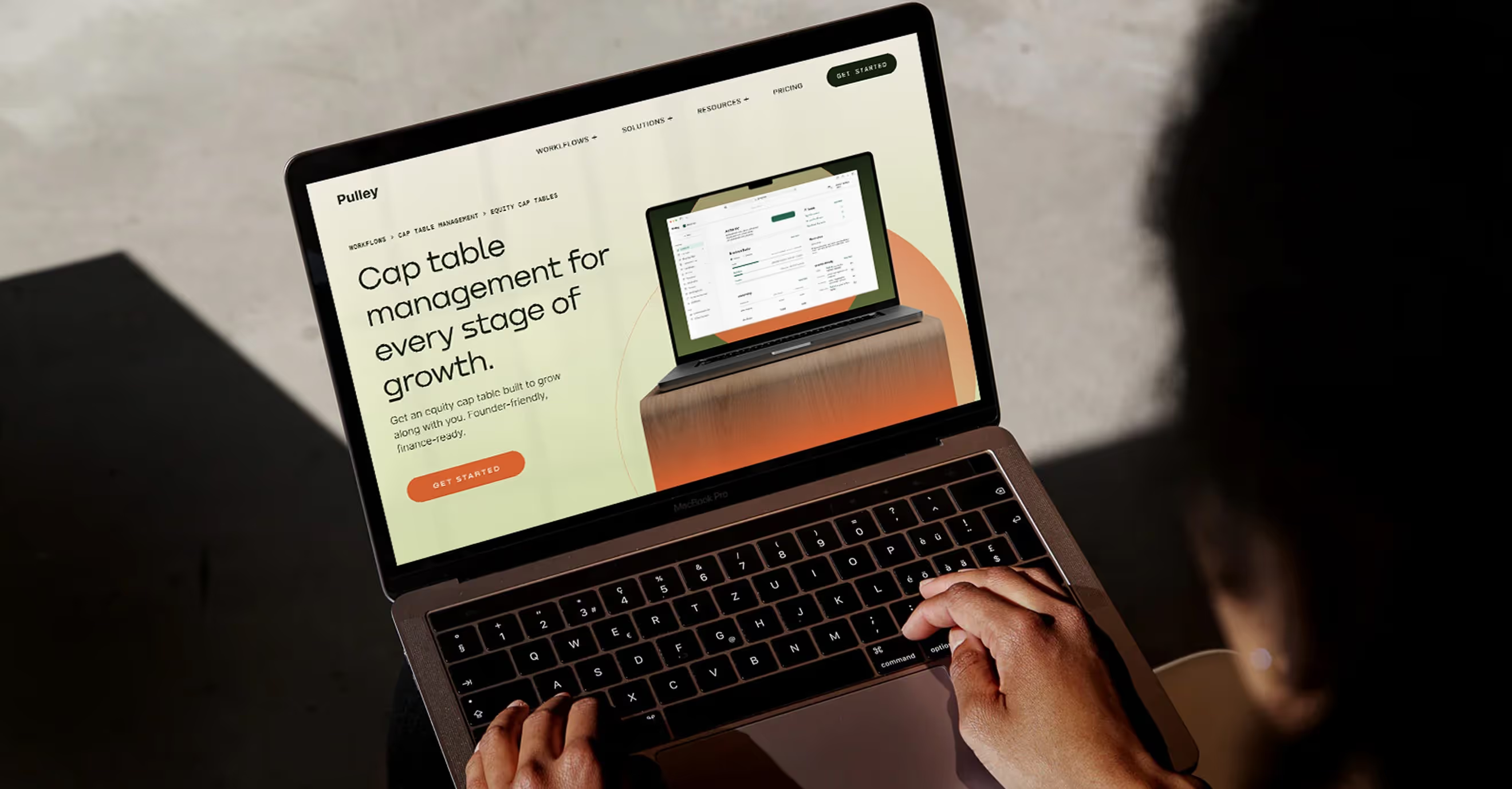
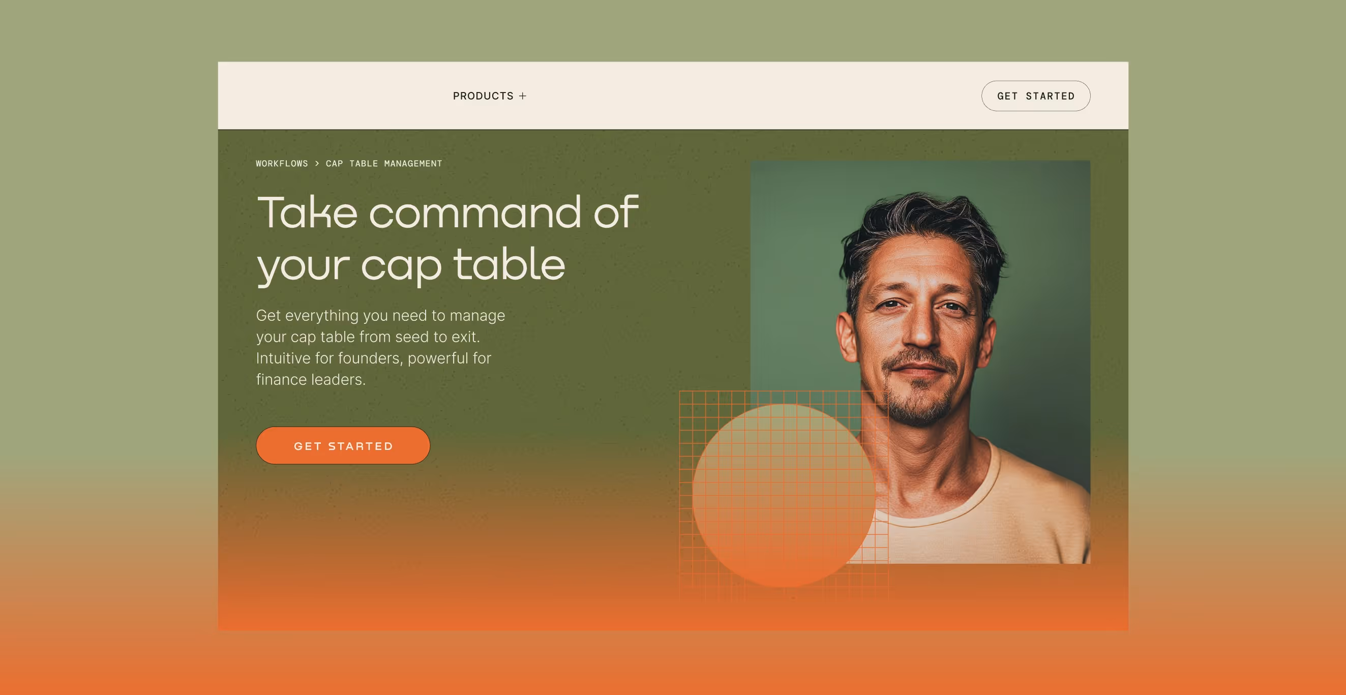
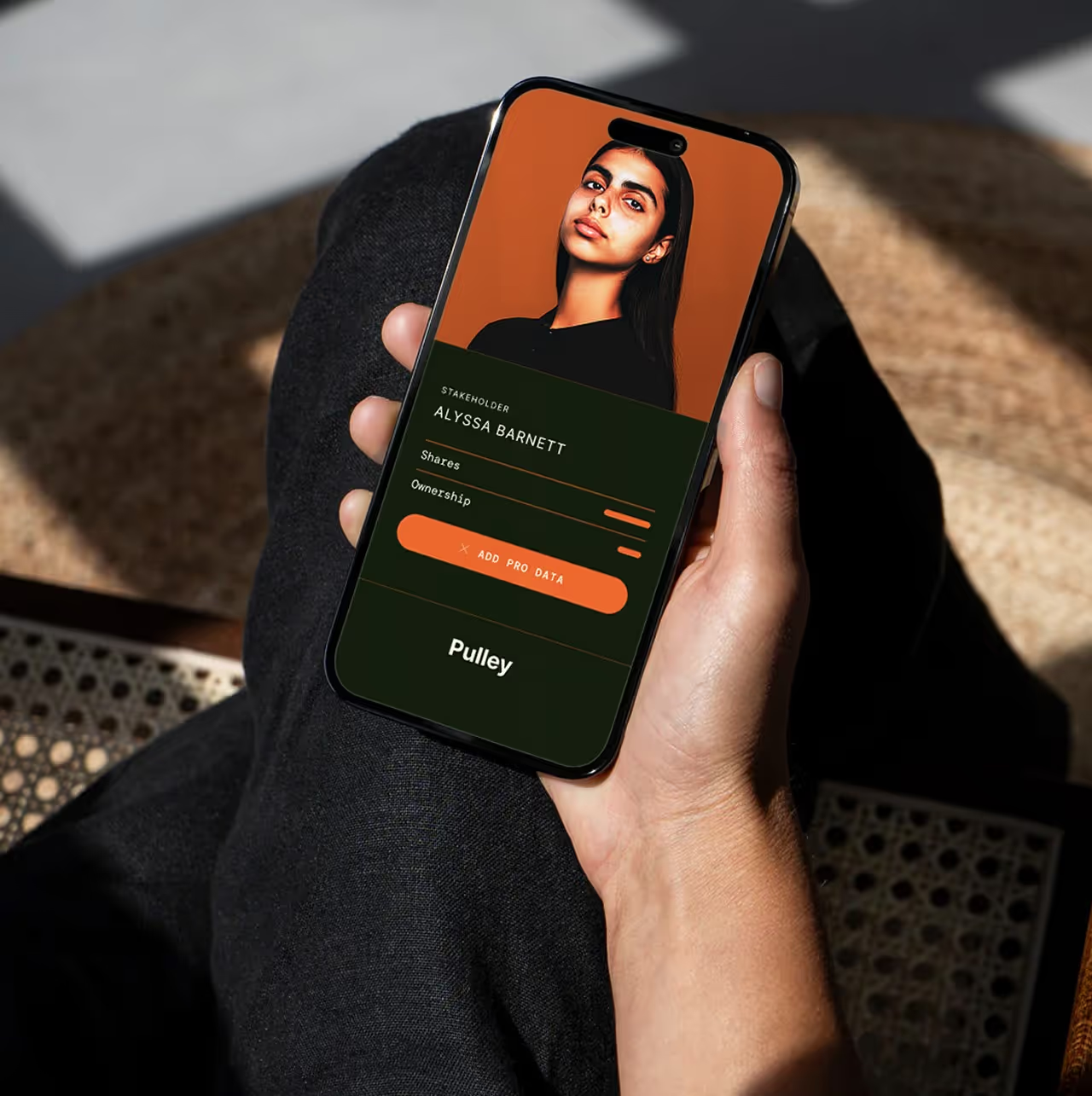
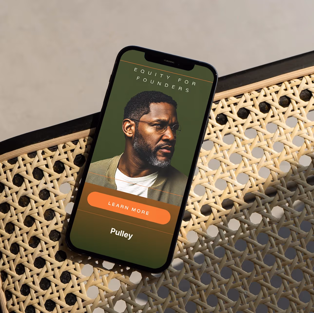
the solution
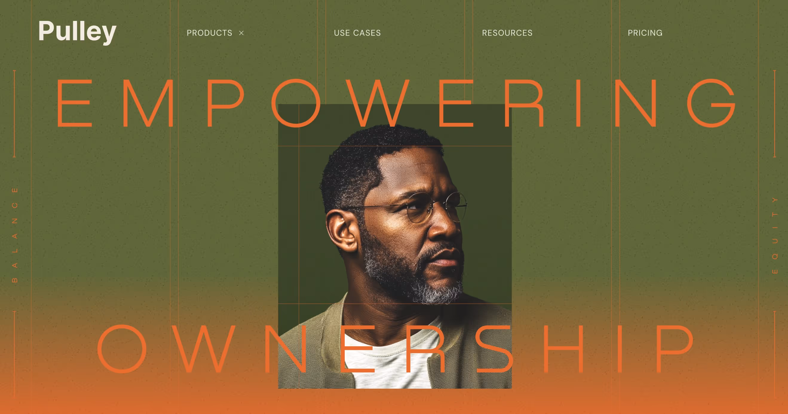
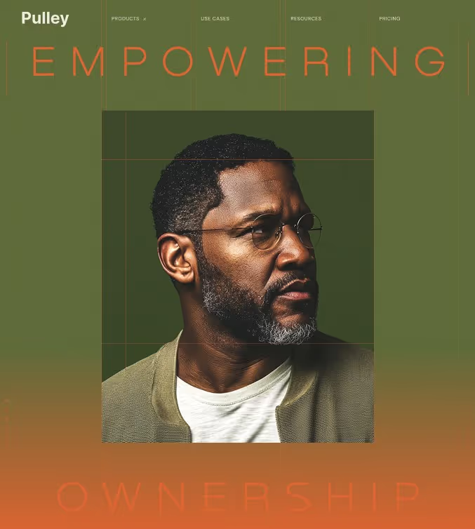
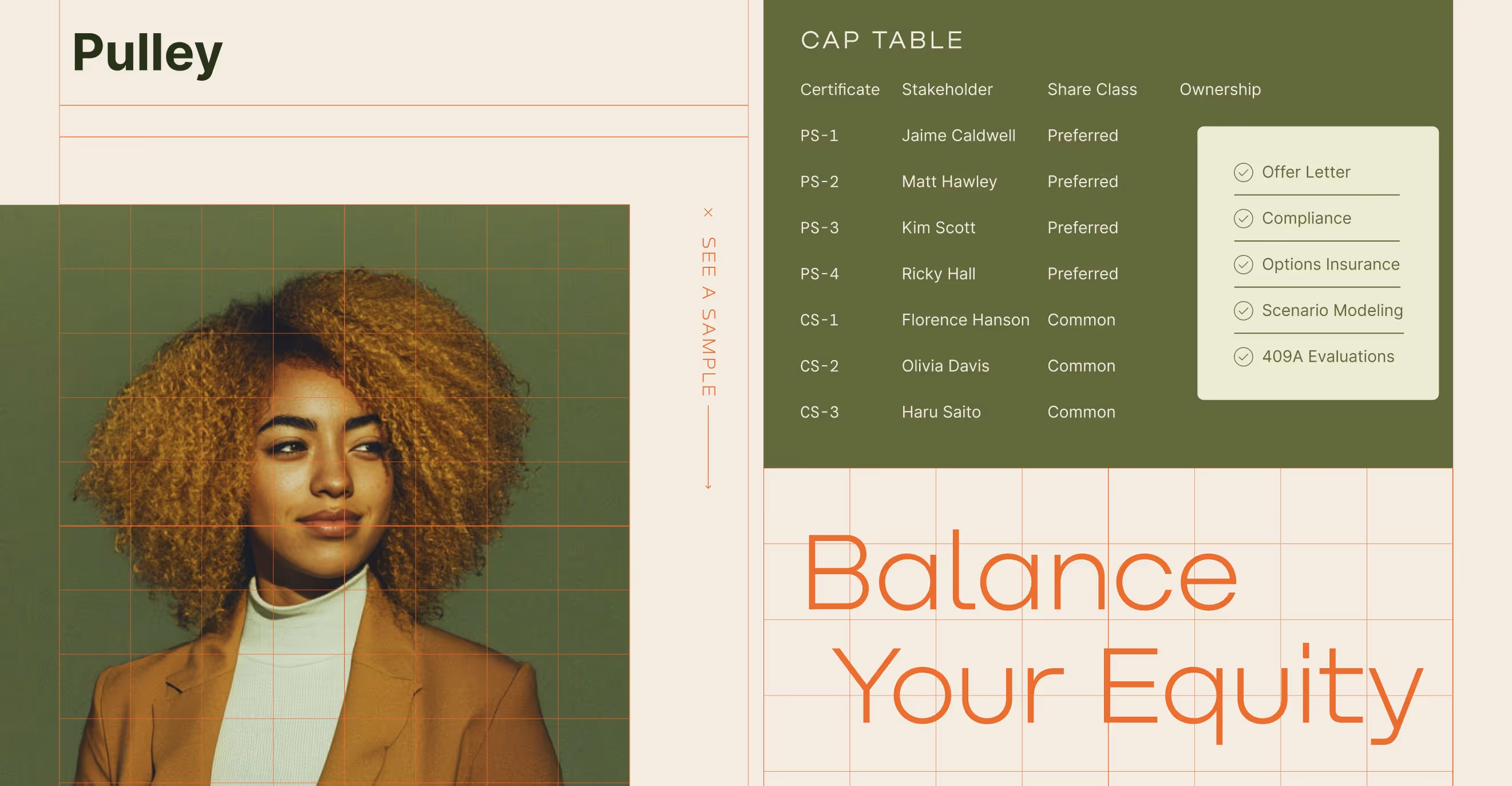
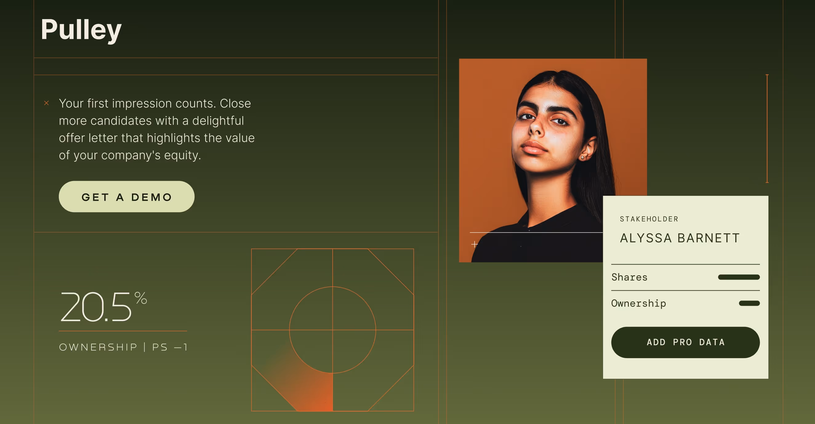
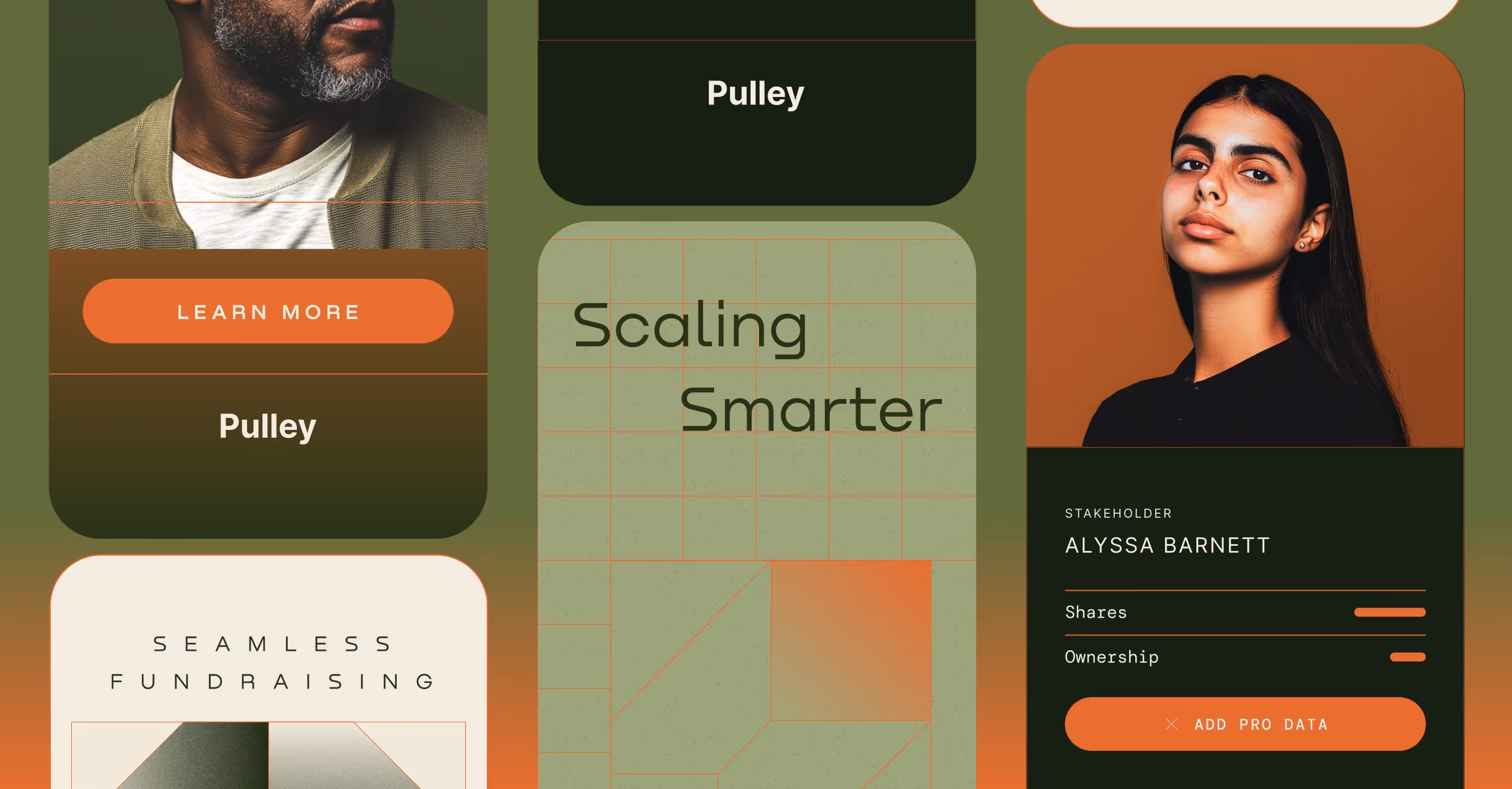
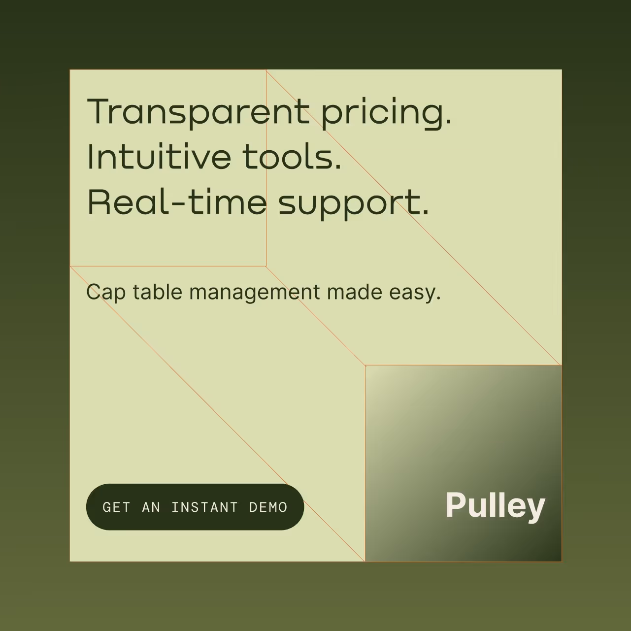
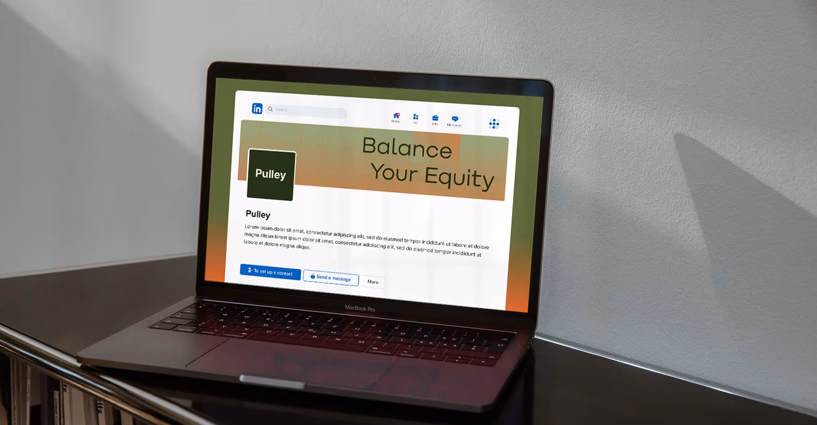
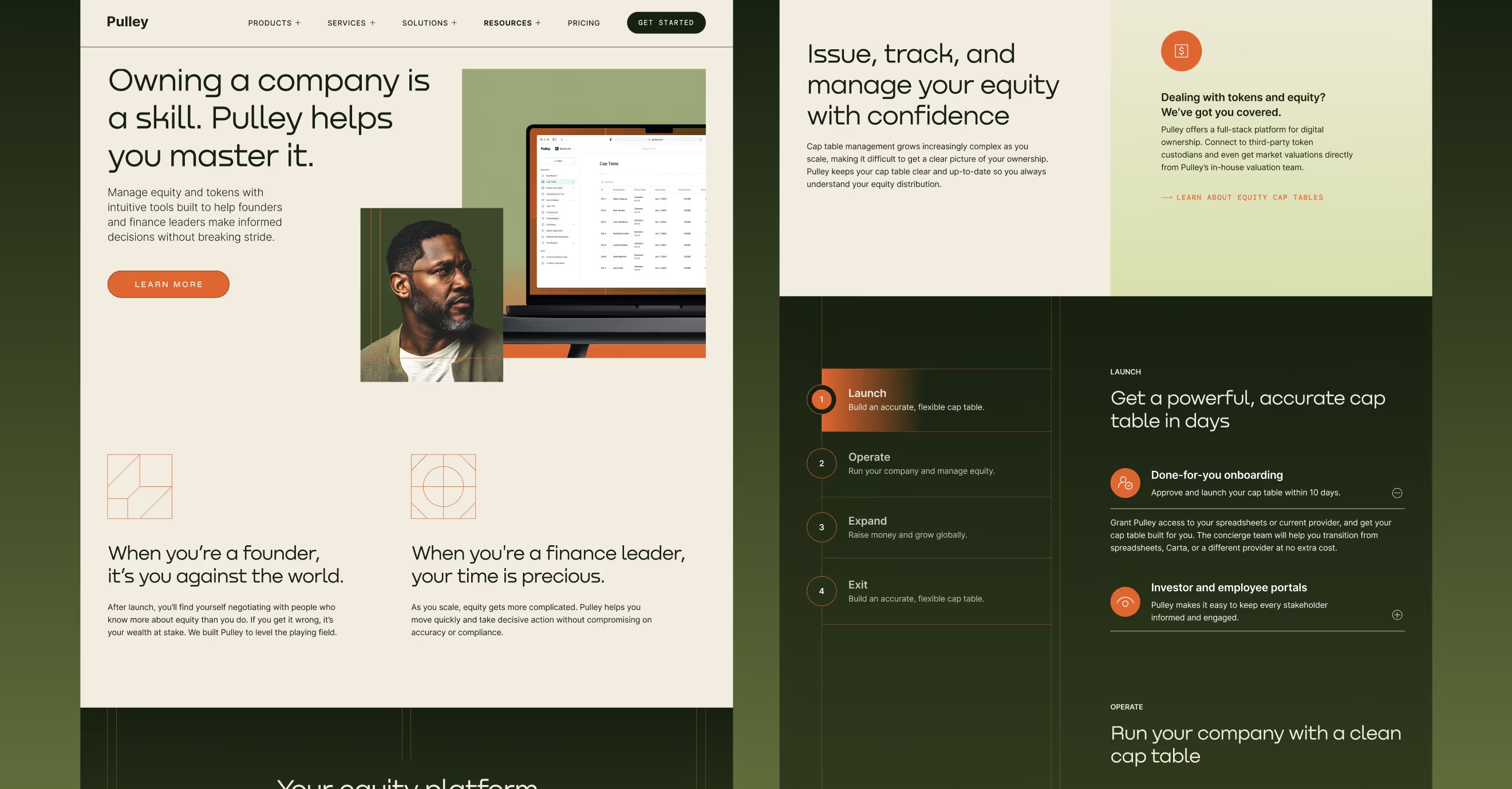
We gave Pulley a refined new identity. One that feels calm, confident, and crystal-clear.
We built a timeless look around simple structure and thoughtful detail—think grid layouts, abstract icons, and a grounded green palette with warm, inviting accents. The new design brings clarity and calm to a category that’s often the opposite. We also introduced a bold headline font and an analog-style photo treatment to keep things human and unique.
Now, Pulley’s brand reflects what their platform actually delivers: precision, trust, and seamless equity management.


.avif)

.avif)
.avif)
.avif)

