
.svg)

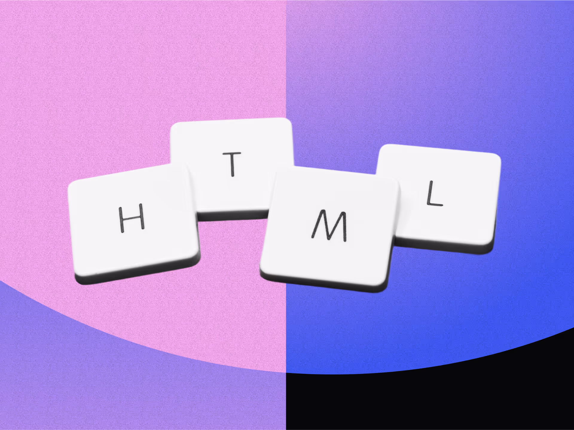
The Complete Guide to Creating A Memorable Facebook Event

A Facebook Event is a built-in marketing tool that lives right where your audience already scrolls, chats, and clicks. It lets you turn a date on the calendar into a full-blown experience, with space for visuals, updates, reminders, and community interaction. Whether you're hosting in-person or online, it's one of the easiest and most effective ways to rally interest and attendance.
Why does it matter? Because visibility equals engagement. A well-created Facebook Event boosts discoverability, keeps your event top-of-mind with automated reminders, and makes it easy for attendees to share the news with others.
In this article, we’ll walk you through how to create Facebook Events that are memorable and perform well. From setting the tone with the right visuals to optimizing for engagement and reach, consider this to be your step-by-step playbook for making an impact that lasts well beyond the RSVP.
The 5 Must-Haves To Create A Facebook Event People Actually Want to Attend
Most Facebook events get ignored because they’re rushed, vague, or forgettable. If you want people to actually show up, you need to treat your event like a product launch: clear, polished, and built for engagement. To achieve this, certain essential elements must be in play. These elements are the baseline for earning attention, building credibility, and making it easy for someone to say yes.
When creating a Facebook event that converts, certain fundamental elements serve as the foundation for all your promotional efforts. Getting these basics right signals professionalism and reliability to potential attendees.
1. Write a Clear and Clickable Title
Your title needs to be attention-grabbing, descriptive, and searchable. Aim for a title that balances SEO-friendly keywords with human appeal. For example, instead of "Annual Company Gathering," try "TechCo's 2025 Innovation Summit: Shaping the Future of AI."
Your event title is your first impression. It needs to captivate and compel action while striking a balance between clarity and intrigue. Try the action word + unique value + event type formula: "Master Data Science: Interactive Workshop with Industry Leaders." Or use the exclusive descriptor + topic + format approach: "Insider's Guide to Crypto: Live Q&A with Industry Experts."
Employing brand positioning strategies helps your event stand out from the crowd. Test your titles by asking, “Would I stop scrolling for this?” Ensure your title sets the right expectations, and that your event meets them. Nothing damages trust more than a spectacular headline followed by a forgettable experience.
2. Cover the When and Where (Without Making People Hunt)
Include the day of the week, date, start time, and end time. For multi-day events, clearly state the whole duration. Nothing frustrates potential attendees more than having to hunt for basic timing information.
For physical events, include the venue name, address, and any relevant parking or transportation details. For virtual events, specify the platform and how attendees will access it. Vague location information makes even the most exciting event seem disorganized.
3. Write a Description That Sells the Experience
Your event description should include a brief overview of what attendees can expect, key speakers or highlights, the value proposition, any special features, and ticket information. This is where you sell the experience, not just the logistics.
Open with a compelling statement or question that communicates the value of attending. Make them feel what they’ll miss out on if they don’t join. Highlight standout features, world-class speakers, interactive sessions, and exclusive takeaways, and use formatting to keep the content scannable, especially for mobile users.
Let your brand’s personality come through. If you’re quirky, lean into it. If you’re buttoned-up and sleek, reflect that. Create urgency without being pushy: “Early bird tickets available until Friday” is far more effective than all-caps hype. End with a clear next step, so your audience knows what to do and why they shouldn’t wait.
4. Choose the Right Privacy Settings
Determine whether your event should be public, private, or invite-only, taking into account your goals and target audience. Each option creates a distinct perception and attracts a different type of attendee.
The technical aspects of your Facebook event significantly affect its discoverability and reach. Public events are discoverable by anyone on Facebook and can be shared widely. Private events are only visible to guests, creating a sense of exclusivity. Select options based on your event's goals and target audience.
5. Optimize Setup for Discoverability and Conversion
Select the most specific categories that fit your event to improve discoverability. Facebook's algorithm uses categories to suggest relevant events to users. Update categories if your event evolves during the planning process.
Use Facebook's recognized venue locations when possible to improve discoverability in location-based searches. This also provides attendees with directions and additional venue information, eliminating the need for extra effort on your part.
Partner with complementary brands or influencers as co-hosts to expand your event's reach and audience. This can significantly increase visibility to new audiences and add credibility to your event through association. Avoiding common branding mistakes is crucial during your event setup to maintain professionalism and trust.
If selling tickets, integrate with Facebook's ticketing partners for a seamless purchase experience. This reduces friction in the conversion process, making it easier for people to commit to attending.
Why Smart Design Makes or Breaks Your Facebook Event
To be honest, poor design doesn't just make your event look unprofessional, it actively convinces people your event isn't worth their time before they even read your description. Every visual choice, from your cover photo to promotional graphics, either builds credibility and excitement or undermines it, and there's no middle ground on a platform where people make split-second decisions. When your design elements work seamlessly with your messaging, they create an experience that transforms casual scrollers into committed attendees.
Make Your Cover Photo Do the Work
Your event's cover photo is often the first visual element people see. To maximize its impact, use the optimal size of 1920 x 1005 pixels with a 16:9 aspect ratio to ensure your image appears crisp on all devices.
Select eye-catching imagery that reflects the tone and purpose of your event rather than generic stock photos. To make your visuals as impactful as possible, consider principles from strategic poster ad design.
Boring visuals = boring event (at least that's what people will assume). Keep the text on the cover image minimal, focusing on essential information such as the event title, date, and location.
Use contrasting colors for text overlays to ensure legibility, especially on mobile devices where most Facebook browsing happens. Consistently integrate your brand's logo, color palette, and fonts to reinforce brand identity and build trust. Utilizing elements like patterns can transform your brand identity. Your visual identity should be as recognizable as your best friend's laugh!
Create Graphic Graphics That Tell Your Story And Build Trust
Beyond the cover photo, develop a suite of visual content that supports your promotional strategy throughout the event timeline. Design graphics that work across different promotional contexts, from Facebook feeds to email campaigns and other social platforms.
Maintain visual consistency with your written voice, whether it's playful, professional, or edgy. Utilizing tools and techniques can help you elevate your brand visually. If your copy is fun and irreverent but your graphics look corporate and stuffy, you're sending mixed signals that confuse potential attendees.
Use graphics to amplify key messages without overwhelming your written content. Consider the power of typography in conveying your brand message. Create visuals that highlight speaker quotes, showcase event highlights, or present key statistics related to your event's theme.
Integrate elements of brand iconography to enhance recognition and appeal. Consider adopting creative approaches to your event design to make a lasting impression and stand out from the crowd.
Consider creating a series of countdown graphics to build anticipation as the event date approaches. Nothing builds excitement quite like seeing "Only 3 days left!" paired with an enticing image of what awaits attendees.
Partner With Design Professionals Who Actually Get Events
Contrary to what you might think, you don't have to figure it out your design solo. Professional designers who understand event marketing know exactly how to translate your vision into visuals that stop the scroll and start conversations, plus they handle all the technical requirements like file sizes and platform-specific dimensions that can make or break how your visuals appear.
The right design partner doesn't just make pretty pictures; they create strategic visual experiences that guide people from curiosity to commitment while you focus on what you do best. Whether you need a complete visual identity for your event or just want to elevate specific pieces, partnering with designers who specialize in event marketing can transform your promotional materials from forgettable to unforgettable.
How To Make Your Facebook Event Buzz Before, During, and After
Most Facebook events die a quiet death with zero engagement and empty seats, while others generate the kind of buzz that makes people genuinely excited to attend. The difference isn't budget or connections, it's treating your event page like the strategic marketing tool it actually is, not just a digital flyer. Your Facebook event becomes your first impression, ongoing conversation starter, and relationship-building platform that transforms casual browsers into committed attendees.
Know What To Say and When To Say It
A well-planned promotional timeline can make the difference between a packed venue and empty seats. Start 3-6 months before the event by creating your Facebook event page with preliminary information. Begin sharing teaser content to build awareness and launch "Save the Date" campaigns to generate early interest.
Two to three months before, increase posting frequency with more detailed event information. Implement early-bird ticket promotions and start engaging with your community through Q&A sessions or polls to gauge interest and gather feedback.
One month before, intensify your messaging with a sense of urgency. Share the finalized agenda and highlight key attractions. Launch retargeting campaigns for users who've shown interest but haven't registered yet.
Two weeks before, focus on last-minute registrations with countdown posts. Share practical information about the event like parking, what to bring, and other logistics. Leverage testimonials from past attendees to build trust and excitement.
During the event, post real-time updates and highlights. Encourage attendees to share their experiences using a specific hashtag. Use Facebook Live to broadcast key moments for those who couldn't attend.
After the event, share highlights and thank attendees. Collect feedback through polls or surveys and begin nurturing the community for future events. This post-event engagement helps maintain momentum and build a loyal following.
Build Recognition That Sticks Through Smart Messaging
Maintaining visual and verbal consistency throughout your promotional period is crucial for building recognition and trust. Develop a visual theme with a cohesive identity that can be adapted across all promotional materials, including a specific color palette, font choices, and graphic elements. Understanding the impact of strategic branding changes can help you maintain consistency.
Establish main themes or messages about your event. Rotate through these themes to maintain consistency while avoiding repetition that could bore your audience. Mix up your content types to keep things interesting—alternate between text posts, images, videos, and interactive content.
Encourage attendees from previous events or early registrants to share their experiences, adding authenticity to your promotion. People trust peer recommendations more than branded messages, so leverage this powerful form of social proof.
Strategically unveil new details about speakers, activities, or special features throughout your timeline to maintain interest. Think of it as a slow, tantalizing reveal that keeps people coming back for more! Develop a unique event hashtag and use it consistently across all promotions, encouraging your audience to use it as well.
Read the Room and Pivot When You Need To
Monitor engagement metrics throughout your promotional period and be prepared to adjust your approach based on what resonates with your audience. Pay attention to which posts generate the most likes, comments, shares, and click-throughs.
If certain content types or messages perform exceptionally well, create more similar content. Conversely, if some approaches fall flat, don't be afraid to pivot. This flexible approach ensures that your promotional efforts remain effective, rather than adhering to a rigid plan that isn't working.
Utilize Facebook's Event Insights to track response rates and attendance commitments. These metrics provide valuable insights into your audience's interests and behaviors, enabling you to refine your messaging for maximum impact.
Tips To Help You Stop Begging for Likes and Start Earning Loyalty
Authentic engagement isn't about tricks, giveaways, or manipulating the algorithm; it's about creating content so genuinely valuable that people can't help but interact with it. When you focus on delivering real value instead of chasing vanity metrics, something powerful happens: your audience stops treating you like just another brand and starts seeing you as a trusted resource they actually want to hear from. The strategies that work best don't feel like strategies at all, they feel like natural conversations between people who share genuine interests and goals.
1. Create Content Worth Sharing Without Asking
Focus on genuine value over explicit sharing requests. Solve real problems, create visually appealing content, offer exclusive behind-the-scenes insights, use compelling storytelling from past attendees, and provide practical resources. When content truly helps your audience, natural sharing follows.
2. Foster Real Connections That Go Beyond the Event Page
Build community through live Q&As, candid behind-the-scenes content, interactive polls for decision-making, user-generated content opportunities, and personalized responses. Make followers feel like insiders and stakeholders by showing the real people behind your event and actively engaging with comments.
3. Keep the Energy Alive Long After the Last Guest Leaves
Maintain post-event momentum with highlight reels, surveys, discussion threads, and personalized thank-you messages. Create recap content showcasing attendee participation while teasing future events. This converts non-attendees for next time and strengthens relationships for ongoing collaboration.
Turn Your Next Facebook Event Into the One Everyone's Talking About
Creating impactful Facebook events requires a strategic blend of compelling content, thoughtful design, and active engagement. The most successful events seamlessly blend professional presentation with authentic connection, creating experiences that begin the moment someone discovers your event online and continue long after they leave.
When you approach event creation as both a writing and design challenge, everything shifts. You're not just announcing details, you're creating complete experiences that begin the moment someone sees your event in their feed and continue long after the last attendee heads home. Your next event could become a defining moment for your brand, creating buzz, engagement, and lasting connections.
Don't let boring visuals convince people your event isn't worth their time, NoBoring Design creates scroll-stopping Facebook event graphics and social media assets that turn casual browsers into committed attendees. Partner with us today!
Key Takeaways
- Successful Facebook events combine compelling copy with strategic design elements to create a complete experience. Together, they guide people from curiosity to commitment.
- Timing your promotional content correctly helps build momentum and maintain interest. Get the timing wrong, and even great events can struggle to fill seats.
- Authentic engagement strategies drive organic sharing and community building. Real value creates natural advocates who share because they want to, not because you asked.
- Visual consistency across all event materials strengthens recognition and trust. Cohesive branding passes the crucial first-impression test that determines whether people take you seriously.

Your website isn't just another digital asset—it's the beating heart of your online presence. In a world where first impressions happen in milliseconds, choosing the right web design agency can mean the difference between a website that simply exists and one that captivates, converts, and crushes goals.
Finding your perfect design partner feels like dating—exciting yet terrifying. You'll meet agencies that promise the moon but deliver a pebble, while others might actually transform your digital presence into something magical.
Ready to find your web design soulmate? Let's discover how to spot the perfect match who'll turn your vision into a head-turning, result-driving digital experience.
Understanding Your Website Needs Before Agency Shopping
Walking into agency conversations without a clear understanding of your needs can lead to poor decisions and unexpected costs. Before reaching out, define what success looks like for your business. Are you aiming to generate leads, increase e-commerce sales, build community, or position your brand as a thought leader? These goals directly influence the design approach, required features, and even the type of agency best suited to your project.
It’s also crucial to understand your audience. Who’s visiting your site, what problems are they trying to solve, and what do you want them to do once they’re there? Knowing your users' needs allows agencies to craft intuitive experiences that guide people toward meaningful actions. Keep in mind that expectations vary by industry—what works for one audience may not work for another.
Lastly, set realistic expectations around budget early in the process. Web design costs can vary significantly based on scope, customization, and long-term needs. Consider the full lifecycle of your site—from the initial build to future updates and maintenance. A clear budget helps agencies offer solutions that align with your priorities while delivering long-term value.
5 Essential Steps to Choosing A Web Design Agency
1. Review Portfolios with Purpose
Finding potential agencies requires methodical research beyond simple Google searches. Start by analyzing portfolios to assess design quality, industry relevance, and project scope.
Look for work that resonates with your aesthetic preferences while achieving business objectives similar to yours. Agencies showcasing diverse styles demonstrate adaptability, while those with industry-specific experience understand sector nuances.
2. Read Testimonials with a Critical Eye
Client testimonials provide windows into the real agency experience. Look beyond generic praise to find specific comments about communication, problem-solving, deadline adherence, and results achieved.
Pay attention to reviews mentioning how agencies handled unexpected challenges—these situations reveal true character and capabilities. When possible, speak directly with past clients for unfiltered perspectives on working relationships.
3. Watch for Red Flags
Pay close attention to warning signs that suggest potential problems. Be wary of agencies with outdated portfolio designs, missing case studies, vague process documentation, or poor experiences on their own websites.
Agencies that can't effectively market themselves rarely excel at marketing others. Similarly, be cautious of bold claims without supporting evidence or measurement methodologies.
4. Consider Industry Recognition
Industry recognition and awards can provide additional validation of an agency's expertise. While not definitive proof of quality, accolades from respected organizations suggest peer recognition and excellence in specific disciplines.
Check whether awards relate to design aesthetics, technical implementation, or business results to determine relevance to your needs.
5. Assess Process Transparency
Evaluate how agencies present their process and methodology. Transparent agencies clearly articulate how they move from discovery through design, development, and launch. Look for evidence of user research, strategic thinking, and testing protocols that ensure quality outcomes.
Agencies that emphasize processes typically deliver more consistent results than those focused solely on creative output.
Key Areas of Expertise to Evaluate in Web Design Agencies
Technical capability fundamentally determines what your website can achieve. Beyond creating visually appealing designs, agencies must build sites that perform across devices, load quickly, and function flawlessly, using techniques like responsive web design.
Assess technical depth by reviewing responsive designs that adapt seamlessly between desktop, tablet, and mobile experiences, and their commitment to accessibility testing. With mobile users representing more than half of global web traffic, responsive excellence isn't optional.
Evaluate their approach to website accessibility standards, like WCAG. Accessible websites reach wider audiences, comply with legal requirements in many jurisdictions, and often perform better in search rankings. Ask about their accessibility testing procedures and how they implement key accessibility improvements while balancing visual design with functional requirements for all users.
Strategic expertise separates exceptional agencies from adequate ones. Strong agencies integrate SEO principles throughout the design process rather than treating it as an afterthought. They understand how design decisions impact search performance and user engagement metrics. Ask potential partners how they incorporate keyword research, content strategy, and technical SEO elements into their design approach.
Marketing integration capabilities ensure your website supports broader business goals, helping to expand market reach. The best agencies consider how your site connects with marketing channels, lead generation systems, and sales processes. They design with conversion optimization in mind, creating strategic pathways that guide users toward meaningful actions. Look for evidence they've improved marketing performance metrics through thoughtful design implementation.
User experience expertise determines how effectively visitors can navigate and engage with your site. Agencies that follow web design best practices will ensure optimal user experiences. Strong agencies demonstrate deep understanding of user behavior, attention patterns, and interaction design principles.
They create experiences that feel intuitive while subtly guiding users toward desired outcomes. Ask about their user research methods, testing procedures, and how they measure experience quality beyond subjective aesthetics.
Essential Criteria for Choosing Your Web Design Partner
The size and structure of a web design agency can shape your entire working relationship. Boutique studios often offer personalized service and direct access to senior talent, making them ideal for hands-on collaboration. In contrast, larger agencies bring broader capabilities, specialized teams, and the infrastructure to handle complex projects at scale. The best fit depends on your project scope, internal team dynamics, and preferred working style.
Clear, consistent communication is one of the strongest indicators of project success. Pay attention to how agencies engage during early conversations—do they listen actively, ask thoughtful questions, and explain things clearly? Their responsiveness and communication habits during the sales process often reflect how they'll manage your project, especially when it comes to feedback, progress tracking, and decision-making.
Cultural alignment plays a big role in collaboration quality. Beyond skill sets, think about whether an agency's tone, pace, and values complement your team. Some businesses thrive with agencies that challenge the status quo, while others prefer a steadier, risk-conscious approach. There’s no right answer—what matters is how well the agency’s personality fits your internal culture.
Finally, consider long-term potential. Strong agency relationships don’t end at launch; they grow with your business. Look for partners who offer ongoing support, optimization, and strategic insight as your digital presence evolves. A partner with staying power and scalable services can support your growth for years to come.
Key Questions to Ask During Web Design Agency Interviews
Look for Genuine Business Understanding
Agency interviews reveal capacity for understanding your business beyond surface-level design conversations. Ask how they approach learning about new industries and audiences. Strong agencies demonstrate genuine curiosity about your business model, competitive landscape, and customer journey. They should ask probing questions about your goals, challenges, and definition of success rather than immediately jumping to design solutions.
Understand Their Process from End to End
Inquire about their design and development process from initial concept through launch. Look for structured approaches that include discovery, planning, design, development, testing, and deployment phases. Strong agencies explain how they incorporate feedback, manage revisions, and ensure quality throughout each stage. Ask for examples of how they've adapted their process to accommodate unique project requirements or unexpected challenges.
Clarify Communication and Collaboration Practices
Discuss communication and project management practices in detail. Learn who would serve as your primary contact, how often you should expect updates, and which tools they use to manage projects. Ask about their approach to gathering and implementing feedback, handling disagreements, and maintaining alignment throughout complex projects. Transparent agencies clearly explain their meeting cadence, documentation practices, and escalation procedures for resolving issues.
Ask How They Measure Success
Explore their approach to measuring success and demonstrating results. Strong agencies define clear metrics aligned with business objectives rather than focusing solely on design aesthetics. Ask for examples of how they've helped previous clients achieve measurable improvements in key performance indicators like conversion rates, engagement metrics, or business outcomes. Look for evidence that they prioritize results over subjective measures of design quality.
Discuss Post-Launch Support and Optimization
Discuss post-launch support and ongoing optimization strategies. Learn about their maintenance packages, update procedures, and approaches to continuous improvement. Strong agencies view website launches as beginnings rather than endings, offering structured programs for monitoring performance, identifying opportunities, and implementing enhancements based on real-world data and changing business needs.
Clarify Pricing and Scope Flexibility
Ask thoughtful questions about pricing structure and how they handle scope changes. Understand what's included in their base pricing versus what might trigger additional costs. Transparent agencies clearly explain their billing practices, provide detailed estimates, and maintain open communication about budget implications of project decisions. Look for partners who demonstrate financial transparency and proactively help you manage resources effectively.
Common Pricing Models for Web Design Services
- Fixed Project Fees
- Provides budget certainty through upfront quotes
- Works for clearly defined projects with stable requirements
- Changes beyond original scope trigger additional charges
- May include limited revisions within the fixed price
- Hourly Billing
- Charges range from $50-$250+ per hour based on expertise and location
- Offers flexibility for evolving projects
- Accommodates changing directions without formal change orders
- Less budget predictability—costs can escalate beyond estimates
- Retainers
- Monthly fees covering agreed services
- Ideal for websites requiring regular updates and optimization
- Includes predetermined service allowances with clear prioritization
- Benefits: predictable budgeting and dedicated resource allocation
- Value-Based Pricing
- Aligns fees with business outcomes and measurable results
- Shares risk and reward between client and agency
- Implementation varies: base fees with performance bonuses or entirely results-based
- Works best with clear, attributable performance indicators
- Website Subscriptions
- All-inclusive monthly payments for design, development, hosting, and maintenance
- Eliminates large upfront investments
- Includes regular updates, security monitoring, and limited design refreshes
- Simplifies budgeting, though potentially costs more over time
Weighing Final Factors in Your Web Design Agency Decision
Finding the right agency isn’t just about skill or cost—it’s about long-term fit, trust, and shared understanding. As you near a final decision, these considerations can help ensure a smooth and successful partnership.
Chemistry and Communication Matter
Beyond capabilities and pricing, consider the human element in your decision. The strongest agency relationships blend professional expertise with personal chemistry. Pay attention to how potential partners listen, respond to concerns, and demonstrate understanding of your vision. Consider whether you genuinely enjoy interactions with their team—you'll spend significant time communicating with these people during your project.
Portfolio Range and Visual Alignment
Evaluate portfolio diversity and design versatility. Some agencies excel in specific aesthetic styles while others demonstrate range across visual approaches. Neither approach is inherently superior, but alignment with your brand vision is essential. Look for evidence they can either execute within your established visual language or develop appropriate new directions that achieve your business objectives.
Tech Stack and Platform Fit
Consider technical ownership and platform implications. Different agencies specialize in various content management systems, e-commerce platforms, and custom development approaches. These choices affect your website's long-term maintenance requirements, expansion capabilities, and even internal team training needs. Ask about technology recommendations and why they believe particular solutions suit your specific situation.
Timing and Production Capacity
Assess timeline alignment and project scheduling. Understanding when an agency can start your project, their typical development timeframes, and how they handle competing priorities helps set realistic expectations. Premium agencies often schedule projects months in advance, requiring patience but potentially delivering superior results. Discuss critical deadlines and whether their production capacity aligns with your business needs.
Contracts, Rights, and Ownership
Review contract terms and ownership provisions carefully. Understand who owns design assets, custom code, and content after project completion. Clarify hosting arrangements, future modification rights, and any ongoing license requirements for third-party elements. Strong agencies offer transparent contracts that protect both parties while ensuring you maintain appropriate control of your digital presence.
Making Your Final Web Design Agency Choice: The Decision-Making Framework
Balance Objectivity with Instinct
Synthesize your research and interviews through a structured evaluation process. Consider creating a weighted decision matrix incorporating factors most relevant to your specific situation. While seemingly mechanical, this approach helps balance emotional responses with objective assessment. Include both capability measures and relationship factors to develop a comprehensive view of each potential partner.
Trust your instincts about relationship potential. Technical capabilities matter enormously, but agency partnerships thrive or fail based on communication quality, cultural alignment, and mutual respect.
Pay attention to how agencies respond when challenged, how they handle disagreements, and whether they genuinely engage with your business objectives beyond design considerations.
Align Stakeholders and Focus on Long-Term Fit
Consider seeking stakeholder input before finalizing your decision. Different team members often notice different aspects of agency presentations and materials. Marketing teams might focus on conversion strategies, IT departments on technical implementation, and executives on business alignment. Gathering diverse perspectives helps identify potential blind spots in your evaluation.
Recognize that perfect agencies don't exist—only right-fit partnerships do. Every agency brings unique strengths and limitations. The goal isn't finding flawless capabilities but rather identifying the partner whose particular excellence aligns with your most critical needs. Sometimes this means prioritizing specialized expertise over comprehensive services or selecting agencies still building their portfolios but demonstrating exceptional understanding of your requirements.
When making your final selection, balance immediate project needs with long-term partnership potential. The strongest agency relationships often extend years beyond initial engagements, evolving to address changing business requirements. Consider not just who can best execute your current project but who can grow alongside your organization as digital needs mature and expand.
Web Design Agency Partnership: Your Path to Digital Excellence
Choosing your web design agency represents more than a vendor selection—it's establishing a creative partnership that shapes your digital identity. The right agency translates your brand essence into compelling visual narratives while engineering experiences that drive measurable business outcomes.
They balance aesthetic excellence with technical precision, creative vision with strategic thinking. When you find this perfect match, your website transforms from a simple information repository to a powerful business engine, attracting, engaging, and converting visitors while strengthening your market position.
Take your time, trust the process, and remember: the extra effort spent finding your ideal design partner pays dividends long after your website launches.
Ready to transform your digital presence with a website that works as beautifully as it looks? We at NoBoringDesign create brand experiences that captivate and resonate, building emotional connections that encourage repeat engagement. Reach out today to learn more!
Key Takeaways
- Clarifying your business objectives, audience needs, and budget parameters sets the foundation for finding the right agency match
- Evaluating an agency's portfolio, technical expertise, and communication style reveals whether they can provide expert web design to translate your vision into reality
- Understanding different pricing models, including options like unlimited design subscriptions, helps align agency services with your business goals and financial constraints
- The ideal web design partner balances creative excellence with business strategy to deliver measurable results
FAQs
What factors should I consider when choosing a web design agency?
When choosing a web design agency, consider their technical expertise, portfolio quality, and communication style. Ensure they understand your business goals, audience, and long-term needs. Look for agencies that balance creativity with strategic thinking, offer transparent processes, and align with your company's culture. Additionally, assess their ability to scale services and provide post-launch support.
How do I evaluate a web design agency’s expertise?
Evaluate an agency’s technical capabilities by reviewing their portfolio for responsive, accessible, and SEO-optimized designs. Assess their ability to integrate marketing strategies into the design, such as conversion optimization. Ensure they understand user experience principles and have a process for measuring success based on key business outcomes, not just aesthetics.
What should I ask during agency interviews?
During interviews, ask agencies about their design process, how they measure success, and how they incorporate client feedback. Discuss their communication practices, project management tools, and how they handle scope changes. Additionally, inquire about post-launch support and their approach to ongoing optimization.
What are common pricing models for web design services?
Common pricing models include fixed project fees, hourly billing, retainers, and value-based pricing. Fixed fees provide budget certainty for well-defined projects, while hourly billing offers flexibility for evolving requirements. Retainers are ideal for ongoing updates, and value-based pricing aligns agency compensation with measurable business outcomes. Consider the model that best fits your project needs and budget.
Launching a website represents a pivotal moment for your brand. Those magical first seconds when someone lands on your page create immediate impressions that determine whether visitors stay or leave.
Your website serves as your digital storefront, ambassador, and often the first touchpoint with potential customers. A well-executed launch establishes credibility, builds trust, and sets the foundation for your online success.
In this article, we’ll walk you through the essential preparations needed to ensure your website launch goes smoothly and effectively captures your audience's attention from the very first click. Let’s dive into the checklist!
Understanding Your Website Objectives and Audience
Before selecting colors or designing layouts, you need to establish clarity around what your website should accomplish and who it needs to reach. These fundamental insights inform every subsequent decision in your website creation journey.
Define Clear Goals Before Launch
Your website needs specific, measurable objectives that align with broader business ambitions. Websites with well-defined purposes enjoy better engagement and higher conversion rates. Consider what your site needs to accomplish—lead generation, brand awareness, product sales, customer support, or audience education.
An e-commerce site might focus on boosting online sales by a specific percentage within six months, while a B2B company might prioritize generating qualified leads through strategic contact forms. Implementing effective performance marketing strategies can help achieve these goals.
Whatever your goals, make sure they follow the SMART framework: Specific, Measurable, Achievable, Relevant, and Time-bound. Also, consider budgeting for web design to align your financial resources with your website objectives.
Identify Target Audience Needs With Precision
Understanding your audience transforms generic web pages into meaningful digital experiences. Demographic analysis through tools reveals the who, what, and where of your audience—age, gender, location, and income details. Psychographic profiling takes you deeper, uncovering interests, values, and lifestyle preferences that help tailor your approach.
Behavioral research shows how people interact with similar websites, revealing patterns you can leverage for better engagement. Competitor analysis highlights what works in your industry and where opportunities exist. Creating detailed user personas dramatically improves your website strategy effectiveness by giving you concrete audience representations to design for.
Align Website Structure With User Journeys
Your website architecture should mirror how your audience thinks and searches for information. Map out logical user flows that guide visitors naturally toward desired actions. Consider how different audience segments might approach your site and what information they'll seek first.
Create intuitive pathways that lead visitors through awareness to consideration to conversion. This thoughtful structure reduces friction points and creates satisfying experiences that encourage extended engagement. When users find what they need without frustration, they're more likely to return and recommend your site to others.
Technical Foundations for Website Security and Compliance
A solid technical framework ensures your website performs reliably while protecting both your business and your users. These technical considerations set the stage for long-term success and security.
Select Reliable Hosting and Website Platforms
Your hosting solution and website platform represent the foundation upon which your entire digital presence rests. Choose options that match your specific needs, considering factors like scalability for traffic growth, uptime guarantees (aim for 99.9% or higher), responsive customer support, and compatibility with your required integrations.
Hosting options range from budget-friendly shared hosting for smaller websites to virtual private servers offering better performance for growing sites.
Dedicated hosting provides maximum resources for high-traffic destinations, while cloud hosting offers supreme scalability with global distribution. For development platforms, solutions like Webflow simplify creation for smaller businesses, while complex projects might benefit from custom development approaches.
Ensure Legal and Security Compliance
Website compliance isn't optional—it protects both your business and your users. Data protection regulations like GDPR for European users and CCPA for California residents create specific requirements you must address. Implementing SSL/TLS certificates enables HTTPS protection across your site, safeguarding user data while improving search engine rankings.
Establish strong password policies and two-factor authentication for administrative access. Keep your CMS, plugins, and server software updated regularly. Consider implementing a Web Application Firewall to guard against common threats and a Content Delivery Network to enhance performance while adding security layers. Set up regular, automated backups with tested restoration processes to create a safety net for your digital assets.
Implement Analytics and Monitoring Systems
Proper analytics setup before launch creates the foundation for data-driven decision-making. Install comprehensive tracking tools to measure traffic sources, user behavior, and conversion metrics. Set up goals that align with your business objectives to track meaningful actions beyond simple page views.
Configure Core Web Vitals monitoring to track Google's key performance metrics, including loading performance, interactivity, and visual stability. Implement error logging to catch and address technical issues quickly. Establish baselines for key metrics so you can accurately measure improvements after launch. These analytics systems transform guesswork into strategic insights that drive website optimization.
Design and User Experience: Three Pillars of Engaging Websites
Exceptional websites combine aesthetics with functionality to create memorable experiences that keep visitors coming back. These design principles ensure your site makes the right impression.
1. Create a Cohesive Visual Identity
Your website design should feel like a natural extension of your brand, creating instant recognition and building trust. Consistent use of brand colors, effective typography, and imagery tells your story visually without words, especially when crafting a brand identity in arts and culture.
Creating a comprehensive style guide helps your team maintain this consistency throughout development and future updates. Staying informed on upcoming design trends can enhance your visual identity and keep your brand current.
Begin with wireframes and sitemaps to establish the structural foundation before adding visual elements. This approach ensures your design serves functionality rather than competing with it. Consistent branding across platforms can boost revenue by up to 23%, demonstrating the tangible business impact of cohesive visual design. This is particularly crucial for creating a creative web design for entertainment, where engaging visual experiences are key.
2. Optimize for Multi-Device Responsiveness
With over 60% of global web traffic coming from mobile devices, responsive design has evolved from nice-to-have to absolute necessity. Search engines prioritize mobile-friendly sites in rankings, making responsiveness a factor in both user experience and discoverability. Sites optimized for mobile devices enjoy higher engagement and conversion rates across all platforms.
Create flexible layouts that adapt beautifully to different screen sizes without sacrificing content or functionality. Design touch-friendly navigation and buttons that accommodate fingers rather than just mouse pointers. Optimize images for rapid loading on mobile connections while maintaining quality.
This attention to mobile user experience leads to significant user engagement enhancement, especially in industries like automotive where users research on-the-go. Implementing a tailored web design approach ensures optimal user experiences, particularly in sectors like real estate.
3. Develop Intuitive Navigation Systems
Navigation serves as your website's wayfinding system, helping visitors discover what they need without frustration. Build logical hierarchies of pages and sections that match how users think about your content, especially when offering strategic marketing materials.
Use clear, standard labels for common pages rather than clever but confusing alternatives. For larger sites, add robust search functionality that helps users find specific information quickly.
Maintain consistent navigation patterns across all pages so users can build familiarity with your interface. For businesses offering strategic marketing materials, this consistency reinforces brand messaging. Intuitive navigation not only pleases visitors but also helps search engines understand your site structure, improving indexing and discoverability.
Website Content Strategy: Approaches for Engaging Audiences
Strategic content connects with your audience while satisfying search engines, creating the foundation for meaningful engagement and conversion.
Craft Compelling Core Content
Develop a clear content strategy that aligns with both user needs and business objectives, especially for social impact initiatives. Audit existing content for relevance and performance, keeping what works and improving or replacing what doesn't. Create comprehensive style guides to maintain consistent voice and messaging across all content types.
Focus on exceptional readability with clear headings, concise paragraphs, and straightforward language that communicates without confusion. Weave in relevant images, graphics, and videos that enhance understanding and break up text.
Provide genuine value through content that solves problems or answers questions your audience actually has. Regularly refresh important pages with updated information and improved visuals to maintain relevance and accuracy.
Implement Strategic SEO Practices
Make your content discoverable through thoughtful search engine optimization. Conduct thorough keyword research to identify relevant terms that match user search intent. Focus on both high-volume terms and specific long-tail phrases that capture particular audience segments. Combining SEO with digital advertising services can enhance your reach and attract more qualified traffic.
Integrate keywords naturally into titles, meta descriptions, headings, and body content without forced repetition. Create unique, comprehensive content that answers user questions better than competing resources. Build strategic internal links between related content to create topic clusters around main pages, improving both user navigation and search engine understanding of your content structure.
Develop Diverse Content Formats
Different audience members consume information in different ways. Create varied content types that appeal to diverse preferences while reinforcing your key messages. Blog posts and articles provide in-depth information for readers seeking a comprehensive understanding. Case studies demonstrate real-world applications and results, building credibility through specific examples.
Visual content like infographics and videos captures attention and explains complex concepts quickly. Interactive elements such as calculators or assessments create engaging experiences that encourage longer site visits. Developing engaging digital assets ensures your message reaches audiences regardless of how they prefer to consume information, maximizing both reach and impact.
Website Testing and Analytics Setup Before Launch
Thorough testing and analytics setup ensure your site works perfectly at launch while providing insights for continuous improvement.
Conduct Functional Website Testing
Comprehensive testing reveals issues before they impact real users. Check all forms, links, and interactive elements to confirm proper functionality across different scenarios. Test user flows from entry points to conversion actions to identify and eliminate points of friction.
Evaluate site performance, including loading times, server response, and resource efficiency. Verify compatibility across browsers, devices, and operating systems to ensure consistent experiences regardless of how users access your site. Conduct security assessments to identify vulnerabilities before launch, protecting both your business and your users.
Verify Accessibility Compliance
Accessibility ensures your website welcomes all visitors, including those with disabilities. Follow Web Content Accessibility Guidelines (WCAG) to create inclusive experiences. Ensure proper color contrast for visitors with visual impairments and provide text alternatives for non-text content like images and videos.
Make sure your site functions properly with keyboard navigation for those who cannot use a mouse. Create forms with clear labels and error messages to accommodate all users. Accessible websites not only serve more visitors but also frequently perform better in search rankings, creating both ethical and practical benefits for your business.
Establish Measurement Frameworks
Set up robust analytics before launch to measure performance from day one. Install comprehensive tracking tools that capture traffic sources, user behavior patterns, and conversion metrics. Configure custom dashboards that highlight your most important KPIs for easy monitoring.
Set up goal tracking for significant user actions like form submissions, purchases, or content downloads. Establish baseline expectations for key metrics so you can accurately measure performance after launch. These measurement frameworks transform raw data into actionable insights that drive continuous website improvement.
Post-Launch Website Optimization and Maintenance Checklist
Launching your website marks the beginning rather than the end of your digital journey. These ongoing activities ensure continued performance and improvement.
Monitor Website Performance Continuously
Regular performance monitoring reveals both issues and opportunities. Track technical metrics like page speed, server response times, and error rates to maintain optimal functionality. Monitor user behavior, including traffic patterns, engagement metrics, and conversion rates to understand how visitors interact with your site.
Keep track of search performance, including rankings, impressions, and click-through rates to measure visibility. Set up alerts for significant changes or issues that require immediate attention. This continuous monitoring helps you address problems quickly while identifying successful elements you can expand upon.
Gather and Implement User Feedback
Direct user input provides invaluable insights beyond what analytics alone can tell you. Collect feedback through strategic surveys, feedback forms, and user testing sessions. Ask specific questions about user experiences, expectations, and barriers to achieve more actionable responses.
Analyze feedback to identify patterns and prioritize improvements based on impact and feasibility. Close the feedback loop by implementing changes and communicating them to users when appropriate. This ongoing dialogue with your audience ensures your website evolves to meet changing needs and expectations.
Refine Content and Conversion Pathways
Your website should improve continuously based on performance data and user feedback. Update content regularly to maintain freshness and accuracy while addressing emerging user questions. Test different headlines, calls to action, and layout variations to identify what resonates most strongly with your audience.
Optimize conversion pathways by removing friction points and streamlining steps toward desired actions. Address underperforming pages through targeted improvements rather than complete redesigns. These incremental refinements compound over time, creating increasingly effective user experiences that drive business results.
Launch Your Brand’s Website With Confidence
A successful website launch requires thorough preparation across multiple dimensions—from technical foundations to user experience design to strategic content. By addressing each aspect of this comprehensive checklist, you position your new website for both immediate impact and long-term success.
Remember that your website represents an evolving asset rather than a completed project. The insights you gather after launch will inform continuous improvements that keep your digital presence aligned with both user needs and business objectives.
Ready to elevate your brand with a website that reflects your unique identity and enhances your digital experience? At NoBoringDesign, we specialize in crafting brand experiences that don't just capture attention—they create lasting emotional connections that keep your customers coming back for more. Book a meeting with us today to learn more!
Key Takeaways
- Understanding your audience and objectives creates the foundation for a website that resonates with visitors and achieves business goals
- Technical foundations including hosting, security, and compliance protect your investment and build visitor trust
- Strategic design, content planning, and thorough testing ensure your website delivers exceptional user experiences across all devices
- Post-launch monitoring and continuous improvement keep your website performing at its best
FAQs
Why is it important to define clear goals before launching a website?
Defining clear goals for your website ensures it serves its intended purpose. Whether you aim to generate leads, boost brand awareness, or drive e-commerce sales, having specific, measurable objectives guides design and content decisions. Websites with clear goals have higher engagement and conversion rates. Setting goals within the SMART framework (Specific, Measurable, Achievable, Relevant, Time-bound) helps align your website with broader business ambitions, ensuring your digital presence is strategically positioned for success.
How do I identify the needs of my website's target audience?
Identifying your audience’s needs is key to creating a website that resonates. Start with demographic analysis (age, location, etc.) and dive deeper into psychographics, such as values and interests. Behavioral research and competitor analysis reveal user preferences and how people interact with similar websites. Developing user personas ensures your site speaks directly to your audience, addressing pain points and delivering personalized, relevant content. This helps you design a site that aligns with both the needs and expectations of your visitors, improving engagement.
What are the essential technical aspects to consider before launching a website?
Technical foundations like reliable hosting, security, and compliance are critical for a successful website launch. Choose a hosting solution that supports scalability, uptime guarantees, and customer support. Ensure your site meets legal requirements such as GDPR or CCPA and implement SSL certificates for secure connections. Regularly update CMS software and plugins, and consider using a Web Application Firewall to prevent cyber threats. Establishing a solid technical infrastructure protects both your business and users, contributing to a smooth, secure user experience.
How can I ensure my website is mobile-friendly and responsive?
With mobile traffic making up over 60% of web visits, responsive design is essential. Ensure your website adapts to various screen sizes, providing a seamless experience on smartphones, tablets, and desktops. Use flexible layouts that adjust without compromising content or functionality. Optimize images and design touch-friendly navigation to improve the mobile experience. A mobile-responsive website not only boosts user engagement and conversions but also improves SEO, as search engines prioritize mobile-friendly sites in rankings.

Typography isn't just pretty lettering for tech brands—it's the voice your company uses when it isn't speaking. The importance of typography in the digital world cannot be overstated; your font choices tell users whether you're innovative, reliable, or cutting-edge before they read a single word. Those first impressions happen in milliseconds, with your typography silently shouting your brand's personality across every touchpoint.
Typography plays a significant role in shaping brand identity and enhancing readability. For tech brands, selecting the right fonts can make a lasting impact on user experience, contributing to stronger brand recognition and engagement.
In this article, we cover the best 10 fonts for tech brands that can elevate your design, making it not just visually appealing but also giving your brand a competitive edge.
Understanding Typography in Tech Branding
Typography serves as a core element of tech brand identity, playing a crucial role in communicating a company's personality, values, and vision in the digital space. Understanding the role of typography is essential as the tech industry continues to evolve; selecting the best fonts for tech brands has become increasingly significant in shaping brand perception and user engagement. Careful attention to choosing fonts can make a substantial difference in how a brand is perceived.
In tech, typography isn't just decoration—it's a powerful differentiator. Sans-serif fonts dominate the landscape because their clean, minimalist style matches the industry's innovation-first mindset. These choices reflect a broader trend toward typography that feels modern, clear, and designed for digital-first experiences.
The Psychology Behind Tech Fonts
The psychology behind font choices runs deep, affecting how users perceive and interact with products. The psychological effects of typography influence perceptions significantly. Sans-serif fonts project professionalism, modernity, and clarity, enhancing brand trust in typography. Their clean lines match tech's focus on efficiency and innovation.
Serif fonts, though less common in tech, prove useful for conveying authority and trustworthiness, especially in enterprise software or fintech. Display fonts create strong brand recognition when used carefully, but need balancing with readable fonts for body text.
What Makes a Great Tech Font
Several key traits stand out in successful tech typography. Understanding the role of fonts in brand communication is crucial. Successful tech-friendly fonts exhibit modernity and simplicity, signaling innovation through clean lines and geometric shapes.
Legibility and versatility ensure fonts work everywhere—from tiny phone screens to giant monitors. The most effective tech fonts maintain legibility and brand consistency regardless of device while communicating forward-looking values through their design characteristics.
10 Best Fonts for Tech Brands
Choosing the right typeface can elevate your brand’s digital presence—here are 10 of the best fonts for tech brands that balance clarity, innovation, and personality.
1. Helvetica Neue
Helvetica Neue stands as perhaps the most recognizable font in the tech world, earning its reputation through extraordinary versatility and unmatched clarity. This modernized version of the classic Helvetica typeface maintains the original's clean lines while offering improved readability across digital interfaces.
Tech giants have embraced Helvetica Neue for its perfect balance of neutrality and character. The font's geometric precision communicates efficiency and reliability—values central to technology brands—without drawing undue attention to itself. This quality makes it ideal for user interfaces where content should take center stage.
Digital Adaptability
What truly distinguishes Helvetica Neue in tech applications is its exceptional performance across screen sizes. The font maintains perfect legibility from desktop monitors to smartwatch displays, with carefully optimized spacing and distinctive letterforms that prevent confusion between similar characters.
The typeface comes in an extensive range of weights, from ultra-light to black, giving brands tremendous flexibility while maintaining consistent visual identity. This range allows companies to create clear hierarchies within interfaces and communications without switching between multiple font families.
Notable Applications
While its ubiquity might suggest lack of originality, tech brands continue finding fresh applications for Helvetica Neue. Financial technology companies particularly favor its clean, trustworthy appearance, while enterprise software developers appreciate how it communicates professionalism without appearing dated or overly corporate.
2. San Francisco
Developed by Apple specifically for its ecosystem, San Francisco represents one of the most meticulously crafted fonts in the tech industry. This sans-serif typeface has become synonymous with Apple's design philosophy—clean, functional, and subtly distinctive.
What makes San Francisco remarkable is its adaptive nature. The font automatically adjusts its letter spacing, weight, and design based on context and size. At smaller sizes, it increases spacing and weight for improved readability; at larger sizes, it tightens these elements for a more refined appearance. This responsiveness makes it particularly valuable for brands building products across multiple devices.
Human-Centered Design
San Francisco embodies human-centered design principles through its carefully balanced proportions. The font's comfortable reading rhythm reduces eye strain during extended use—a critical consideration for tech products where users might spend hours engaging with text.
Beyond its technical performance, San Francisco communicates a specific brand personality. Its clean, geometric forms project modernity and precision, while subtle rounded elements add approachability. This careful balance helps technology brands appear innovative without seeming cold or mechanical.
Versatility Across Platforms
Though originally designed for Apple products, San Francisco's influence extends throughout the tech industry. Its design principles—particularly its emphasis on screen optimization and adaptive behavior—have inspired many custom tech brand typefaces. Companies seeking typography that works flawlessly across platforms often look to San Francisco as their model.
3. Proxima Nova
Proxima Nova has emerged as a favorite among forward-thinking tech brands like BuzzFeed and Dropbox, offering a hybrid of geometric precision and humanist warmth. This hybrid character makes it exceptionally versatile, working equally well for enterprise software interfaces and consumer-facing applications.
The font's slightly condensed proportions make efficient use of screen space without sacrificing readability, allowing designers to display more information while maintaining comfortable reading experiences. This efficiency, combined with its clear letterforms, makes Proxima Nova particularly valuable for data-heavy applications and dashboards.
Contemporary Appeal
Tech brands appreciate Proxima Nova for its contemporary feel that doesn't chase trendy extremes. The typeface appears distinctly modern without design elements that might quickly date. This timeless quality makes it a safe yet distinctive choice for companies building long-term brand identities in the fast-changing tech landscape.
The font family includes an extensive range of weights and styles, providing tech brands with a complete typographic toolkit from a single source. This versatility allows companies to maintain visual consistency across marketing materials, interfaces, and documentation while still creating dynamic, hierarchical designs.
4. Roboto
Google's Roboto font has revolutionized digital typography since its introduction in 2011. Created specifically for Android interfaces, this typeface has become one of the most widely used fonts in technology branding and product design worldwide.
Roboto's mechanical skeleton provides clarity and functionality, while its geometric forms create a sense of mathematical precision appropriate for technology companies. However, what distinguishes Roboto from similar sans-serif fonts are its slightly friendlier, more open curves that add a subtle approachability to its technological character.
Cross-Platform Excellence
The font's exceptional performance across devices and screen resolutions makes it particularly valuable for tech brands. Roboto maintains perfect legibility even at very small sizes, with distinctive letterforms that prevent character confusion. This clarity makes it ideal for complex interfaces where quick information scanning is essential.
Roboto's versatility extends beyond digital applications. The typeface performs equally well in print materials, allowing tech brands to maintain consistent typography across all touchpoints. This flexibility has made it a favorite for companies seeking cohesive cross-platform brand experiences.
Open Source Advantage
As an open-source font, Roboto offers tech brands significant practical advantages. Companies can freely use and modify it without licensing concerns, making it particularly appealing for startups and projects with limited budgets. This accessibility has contributed to its widespread adoption throughout the technology sector.
5. Product Sans
Product Sans represents Google's typographic evolution, developed specifically to represent its expanding product ecosystem. This geometric sans-serif font merges mathematical precision with subtle playfulness, reflecting Google's approach to technology as both serious and approachable.
The typeface's perfectly circular forms create an immediate sense of precision and harmony, qualities essential for technology brands. However, small details like the double-story 'g' and friendly terminals prevent the geometric structure from feeling cold or mechanical. This balance makes Product Sans particularly effective for consumer-facing tech products.
Brand Recognition
Though similar to other geometric sans-serifs at first glance, Product Sans contains distinctive character details that create immediate brand recognition. The slightly rounded terminals and consistent stroke weights contribute to its unique personality while maintaining exceptional legibility across sizes and contexts.
Product Sans demonstrates how custom typography can elevate tech branding. By developing a proprietary typeface that precisely matches its brand values, Google created a distinctive visual voice that performs perfectly in all applications while strengthening brand cohesion across its diverse product portfolio.
6. Source Sans Pro
Source Sans Pro stands out among tech-friendly typefaces through its extraordinary balance of clarity and character. Developed by Adobe as its first open-source font, this humanist sans-serif offers exceptional versatility for technology brands across digital and print applications.
The font's slightly condensed proportions make efficient use of screen space without compromising readability, allowing tech interfaces to display more information while maintaining comfortable reading experiences. This efficiency, combined with its clean letterforms, makes Source Sans Pro ideal for data-heavy applications and technical documentation.
Accessibility Focus
What truly distinguishes Source Sans Pro is its emphasis on accessibility. The typeface features enhanced character spacing, distinctive letterforms that prevent confusion between similar characters, and carefully optimized stroke weights. These features make it exceptionally readable for users with visual impairments or reading disabilities.
The font family includes an extensive range of weights and styles, providing tech brands with a complete typographic system for creating clear information hierarchies. This versatility allows companies to maintain consistent typography across all communications while ensuring content remains perfectly accessible to all users.
7. Montserrat
Montserrat brings a distinctive contemporary edge to tech branding while maintaining exceptional functionality. This geometric sans-serif typeface draws inspiration from urban typography, giving it a slightly unconventional character that helps technology brands stand out in crowded markets.
The font's geometric structure communicates precision and innovation, while its slightly wider proportions and open counters ensure excellent readability on screens. This combination makes Montserrat particularly effective for forward-thinking tech brands seeking to balance distinctiveness with functionality.
Visual Impact
Montserrat creates immediate visual impact, especially in headlines and display applications. Its strong geometric forms command attention without resorting to decorative elements that might compromise legibility or appear unprofessional. This bold presence makes it effective for tech startups seeking to make strong first impressions.
The typeface performs exceptionally well across both digital and print applications, allowing tech brands to maintain consistent typography across all touchpoints. This versatility, combined with its distinctive character, has made Montserrat increasingly popular among technology companies seeking type with personality that doesn't sacrifice functionality.
8. Gotham
Gotham embodies technological authority through its architectural precision and mathematical harmony. This geometric sans-serif typeface communicates reliability and innovation simultaneously, making it particularly effective for enterprise technology brands and financial technology companies.
The font's perfectly balanced proportions and consistent stroke weights create a sense of order and precision, values central to many technology companies. Despite this geometric foundation, Gotham maintains a distinctly human feel through subtle details that prevent it from appearing cold or mechanical.
Trustworthy Character
Technology brands, particularly those handling sensitive data or financial transactions, appreciate Gotham for its ability to communicate trustworthiness. The typeface's structured appearance creates an immediate sense of stability and reliability, helping companies establish credibility with users and clients.
Gotham's extensive family includes numerous weights and widths, providing tech brands with exceptional flexibility while maintaining consistent visual identity. This range allows companies to create distinct information hierarchies and emphasis without introducing multiple typefaces that might fragment brand recognition.
9. Inter
Inter represents the newest generation of tech-focused typography, designed specifically for computer screens and user interfaces. This modern sans-serif combines exceptional technical performance with subtle human touches that make extended reading comfortable.
What distinguishes Inter from similar typefaces is its meticulously optimized letter spacing and consistently open apertures. These features ensure perfect legibility even at very small sizes, making the font ideal for complex interfaces and data visualizations. The typeface maintains this clarity across device types and screen resolutions.
Digital-First Design
Inter embodies digital-first design thinking. Every aspect of the typeface has been optimized for screen display, from its consistent x-height to its slightly taller lowercase letters. These adaptations make the font remarkably clear and readable across digital platforms without requiring size adjustments or special formatting.
The typeface includes extensive OpenType features, including tabular figures, fractions, and alternate characters. These options give tech brands tremendous flexibility in presenting complex information clearly, making Inter particularly valuable for data-driven applications and technical interfaces.
10. Space Grotesk
Space Grotesk brings distinctive character to tech branding through its blend of geometric precision and subtle quirks. Its slightly rounded terminals and selective irregularities create approachability, while the structured foundation ensures functionality—ideal for consumer tech brands balancing innovation with accessibility.
Futuristic Appeal
Space Grotesk carries subtle futuristic undertones that resonate with technology companies focused on innovation. The typeface's slightly unconventional character shapes—particularly in letters like 'a' and 'g'—create immediate visual interest without resorting to decorative elements that might compromise legibility.
Despite its distinctive character, Space Grotesk maintains exceptional functionality across applications. The font performs well in both headlines and body text, allowing tech brands to create cohesive typography systems that express personality while ensuring information remains perfectly accessible to users.
Ready to elevate Your Tech Brand with Perfect Typography?
Typography forms the silent foundation of tech brand identity, speaking volumes before users read a single word. By establishing brand identity through thoughtful typography choices, tech brands can balance aesthetic considerations with functional requirements, creating distinctive voices that resonate across digital touchpoints.
From Helvetica Neue's timeless clarity to Space Grotesk's forward-looking personality, each typeface offers unique advantages for technology companies seeking to communicate innovation, reliability, and trustworthiness.
Typography can transform how users perceive your technology brand, but finding the perfect font combination requires expertise and strategic thinking. At NoBoringDesign, we design brand experiences that go beyond grabbing attention—we build lasting emotional bonds that keep your customers engaged. Schedule a meeting with us to discover how!
Key Takeaways
- Typography forms the silent foundation of tech brand recognition, influencing how users perceive innovation and reliability
- Font selection directly impacts user experience, with appropriate typography improving readability by up to 50%
- The best tech fonts balance modern aesthetics with functional considerations like screen legibility and cross-platform consistency
- Custom typefaces are increasingly becoming competitive advantages for tech companies seeking unique brand identities
FAQs
Why is typography so important for tech brands?
Typography is a core component of tech brand identity. It shapes first impressions and communicates a brand's values, such as innovation, reliability, and modernity, before a single word is read. The right font can improve user experience, enhance readability, and strengthen brand recognition, ultimately influencing how users interact with products. It can make a significant impact on a brand's overall perception, helping it stand out in the competitive tech market.
What makes a good font for a tech brand?
A great font for tech brands combines modernity with simplicity, prioritizing legibility and versatility across all screen sizes. Key traits include clean lines, geometric shapes, and adaptability to various devices, ensuring readability from mobile screens to desktop monitors. Successful tech fonts reflect innovation while maintaining consistency and clarity, essential for creating a cohesive brand experience across platforms. Fonts like Helvetica Neue, San Francisco, and Roboto balance these qualities to communicate a forward-thinking brand image.
How do different fonts impact user experience in tech branding?
Fonts significantly influence user experience by affecting readability, accessibility, and the overall tone of a tech product. For instance, sans-serif fonts like Helvetica Neue and Proxima Nova are favored for their clarity and modern appeal, ensuring text is easily read on screens. Fonts that are easy to read help users navigate interfaces efficiently, while poorly chosen typography can create confusion or cause eye strain. A well-selected font helps communicate the brand's reliability, professionalism, and innovation, making the product more engaging and user-friendly.
Can custom fonts benefit a tech brand’s identity?
Yes, custom fonts offer tech brands a unique advantage by establishing a distinct visual identity. By creating proprietary typography, brands can reinforce their core values and create a memorable, cohesive brand experience across all platforms. For example, Google’s Product Sans or Apple’s San Francisco have become synonymous with their respective brands, helping to build instant recognition. Custom fonts allow tech companies to differentiate themselves, enhancing brand recognition while ensuring that the font aligns perfectly with the brand's personality and user experience goals.

Ever opened an email that just hits differently? The kind that pulls you in, oozes professionalism, and makes your finger magnetically drawn to that call-to-action button? That's no happy accident—it's brilliant email design working its magic.
Those thoughtful personalized touches? They make a real difference compared to generic messages. And with more subscribers reading emails on mobile devices, your design choices aren't just important—they're make-or-break.
In this article, we'll explore 10 email design ideas for businesses that can elevate your campaigns. Let’s go!
Understanding the Fundamentals of Email Design
Great email design stands on three core principles that work together to create messages your audience actually wants to open. Understanding these fundamentals is essential when crafting effective email messages.
Brand Alignment
Think of your emails as tiny brand ambassadors partying in your subscribers' inboxes. Every email should sing your brand's song through consistent logos, colors, typography, and tone, all defined in your brand style guide.
This harmony builds trust over time. When a brand revamps its email templates to perfectly mirror its identity, engagement improves significantly. That's the power of looking like yourself, everywhere you show up.
Visual Hierarchy
Brilliant emails guide your reader's eye exactly where you want it to go, leading them on a visual journey from headline straight to that juicy call-to-action. The inverted pyramid model works wonders: hook them with a broad attention-grabber, reel them in with supporting details, and land them with a focused call to action.
Today's most engaging campaigns use storytelling techniques, arranging elements like chapters in a page-turner. This keeps readers scrolling, with each section flowing naturally into the next. Eye-tracking research reveals we scan content in an F-pattern, so placing your heavy hitters along this natural reading path instantly boosts engagement.
Responsive Design
With Apple's email clients now commanding over 65% of the global email client market, with the iPhone alone accounting for more than 60%—mobile-friendly email design is absolutely essential. Responsive design ensures your emails look great on any device, making it key to reaching your mobile audience effectively.
Brands that embrace responsive design can see significantly higher click rates than those using desktop-only formats, according to industry research.
10 Email Design Ideas for Businesses
Different goals call for different email formats. Each of these 10 email design ideas serves specific purposes with unique visual approaches to maximize results.
1. Newsletter Email Design
Newsletters dance on the tightrope between informative and visually enticing, keeping subscribers connected between purchases. Embracing innovative email designs can help make your newsletters stand out in a crowded inbox. The most effective newsletter designs use modular layouts that break content into deliciously scannable chunks.
Campaign Monitor research shows that newsletters with clearly defined content blocks and simplified layouts achieve higher click-through rates than cluttered or continuous layouts, as they make information easier to digest and guide the reader’s eye. Brands like Airbnb use eye-catching header images and alternating text and image sections to keep readers engaged throughout longer content.
Implementing advanced personalization techniques, such as dynamic content blocks tailored to subscriber behavior, can further boost engagement. Campaign Monitor’s own tests showed a 13% increase in conversions when using dynamic content.
2. Promotional Email Design
Promotional emails demand bold visuals and compelling CTAs that spark immediate action. Designing clear, action-oriented CTAs is crucial for encouraging recipients to engage with your offer. The best promotional designs use eye-catching imagery—often showing products in real-world contexts—to quickly communicate value and build desire.
Interactive elements like product carousels, polls, and videos can transform passive reading into active engagement, with brands like Sephora frequently using carousels to showcase multiple products without overwhelming the viewer.
Adding countdown timers is another proven strategy, creating urgency and often leading to higher conversion rates by tapping into the "get it before it's gone" mindset.
3. Transactional Email Design
Transactional emails confirm actions like purchases or password resets, making clarity and function non-negotiable. These practical messages are also hidden opportunities for engagement. Clever visuals, such as order tracking graphics or account activity timelines, can transform dry data into engaging content.
Clean layouts with generous white space and clear information hierarchy help users spot critical details at a glance, while small personal touches make automated messages feel refreshingly human.
4. Event Invitation Email Design
Event invitations need to spark excitement while clearly answering when, where, and what. Successful invitation designs use vibrant, high-contrast colors to create visual energy, with critical details (date, time, location) presented in an unmistakable hierarchy.
Adding one-click calendar features that seamlessly drop events into users' schedules dramatically increases attendance by removing friction. Countdown elements build delicious anticipation as the event approaches, while map integration helps people visualize exactly where they're heading.
5. Welcome Email Design
Welcome emails set the tone for your entire relationship, with 74% of subscribers expecting them immediately after signup. Effective welcome designs blend warmth with personality through distinctive visuals and friendly copy that feels like a handshake, not a form letter.
Clear next steps prevent new subscribers from feeling lost, while simple preference questions gather insights without overwhelming people during that critical first impression. Brands like Headspace use calming visuals and a clear "Start Your Journey" button to mirror their app experience and guide new users.
Incorporating engaging elements such as video can further boost click-through rates and help introduce your brand with personality and flair, though the exact increase may vary by audience and implementation.
6. Abandoned Cart Email Design
Abandoned cart emails rescue potential sales with gentle reminder designs that feel helpful, not pushy. Product visuals should mirror exactly what customers saw while shopping, showing precisely what treasures they left behind. Nearly 70% of carts get abandoned, but cleverly designed recovery emails can reclaim a significant portion of otherwise lost revenue.
Adding "Reserved for you" messaging or limited-time offers creates compelling reasons to complete the purchase. Brands like Casper pair product reminders with customer reviews, tactfully addressing potential purchase concerns without being pushy.
Personal touches, like "We noticed you were interested in...", make automated emails feel more attentive rather than robotically intrusive.
7. Survey or Feedback Email Design
Feedback requests need to make responding irresistibly easy while maximizing completion rates. Clean, focused layouts with minimal distractions keep respondents on task, and visual rating scales using icons instead of numbers make feedback feel intuitive rather than academic.
Straightforward copy should clearly state the time commitment ("Takes just 2 minutes") and why participation matters. Uber's rider feedback emails use a brilliantly simple 5-star system requiring just one click, with options for more detailed feedback afterward.
Adding progress bars can further increase completion rates by making the feedback process feel more like a satisfying game than a chore, as supported by user experience best practices.
8. Product Launch Email Design
Product launches require both excitement and education rolled into one irresistible package. Successful launch emails tell a compelling story that introduces a problem, unveils the new product as the hero solution, and highlights key features through benefit-focused messaging.
Stunning hero images or videos showcase the product at its absolute best, while animated GIFs can demonstrate functionality without requiring video playback. Apple's product launch emails master dramatic product photography paired with minimal text that lets the design do the talking.
Technical products shine with comparison charts or "before and after" visuals that clearly demonstrate improvements over previous versions or competitor offerings.
9. Seasonal or Holiday Email Design
Seasonal campaigns refresh your email look while staying true to your brand identity. Successful holiday designs thoughtfully incorporate seasonal colors and imagery without overwhelming your core brand elements.
Time-limited visuals create urgency around seasonal offers, while emotional copy connects products to those warm holiday feelings we all crave. Anthropologie's seasonal emails subtly include holiday touches while maintaining their distinctive aesthetic intact.
Flexible layouts work beautifully for both promotional content and gift guides, making these designs versatile players throughout the seasonal period.
10. Re-engagement Email Design
Re-engagement emails win back inactive subscribers with creativity and genuine value. Effective campaigns use conversational messaging that acknowledges a subscriber’s absence without laying on the guilt too thick. Friendly visuals, such as "We miss you" illustrations, create an emotional connection, while fresh offers provide compelling reasons to return.
Duolingo’s re-engagement emails, for example, use their owl mascot to deliver playful nudges that motivate users to resume language learning without feeling scolded.
Providing a preference center where subscribers can adjust how often they hear from you can also help retain those who might otherwise unsubscribe due to email fatigue.
Key Elements of Successful Email Designs
Beyond format choice, specific design elements dramatically impact email effectiveness. These components create cohesive, brand-aligned communications.
Color Schemes
Colors trigger powerful emotional responses and shape brand perception the instant an email opens. Each hue carries specific associations: blue builds trust and reliability, green suggests growth and calm, while red ignites urgency and excitement.
Practical color use requires striking the perfect balance between brand colors and functional needs. CTAs need high-contrast colors that pop from the background like they're jumping off the screen, while text should maintain a 4.5:1 contrast ratio with its background for accessibility standards.
Dark mode optimization has become essential as more email clients embrace the dark side. Transparent PNGs with dark outlines might vanish against dark backgrounds, while certain color combinations can look downright bizarre when inverted.
Typography
Typography communicates brand personality while ensuring readability across every device. Choosing the right email typography is essential for maintaining brand consistency and readability. Brand fonts maintain consistency, but savvy email designers specify web-safe fallback fonts since custom fonts aren't universally supported by all email clients.
Font hierarchy organizes information visually through size, weight, and spacing. Headlines typically command attention at 20-25px, subheadings guide at 16-18px, and body text sits comfortably at 14-16px. Mobile optimization needs slightly larger sizes and more generous line spacing for thumb-friendly reading.
Email clients support dramatically different font families, making testing absolutely essential. Clients like Outlook and Gmail often ignore custom fonts, defaulting to system fonts such as Times New Roman or Arial, which can alter your design’s appearance. To mitigate this, use fallback fonts that closely match your custom font’s style and rigorously test emails across major clients.
Top Tools and Resources for Designing Effective Emails
Creating professional email designs has become dramatically easier with specialized tools that handle technical complexities behind the scenes.
Email Design Software
User-friendly platforms like Canva offer drag-and-drop email templates with built-in responsive behavior. Their intuitive visual editor makes design accessible to non-designers while providing enough flexibility for proper brand customization.
For more advanced control, Mailchimp's design tools include powerful template builders with preview functions across desktop and mobile views. Their all-in-one approach streamlines the process from creation to sending.
Stripo specializes in interactive email elements like embedded videos, accordion menus, and AMP-powered features that work across major email clients. Their code export lets designs be imported into any email service provider.
Templates and Plugins
Starting with professionally designed templates saves precious time while ensuring best practices are baked in from the start. Really Good Emails curates stellar examples from leading brands that provide both inspiration and practical design approaches.
Testing tools like Litmus or Email on Acid preview your designs across 90+ email clients and devices, catching rendering issues before they reach your audience. Their analytics also track which email clients your subscribers use most, helping focus compatibility efforts where they matter most.
Chamaileon offers modular email blocks that can be saved and reused across campaigns, creating consistency while dramatically cutting production time for regular sends.
Common Mistakes in Email Design and How to Avoid Them
Even seasoned marketers make design errors that undermine otherwise strong campaigns. Knowing these pitfalls—both in design and email copywriting mistakes—helps you sidestep them with confidence.
Cluttered Layouts
Cluttered layouts overwhelm readers and dilute your message. Embrace white space and limit each email to one main goal.
Weak Subject Lines
Weak subject lines waste gorgeous designs when emails remain unopened. Write clear, specific subjects that spark curiosity or boldly state the value waiting inside.
Ignoring Mobile Users
Skipping mobile optimization frustrates the majority of your audience. Always use responsive templates that flex to any screen size, with touch targets at least 44x44 pixels to prevent those frustrating "fat finger" click errors.
Unclear Visual Priorities
Chaotic visual hierarchy leaves readers confused about what deserves their attention. Use size, color, and placement to create crystal-clear visual paths from most to least important elements.
Too Many CTAs
Too many CTAs create paralysis rather than action. Emails with 2-3 CTAs have high click rates, while more than three cause decision paralysis and tank engagement.
Accessibility Oversights
Forgetting accessibility shuts out subscribers with disabilities. Always add descriptive alt text for images, maintain proper text contrast, and never convey critical information solely through color.
Technical Errors
Broken links and errors damage your credibility faster than anything. Test every link before sending and proofread thoroughly, as emails with mistakes might see fewer conversions.
Poor Timing
The most brilliantly crafted email designs will flop if sent at the wrong time. Optimize send times based on your audience's actual habits, generally avoiding nights, weekends, and holidays unless specifically relevant to your message.
Elevate Your Email Marketing with Strategic Design
Email design isn't just about aesthetics—it's about creating meaningful connections with your audience that drive measurable business results. The most effective email campaigns combine strategic design choices with compelling content, all working together to guide subscribers toward specific actions.
Remember that great email design is never static. It evolves alongside changing user behaviors, technological advances, and your own growing understanding of what resonates with your specific audience. Regular testing, analysis, and refinement are essential parts of the email design process.
Ready to transform your email marketing with designs that don't just look good but actually perform? NoBoringDesign specializes in creating brand experiences that form deep emotional connections, not just surface-level attention. Get in touch with us today to learn more!
Key Takeaways
- Strong email design enhances engagement, improves readability, and builds lasting brand trust
- Each email format—newsletters, promotions, launches—serves a distinct business purpose
- Responsive design is critical, with most users reading emails on mobile devices
- Using the right tools and templates streamlines email creation without sacrificing quality
FAQs
Why is email design important for businesses?
Email design is crucial because it enhances user experience, drives higher engagement, and ensures your messages stand out in crowded inboxes. A well-designed email makes it easier for readers to digest information, take action, and feel connected to your brand. With mobile devices being the primary email platform, a responsive, user-friendly design is essential for success.
What are some of the best email designs for banks?
For banks, email designs should prioritize clarity, security, and trust. Clean layouts with clear CTAs, simple typography, and intuitive navigation are key. Use a consistent color scheme that aligns with the brand’s identity and builds trust. Personalized elements, such as transaction updates or account summaries, can further enhance engagement. Ensure that the design is responsive, especially given the diversity of mobile device usage in the banking sector.
Where can I find email design templates for my business?
Email design templates can be found on platforms like Canva, Mailchimp, and Stripo. These tools offer a wide range of pre-made templates that suit various business needs, including newsletters, promotional emails, and event invitations. Templates save time and maintain best practices in design. Many come with built-in responsive behavior and customization options to align with your brand. Some websites also provide free and premium templates tailored for specific industries, such as retail or tech.
What makes an effective email header design?
An effective email header design is visually compelling, concise, and aligned with the brand’s identity. It should immediately capture the reader's attention while providing clear direction. Key elements include a strong visual hierarchy, legible typography, and a balance of text and imagery. The header should also reflect the overall tone of the email and provide relevant context, whether it's a promotion, newsletter, or announcement. Adding a CTA in the header can further guide the user toward the desired action.
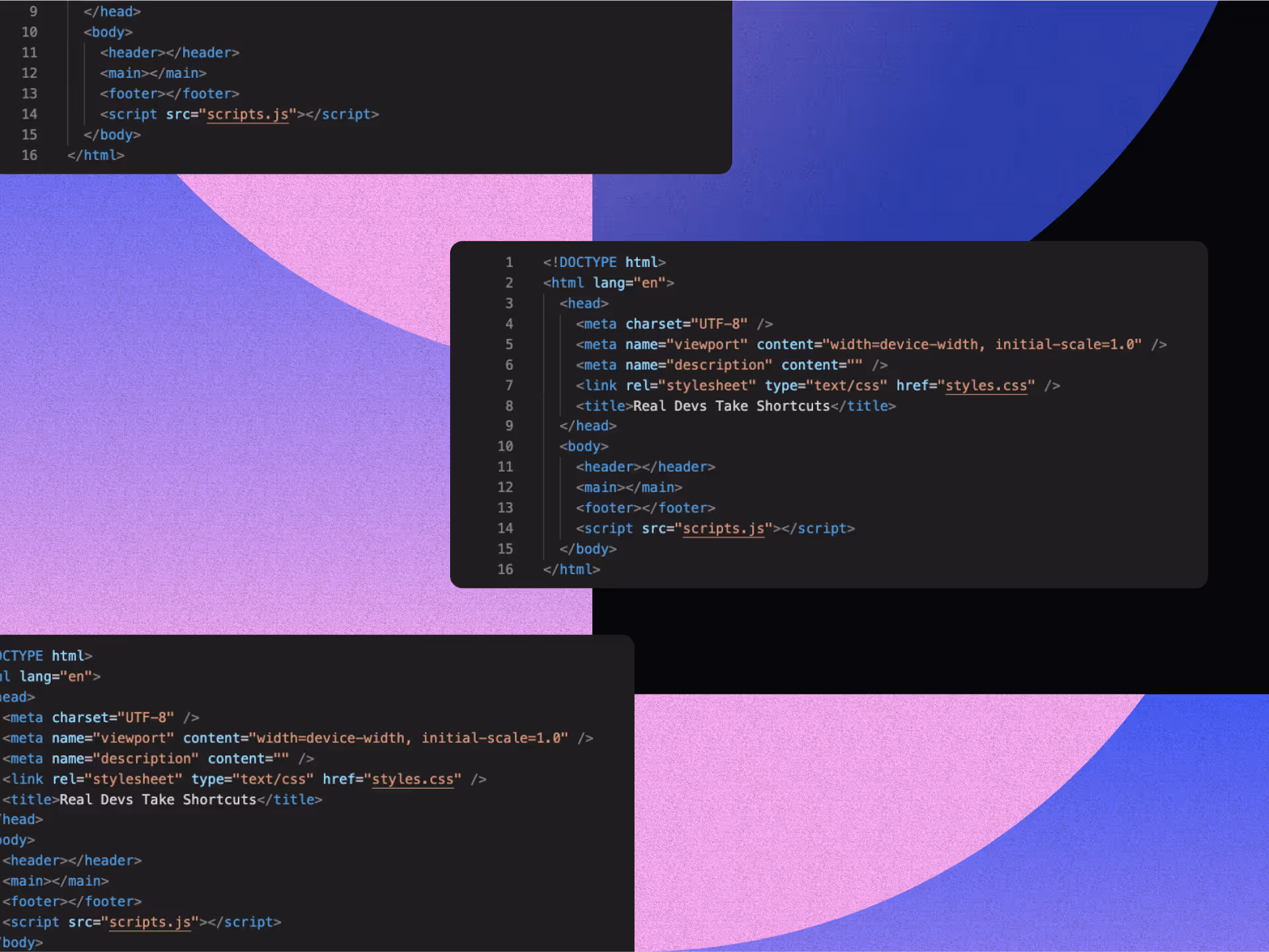
Tired of wrestling with plugins and rigid templates? Making the move to Webflow gives you the creative freedom, cleaner code, and full design control you've been craving. It’s not just a platform switch—it’s a smarter, design-first way to build for the web.
Webflow's visual editor puts unprecedented control in your hands, letting you craft unique, responsive sites without WordPress's typical roadblocks. Why make the leap? Less technical baggage. WordPress sites often create bloated, vulnerable code through excessive plugin use, dragging down performance and raising maintenance costs.
In this article, we’ll break down exactly how to migrate from WordPress to Webflow—and why more designers are making the switch for a faster, smoother, more creative workflow.
Understanding Key Differences Between WordPress and Webflow
Before jumping into migration, understanding the fundamental differences between WordPress and Webflow helps set realistic expectations. These platforms follow distinctly different philosophies when it comes to website creation and management.
Visual-First Approach vs. Plugin Architecture
Webflow stands out with its visual-first approach to web design. It provides a Photoshop-style interface that allows designers to create unique layouts without relying heavily on pre-built templates or themes. This interface generates clean, semantic HTML, CSS, and JavaScript code, ensuring performance and scalability without unnecessary code bloat.
WordPress, on the other hand, relies heavily on themes and plugins for design capabilities. While it offers thousands of pre-designed themes, customization beyond the theme's constraints often requires coding knowledge. This reliance on plugins can lead to code bloat and slower performance, affecting user experience and search engine rankings. Furthermore, integrating advanced features or embracing innovative trends such as AI in design can be challenging within WordPress's architecture.
Design Freedom and Customization
Webflow's drag-and-drop editor offers granular design customization capabilities. Its responsive design tools prioritize pixel-perfect layouts across devices, including custom breakpoints and previews for various screen sizes. Built-in animation tools allow for advanced interactions and motion effects, making it easier to craft immersive user experiences without additional plugins.
Staying ahead of emerging design trends is also more straightforward with Webflow, as its platform supports the latest in web design innovations such as micro-interactions and advanced typography design. Webflow also facilitates accessible web design, helping you create sites that are inclusive and comply with accessibility standards. Additionally, Webflow's flexibility supports stronger brand positioning strategies, allowing your website to better reflect your brand's unique identity.
In contrast, WordPress users often turn to page builders to achieve similar levels of customization. However, these add-ons can further contribute to bloated code and slower performance. Mobile responsiveness in WordPress depends largely on the selected theme and may require additional manual configuration for optimization.
Content Management and Collaboration
Webflow offers a "composable CMS" tailored for visual content creation and management. This empowers non-technical users like marketers and designers to edit content directly on the canvas. Integrated features like built-in SEO tools and streamlined workflows reduce reliance on third-party plugins, simplifying content updates and site optimizations.
Moreover, Webflow's CMS facilitates effective website copywriting by allowing content creators to see exactly how their text will appear on the live site as they edit. While WordPress is scalable for content-heavy sites like blogs and news portals, it lacks modern CMS features such as visual editing and flexible data modeling. WordPress's document locking and rudimentary revision system make team collaboration less efficient compared to Webflow's more integrated approach.
Essential WordPress to Webflow Pre-Migration Considerations
Before starting your WordPress to Webflow migration, proper planning lays the groundwork for a smooth transition. Taking time to evaluate your current site and set clear objectives will help you avoid common pitfalls and ensure your new Webflow site meets your business needs.
Assessing Your Current WordPress Site
Begin with a comprehensive audit of your WordPress website. Create a detailed content inventory cataloging all your pages, posts, custom post types, and media files. Document any custom functionality that your current plugins provide, determining which features are essential and need to be replicated in Webflow. Assessing your current WordPress site also involves understanding your web design costs, so you can plan your budget effectively for the migration.
Take stock of your images, videos, and other media assets, as Webflow handles media differently than WordPress. Organize these files before migration to streamline the process. Document your current URL structure, metadata, and any SEO optimizations you've implemented to preserve your search engine rankings during the transition.
Setting Clear Goals for Your New Webflow Site
Define your objectives for the new Webflow site with specificity. Outline your vision for the new site's aesthetics and user experience, considering how Webflow's design capabilities may allow for enhancements that weren't possible in WordPress. Consider incorporating effective branding strategies to reinforce your brand identity throughout your new site. List the essential features your new site must have, exploring how Webflow's native features or integrations can replace your current WordPress plugins.
Set specific goals for site speed, mobile responsiveness, and other performance metrics. Webflow often provides performance improvements over WordPress, so aim high with your targets. Define your SEO strategy for the new site, including plans for maintaining current rankings and improving visibility in search results.
Creating a Realistic Migration Timeline
Break down the migration process into manageable phases, such as content export, design implementation, and data import. Determine who will handle each aspect of the migration, whether it's your internal team or external experts. Allow ample time for thorough testing of the new Webflow site before going live, including cross-browser and device compatibility checks.
Plan for any necessary downtime during the final stages of migration, aiming to minimize disruption to your users. Include a monitoring period after launch for analyzing performance and making necessary adjustments. Remember to back up your WordPress site before beginning any migration steps, creating a safety net in case of unexpected issues.
The Four-Phase Migration Process
Moving from WordPress to Webflow requires careful execution across several stages. This methodical approach ensures your content transfers accurately while taking advantage of Webflow's enhanced design capabilities.
1. Exporting Content from WordPress
Start by creating a full backup of your WordPress site before any export process begins. This precaution ensures you have a fallback option if issues arise during migration. Use appropriate export tools to create customizable CSV files compatible with Webflow, allowing you to select specific post types, pages, and custom content for export.
Export your content in separate CSV files for different content types such as blog posts, pages, and products. Include all relevant fields like title, content, publication date, author, categories, tags, and custom fields. Remember that WordPress doesn't include media files in exports, so you'll need to manually download your media library from the wp-content/uploads directory and organize these files locally before uploading to Webflow.
2. Importing Content into Webflow
Before importing, set up Collections in Webflow that correspond to your WordPress content types. For example, create a "Blog Posts" collection with fields matching your WordPress post structure. Review your exported CSV files to ensure data consistency and remove any unnecessary information. Webflow's importer requires properly formatted data, so clean your CSV files thoroughly.
Navigate to your Webflow project's CMS panel and use the import feature to upload your CSV files. During this process, map WordPress fields to their Webflow equivalents, connecting data points like post titles, content, featured images, and categories to the appropriate fields in Webflow. For custom fields or metadata from WordPress, create corresponding Custom Fields in your Webflow Collections and import this data separately if necessary.
3. Redesigning Your Site in Webflow
Decide whether to start with a Webflow template or build a custom design from scratch based on your needs and resources. Templates speed up the process, while custom designs offer more flexibility. Use Webflow's visual editor to rebuild your site's layout and navigation, focusing on creating a responsive design that works well across all devices.
Take advantage of Webflow's advanced design features to enhance your site's visual appeal and functionality. This includes creating custom animations and interactions, implementing responsive layouts with flexbox and grid, and setting up dynamic content display using CMS collections.
Utilize the platform's capabilities to showcase the data visualization evolution in your industry, providing interactive and informative visual elements that engage users. Optimize your site for performance by using responsive images, minified CSS and JavaScript, and Webflow's global CDN for fast content delivery.
4. Recreating Functionality and Features
For features previously handled by WordPress plugins, explore Webflow's native capabilities or compatible third-party integrations. Forms can be built using Webflow's form builder or integrated with external form services.
E-commerce functionality can be implemented through Webflow E-commerce or integrations with other platforms. SEO optimization can leverage Webflow's built-in SEO settings and custom meta fields.
Recreate any custom functionality your WordPress site relied on, adapting your approach to Webflow's architecture. This might involve using Webflow's interactions to replace certain plugins or finding alternative solutions for specific features.
Remember that migration presents an opportunity to not just replicate your existing site, but to enhance its design and functionality for a better user experience.
Migrating From WordPress to Webflow: Critical SEO Preservation Strategies
Maintaining your SEO rankings during migration requires deliberate attention to search engine factors. With proper planning, you can preserve and even improve your search visibility while transitioning to Webflow.
Implementing Proper 301 Redirects
301 redirects serve as signposts telling search engines and users that a page has permanently moved to a new location. They pass along most of the SEO value from the old URL to the new one, helping maintain your search rankings.
Start by creating a comprehensive mapping document that pairs each old WordPress URL with its corresponding new Webflow URL.
After generating your redirect mappings, implement them in Webflow through the Project Settings > Hosting > 301 Redirects section. Upload your URL mapping document to automatically create the necessary redirects.
Test each redirect thoroughly to ensure they function correctly and that no pages return 404 errors, as broken links can negatively impact user experience and search rankings.
Preserving Metadata and Search Signals
Export your existing SEO metadata from WordPress, including title tags, meta descriptions, and custom fields that influence search performance. Utilize Webflow's CMS import functionality to bulk upload metadata for dynamic content like blog posts, ensuring this valuable SEO information transfers correctly.
For static pages, manually transfer the metadata using Webflow's on-page SEO settings. Employing effective SEO strategies during this process is crucial to maintain and improve your site's visibility.
Take advantage of Webflow's built-in SEO tools to refine your metadata further after import. Customize title tags and meta descriptions for each page, set up canonical tags to prevent duplicate content issues, and configure Open Graph metadata for improved social sharing.
Maintain your heading hierarchy (H1, H2, etc.) during migration to preserve important on-page SEO signals that search engines use to understand content structure.
Post-Migration SEO Monitoring
After completing the initial migration, generate a new sitemap.xml in Webflow and submit it to Google Search Console to ensure quick indexing of your new site structure. This helps search engines discover and catalog your content efficiently.
Use Google Search Console and analytics tools to track your site's performance immediately after migration, watching for any unusual fluctuations in traffic or rankings.
Leverage Webflow's built-in Content Delivery Network (CDN) and optimize media file sizes to enhance site speed, a crucial ranking factor that influences both user experience and search placement.
Avoid making drastic content or structural changes immediately after migration, as incremental changes allow search engines to reindex URLs and adjust rankings more smoothly, minimizing potential traffic losses.
WordPress to Webflow: Essential Post-Launch Optimization Techniques
After successfully migrating to Webflow, ongoing optimization ensures your site continues to perform at its best. These strategies help refine your new site and maximize its potential.
Comprehensive Testing and Quality Assurance
Conduct thorough testing across multiple browsers and devices before and after launch. Create a detailed checklist covering all aspects of your site's functionality, content accuracy, and design consistency. Verify that all interactive elements, forms, and integrations work as expected in different environments. Check that all migrated content appears correctly and maintains proper formatting.
Examine your site's design consistency across different screen sizes to ensure a seamless responsive experience. Confirm that metadata, alt tags, and other SEO components have been transferred correctly and function as intended. Use performance testing tools to assess and optimize your site's load times, as speed significantly impacts both user experience and search rankings.
Performance Monitoring and Enhancement
Use Webflow's built-in analytics alongside other monitoring tools to track site traffic, user behavior, and performance metrics. This data helps identify areas for improvement and measure the success of your migration. Monitor key performance indicators like page load times, bounce rates, and conversion metrics to spot potential issues quickly.
Optimize your media files and leverage Webflow's CDN capabilities to enhance site speed. Compress images appropriately, use modern formats like WebP where supported, and implement lazy loading for media-heavy pages. Regularly check for any broken links or functionality issues that might emerge over time, addressing them promptly to maintain site integrity.
Content Refinement and Expansion
Review your migrated content to identify opportunities for enhancement or restructuring based on Webflow's capabilities. Update outdated information and improve content quality where needed.
Develop a consistent content update schedule to keep your site fresh and relevant for both users and search engines. Focusing on enhancing brand awareness through your content can also amplify your reach and engagement.
Take advantage of Webflow's design flexibility to present your content more effectively. Consider how you might enhance readability through typography changes, add visual elements to illustrate concepts, or improve content flow through better layouts.
Regularly update your content calendar with fresh material that addresses your audience's evolving needs and interests.
User Experience Optimization
Collect user feedback about your new Webflow site through surveys, analytics, and direct communication. Use this information to identify pain points or areas for improvement in the user experience. Track user journeys through your site to detect any navigation issues or confusing elements that might benefit from redesign.
Make data-driven adjustments to your site based on user behavior patterns, focusing on improvements that enhance engagement and conversion rates.
Test variations of key pages to determine which designs or layouts perform better with your audience. Continuously refine your site's usability based on real-world usage data rather than assumptions.
Unlocking New Possibilities
Switching from WordPress to Webflow unlocks greater design freedom, improved performance, and simplified maintenance. With Webflow, you gain full control over your site's design, reducing the need for excessive plugins and streamlining the process. This transition may require some preparation, but the outcome is a faster, more secure, and visually stunning website that reflects your brand’s identity.
Migrating to Webflow isn’t just a platform switch—it’s an opportunity to elevate your brand’s online presence and prepare for future growth.
At NoBoring Design, we help businesses craft impactful brand experiences that resonate and create lasting connections. Let’s discover how we can bring your vision to life—book a meeting with us today!
Key Takeaways
- Webflow offers superior design freedom and control compared to WordPress's plugin-dependent architecture
- The visual-first approach eliminates code bloat while maintaining better site performance
- Migration requires careful planning for content transfer and SEO preservation
- Post-migration optimization enhances your site's performance and user experience
FAQs
Why should I switch from WordPress to Webflow?
Switching from WordPress to Webflow offers enhanced design flexibility, cleaner code, and reduced reliance on plugins. Webflow's visual editor empowers designers to create fully custom, responsive layouts without sacrificing performance. Unlike WordPress, which often becomes bloated from third-party plugins and themes, Webflow generates optimized code and integrates essential features natively. This results in faster load times, improved SEO, and a streamlined maintenance experience. For businesses focused on brand identity, Webflow also supports advanced animations, accessibility compliance, and modern UI trends, making it ideal for those wanting to elevate their digital presence with minimal technical hassle.
What are the steps to migrate a WordPress site to Webflow?
Migrating from WordPress to Webflow involves four key phases: exporting content from WordPress, importing it into Webflow’s CMS, redesigning your site using Webflow’s visual editor, and recreating site functionality using Webflow tools or third-party integrations. It’s essential to back up your WordPress site and audit your existing content, media, and SEO metadata. After importing, redesign your layout in Webflow to take advantage of its responsive and animation features. Recreate essential site features—like forms or e-commerce—using native tools or integrations. Finally, implement redirects and optimize for SEO to maintain rankings during and after the transition.
How can I preserve SEO rankings during the migration?
To preserve SEO rankings when moving from WordPress to Webflow, implement 301 redirects to maintain link equity and prevent broken URLs. Export and import metadata like title tags, descriptions, and alt text into Webflow’s SEO fields. Maintain consistent heading structures and URL paths where possible. After migration, generate and submit a new sitemap to Google Search Console for proper indexing. Monitor rankings and traffic closely with analytics tools. Avoid major structural changes immediately post-launch; instead, make incremental updates. These best practices ensure you retain search visibility and can even boost performance with Webflow’s faster load times and cleaner code.
What functionality might I lose or gain by switching to Webflow?
When switching to Webflow, you may lose access to certain WordPress plugins but gain a cleaner, more efficient platform with built-in features. Webflow includes visual CMS editing, responsive design tools, advanced animations, and integrated SEO controls—all without requiring external plugins. While WordPress supports extensive plugin-based customization, it often leads to bloated code and higher maintenance. Webflow, in contrast, emphasizes performance and control. For complex features like memberships or advanced e-commerce, Webflow may require third-party integrations. However, the trade-off is a more intuitive, design-first experience that empowers marketers and designers without relying on developers for routine updates.

In tech, a logo isn’t just a symbol—it’s a signal. Before someone signs up, downloads, or dives deeper, they encounter your logo. In that split-second interaction, perception is shaped. Trust is built—or lost.
Great tech logos do more than stand out. They scale across devices, flex with the brand, and capture complex ideas in a glance. Whether through bold simplicity, clever symbolism, or distinctive color, these marks distill a company’s essence into a visual identity that’s both strategic and emotional.
From iconic symbols to groundbreaking designs, the best tech logos exemplify how brilliant visual identities can tell your innovation story, showcase technical prowess, and communicate commitment to progress at a glance.
Ready to discover the visual magic that powers tech branding? This article unwraps what makes tech logos resonate, examines ten stellar examples, and offers practical insights for creating head-turning identities that capture innovation's essence.
1. Apple: Simplicity As Ultimate Sophistication
Apple’s logo stands as a masterclass in minimalist design, demonstrating how simplicity can forge an enduring brand identity. Its evolution from a detailed illustration of Isaac Newton to the iconic bitten apple reflects a deliberate shift toward clarity and universality.
The final design—a sleek, monochrome silhouette with a single bite—achieves instant recognition while symbolizing knowledge, innovation, and accessibility. This pared-down aesthetic ensures the logo performs flawlessly across mediums, from tiny app icons to towering billboards, proving that restraint can amplify impact.
The genius lies in its subtle details. The bite mark serves dual purposes: it prevents confusion with generic fruit imagery and injects playful intrigue into an otherwise straightforward shape. This small modification transforms the apple from a mundane object into a distinct emblem, embodying Apple’s philosophy of blending creativity with practicality.
The logo’s adaptability further cements its brilliance, seamlessly transitioning from rainbow stripes in the 1970s to today’s sleek metallic finishes, all while retaining its core identity.
Ultimately, the logo succeeds by mirroring Apple’s design ethos. Its clean lines and lack of ornamentation echo the brand’s commitment to user-friendly innovation, where form follows function. Unlike logos that rely on trends or text, Apple’s mark communicates elegance and ingenuity through pure visual language. It transcends cultural and linguistic barriers, acting as a universal shorthand for cutting-edge technology and thoughtful design—qualities that solidify its place among the world’s most iconic brand symbols.
2. Google: Playful Professionalism in Perfect Balance
Google’s logo is a masterful example of design that balances playfulness with professionalism. Its vibrant primary colors showcase diversity and approachability while maintaining a sense of authority. The sans-serif typeface introduced in 2015 was a game-changer, enabling the logo to scale seamlessly across platforms—from tiny mobile screens to massive billboards—while maintaining clarity and simplicity.
What sets Google’s logo apart is its ability to remain consistent across all its variations. Whether it appears as the full wordmark, the multicolored "G" icon, or animated Doodles celebrating cultural moments, the core identity is instantly recognizable. This flexibility allows Google to express creativity without losing its professional edge, making it one of the most versatile logos in the world.
The color sequence—blue, red, yellow, blue, green, red—adds a rhythmic visual flow that sticks in our minds. These colors weren’t chosen randomly; they reflect Google’s willingness to break from tradition while still creating harmony. This thoughtful approach mirrors Google’s philosophy of blending innovation with accessibility, making its logo a symbol of simplicity that resonates universally.
3. Stripe: Minimalism With Maximum Impact
Stripe’s logo perfectly captures the essence of its brand—simple, efficient, and trustworthy. The clean wordmark with its pristine typography reflects the company’s focus on removing friction from payment processing. Subtle details like the rounded terminals and balanced letter spacing add a touch of approachability while maintaining professionalism, a balance that many fintech companies strive to achieve.
What makes Stripe’s logo stand out is its adaptability. Whether it’s animated on their website or static on marketing materials, the logo seamlessly fits any context. This flexibility reflects Stripe’s innovative and forward-thinking nature, ensuring the brand remains recognizable across platforms and mediums.
The monochromatic design enhances its versatility, allowing other brand elements—like colorful gradients or animations—to shine when appropriate. This thoughtful approach ensures that Stripe’s visual identity remains consistent yet dynamic, embodying the company’s mission to simplify online payments with elegance and precision.
4. Slack: Communication Captured in Color and Form
Slack’s logo is a standout example of thoughtful modern branding. Its vibrant color palette and distinctive octothorpe symbol reflect the platform’s focus on communication and collaboration. The redesign streamlined these elements into a more versatile and scalable form while retaining the playful yet professional character that defines Slack’s identity.
The four colors—blue, green, yellow, and red—create a sense of energy and diversity that aligns with Slack’s role as a tool for connecting teams. While not explicitly tied to specific communication channels, this colorful approach reinforces the brand’s emphasis on inclusivity and creativity.
What makes Slack’s logo particularly effective is its adaptability. Whether displayed in full color, monochrome, or scaled down to fit small screens, it remains instantly recognizable. The geometric precision of the octothorpe ensures clarity in every format, while the simplified design respects user attachment to the original logo by refining rather than reinventing its core concept.
5. Netflix: The Power of Visual Rhythm
Netflix’s logo is a masterclass in how typography alone can create powerful brand recognition. Its bold red wordmark reflects excitement and passion for entertainment, while the clean, connected letterforms suggest seamless storytelling, perfectly aligned with the streaming service’s mission. The ribbon-like "N" icon introduced in 2016 adds depth and adaptability, working beautifully as an app icon or social media avatar while maintaining instant connection to the full wordmark.
What sets Netflix’s logo apart is its versatility across platforms. Whether scaled down for mobile screens or displayed prominently on billboards, the design remains crisp and recognizable. The dimensional aspect of the "N" subtly nods to cinema spotlights and projection, honoring film heritage while embracing modern digital aesthetics. This balance positions Netflix at the intersection of Hollywood tradition and Silicon Valley innovation.
Rather than relying on traditional luxury signifiers like gold or serif fonts, Netflix uses bold simplicity to convey confidence and premium quality. This approach has helped transform streaming from a tech novelty into the primary way many people consume entertainment today. The logo’s thoughtful design choices ensure it resonates with audiences worldwide while staying true to Netflix’s core values of accessibility and innovation.
6. Amazon: The Smile That Speaks Volumes
Amazon’s logo is a brilliant example of how design can communicate a brand’s mission with simplicity. The yellow curve, which doubles as both a smile and an arrow connecting "A" to "Z," represents Amazon’s commitment to offering everything customers need while ensuring their satisfaction. This clever element captures the essence of Amazon’s promise: delivering happiness through convenience and variety.
What sets the logo apart is its versatility. Whether displayed on a tiny app icon or stretched across warehouse signage, the design remains clear and recognizable. The bold black wordmark paired with the warm yellow-orange smile creates a balance between professionalism and approachability, helping Amazon maintain trust despite its massive scale.
The logo also honors Amazon’s focus on efficiency and innovation. The arrow suggests movement and progress, symbolizing the seamless journey from order placement to delivery. By packing so much meaning into a simple design, Amazon has created an iconic visual identity that resonates with customers worldwide.
7. Twitter (X): Evolution That Maintains Recognition
Twitter’s rebranding to "X" marks a bold new chapter in its visual identity. The original blue bird logo perfectly captured the platform’s essence—quick, light communication soaring through digital space. Its proportions and upward orientation conveyed optimism and openness, qualities central to Twitter’s mission of connecting people globally.
The transition to the X logo represents a dramatic reinvention of the brand. While some users view this as a loss of familiarity, others see it as a reflection of Musk’s ambition to transform Twitter into an all-encompassing "everything app." The geometric simplicity of the X design ensures adaptability across platforms, maintaining scalability from mobile icons to large-scale branding applications.
Twitter’s logo journey demonstrates how visual identities can evolve alongside a company’s mission. From the detailed blue bird to the minimalist X, each iteration reflects a shift in focus—from fostering communication to embracing bold innovation. Whether this change strengthens user connection or challenges brand loyalty remains an ongoing conversation in the design world.
8. Airbnb: Human Connection Through Geometric Elegance
Airbnb’s 2014 logo transformation introduced the "Bélo," a symbol that brilliantly encapsulates belonging through a blend of four elements: a person, a location pin, a heart, and the letter "A." Its continuous, mathematically precise curves balance structure with warmth, mirroring Airbnb’s fusion of technology and human connection.
The logo’s universal design avoids culturally specific references, enabling it to resonate globally. Combined with the bespoke coral-red hue ("Rausch"), named after the street where Airbnb was founded, it stands apart from conventional tech branding by emphasizing hospitality over transactional coldness.
This thoughtful approach has made the Bélo a masterclass in global branding. Its simplicity allows for endless customization by users, fostering community ownership while maintaining consistent recognition—a key factor in Airbnb’s worldwide success.
9. Spotify: Soundwaves in Visual Form
Spotify’s logo is a brilliant translation of audio experience into visual form. The three curved lines within the green circle symbolize sound waves emanating from a source, perfectly capturing the essence of streaming music. This simple yet evocative design communicates Spotify’s core service instantly, even without the accompanying wordmark.
The vibrant green color distinguishes Spotify in the crowded tech landscape. This hue has become synonymous with the brand, symbolizing growth and creativity while evoking feelings of energy and freshness. Its unique color choice ensures strong brand recognition globally, making Spotify’s logo an iconic representation of musical freedom.
What truly elevates Spotify’s logo is its versatility. The circular icon works seamlessly as an app button on mobile devices while maintaining clarity and recognition at larger scales like billboards or advertisements. Combined with Spotify’s duotone imagery and clean typography, the logo serves as the cornerstone of a cohesive visual identity system that resonates with audiences worldwide.
10. Tesla: Symbolism That Drives Innovation
Tesla’s logo may appear simple at first glance—a sleek "T" symbolizing the company name—but it holds deeper meaning. The shape represents a cross-section of an electric motor, directly tying the visual identity to Tesla’s groundbreaking technology. This clever design choice reflects Tesla’s commitment to purposeful innovation, where every detail serves a function.
Unlike traditional automotive logos that rely on shields or animals, Tesla’s clean and futuristic emblem signals a break from convention. Its minimalism conveys confidence and precision without needing elaborate decoration, perfectly aligned with the company’s mission to reinvent transportation and energy solutions.
The logo’s balance of sharp angles and smooth curves creates visual tension that holds attention. The pointed upper section suggests forward movement and innovation, while the rounded lower curves add approachability—a duality that mirrors Tesla’s role as both a cutting-edge technology leader and a consumer-focused brand. This thoughtful design has made Tesla’s logo an iconic representation of sustainability, progress, and modernity.
What Makes a Tech Logo Stand Out?
Tech logos operate under intense pressure. They must perform at tiny scales, stand out in crowded app stores, and still evoke trust, innovation, and personality—all without saying a word. The best logos in tech succeed not just because they’re aesthetically pleasing, but because they’re built on strong conceptual foundations that align tightly with brand purpose.
What sets these logos apart is their strategic clarity. Apple’s minimalist bite, Google’s rhythmic color play, and Amazon’s smiling arrow aren’t just decorative—they each distill complex brand values into a visual shorthand. These marks communicate ideas like accessibility, delight, scale, and technical excellence in a glance.
Another standout trait? Flexibility. Whether animated, reduced to an icon, or expanded for print, these logos hold up. They work across contexts and cultures, scaling without losing meaning.
They also tell a story. Airbnb’s symbol, for instance, layers community, location, and love into one seamless shape. Tesla’s “T” subtly reflects the company’s tech roots. Every detail—from color choice to geometry—is intentional.
Ultimately, these logos endure because they make the abstract tangible. They embody ideas we associate with innovation: clarity, movement, simplicity, and connection. In a time where attention is scarce and impressions are instant, the strongest logos do more than identify—they communicate.
The Visual Language of Technology
Great tech logos go beyond mere identification—they become brand ambassadors that instantly communicate a company's mission. Through ten standout examples, we see how successful logos balance simplicity with distinctiveness while aligning with brand values.
Thoughtful color choices and shapes play a key role in shaping brand perception—like Apple's minimalism and Spotify's vibrant sound waves, which communicate personality at a glance. The best logos are adaptable, performing seamlessly across devices without losing recognition or core identity.
When your tech brand needs a logo that captures innovation and resonates with your audience, keep these principles in mind. Your logo is more than just a visual—it's your most powerful brand ambassador.
Ready to create a tech logo that doesn't just exist but excels? At NoBoring Design, we transform complex tech concepts into compelling visual stories. Let us help your brand make an unforgettable first impression.
Key Takeaways
- The most successful tech logos balance simplicity with distinctiveness while maintaining perfect alignment with brand values
- Color psychology and thoughtful shape selection dramatically impact how audiences perceive and remember tech brands
- Great tech logos perform beautifully across all platforms while maintaining their core identity and recognition value
- The ten logos featured demonstrate how visual storytelling can communicate complex brand promises in a single, memorable mark
FAQs
- What makes a tech logo the best?
The best tech logos go beyond looking good—they tell a brand’s story in a single glance. They combine simplicity, originality, and strategic intent to communicate innovation, trust, and personality. A top-tier tech logo scales flawlessly across devices, works in any format, and holds meaning without needing explanation. Think of Apple’s iconic bite or Amazon’s smiling arrow—each element serves a purpose. The best logos also spark emotional connection and cultural relevance, helping brands cut through noise and build recognition. In the digital world, where attention is short, the best logos make a lasting impression instantly.
- Why is scalability important in tech logo design?
Scalability ensures a tech logo maintains clarity and recognition across all touchpoints—from tiny app icons to large-format advertising. Since users engage with tech brands across multiple devices, a logo must be flexible enough to look great at any size. Logos like Google’s multicolored "G" or Spotify’s circular soundwaves work well because they retain distinctiveness even when minimized. A scalable logo enhances brand consistency and trust, avoiding pixelation or loss of detail that can occur when designs aren’t optimized for responsiveness in digital environments.
- How do colors impact the success of a tech logo?
Color plays a crucial role in how a tech logo is perceived. It shapes brand personality, evokes emotion, and helps with recognition. Google’s vibrant palette signals creativity and accessibility, while Tesla’s monochrome mark conveys sophistication and innovation. Strategic use of color can distinguish a brand in crowded markets and create intuitive associations—green for growth, red for energy, blue for trust. The right color choices don’t just look good—they reinforce brand values and help the logo resonate with global audiences across cultures and platforms.
- Can minimalism still communicate a strong brand message?
Yes—minimalism often strengthens a tech logo’s impact. Stripped of unnecessary elements, minimalist logos deliver clear, immediate meaning. Apple’s sleek silhouette or Stripe’s clean wordmark proves that simplicity can speak volumes. Minimalist design makes logos more versatile, timeless, and easier to remember. It also reflects the broader tech ethos of streamlined, user-focused experiences. When done thoughtfully, minimalist logos don’t sacrifice depth—they distill it, communicating a brand’s innovation, clarity, and confidence without relying on excessive detail or text.


.avif)

.avif)
.avif)
.avif)

