
.svg)

The Complete Guide to Creating A Memorable Facebook Event

A Facebook Event is a built-in marketing tool that lives right where your audience already scrolls, chats, and clicks. It lets you turn a date on the calendar into a full-blown experience, with space for visuals, updates, reminders, and community interaction. Whether you're hosting in-person or online, it's one of the easiest and most effective ways to rally interest and attendance.
Why does it matter? Because visibility equals engagement. A well-created Facebook Event boosts discoverability, keeps your event top-of-mind with automated reminders, and makes it easy for attendees to share the news with others.
In this article, we’ll walk you through how to create Facebook Events that are memorable and perform well. From setting the tone with the right visuals to optimizing for engagement and reach, consider this to be your step-by-step playbook for making an impact that lasts well beyond the RSVP.
The 5 Must-Haves To Create A Facebook Event People Actually Want to Attend
Most Facebook events get ignored because they’re rushed, vague, or forgettable. If you want people to actually show up, you need to treat your event like a product launch: clear, polished, and built for engagement. To achieve this, certain essential elements must be in play. These elements are the baseline for earning attention, building credibility, and making it easy for someone to say yes.
When creating a Facebook event that converts, certain fundamental elements serve as the foundation for all your promotional efforts. Getting these basics right signals professionalism and reliability to potential attendees.
1. Write a Clear and Clickable Title
Your title needs to be attention-grabbing, descriptive, and searchable. Aim for a title that balances SEO-friendly keywords with human appeal. For example, instead of "Annual Company Gathering," try "TechCo's 2025 Innovation Summit: Shaping the Future of AI."
Your event title is your first impression. It needs to captivate and compel action while striking a balance between clarity and intrigue. Try the action word + unique value + event type formula: "Master Data Science: Interactive Workshop with Industry Leaders." Or use the exclusive descriptor + topic + format approach: "Insider's Guide to Crypto: Live Q&A with Industry Experts."
Employing brand positioning strategies helps your event stand out from the crowd. Test your titles by asking, “Would I stop scrolling for this?” Ensure your title sets the right expectations, and that your event meets them. Nothing damages trust more than a spectacular headline followed by a forgettable experience.
2. Cover the When and Where (Without Making People Hunt)
Include the day of the week, date, start time, and end time. For multi-day events, clearly state the whole duration. Nothing frustrates potential attendees more than having to hunt for basic timing information.
For physical events, include the venue name, address, and any relevant parking or transportation details. For virtual events, specify the platform and how attendees will access it. Vague location information makes even the most exciting event seem disorganized.
3. Write a Description That Sells the Experience
Your event description should include a brief overview of what attendees can expect, key speakers or highlights, the value proposition, any special features, and ticket information. This is where you sell the experience, not just the logistics.
Open with a compelling statement or question that communicates the value of attending. Make them feel what they’ll miss out on if they don’t join. Highlight standout features, world-class speakers, interactive sessions, and exclusive takeaways, and use formatting to keep the content scannable, especially for mobile users.
Let your brand’s personality come through. If you’re quirky, lean into it. If you’re buttoned-up and sleek, reflect that. Create urgency without being pushy: “Early bird tickets available until Friday” is far more effective than all-caps hype. End with a clear next step, so your audience knows what to do and why they shouldn’t wait.
4. Choose the Right Privacy Settings
Determine whether your event should be public, private, or invite-only, taking into account your goals and target audience. Each option creates a distinct perception and attracts a different type of attendee.
The technical aspects of your Facebook event significantly affect its discoverability and reach. Public events are discoverable by anyone on Facebook and can be shared widely. Private events are only visible to guests, creating a sense of exclusivity. Select options based on your event's goals and target audience.
5. Optimize Setup for Discoverability and Conversion
Select the most specific categories that fit your event to improve discoverability. Facebook's algorithm uses categories to suggest relevant events to users. Update categories if your event evolves during the planning process.
Use Facebook's recognized venue locations when possible to improve discoverability in location-based searches. This also provides attendees with directions and additional venue information, eliminating the need for extra effort on your part.
Partner with complementary brands or influencers as co-hosts to expand your event's reach and audience. This can significantly increase visibility to new audiences and add credibility to your event through association. Avoiding common branding mistakes is crucial during your event setup to maintain professionalism and trust.
If selling tickets, integrate with Facebook's ticketing partners for a seamless purchase experience. This reduces friction in the conversion process, making it easier for people to commit to attending.
Why Smart Design Makes or Breaks Your Facebook Event
To be honest, poor design doesn't just make your event look unprofessional, it actively convinces people your event isn't worth their time before they even read your description. Every visual choice, from your cover photo to promotional graphics, either builds credibility and excitement or undermines it, and there's no middle ground on a platform where people make split-second decisions. When your design elements work seamlessly with your messaging, they create an experience that transforms casual scrollers into committed attendees.
Make Your Cover Photo Do the Work
Your event's cover photo is often the first visual element people see. To maximize its impact, use the optimal size of 1920 x 1005 pixels with a 16:9 aspect ratio to ensure your image appears crisp on all devices.
Select eye-catching imagery that reflects the tone and purpose of your event rather than generic stock photos. To make your visuals as impactful as possible, consider principles from strategic poster ad design.
Boring visuals = boring event (at least that's what people will assume). Keep the text on the cover image minimal, focusing on essential information such as the event title, date, and location.
Use contrasting colors for text overlays to ensure legibility, especially on mobile devices where most Facebook browsing happens. Consistently integrate your brand's logo, color palette, and fonts to reinforce brand identity and build trust. Utilizing elements like patterns can transform your brand identity. Your visual identity should be as recognizable as your best friend's laugh!
Create Graphic Graphics That Tell Your Story And Build Trust
Beyond the cover photo, develop a suite of visual content that supports your promotional strategy throughout the event timeline. Design graphics that work across different promotional contexts, from Facebook feeds to email campaigns and other social platforms.
Maintain visual consistency with your written voice, whether it's playful, professional, or edgy. Utilizing tools and techniques can help you elevate your brand visually. If your copy is fun and irreverent but your graphics look corporate and stuffy, you're sending mixed signals that confuse potential attendees.
Use graphics to amplify key messages without overwhelming your written content. Consider the power of typography in conveying your brand message. Create visuals that highlight speaker quotes, showcase event highlights, or present key statistics related to your event's theme.
Integrate elements of brand iconography to enhance recognition and appeal. Consider adopting creative approaches to your event design to make a lasting impression and stand out from the crowd.
Consider creating a series of countdown graphics to build anticipation as the event date approaches. Nothing builds excitement quite like seeing "Only 3 days left!" paired with an enticing image of what awaits attendees.
Partner With Design Professionals Who Actually Get Events
Contrary to what you might think, you don't have to figure it out your design solo. Professional designers who understand event marketing know exactly how to translate your vision into visuals that stop the scroll and start conversations, plus they handle all the technical requirements like file sizes and platform-specific dimensions that can make or break how your visuals appear.
The right design partner doesn't just make pretty pictures; they create strategic visual experiences that guide people from curiosity to commitment while you focus on what you do best. Whether you need a complete visual identity for your event or just want to elevate specific pieces, partnering with designers who specialize in event marketing can transform your promotional materials from forgettable to unforgettable.
How To Make Your Facebook Event Buzz Before, During, and After
Most Facebook events die a quiet death with zero engagement and empty seats, while others generate the kind of buzz that makes people genuinely excited to attend. The difference isn't budget or connections, it's treating your event page like the strategic marketing tool it actually is, not just a digital flyer. Your Facebook event becomes your first impression, ongoing conversation starter, and relationship-building platform that transforms casual browsers into committed attendees.
Know What To Say and When To Say It
A well-planned promotional timeline can make the difference between a packed venue and empty seats. Start 3-6 months before the event by creating your Facebook event page with preliminary information. Begin sharing teaser content to build awareness and launch "Save the Date" campaigns to generate early interest.
Two to three months before, increase posting frequency with more detailed event information. Implement early-bird ticket promotions and start engaging with your community through Q&A sessions or polls to gauge interest and gather feedback.
One month before, intensify your messaging with a sense of urgency. Share the finalized agenda and highlight key attractions. Launch retargeting campaigns for users who've shown interest but haven't registered yet.
Two weeks before, focus on last-minute registrations with countdown posts. Share practical information about the event like parking, what to bring, and other logistics. Leverage testimonials from past attendees to build trust and excitement.
During the event, post real-time updates and highlights. Encourage attendees to share their experiences using a specific hashtag. Use Facebook Live to broadcast key moments for those who couldn't attend.
After the event, share highlights and thank attendees. Collect feedback through polls or surveys and begin nurturing the community for future events. This post-event engagement helps maintain momentum and build a loyal following.
Build Recognition That Sticks Through Smart Messaging
Maintaining visual and verbal consistency throughout your promotional period is crucial for building recognition and trust. Develop a visual theme with a cohesive identity that can be adapted across all promotional materials, including a specific color palette, font choices, and graphic elements. Understanding the impact of strategic branding changes can help you maintain consistency.
Establish main themes or messages about your event. Rotate through these themes to maintain consistency while avoiding repetition that could bore your audience. Mix up your content types to keep things interesting—alternate between text posts, images, videos, and interactive content.
Encourage attendees from previous events or early registrants to share their experiences, adding authenticity to your promotion. People trust peer recommendations more than branded messages, so leverage this powerful form of social proof.
Strategically unveil new details about speakers, activities, or special features throughout your timeline to maintain interest. Think of it as a slow, tantalizing reveal that keeps people coming back for more! Develop a unique event hashtag and use it consistently across all promotions, encouraging your audience to use it as well.
Read the Room and Pivot When You Need To
Monitor engagement metrics throughout your promotional period and be prepared to adjust your approach based on what resonates with your audience. Pay attention to which posts generate the most likes, comments, shares, and click-throughs.
If certain content types or messages perform exceptionally well, create more similar content. Conversely, if some approaches fall flat, don't be afraid to pivot. This flexible approach ensures that your promotional efforts remain effective, rather than adhering to a rigid plan that isn't working.
Utilize Facebook's Event Insights to track response rates and attendance commitments. These metrics provide valuable insights into your audience's interests and behaviors, enabling you to refine your messaging for maximum impact.
Tips To Help You Stop Begging for Likes and Start Earning Loyalty
Authentic engagement isn't about tricks, giveaways, or manipulating the algorithm; it's about creating content so genuinely valuable that people can't help but interact with it. When you focus on delivering real value instead of chasing vanity metrics, something powerful happens: your audience stops treating you like just another brand and starts seeing you as a trusted resource they actually want to hear from. The strategies that work best don't feel like strategies at all, they feel like natural conversations between people who share genuine interests and goals.
1. Create Content Worth Sharing Without Asking
Focus on genuine value over explicit sharing requests. Solve real problems, create visually appealing content, offer exclusive behind-the-scenes insights, use compelling storytelling from past attendees, and provide practical resources. When content truly helps your audience, natural sharing follows.
2. Foster Real Connections That Go Beyond the Event Page
Build community through live Q&As, candid behind-the-scenes content, interactive polls for decision-making, user-generated content opportunities, and personalized responses. Make followers feel like insiders and stakeholders by showing the real people behind your event and actively engaging with comments.
3. Keep the Energy Alive Long After the Last Guest Leaves
Maintain post-event momentum with highlight reels, surveys, discussion threads, and personalized thank-you messages. Create recap content showcasing attendee participation while teasing future events. This converts non-attendees for next time and strengthens relationships for ongoing collaboration.
Turn Your Next Facebook Event Into the One Everyone's Talking About
Creating impactful Facebook events requires a strategic blend of compelling content, thoughtful design, and active engagement. The most successful events seamlessly blend professional presentation with authentic connection, creating experiences that begin the moment someone discovers your event online and continue long after they leave.
When you approach event creation as both a writing and design challenge, everything shifts. You're not just announcing details, you're creating complete experiences that begin the moment someone sees your event in their feed and continue long after the last attendee heads home. Your next event could become a defining moment for your brand, creating buzz, engagement, and lasting connections.
Don't let boring visuals convince people your event isn't worth their time, NoBoring Design creates scroll-stopping Facebook event graphics and social media assets that turn casual browsers into committed attendees. Partner with us today!
Key Takeaways
- Successful Facebook events combine compelling copy with strategic design elements to create a complete experience. Together, they guide people from curiosity to commitment.
- Timing your promotional content correctly helps build momentum and maintain interest. Get the timing wrong, and even great events can struggle to fill seats.
- Authentic engagement strategies drive organic sharing and community building. Real value creates natural advocates who share because they want to, not because you asked.
- Visual consistency across all event materials strengthens recognition and trust. Cohesive branding passes the crucial first-impression test that determines whether people take you seriously.

Creating a presentation that captivates audiences isn't just about pretty slides—it's about strategic planning and purposeful design. When you step in front of your audience, your presentation deck becomes a visual extension of your message, a carefully orchestrated blend of content and aesthetics that guides viewers through your story.
The difference between forgettable presentations and memorable ones often comes down to thoughtful objectives, audience understanding, and design principles that enhance rather than distract from your core message.
In this article, we’ll walk you through how to set clear goals, tailor your message to your audience, and design with intention—so your next presentation doesn’t just inform, it inspires.
Understanding the Purpose and Audience of Your Presentation
Every effective presentation begins with two fundamental questions: what do you want to achieve, and who will be sitting before you? These considerations form the backbone of your entire presentation strategy.
Defining Your Presentation Purpose
Your presentation's purpose acts as the north star guiding all content and design decisions. Are you aiming to inform your team about quarterly results? Persuade potential clients to choose your services? Motivate employees during challenging times? Each objective demands a different approach.
Client pitches should focus on solving specific problems with clear outcomes. Educational workshops need practical insights that participants can implement. Investor meetings require concise problem statements paired with compelling opportunities. When you align every slide with your core purpose, your presentation maintains focus and increases the likelihood of achieving your desired outcome.
Getting to Know Your Audience
The most beautifully designed presentation will fall flat if it doesn't connect with your specific audience. Consider factors like professional experience, knowledge level, and what motivates your listeners. This information helps you craft content that resonates on a personal level.
Tailoring your presentation to your audience creates an immediate connection. Personalizing content within your presentation can immediately improve engagement, as tailored messages are more likely to resonate with your audience's specific needs and concerns.
Gather insights about your audience through social media profiles, pre-event surveys, or conversations with event organizers. A tech-savvy audience might appreciate innovative data visualizations, while more traditional groups might prefer conventional charts. The key lies in addressing your audience's specific needs and concerns.
The Fundamentals of Effective Presentation Design
Presentation decks serve as powerful communication tools that blend visuals, storytelling, and targeted content. Understanding their essence and the importance of thoughtful design creates a foundation for presentations that engage, simplify complex ideas, and stick in memory.
The Essence of Presentation Decks
A presentation deck goes far beyond random slides thrown together—it's a carefully crafted visual journey supporting your message. Effective decks tell compelling stories, use visual elements to enhance understanding, and maintain consistent design themes throughout. They focus on key messages rather than overwhelming with unnecessary details, and they adapt seamlessly to audience expectations.
Successful presentation decks guide viewers through information in a logical, visually appealing way. They complement your spoken words rather than competing with them, creating harmony between what you say and what your audience sees. This synergy makes your message more powerful and memorable than either component could achieve alone.
Why Design Matters in Presentations
Design significantly affects how audiences receive and retain information. Well-designed slides enhance comprehension and recall—visual processing improves both understanding and memory of presented information.
Clean, simple designs focus attention on key points, reduce cognitive load, create professional impressions, and enhance presenter credibility. When slides look polished and coherent, it signals careful thought and respect for your audience's time.
Thoughtful design considers visual hierarchy to guide attention, color psychology to evoke emotions, typography choices for readability, whitespace for visual breathing room, and consistency for cohesiveness. Mastering these fundamentals creates presentations that effectively communicate while engaging your audience.
Creating Compelling Content Through Storytelling
The most powerful presentations combine strong narratives with well-organized content. This combination creates emotional connections while ensuring your message remains clear and accessible.
Developing Your Presentation Narrative
Storytelling transforms ordinary presentations into memorable experiences. Two effective frameworks include the Hero's Journey and the Three-Act Structure.
The Hero's Journey positions your audience as heroes facing challenges (their ordinary world), presents your solution as the call to adventure, acknowledges potential hesitations, positions your company as the mentor, and concludes with the transformation and benefits they'll experience.
The Three-Act Structure provides logical flow through setup (introducing the key problem), confrontation (exploring challenges and your solution), and resolution (highlighting outcomes and next steps).
Steve Jobs masterfully used this structure when introducing the iPhone, beginning with smartphone limitations, introducing the revolutionary iPhone as the solution, and concluding with a powerful vision of technological change. Stories stick while facts fade—weaving data and key points into narratives makes presentations significantly more engaging and memorable.
Additionally, incorporating effective animation use can bring your stories to life and keep your audience engaged.
Organizing for Maximum Impact
With your narrative framework established, organization becomes crucial for logical flow. Begin with a compelling introduction that hooks your audience, then clearly define the challenge or opportunity before presenting your core solution. Support your points with relevant data and examples, highlight key benefits, and end with clear next steps.
Focus on distilling your message into simple, high-impact points that resonate with audience needs. Avoid information overload by remembering you're creating a presentation, not a detailed report.
Use concrete examples, relevant data, personal stories, thought-provoking questions, and simple analogies to explain complex concepts. This combination of strong narrative structure and well-organized, audience-focused content creates presentations that both inform and inspire action.
Essential Design Principles for Effective Slides
Creating visually compelling slides requires understanding fundamental design principles that guide audience attention and enhance comprehension. These principles transform ordinary slides into powerful visual tools.
1. Consistency and Simplicity
Visual consistency creates a cohesive, professional impression throughout your presentation. When fonts, colors, and layouts remain uniform, your audience focuses on content rather than constantly readjusting to changing designs. This approach looks polished while reducing visual cognitive load.
Embrace simplicity by using minimal font types (two to three maximum), limiting text on each slide, and employing clean layouts. Incorporating minimalist motion design tips can also enhance your slides without distracting from your message.
Cluttered slides overwhelm audiences and dilute messages. Remember that slides support your spoken words rather than replacing them—they should highlight key points, not contain every detail you'll discuss.
2. Strategic Use of Visuals
Visual elements dramatically enhance understanding and information retention.Using visuals effectively in presentations can greatly enhance audience retention compared to relying on text alone. It’s important to choose high-quality, relevant images that directly support your message rather than generic stock photos. Incorporating charts and graphs helps simplify complex data, making trends and comparisons easier to understand at a glance.
When incorporating visuals, consider their purpose and placement carefully. Each visual should serve a specific function—explaining a concept, highlighting a trend, or creating emotional connection. Balance text and visuals on each slide, using the assertion-evidence approach where headlines state main points and visuals provide supporting evidence.
3. Optimizing for Readability
Your content only works if audiences can easily read and understand it. Choose sans-serif fonts like Arial or Helvetica for screen readability, with sufficient size (minimum 24 points recommended) to ensure visibility even from a distance. Create high contrast between text and background colors—dark text on light backgrounds or vice versa works best.
Consider color psychology when designing slides. Blues convey trust and professionalism, reds signal urgency or excitement, and greens are associated with growth. Use visual hierarchy through size, color, and positioning to guide attention to the most important information.
The arrangement of elements significantly impacts perception—consider the rule of thirds for balanced composition and embrace whitespace to prevent overwhelming viewers. These combined approaches significantly improve audience retention while maintaining professional visual appeal.
Selecting the Right Tools for Your Presentation Design
The tools you select can transform your presentation creation process from tedious to enjoyable while significantly impacting your final product. With numerous options available, understanding the strengths of each helps you make informed choices.
Traditional Presentation Software
Microsoft PowerPoint and Apple Keynote remain popular choices for their versatility and familiarity. PowerPoint offers highly customizable templates, advanced animations, and integration with other Microsoft Office applications. Its intuitive interface works well for most users, though design quality depends on individual skills. It particularly excels for traditional corporate or academic presentations.
Apple Keynote provides clean, modern design templates with seamless integration across Apple devices. Its user-friendly interface makes creating visually appealing presentations straightforward, especially for Mac users. Creative professionals often prefer Keynote for its polished aesthetic and intuitive design capabilities.
Modern Tools for Effective Presentation Design
Innovative tools have emerged that simplify the design process through smart templates and AI assistance. These platforms automatically adjust design elements for visual harmony, making professional-quality presentations accessible even to those without design backgrounds. Their pre-designed templates provide starting points that maintain consistent branding while saving significant time.
Cloud-based options enable seamless collaboration, allowing team members to contribute simultaneously from different locations. This capability proves particularly valuable for distributed teams or when gathering input from multiple stakeholders. Many newer platforms also integrate interactive elements like polling and audience feedback tools, transforming passive presentations into engaging experiences.
Finding Your Perfect Match
Selecting the ideal presentation design tool depends on your specific needs and circumstances. Consider your design skills, budget constraints, collaboration requirements, and presentation goals when making your choice.
For structured, corporate presentations, traditional software often provides the right balance of familiarity and functionality. Non-designers seeking professional results might prefer AI-assisted tools that simplify design decisions.
For visually rich, creative presentations, platforms with extensive design libraries and templates offer valuable shortcuts. Collaborative teams benefit from cloud-based solutions with real-time editing capabilities.
By assessing your requirements honestly, you'll find the tool that balances your needs with available resources, helping you create compelling presentations that engage audiences and convey messages effectively.
Transforming Drafts into Polished Presentations
The journey from initial draft to final presentation involves careful refinement and preparation. This transformation process turns good presentations into great ones through evaluation and practice.
Refining Your Slides for Maximum Impact
Evaluate each slide against clear criteria to ensure effectiveness. Check content clarity by confirming each slide focuses on a single key idea. Assess visual appeal to verify that graphics enhance rather than distract from your message. Ensure alignment with objectives by confirming each slide contributes to your overall presentation goals.
Maintain design consistency with uniform fonts, colors, and layouts throughout your deck. Test readability by verifying text size and contrast against backgrounds. Simplify complex ideas through effective data visualization using appropriate charts and graphics.
After self-evaluation, seek feedback from colleagues or mentors who can provide fresh perspectives and identify overlooked issues or opportunities for improvement.
Mastering Your Delivery
Practice at least five complete run-throughs to build confidence and familiarity with your content. Record yourself during these sessions to identify areas for improvement in both verbal and non-verbal communication. Watch for filler words, awkward pauses, or distracting gestures.
Time your presentation carefully to ensure it fits within allocated timeframes while leaving room for questions. Prepare thoroughly for potential questions by anticipating audience inquiries and developing concise responses. Familiarize yourself with presentation technology and have backup plans for potential technical issues.
Focus on pacing and emphasis during practice, varying speaking speed to maintain engagement and using strategic pauses to emphasize key points. Through dedicated refinement and practice, your presentation becomes more polished, professional, and impactful.
Avoiding Four Common Presentation Pitfalls
Even experienced presenters make mistakes that diminish their presentation's effectiveness. Recognizing these common pitfalls helps you create more engaging and impactful presentations.
Slide Overload
The most frequent presentation mistake involves cramming slides with excessive text or complex data. This approach overwhelms audiences and dilutes core messages. Simplify content by focusing on key messages and essential data points.
Implement the "one idea per slide" rule to maintain clarity and audience focus. Replace text-heavy slides with impactful images, charts, or infographics that communicate concepts visually.
Simplifying slides with visuals and concise points ensures clarity and boosts retention, keeping your audience engaged. Remember that slides support your spoken content—they shouldn't contain every word you plan to say. Embrace simplicity in both content and design to create presentations that communicate clearly without overwhelming viewers.
Audience Disconnection
Delivering one-way presentations without considering interaction leads to disengagement and reduced information retention. Incorporate interactive elements like thought-provoking questions throughout your presentation to maintain audience involvement. Weave relevant stories or case studies into your content to make points more relatable and memorable.
Incorporating multimedia elements such as video clips can reinforce key messages and keep your audience's attention, especially during key transitions. Focus on creating conversational presentations that feel like dialogues rather than lectures. This approach maintains audience attention while making your content more engaging and memorable.
Lack of Audience Perspective
Many presenters focus solely on their own perspective without considering audience needs and interests. This disconnect prevents effective communication. Research your audience thoroughly to understand their background, expectations, and goals. Customize examples, case studies, and language to resonate specifically with your listeners.
Clearly demonstrate how your information benefits the audience by addressing "what's in it for them." Connect data directly to audience concerns and provide actionable takeaways that create immediate value. This audience-centric approach significantly increases engagement and perceived relevance of your presentation.
Design Inconsistency
Inconsistent or unappealing visual design distracts from your message and diminishes credibility. Common design mistakes include inconsistent fonts and colors, low-quality visuals, and overused animations. Maintain a consistent color palette and font scheme throughout your presentation. Select high-quality, relevant images that enhance your message.
Apply color psychology principles thoughtfully by choosing colors that support your content's tone and purpose. Applying visual consistency and thoughtful design principles enhances retention and keeps your audience focused. Professional, consistent design creates credibility and allows your content to shine without visual distractions.
The Art of Presentation Excellence
Mastering presentation deck design combines clear objectives, compelling storytelling, and thoughtful visual principles. When you understand your audience and purpose, craft strong narratives, and apply consistent design elements, ordinary slides transform into powerful communication tools.
The most effective presentations respect audience intelligence while delivering clear value—whether you're pitching to clients, teaching concepts, or sharing vision with your team. Each presentation offers an opportunity to refine your approach and strengthen your communication impact. Remember that great presentations aren't about slides—they're about creating meaningful connections that inspire action.
Ready to elevate your presentation approach? Start by designing decks that not only capture attention but also communicate your message with impact. At NoBoring Design, we specialize in crafting brand experiences that connect with audiences and drive results. Book a meeting with us today and let’s make your message unforgettable!
FAQs
What is the first step in creating a successful presentation deck?
The first step is defining your presentation’s purpose. Whether you’re informing, persuading, or motivating, your objective will shape the entire deck. A clear goal ensures your slides stay focused and relevant, allowing you to design with intention and craft content that supports your desired outcome. Whether you’re pitching to clients or delivering a company update, aligning each slide with your purpose helps maintain coherence throughout the presentation.
How can I tailor my presentation for a specific audience?
To tailor your presentation effectively, you must understand your audience’s needs, motivations, and knowledge level. Consider factors like their professional experience, interests, and expectations. Use surveys, social media insights, or event organizers’ feedback to gather this information. Customize your content to speak directly to these elements, ensuring the message resonates. For example, a tech-savvy audience might appreciate innovative data visuals, while a more traditional crowd may prefer straightforward charts.
Why is design important in presentation decks?
Design is crucial because it enhances comprehension and retention. A well-designed presentation helps the audience process information more easily and improves recall. Consistent visuals, like fonts, colors, and layouts, reduce cognitive load, allowing your message to stand out. Good design also builds credibility, making your presentation look polished and professional. Strategic use of visuals, typography, and whitespace guides attention and reinforces your key points without overwhelming your audience.
How do I ensure my presentation deck remains focused and impactful?
To keep your presentation focused, simplify your slides by highlighting key messages and reducing unnecessary text. Follow the “one idea per slide” rule to maintain clarity. Use visuals like graphs, charts, and images to break up text and reinforce concepts. Ensure each slide supports your overall objective and directly connects with the audience’s needs. Additionally, avoid overloading your deck with too much information; instead, focus on presenting high-impact, memorable content.

Great visuals catch the eye, but mastering ad copy is what makes people act. In graphic design, ad copy isn't just words on a page, it's strategic storytelling that transforms good designs into marketing magic.
Think about it: a stunning design might turn heads, but the right words make hearts race and wallets open. When both elements work in harmony, that’s when the magic really happens.
For design companies today, mastering this perfect blend creates a serious edge. When your imagery and messaging sync up perfectly, you're not just grabbing attention, you're igniting action. In this article, we’ll break down how to craft compelling ad copy that elevates your design work and drives real results.
The Importance of Mastering Ad Copy in Graphic Design
The partnership between eye-catching visuals and persuasive text creates marketing that sticks. Beautiful design pulls people in, but it's the ad copy that gives meaning and pushes them to act. Together, they create experiences that burn into memory—this is true marketing design synergy.
Visual design and ad copy serve distinct yet complementary functions: visuals evoke emotions, while copy offers guidance and information. This dynamic is supported by science—Richard Mayer's Cognitive Theory of Multimedia Learning demonstrates that combining text with visuals significantly enhances memory retention and engagement.
Minimalist design paired with concise, benefit-driven copy is a proven formula—clean visuals and punchy phrases consistently produce campaigns that both impress and persuade.”
Match Visual and Verbal Tone
Make sure your fonts, colors, and images work with your copy style. Minimal designs need concise, punchy language. When the visual elements reinforce what your words are saying, the entire message becomes more powerful and memorable, showcasing the importance of persuasive copy in design.
Find the Right Balance
Don't overcrowd your designs. Use visuals to catch the eye and communicate core ideas, while ad copy handles the details and persuasion. This balance prevents information overload and keeps your message clear and focused on what matters most. Tailoring your ads to specific platforms through platform-specific design ensures they perform optimally.
Tell a Cohesive Story
Authentic visuals combined with messaging that challenges common assumptions can create a powerful emotional impact and tell a cohesive story. When your visuals and copy tell the same story from different angles, you create a multi-dimensional experience that resonates on multiple levels.
Core Principles of How to Master Ad Copy
Want to create messages that hit home, communicate clearly, and make people act? Let's dig into how to master ad copy, especially for graphic design services, by effectively combining design with copy.
Understand Your Audience
Great ad copy starts with understanding client psychology. For design services, this means getting inside your potential clients' heads—what problems keep them up at night, and what would make their lives easier?
Do your homework: run surveys to get direct feedback, listen to social media conversations about design needs, and check out competitors to spot messaging gaps you can fill.
Once you know what makes your audience tick, speak directly to those needs. If you discover clients struggle with tight deadlines, focus your copy on how your design services save time.
Talk to readers like they're sitting across from you. Say "you" and "your" to make it personal. Instead of "Our design services are efficient," try "Your design projects, completed faster than ever."
Clarity and Simplicity
As a designer, you already know clean, clear communication works best. Your ad copy should follow the same principle. Skip the fancy industry terms that might confuse potential clients.
Keep descriptions brief but meaty enough to show you solve real problems: "Transform your brand with our sleek, modern designs. We turn complex ideas into clear, compelling visuals that capture your audience's attention."
This tells clients exactly what you do and what they'll get—no fluff needed. Apply the same minimalist principles to your writing that you use in design—include only what's necessary. Clear ad copy prevents confusion between your visuals and message.
Strong Call to Action
A strong CTA gets people moving and boosts conversions. For design services, make your CTA action-focused and create a sense of "now or never." Try CTAs like "Start Your Design Journey," "Transform Your Brand Today," or "Get Your Free Design Consultation." These tell people exactly what to do next.
How your CTA looks matters just as much as what it says. Use contrasting colors, bold fonts, or standalone positioning to make it pop. A bright button that stands out from the rest of your design can make all the difference. Weak or hidden CTAs kill conversion rates. Make your CTA impossible to miss and irresistible to click.
Crafting Compelling Narratives for Powerful Ad Copy
Stories sell. In design and advertising, the power of words in design connects with audiences on an emotional level, creating campaigns that stick in memory long after the first glance. Here's how to weave narratives into your ad copy that forge real connections with your audience.
We make decisions based on feelings, then justify them with facts. Tap into emotions specific to creative professionals—their passion, curiosity, and pride in their work. Use descriptive language that sparks imagination. Words like "discover," "transform," or "create" paint possibilities in your audience's mind.
Emotional Appeal Strategies
Norman's Three Levels of Emotional Design offers a framework for deeper emotional connection. The visceral level targets immediate, gut reactions to aesthetics. The behavioral level focuses on how natural and intuitive your offering feels. The reflective level connects to deeper values and identity.
Apple nails this approach with sleek product visuals (visceral), user-friendly interfaces (behavioral), and messaging that ties their products to creativity and personal expression (reflective). This multi-layered approach creates advertising that resonates on multiple levels simultaneously.
Benefit-Focused Messaging Techniques
Features tell, benefits sell. Focus on how your offering improves lives or businesses. Designers care more about boosting creativity and efficiency than technical specs. To create benefit-focused messages that land, identify pain points, position your offering as the solution, and paint the before-and-after picture. By focusing on transformation, you can craft messages that resonate deeply with your audience.
Instead of "Our software has a vast library of templates," try "Spark your creativity and save hours of design time with access to thousands of customizable templates." Frame benefits around specific pain points such as time pressure, technical hurdles, and creative blocks. Each benefit should directly address a challenge your audience faces regularly.
Narrative Structure Elements
Create a story structure that takes prospects on a journey. Start by acknowledging their current situation and challenges, introduce your solution as the transformative element, and paint a vivid picture of their improved future state. This classic story arc creates natural tension and resolution that keeps readers engaged. By crafting resonant messages, you can ensure your ads connect deeply with your audience.
By focusing on benefits rather than features, your ad copy speaks directly to what designers truly want—solutions that make their work better, faster, and more fulfilling. These storytelling techniques transform your ads from sales pitches into compelling narratives that capture imagination and inspire action.
Integrating Ad Copy with Visual Design
The magic happens when great words and visuals work together. As designers who often control both elements, knowing how to blend them effectively creates ads that truly perform. Let's explore how to master ad copy by creating harmony between copy and design for maximum impact.
Creating seamless ads means strategically combining ad copy with visual elements. With social media platforms heavily focused on visual content, aligning copy with visuals through strategic writing and design is crucial. Your words give meaning to your visuals, turning abstract designs into clear messages.
Creating Visual-Verbal Harmony
Match visual and verbal tone by ensuring your fonts, colors, and imagery support your copy style. Apple's clean visuals and short, powerful phrases like "Think Different" show perfect alignment between what you see and what you read. This creates a synergy between design and copy that amplifies your message. By maintaining visual harmony, you ensure that all elements of your design complement the message.
Find the right balance by not overwhelming your audience. Let visuals capture attention and convey main ideas, while ad copy fills in details and persuades. This balance prevents information overload and keeps your message clear.
Create emotional connection by using visuals and words together to trigger specific feelings. Dove's Real Beauty campaigns pair authentic photos of diverse women with messages that challenge beauty norms, creating powerful emotional impact.
Mastering Visual Hierarchy
Visual hierarchy guides readers through your ad in the right order. By using size, color, and typography strategically, you can highlight what matters most and create a clear path for the eye.
Create typographic contrast by using a bold, creative font for headlines with a clean, sans-serif font for body copy. This contrast draws attention to key points while keeping everything readable.
Use color strategically to make important elements like your call-to-action stand out with contrasting colors. Using bright, brand-aligned colors naturally draws the eye and can make key elements stand out.
Guide the viewer's journey by arranging elements to lead the viewer naturally through your ad—from headline to supporting copy to CTA. This flow ensures your audience absorbs your full message in the right order.
The best ads seamlessly blend compelling visuals with persuasive ad copy, creating a unified experience that grabs attention, communicates clearly, and inspires action. These principles create advertising that stands out in today's crowded marketing landscape.
Advanced Strategies for Mastering Ad Copy
Ready to take your copy from good to great? Let's explore advanced techniques that can sharpen your messaging for maximum impact. These strategies build on the basics but add sophistication through testing and data-driven refinement.
A/B testing strategies are your secret weapon for mastering ad copy improvement. This method lets you compare different versions of your ad to see what truly connects with your audience.
Effective Testing Methodologies
For design services, test elements like headlines, visuals, and CTAs to optimize the integration of persuasive copy and design. Setting up effective tests is straightforward: pick one element to test at a time, create two versions of your ad changing only that one element, run both versions to similar audiences simultaneously, and track metrics like click-through rates, conversions, and engagement to find your winner.
Many designers skip testing, missing chances to improve their ads' performance. Consistent testing and refinement is how good ad copy becomes great ad copy. Each iteration brings you closer to the perfect balance of messaging that resonates with your specific audience.
Data-Driven Persuasion Techniques
Concrete numbers make your claims more believable and persuasive. For design services, try including user stats, efficiency metrics, and client results. When using data, only use current, reliable statistics, present numbers visually in a way that fits your design aesthetic, and use data to support your main selling points rather than overwhelm with too many figures.
Instead of simply claiming "Our design software is fast," try "Designers report a 30% increase in productivity using our software, completing projects in record time." This specific claim backed by data carries much more weight and credibility with skeptical audiences.
Psychological Triggers in Copy
Understanding human psychology can dramatically improve your ad copy. Techniques like scarcity (limited-time offers), social proof (testimonials), and reciprocity (free resources) tap into fundamental human drives. When used ethically and strategically, these triggers can significantly boost response rates without feeling manipulative.
These advanced strategies help you create messaging that not only grabs attention but offers compelling, evidence-based reasons for clients to choose your design services. Refining your approach through consistent testing and audience feedback helps continuously improve performance.
Overcoming Common Mistakes in Ad Copy
As designers, we often focus on making things look amazing. But even the prettiest ads fail when the ad copy doesn't work. Let's tackle the most common copy pitfalls and how to fix them.
Design and Style Issues
Over-styling and visual overload happens when we try too hard to impress with design tricks, often ending up with ads that confuse rather than convert. Too many visual effects—gradients, shadows, unnecessary icons—overwhelm viewers and drown out your message. The solution is to embrace simplicity. Use white space strategically to highlight what matters and strip away everything that doesn't serve your core message.
Poor typography and font hierarchy can make or break your ad's readability and impact. Using too many fonts or failing to create clear hierarchies makes ad copy hard to read and understand. Stick to two fonts max, playing with weights and sizes to create structure. Maintain consistent spacing, clear kerning, and proper leading for better readability.
Content and Structure Problems
Excessive text content sometimes happens when we try to say too much in too little space. Ads that break the "20% text rule" look busy and turn viewers away. Say more with less by limiting text to one powerful headline and brief supporting content. Let your visuals do some of the talking.
Weak or missing calls-to-action lead to poor click-through rates. Vague CTAs like "Learn More" or visually buried CTAs don't drive action. Make your CTA stand out in your design and use action words paired with a sense of urgency or clear benefit.
Technical Considerations
Misalignment between visuals and message creates disconnect and reduces effectiveness. When your pictures and words tell different stories, confusion follows. Ensure your graphics reinforce your CTA and message, leaving no room for mixed messages. Test your ads to confirm visuals and copy work together.
Neglecting mobile optimization is a major mistake with most people viewing ads on phones. Ads not scaled for mobile can cut off text or make CTAs untappable on smartphones. Design with mobile in mind first and test your ads on various screen sizes to ensure they work everywhere. Use larger fonts and simpler designs for better mobile readability.
By addressing these common mistakes, you'll create more effective ad designs that don't just look impressive but actually drive results. Great ads blend beautiful visuals with clear, compelling ad copy that connects with your audience and inspires them to act.
Words and Visuals—The Ultimate Power Duo
Words and images need each other. The most beautiful designs fall flat without strategic ad copy, while even simple visuals become marketing powerhouses when paired with the right words.
The principles we've covered—knowing your audience, keeping things clear, crafting compelling CTAs, and creating emotional connections—form the backbone of how to master ad copy. Master these elements and pair them with your design skills, and you'll create marketing that truly works.
A great ad copy isn't set-it-and-forget-it. It demands ongoing testing, refinement, and adaptation. The best designers treat ad copy as a work in progress, using data and feedback to keep improving. This growth mindset separates designers who simply make things look good from those who deliver real communication value.
At NoBoring Design, we believe that stunning visuals deserve equally compelling words. Our integrated approach combines design excellence with strategic messaging, creating campaigns that capture attention and drive action. We don't just make things look good—we make them work hard for your business. Ready to transform your design work with powerful ad copy? Let’s turn your designs into conversion machines—reach out today!
Key Takeaways
- Ad copy and visual design work together to create marketing that drives results
- Effective ad copy speaks directly to audience needs while maintaining clarity
- Strategic integration of text and visuals creates harmony that guides viewers
- Testing and refining your approach leads to continually improving performance
FAQs
Why is ad copy important in graphic design?
Ad copy gives context and meaning to visual design, turning attention into action. While visuals grab the viewer's eye, it's the copy that communicates value, solves problems, and motivates engagement. Strong ad copy helps guide user behavior, highlights benefits, and reinforces brand messaging. When paired with compelling design, it creates a powerful marketing experience that resonates emotionally and logically. Without well-crafted copy, even the most beautiful design can fall flat. Mastering both elements ensures your campaigns are not just visually appealing but also strategically effective, resulting in higher conversions and lasting audience impact.
How do you balance visuals and text in graphic design ads?
Balancing visuals and text requires clarity, focus, and intention. Use visuals to attract and convey emotion, while ad copy should clarify the message and persuade action. Avoid overcrowding—each element must serve a purpose. Use white space and visual hierarchy to guide the viewer’s attention from headline to supporting copy to call-to-action (CTA). Match your design tone to the copy style for cohesion. Keep copy concise and benefit-driven to complement the design without overwhelming it. This strategic blend ensures your message is clear, your visuals shine, and your audience stays engaged.
What makes a strong call-to-action in ad copy for design services?
A strong CTA is specific, actionable, and visually prominent. It clearly tells the viewer what to do next, like “Book Your Free Consultation” or “Transform Your Brand Today.” Use active language and create urgency with phrases like “now” or “today.” Design-wise, make the CTA stand out using contrasting colors, bold typography, or isolated positioning. It should be one of the most visually distinct elements in your ad. A strong CTA removes friction, guides users, and increases conversions—turning viewers into customers by making the next step obvious and enticing.
How can storytelling improve ad copy in design marketing?
Storytelling adds emotional depth to ad copy, making it more relatable and memorable. Instead of just listing features, a great copy walks the audience through a journey—from their current challenge to a better future enabled by your service. This narrative arc creates tension and resolution, driving engagement. Use emotionally resonant language, focus on transformation, and align the message with visuals for a cohesive story. Storytelling taps into values, identity, and aspirations, especially for creative audiences, making your ad feel personal and compelling rather than transactional.

Ever landed on a stunning website with slick animations and a gorgeous interface, only to leave scratching your head about what the company actually does? That's the age-old battle between design and messaging playing out right before your eyes. Too many businesses fall for visuals before clarifying their communication—resulting in beautiful but ineffective websites that miss the mark on engagement and connection.
The key is prioritizing copy before design. Clear, compelling messaging should guide the visual experience, not trail behind it. That doesn’t mean design elements like color palettes aren’t important—they are. But without strong messaging, even the most striking visuals fall flat.
Websites rooted in great copy consistently outperform those that rely on design alone, especially when it comes to conversions. It’s not about choosing one over the other—it’s about getting the order right.
Want to learn how to balance both for maximum impact? Keep reading to know how.
The Foundation of Effective Websites
Website copy forms the bedrock of effective web design, defining your site's goals, brand voice, and unique selling proposition. When you prioritize copy, it becomes a strategic blueprint for your entire website, guiding what needs to be said at each step of the user journey. This approach ensures design elements, whether through mobile-first design practices or other visual strategies, support rather than distract from your core message.
Copy establishes your brand's voice, targets your audience, and clarifies your key value propositions—key elements of effective brand positioning. By defining these elements upfront, copywriters create a framework that shapes all design decisions that follow. This strategic alignment ensures your brand's message and unique selling proposition are solid before visual elements enter the picture.
Good copy guides users through your website, creating a narrative structure that design elements should enhance. This approach helps establish information hierarchy and places calls-to-action where they'll be most effective. By focusing on copy first, you ensure all elements—including visuals—fit into a cohesive story that connects with your target audience.
Effective copywriting directly addresses user needs, pain points, and questions, creating engagement by answering "what's in it for me?" before users get distracted by visuals. This user-centric approach sets the stage for design elements that enhance rather than overshadow your message. Copy-driven websites significantly improve user retention and time spent on pages, moving users toward conversion by keeping them intrigued and informed throughout their journey.
The Pitfalls of Design-First Approaches
When businesses put design ahead of copy in their website development, they often create beautiful but ineffective digital experiences. The problems stem from mismatched priorities that hurt their online effectiveness and ultimately their bottom line.
A Disconnect Between Voice and Visuals
A major issue with design-first approaches is the disconnect between brand voice and visual identity—a common branding mistake. This gap creates inconsistency and confusion. Picture a tech startup trying to convey simplicity through clean design, but whose copy is filled with technical jargon—users get mixed signals and often bounce without converting.
When design dictates the final product, brand voice and messaging can feel disconnected from the visuals, creating a fragmented experience that fails to resonate with your audience.
Poor Integration Dilutes the Message
When copy gets shoehorned into existing designs, practical problems emerge. Predetermined spaces can force copywriters to cut or simplify their message, diluting what you're trying to say. At worst, poorly integrated copy becomes unreadable due to tiny fonts or poor contrast with backgrounds.
Trying to fit meaningful content into pre-set designs often waters down your message impact. These integration problems often lead to expensive redesigns or ineffective compromises that damage user experience and website effectiveness.
Isolated Workflows Undermine Results
When visuals take center stage, users struggle to understand your key business messages, reducing marketing impact. Design-driven branding might look pretty but leave users confused about your core message or what action to take. A beautiful landing page may seize attention, but persuasive copy inspires action. This captures the need to balance visual appeal with clear, compelling messaging.
When copywriters and designers work in isolation, goals get misaligned. Miscommunication about tone, audience, or objectives results in brand products that miss the mark with customers. Bringing copywriters and designers into the conceptual process fosters synergy. When teams collaborate early, both copy and design can evolve together organically to achieve cohesive branding.
The Benefits of Starting with Words
Starting with copy before design offers major benefits that can transform your website's success. This approach creates a solid foundation for everything that follows in the development process.
Clearer Direction = Smoother Design Process
Finalizing copy first streamlines everything by giving designers clear direction. They can make smart choices about space, contrast, and hierarchy when they know exactly what content they're working with.
This approach cuts down on expensive revisions caused by trying to squeeze content into pre-made layouts. Copy-first workflows dramatically improve design efficiency. Pre-approved content creates clear boundaries for designers, making layouts simpler and reducing misalignments for a smooth development process.
Higher Engagement and Conversion
Message-driven websites improve engagement metrics like time on site, pages visited, and bounce rates. When your copy addresses user needs and pain points head-on, you create engagement by answering their most important question: "What's in it for me?"
Good copy builds a compelling story that guides users from interest to conversion with effective CTAs. This strategic approach ensures your website not just looks good but actually communicates and converts. Effective copywriting engages users before they get distracted by visuals.
Consistency and Strategic Alignment
Setting your messaging early ensures your brand stays consistent everywhere. This unified approach builds recognition and trust. When your brand guidelines include both copy and design principles, you maintain consistency from your website to social media.
A copy-first approach locks in your brand's message, unique selling proposition, and tone upfront. This prevents any watering down of business goals and aligns design with your message rather than the reverse.
Better Structure for User Experience
Writing copy first gives you a clear map of your website's hierarchy, user flow, and navigation. This lets your team create detailed wireframes, sitemaps, and user journeys with confidence. Designers can plan for headlines, subheadings, and body text, creating layouts that support your content instead of forcing content into existing designs.
How to Seamlessly Blend Copy and Design
Creating harmony between copy and design requires strategy and teamwork. The magic happens when both elements complement each other perfectly, creating a unified experience for your users.
Start with Alignment and Collaboration
Success hinges on strong partnerships between copywriters and designers from day one. Start projects with everyone in the room to align both teams on goals, audience, and key messages before any work begins.
Use physical or virtual collaborative spaces like Miro or digital whiteboards to help both teams develop concepts together. Schedule frequent meetings between copywriters and designers to share progress and solve problems. This ongoing conversation keeps everyone aligned.
Use the Right Tools and Feedback Loops
Use platforms that streamline communication. Slack for quick messages, Figma for collaborative design, and Google Docs for shared content creation help teams stay coordinated. Create clear feedback processes where designers feel free to suggest copy edits that improve visual integration, while copywriters propose design adjustments that enhance clarity.
Build, Refine, and Test Together
Begin with joint analysis of the audience, goals, and content structure—this becomes your shared blueprint. Writers draft copy based on key messages, while designers build layouts around those words.
As wireframes evolve into polished visuals, both teams refine their work in tandem. Final copy and design should be tested together with real users, using feedback to guide final adjustments and ensure everything clicks.
This approach ensures copy and design evolve together, creating a cohesive, effective final product that resonates with your audience and achieves your business goals.
Real Impact: What Happens When Copy Comes First
You don’t need a Fortune 500 case study to see the results of a copy-first approach—you just need to look at what happens behind the scenes. When businesses prioritize messaging before visuals, they immediately streamline their workflow. Copy provides a clear roadmap for every stakeholder, from designers to developers to marketers.
Designers in particular benefit from this clarity. When they receive finalized or close-to-final copy, they’re able to build layouts that actually support the message, not just look good.
There's no need to make assumptions about how much space a headline needs or whether a paragraph might change halfway through the design process. This avoids the all-too-common scenario of endless tweaks, text overflow, or awkward white space.
Marketing teams also thrive when the copy is done early. Campaigns launch faster, landing pages go live with fewer edits, and brand messaging stays consistent across platforms. With foundational copy in place, it becomes easier to scale content for emails, ads, and social media.
Instead of reinventing the wheel, teams can build from a solid core of approved messaging. The result is better storytelling across the board—and a more cohesive experience for users, wherever they engage with your brand.
Most importantly, your customers benefit. Visitors don’t come to your website just to admire the design—they come for answers. When the copy leads the experience, it puts their needs front and center. It anticipates their questions, dissolves their doubts, and guides them toward action.
Whether it's buying a product, booking a call, or signing up for a newsletter, copy-first websites feel less like decoration and more like a conversation. That’s what builds trust—and ultimately, results.
Finding the Right Balance
While many experts recommend starting with copy, design-first approaches have merit too. Understanding both perspectives leads to more balanced web development that serves your audience's needs.
Design-first advocates point to several advantages worth considering. Starting with interface design puts user needs, navigation, and accessibility at the forefront. This works especially well for software and web apps where user experience is critical. Designers can establish a "visual tone" that helps writers align their content with the emotions evoked by the design. An edgy design naturally inspires bold, modern copy that matches its energy.
Design-first enables rapid creation of prototypes for stakeholder evaluation. Teams can gather feedback and adjust designs before investing in finalized copy. When writers know page layouts beforehand, they can create precise, formatted content without overwriting or creating unnecessary material. This efficiency can be valuable in projects with tight timelines or specialized layout requirements.
The best approach often combines elements of both methods for maximum impact. Start with rough drafts of both copy and design and revise them together as the project progresses. This ensures content and visuals complement each other in real-time. Collaborate during wireframing to align messaging and layout early, building understanding between copywriters and designers from the beginning.
Present combined prototypes for early feedback, allowing simultaneous refinement of content and design. Adapt your process based on project needs—some pages benefit from copy leading, while others might need design to set the direction. Using copy-first workflows improves design efficiency, with pre-approved content setting clear spatial guidelines for designers. This simplified layouts and reduced misalignments, creating a smooth process that borrows strengths from both approaches.
By recognizing the value in design-first thinking and incorporating it into a flexible approach, you can create websites that are visually stunning and communicate effectively. The goal remains creating a website that works. Whether copy leads design or vice versa, focus on delivering a cohesive, user-friendly experience that aligns with business goals and connects with your audience.
Words First, Visuals Second: The Path to Website Success
Let's cut to the chase—starting with killer copy creates the bedrock for websites that don't just look pretty but actually deliver results. Prioritizing copy before designing your website means building experiences that communicate with crystal clarity and convert like crazy, through techniques like landing page optimization.
Clear, compelling copy engages visitors by addressing their needs and guiding them from curiosity to conversion. Starting with messaging streamlines workflows, reduces costly revisions, and ensures the final design feels purposeful. With a solid content foundation, planning user flow and wireframes becomes easier and more effective. To build websites that truly resonate and convert, always lead with strong communication—then let design bring it to life.
At NoBoring Design, we craft websites that speak and sing. We believe words and visuals should dance together, but the lyrics always come before the choreography. Our content-first approach has helped businesses like yours transform their digital presence from merely decorative to genuinely effective. Let’s build a website that works—book a free call today.
Key Takeaways
- Copy establishes your brand's voice, purpose, and unique selling proposition, creating a strategic blueprint for your entire website
- Starting with messaging helps designers make smart visual choices that amplify rather than compete with your core message
- Copy-first websites show measurable improvements in engagement metrics and conversion rates
- The most effective websites balance both elements, with messaging guiding design decisions for a cohesive user experience
FAQs
Why is it better to start with a copy before designing a website?
Starting with a copy gives your website a clear purpose and strategic direction. It defines your goals, voice, and audience—guiding every design choice. When designers know what the content is, they can create layouts that support the message, not just look good. This reduces costly revisions and results in a more cohesive user experience. Copy-first websites also perform better, keeping users engaged and leading them toward conversion. In short, strong messaging ensures your site isn’t just attractive—it’s effective and aligned with your brand's objectives from the start.
Can't design help inspire the copy? Why not design first?
Design can inspire tone, but starting with visuals often forces copy into tight spaces, weakening the message. Without knowing what needs to be communicated, design choices can distract or confuse users. Copy provides structure—defining what to say, to whom, and when. Designers can then use layout and visual hierarchy to elevate the message. It’s like decorating before building the house—it might look good, but it won’t function well. Copy should lead so design can amplify, not compete with, the message. That balance creates a clear, compelling user experience that connects and converts.
How does starting with copy improve user experience (UX) and conversions?
Starting with copy creates a user-focused structure, making your site easier to navigate and understand. Messaging guides layout, ensuring key info appears where users expect it. Strong copy answers user questions—like what you offer and why it matters—early, reducing confusion and bounce rates. Clear CTAs, placed strategically, help move visitors toward conversion. With the right words leading the way, visuals become supporting elements, not distractions. This message-first approach keeps users engaged, improves time on site, and ultimately boosts conversions by building trust and guiding actions effectively.
What’s the best way for designers and copywriters to collaborate on a website project?
Successful websites come from early, close collaboration between writers and designers. Start with shared planning—align on goals, audience, and message. Copywriters should outline key content, then designers use that to build wireframes. Use tools like Figma or Google Docs to co-create and refine together. Regular check-ins prevent disconnects and ensure everything works as one. When both teams collaborate from the start, the result is a website where visuals support the message—and messaging fits the design. It’s a team effort that delivers a seamless, strategic, and conversion-focused digital experience.

What comes to mind when you think of your brand’s website? A sleek homepage? Bold visuals? Clever copy? While those are all important, your website is much more than a digital business card—it’s your always-on storefront, representing your brand even when you’re offline.
Jumping into design without clear branding is a costly mistake. A weak brand identity can confuse visitors, reduce credibility, and hurt your reputation. Stanford’s Web Credibility Research found that 46.1% of users judge a site’s credibility based on its design—proof that branding and visuals must align. Think of branding as the foundation and your website as the structure: no matter how polished, it will crumble without a solid base.
In this article, we’ll walk through everything you need before launching your website—so your brand shows up strong, clear, and ready to win online.
Understanding the Relationship Between Brand and Website
Brand identity encompasses everything that reveals your personality, values, and mission. Your logo, colors, typography, voice—all those elements show who you truly are and contribute to your brand positioning. This identity serves as the blueprint for how customers connect with your company.
Website design brings your brand to life online. It materializes your identity through layout, user experience, and interactive elements that engage visitors. These concepts aren't just friendly neighbors—they're dance partners with specific roles. Branding leads, website design follows.
When brands like Apple craft websites, every pixel—from minimalist design to sleek typography—aligns with their established identity of innovation and elegance. Coca-Cola splashes their iconic red across platforms, creating instant recognition. These companies understand that brand consistency builds the familiarity and trust essential for successful business relationships.
The cost of misalignment hurts more than aesthetics. A disjointed website that doesn't match broader brand messaging confuses visitors and damages credibility at first sight. When users experience your brand inconsistently across touchpoints, they struggle to form meaningful connections with your business.
This matters tremendously for businesses seeking long-term relationships with customers. Each digital interaction either reinforces or undermines your brand promise, making proper sequence—branding first, then website design—a business necessity rather than a creative preference.
The Business Consequences of Skipping Brand Development
Rushing to build a website before establishing brand identity leads to significant consequences that extend beyond poor aesthetics. What appears to be a time-saving shortcut often creates expensive problems with lasting impact.
Website redesigns drain resources when your digital presence doesn't align with evolving brand identity. Companies frequently find themselves rebuilding from scratch what could have been done right the first time. During these redesigns, businesses lose momentum as resources shift from growth to correction, while competitors with cohesive branding move ahead.
Websites built without brand clarity fail to convert visitors into customers. Without consistent messaging guided by brand strategy, user journeys become confusing, creating friction in the sales funnel and reducing conversion rates. The numbers tell the story—improved user experience driven by brand alignment can boost conversion rates dramatically.
Marketing efficiency suffers when your website doesn't effectively communicate brand value. Without clear brand positioning, companies spend more on advertising and SEO for diminishing returns. This inefficiency compounds over time, turning what seemed like a money-saving decision into a costly mistake.
Your website forms first impressions. A poorly conceived site immediately damages trust, with research showing that over a third of users leave websites they find unattractive or unprofessional. Generic design that doesn't reflect clear brand identity fails to distinguish your business in crowded markets, highlighting the importance of visual consistency.
In an era where a single click can shape public opinion, negative perceptions don’t just stay local, they ripple outward, fast. Social media magnifies design inconsistencies and poor user experiences, turning individual negative experiences into widely shared criticisms. Recovery from brand perception problems takes considerably longer than creating a strong brand identity initially.
These consequences affect businesses of all sizes but hit smaller companies and startups particularly hard. Limited financial resources mean redesigns create proportionally larger burdens, while startups have fewer chances to make first impressions, making brand consistency crucial from day one.
7 Essential Brand Elements to Develop Before Your Website Design
Before getting into website design, establishing fundamental elements of your brand identity creates the foundation for all design decisions. These components ensure your website authentically represents your business rather than following generic templates or trends.
1. Brand Purpose and Values
Your brand purpose explains why your company exists beyond making money, while values define what your company stands for. These foundational elements provide direction for all design decisions. When purpose and values are clearly defined, they influence critical website elements like structure, information hierarchy, and content emphasis.
A company with sustainability as a core value might feature natural color palettes and highlight eco-friendly practices prominently. Without this clarity, your website risks feeling generic or disconnected from what your business truly stands for.
2. Target Audience Definition
Understanding exactly who you're designing for goes beyond basic demographics. Developing detailed audience insights helps create a website that connects with intended users. Your audience research directly affects navigation structure, content types, design aesthetics, and language complexity.
A B2B software company might design for sophisticated users with detailed specifications, while a consumer brand might emphasize emotional connection. Without clear audience definition, your website risks trying to appeal to everyone while connecting with no one.
3. Brand Positioning and Differentiation
Your brand positioning articulates how you differ from competitors and why customers should choose you. This unique value proposition influences the hierarchy and emphasis of your website design. When positioning is clear, it shapes homepage messaging, design elements, content structure, and user experience.
If your positioning emphasizes premium quality, your website should feature high-resolution imagery, sophisticated typography, and clean layout that reflects this premium experience. Without defined positioning, your website may blend with competitors, failing to give visitors compelling reasons to choose you.
4. Brand Voice and Messaging
Your brand voice determines how you speak to your audience—whether formal, friendly, technical, or playful. This voice needs consistency across all website content. Consistency in verbal identity significantly impacts how users perceive your brand, influencing website copy, headlines, calls-to-action, and support content.
Consider how Mailchimp uses conversational, sometimes humorous tone throughout their website, while IBM maintains an authoritative, professional voice. Your website copy should sound like it comes from the same entity, regardless of which page visitors land on.
5. Visual Identity System
Your visual identity extends beyond your logo to include color palette, typography, photography style, and design elements that make your brand recognizable. Understanding typography's role in brand identity is essential, as is the psychology of color in logo design. Consistency in visual elements strengthens brand recognition and enhances user experience, directly impacting website color scheme, typography hierarchy, image selection, and UI element design.
Apple's minimalist visual identity translates into clean website design with ample white space, while Coca-Cola's website prominently features their iconic red throughout. Without established visual guidelines, your website risks appearing disjointed or generic, missing the opportunity of establishing a memorable brand.
6. Brand Story and Narrative
Your brand story creates emotional connection with your audience by sharing origins, mission, and vision in compelling ways. This narrative gives context to your products or services and helps differentiate your brand. Storytelling elements enhance user experience, influencing content presentation, visual storytelling, and emotional connection points.
Patagonia effectively weaves their environmental mission throughout their website, creating a consistent narrative that reinforces their brand story. When your story remains undefined, your website misses opportunities to create meaningful connections with visitors.
7. Brand Experience Guidelines
Brand experience guidelines define how users should feel when interacting with your brand across touchpoints. These guidelines ensure your website delivers a consistent experience aligned with your overall brand promise. Your experience guidelines influence website performance expectations, interactive elements, form design, and overall user journey architecture.
Airbnb's website embodies their brand principles of belonging and community through personalized recommendations, user-generated content, and intuitive navigation. Successful brands treat user experience as integral to their identity, not as a separate consideration.
The Branding-to-Website Design Process: A Practical Roadmap
Developing brand identity before website design requires careful planning and collaboration. A practical approach follows key phases that build upon each other to create a cohesive digital presence.
The process typically begins with discovery and research, analyzing market landscape, competitor positioning, and audience needs. This foundation supports brand strategy development, where mission, values, positioning, and messaging frameworks take shape. Only after these elements are defined does visual identity creation begin, developing logo, color palette, typography, and comprehensive brand guidelines.
With the brand foundation established, website planning can begin with purpose and direction. Goals and user journeys emerge naturally from brand strategy, while site architecture and content planning align with brand messaging. The final phase, website design and development, brings these elements together into a cohesive digital experience that authentically represents your brand. When it comes to website development, choosing the right platform—such as Webflow versus WordPress—can significantly impact the ability to implement your brand's design and functionality.
This sequence ensures your website emerges as a natural extension of your brand rather than a disconnected digital entity. The most successful projects maintain clear communication between brand strategists and web designers throughout the entire process, not just at handoff points.
The transition from brand guidelines to website design represents a critical handoff requiring careful attention. Starting with a comprehensive design brief that includes brand guidelines, audience insights, and website goals creates alignment between brand strategy and design execution. Mood boards help translate brand personality into digital visuals, while key page templates demonstrate how brand elements appear in different contexts.
Common Pitfalls When Designing Websites Before Establishing Branding
When businesses rush to create websites before developing clear brand strategy, they stumble into common traps that hurt their bottom line and market position. Understanding these pitfalls helps avoid costly mistakes that undermine digital effectiveness.
Without established brand guidelines, websites often end up looking like every other business in the industry. Visual elements lack purpose and cohesion across pages, while design choices become arbitrary rather than strategic. This lack of differentiation hurts in competitive markets where brand recognition drives customer acquisition.
Brand positioning and audience understanding provide crucial direction for website design. Without this clarity, websites struggle to connect with intended users. Design elements might appeal to the wrong demographic, content tone may not resonate with ideal customers, and user experience might not match audience expectations.
Starting with website rather than brand strategy often leads to expensive and disruptive redesigns. As brand identity develops, existing websites quickly become outdated. These redesigns aren't just cosmetic updates but represent substantial resource allocation that proper planning could have avoided.
For instance, when Gap attempted to rebrand in 2010 without fully integrating the new brand identity across all customer touchpoints, including their website, it led to widespread customer backlash and the company reverted to its original logo within a week. This example highlights the critical importance of aligning website design with brand strategy to maintain customer trust and market position.
When websites are created in isolation from broader brand strategy, inconsistencies emerge across customer touchpoints. Social media accounts look different from websites, email communications have a different tone than site content, and print materials lack cohesion with digital presence. This inconsistency creates brand confusion, where customers struggle to form a clear mental image of your company.
Without brand guidelines informing design decisions, websites often suffer from confused information architecture and user flows. Navigation may not reflect business priorities, visual hierarchy might not guide users to key information, and design elements can compete for attention rather than working together.
The lack of clear direction often leads to scope creep and endless revisions. Design discussions become subjective without brand guidelines as reference, project timelines extend as stakeholders debate aesthetic choices, and budgets expand to accommodate continuous changes.
Measuring Success: The Impact of Brand-First Websites
When brand identity precedes website design, businesses see measurable improvements across key performance indicators. Understanding how to track these impacts demonstrates the return on investment for proper brand development.
Websites built on solid brand foundations typically see higher conversion rates as they create clearer pathways to action that resonate with target audiences. When visitors encounter websites that clearly communicate brand identity and value proposition, they're more likely to stay and explore, resulting in lower bounce rates and increased time on site.
Brand-aligned websites create more engaging experiences that encourage deeper exploration, translating to longer average session duration and more pages per session. Incorporating elements such as micro-interactions enhance user experience, further engaging visitors. This engagement extends beyond the website itself, as authentically branded digital experiences tend to generate more organic sharing and referral traffic.
Companies that redesign websites after establishing proper brand identity often see dramatic improvements. E-commerce businesses experience reduced cart abandonment when checkout processes align with brand promises of simplicity and transparency. B2B service providers generate more qualified leads when websites accurately communicate unique brand positioning.
The brand-first approach creates a framework for continuous improvement rather than periodic expensive redesigns. With clear brand guidelines in place, companies can make iterative improvements based on data while maintaining brand consistency, test new features without compromising core identity, and expand to new platforms with a unified brand experience.
This approach transforms websites from static marketing assets into dynamic extensions of brands that evolve with businesses and respond to market changes. The data not only validates initial investment in brand development but provides valuable insights for ongoing optimization of both brand strategy and digital presence.
The Strategic Advantage of Brand-First Websites
Prioritizing brand identity before website design offers long-term benefits. When your site reflects a clear brand purpose, values, and personality, it fosters trust, creates consistent user experiences, and avoids costly redesigns. This strategy boosts engagement, conversions, and customer loyalty.
Without brand direction, a website can feel generic or disconnected—especially as more interactions happen online. Though brand-first design may require upfront investment, it leads to faster development, cost savings, and stronger market positioning. In the end, it turns your website into a strategic business tool.
At NoBoringDesign, we believe in the power of brand-first websites. Our team creates striking digital experiences built on solid brand foundations, ensuring every pixel works to strengthen your unique market position. Our subscription model makes professional branding and website design accessible to businesses of all sizes, combining creative brilliance with strategic thinking to build websites that aren't just pretty—they're purposeful. Build a brand-first website that converts – start here.
Key Takeaways
- Strategic planning creates the foundation for your website's success by aligning business goals with user needs
- Technical infrastructure decisions directly impact performance, scalability, and security
- Cohesive design elements and compelling content drive engagement and conversions
- Comprehensive testing prevents launch failures and ensures a smooth user experience
FAQs
Why should branding come before website design?
Branding lays the foundation for your business identity—defining your purpose, voice, values, and visual style. Without it, website design becomes guesswork, leading to inconsistent messaging and missed opportunities. A strong brand ensures your website resonates with your audience, communicates clearly, and reflects your company’s unique value. Starting with design before branding often results in costly redesigns, lower conversion rates, and weak first impressions. In short, branding guides the entire web experience, ensuring every design choice supports your business goals.
What happens if I skip branding and jump into website design?
Skipping branding leads to fragmented design, mixed messaging, and user confusion. Your website may look nice but lack the substance and clarity needed to connect with your audience. Without a defined voice, identity, and positioning, the site may feel generic or off-brand, hurting credibility and engagement. It also increases the likelihood of redesigns, wasted budget, and poor marketing performance. Essentially, you’re building a digital storefront on an unstable foundation—one that could collapse under pressure or fail to convert visitors into customers.
What key branding elements should I define before designing my website?
Before designing your website, define your brand purpose, values, target audience, positioning, voice, visual identity (logo, colors, typography), and brand story. These elements shape your site’s tone, layout, imagery, and messaging. For example, understanding your audience affects content language and navigation, while your brand voice drives tone in headlines and calls-to-action. Having a clear visual and verbal identity ensures consistency across digital touchpoints, helping visitors trust and remember your brand.
How does brand-first design improve website performance?
A brand-first approach improves website performance by boosting clarity, consistency, and engagement. It creates intuitive user journeys that reflect your brand’s promise, increasing trust and conversion rates. Clear branding reduces bounce rates and encourages longer sessions as users connect with a cohesive narrative and experience. It also streamlines marketing efforts, improves SEO effectiveness, and provides a flexible framework for future updates or platform expansions. Simply put, branding gives your website direction, purpose, and staying power in a crowded digital space.

Designing an eBook isn’t just about dressing up words with a sleek cover—it’s about building an immersive experience that keeps readers hooked from the first swipe to the final scroll. In the era of instant impressions, a well-designed eBook does more than inform—it invites, engages, and converts. For modern brands, it's not just a content piece; it’s a visual handshake, a proof of expertise, and a lead-generating powerhouse all rolled into one.
Gone are the days of plain text documents masquerading as eBooks. Modern eBook design embraces visual storytelling, utilizing animation and interactive elements to transform complex information into digestible insights. The best eBooks leverage multimedia integration—from embedded videos to quizzes—to delight, engage, and create memorable connections with readers.
When crafted with intention, an eye-catching eBook establishes your brand as the go-to authority in your field. It tackles industry problems head-on while guiding readers through a visual journey that reflects your unique brand personality.
In this article, we’ll break down the key elements that go into designing an eBook that’s both beautiful and effective. From layout to typography, interactivity to branding, you’ll learn how to create an eBook that informs, impresses, and converts.
Essential Planning Steps Before Designing Your eBook
Before you open any design software, define your audience and purpose. B2B readers prefer structured, polished content, while B2C audiences respond to emotional, visually engaging designs. Whether your goal is lead generation, education, or brand awareness, it should guide every design decision. Use audience personas to clarify who you're designing for and what they need.
Your format choice dramatically impacts how readers experience your content. PDF locks layouts in place but doesn't adapt well to different screen sizes. EPUB features text that adjusts to fit any device while welcoming interactive elements. MOBI works primarily within the Kindle ecosystem but has limited appeal elsewhere.
When choosing dimensions for your eBook, think about where it will be published and how readers will engage with it. Common options include 6×9 inches, which is a classic book size great for text-heavy content; 8.5×11 inches, the standard letter size that's ideal for worksheets and forms; and square formats, which are especially eye-catching and work well for highly visual content.
Portrait orientation works beautifully for text-heavy eBooks, while landscape gives breathing room for wide images or side-by-side comparisons.
A well-organized eBook creates a smooth, enjoyable journey for your readers. Start by mapping out a comprehensive outline—think of it as plotting the perfect road trip. Developing a solid content strategy ensures your outline flows logically, building knowledge step by step.
When deciding on length, consider your purpose. Lead generation eBooks tend to be shorter (10-25 pages), while comprehensive guides might stretch to 30-100+ pages. Digital formats free you from the constraints of print!
Plan your content hierarchy with precision, using clear chapter divisions, consistent heading levels, and a clickable table of contents for easy navigation. Break up text with strategically placed visual elements that give the eye welcome rests.
4 Design Elements That Create Engaging eBooks
1. An Impactful Cover Design
Your eBook cover makes the first impression—and we all know how crucial those are. For B2B audiences, professional, minimalist designs that radiate authority work wonders. B2C eBooks, however, thrive with bold, vibrant designs that trigger emotional responses.
Typography plays a starring role in cover design. Your title should remain readable even when shrunk to thumbnail size:
- Make your font size large enough to read when scaled down
- Ensure title text pops against the background
- Choose fonts that express your brand personality while staying crystal-clear
When balancing images and text, remember that simple designs with a clear focus work best, especially as thumbnails. Cluttered covers get lost in search results and category listings—they simply fail to catch the eye.
2. Typography and Readability
Picking the right typography isn't just about looking pretty—it's about creating an eBook that readers can comfortably engage with for hours. Serif fonts create a traditional book feel with small decorative strokes that guide the eye, making them excellent for academic content. Sans-serif fonts offer a cleaner, more modern look that typically shines on digital screens.
For optimal readability:
- Set body text at 12pt for comfortable reading
- Make headings pop at 14-18pt for clear hierarchy
- Keep line spacing (leading) at 1.5-2 times your font size
- Break paragraphs into smaller chunks in digital formats
Content hierarchy becomes instantly navigable with consistent formatting through bold text for key concepts, italics for emphasis, and clear distinctions between chapter titles, section headings, and body text, leveraging the full typography capabilities of your design tools.
3. Visual Elements and Branding
Weaving your brand elements throughout your eBook reinforces recognition and builds trust. This includes understanding the importance of typography in conveying your brand's personality. Establish a clear visual identity system that includes your color palette, logo placement standards, typography guidelines, and design elements like borders or patterns that reflect your visual identity.
Custom illustrations and graphics aligned with your message dramatically boost engagement compared to generic stock imagery. When using photography, sidestep common stock image pitfalls by selecting images that feel authentic rather than staged and using consistent editing styles across all photos.
Your color scheme should reinforce branding while enhancing readability. High contrast between text and background isn't just good design—it's essential for accessibility. Aim for a minimum contrast ratio of 4.5:1 for standard text.
4. Layout and White Space
Effective page layout is crucial for digital reading—people interact differently with screen-based content than with print. Maintain consistent margins of at least 1 inch around your content, create a grid system that aligns text and visual elements with precision, and develop master layouts for different page types.
White space serves a vital purpose beyond aesthetic appeal. Strategic use of white space enhances focus by isolating content segments and giving readers' eyes a place to rest. It boosts comprehension, reduces mental fatigue, highlights important content elements, and creates visual hierarchy.
To balance text and visual elements for maximum impact, break up text walls into smaller paragraph blocks, limit paragraphs to 3-5 lines on digital devices, position related images near their corresponding text, and give diagrams and illustrations room to breathe.
Powerful eBook Design Tools and Implementation Methods
Choosing the right design software can make or break your eBook creation process. Different tools offer distinct advantages depending on your skill level, budget, and design ambitions.
Adobe InDesign excels for professional designers creating complex layouts with advanced typography control, powerful master pages, and excellent export options—but comes with a steeper learning curve and monthly subscription cost.
Canva shines for beginners and non-designers with its user-friendly interface, template library, and quick learning curve—though it offers fewer advanced features and less control over typography.
Other options include Designrr for content repurposing, Vellum for fiction authors on Mac, and Scribus as a free alternative to Adobe InDesign with good PDF creation capabilities.
Creating a professional eBook involves more than just throwing together some text and images. Start with a properly sized document and generous margins. Then create master pages or templates for chapter openers, standard pages, and special sections to maintain consistency throughout.
Establish style guidelines by defining heading styles, paragraph styles, and character styles with appropriate size, weight, and spacing. Implement visual elements that enhance rather than distract—using high-resolution images that scale beautifully and creating consistent spacing around visuals.
Maintain consistency throughout by using style sheets religiously rather than manually formatting text, creating a style guide documenting all your design decisions, and checking for consistency in heading structures, spacing, and image treatment.
Design Your eBook for Interactivity
Interactive elements transform static eBooks into engaging experiences that keep readers invested from start to finish. Incorporate clickable elements like a hyperlinked table of contents, cross-references within text, external links to supporting resources, and eye-catching buttons for key actions.
Modern eBook formats support various multimedia elements that supercharge engagement—embedded videos, audio clips, animations, and interactive graphics that respond to reader interaction. For educational eBooks, interactive elements like quizzes and explorable diagrams can dramatically improve information retention by transforming passive reading into active learning.
A well-designed interactive table of contents serves as both a navigation tool and a content roadmap. Include multiple heading levels for detailed navigation, design it to match your eBook's visual style, make entries obviously clickable, and consider adding thumbnail images for visual chapters.
Advanced eBook Design Strategies for Professional Results
Different content types crave different design strategies to maximize their impact. For tutorials and how-to guides, focus on crystal-clear, step-by-step instructions with numbered lists, eye-catching callout boxes for tips and warnings, visual aids that make complex processes click instantly, and consistent icons that signal different types of information.
For case studies and testimonial-heavy content, prioritize bold pull quotes from customers that highlight key testimonials, striking before/after comparisons with visual emphasis, dynamic timeline graphics that show progression, and human-centered imagery that forges emotional connections with readers.
For data-rich content and research reports, engage readers with charts and graphs that make key statistics pop, infographics that transform complex relationships into visual stories, clean data tables with clear visual hierarchy, and strategic color-coding to categorize information intuitively.
With so many people reading on mobile devices, implementing responsive design principles when designing eBooks is crucial. Create single-column layouts that flow naturally on narrow screens, break text into shorter paragraphs for better readability on small displays, make touch targets (buttons, links) finger-friendly, and test layouts on multiple device sizes.
Font choices become even more critical on smaller screens. Select fonts specifically engineered for screen readability, set comfortable font sizes (minimum 16px for body text), increase line spacing slightly for better legibility, and limit font varieties to maintain visual harmony. Implement adaptive typography to ensure fonts adjust appropriately on different screen sizes.
To create truly responsive eBooks, incorporate elements that adapt intelligently using CSS techniques—scalable vector graphics (SVGs) that remain crisp at any size, flexible image placement that reflows naturally with text, collapsible sections for complex content, and navigation menus that transform beautifully for touch interfaces.
eBook Testing, Exporting, and Promotion Strategies
Quality Assurance and Feedback Implementation
Before publishing, run through a comprehensive quality assurance checklist. Test across multiple devices, including tablets, smartphones, e-readers, and desktop applications to catch any format-specific issues. Look for text reflow problems on smaller screens, images appearing distorted or misaligned, interactive elements failing on certain platforms, and font inconsistencies between devices.
The most powerful eBooks evolve through iteration and feedback. Collect reader insights through feedback forms within the eBook, reader surveys after download, focus group sessions, and user behavior analytics. Create variations of key elements to discover what resonates best with your audience through A/B testing of different cover designs, heading styles, navigation systems, and interactive elements.
Export Options and File Formats
When it's time to share your eBook with the world, choosing the right file format is crucial. PDF preserves your design exactly as you created it, but doesn't adapt to different screen sizes. EPUB has become the gold standard with text that adjusts to fit any screen size, support for rich interactive features, and excellent accessibility options. MOBI works primarily with Kindle devices but is increasingly outdated.
Optimize file size without sacrificing quality by using web-optimized images in the right formats, including only the specific font weights and styles you're actually using, stripping out unused content and styles before export, and experimenting with compression settings.
Promotional Design Elements
Extend your eBook design into promotional materials to create a cohesive marketing ecosystem. Extract key visual elements to build consistent promotional assets like social media graphics, email header images, blog post featured images, and digital ads that leverage your eBook's design language.
Design landing pages that serve as gateways to your eBook download. Use the same visual language as your eBook cover, highlight benefits rather than just features, include enticing preview images of internal pages, maintain consistent typography and color schemes, and feature clear, action-oriented download buttons that pop.
For email marketing campaigns, create consistent header designs across multiple messages, include visually appealing eBook mockups, use design elements from your eBook as email section dividers, and maintain typography consistency between your eBook and email content.
Your eBook, Your Brand’s Signature Piece
Through this guide, we've explored the essential principles that transform eBook design from ordinary to extraordinary. Well-designed eBooks serve as powerful brand ambassadors, positioning organizations as thought leaders while building lasting trust.
These principles extend far beyond eBooks to blog posts, white papers, case studies, and other digital content. Each piece becomes an opportunity to strengthen your visual identity and enhance user experience.
Ready to create an eBook that captivates your audience? At NoBoringDesign, we blend creative innovation with strategic thinking to craft eBooks that don't just inform—they transform. Our team erects monuments to extraordinary brands, bringing your unique vision to life with clarity, warmth, and that playful edge that makes your content unmistakably yours.
Your eBook isn't just another digital document—it's your brand ambassador, thought leadership platform, and lead generation powerhouse all wrapped in one beautifully designed package. The world is waiting to see what you'll create.
Key Takeaways
- eBook design combines visual hierarchy, typography, color schemes, and cross-platform compatibility to create engaging reading experiences
- Different content types (tutorials, case studies, data-heavy research) require tailored design approaches
- Format selection (PDF, EPUB, MOBI) affects how your content displays across devices
- Strategic design elements extend beyond the eBook itself into promotional materials for maximum impact
FAQs
How to design an eBook from scratch?
Define your ebook's purpose, audience, and topic. Create an organized outline with chapters and sections. Write content optimized for digital reading with short paragraphs and subheadings. Use professional software like InDesign or Word. Select standard dimensions (typically 6"×9") and establish consistent formatting with styles. Design an eye-catching cover that works as a thumbnail. Include proper front matter (title page, copyright, table of contents) and back matter. Export to EPUB or MOBI format based on your distribution platform. Test on multiple devices before publishing.
How to design an ebook cover?
Start with market research of similar bestselling titles. Choose appropriate dimensions (2,560×1,600 pixels for Amazon). Select eye-catching imagery that communicates genre and content. Use legible typography with your title larger than the subtitle and author name. Ensure text is readable as a thumbnail. Maintain good contrast between text and background. Include essential metadata. Use professional design software like Photoshop or Canva. Test your cover at multiple sizes to ensure visibility. Consider hiring a professional designer for best results.
How to design an ebook for Amazon?
Format your manuscript according to Kindle Direct Publishing guidelines. Use Kindle Create or Kindle Previewer tools for optimal formatting. Set dimensions to 1600×2560 pixels for the cover. Ensure proper chapter navigation with a linked table of contents. Use HTML headings for chapter titles. Optimize images to less than 127KB when possible. Remove unnecessary formatting, headers, and footers. Include front and back matter. Preview on multiple device types before publishing. Follow Amazon's content quality guidelines for best visibility in their store.
How to design an ebook in InDesign?
Create a new document with appropriate dimensions (typically 6"×9"). Set up master pages with consistent margins and running headers/footers. Use paragraph and character styles for consistent formatting. Add chapters using the Table of Contents feature. Export as EPUB by selecting File > Export > EPUB (Reflowable). Enable hyperlinks and cross-references. Optimize images for digital viewing. Test your ebook on various devices before finalizing. Consider creating separate layouts for different screen sizes to enhance readability.

In a swipe-right world, who even reads brochures anymore? Turns out, a lot of people do! Research shows that 85% of consumers base purchasing decisions on color, and 80% of brand recognition comes down to color. Tangible marketing materials offer something digital can't—a physical, multi-sensory experience that sticks with people.
The challenge? Creating brochures that stand out in a world where everyone’s making them. Whether you're promoting corporate services, travel experiences, or retail offers, these design ideas help you craft materials that captivate, engage, and convert.
1. Bold Typography as Focal Element
Typography has evolved from merely displaying text to becoming a dominant design element. Today's most striking brochures use oversized fonts, creative arrangements, and custom typefaces to make statements that transcend the words themselves.
Strategic typography becomes the visual anchor of your design. Oversized headlines and dramatic spacing create immediate impact that pulls readers in before they've read anything. This works particularly well in minimalist designs where typography becomes the star.
When paired with clean, uncluttered layouts, bold typography creates a striking impression while still communicating clearly. The contrast between substantial letterforms and white space creates a natural focal point, guiding the eye exactly where you want it.
2. Strategic Minimalism and White Space
"Less is more" continues to dominate brochure design trends. Minimalist designs excel at highlighting key information through simplicity rather than complexity.
White space (or negative space) isn't just empty area—it's a powerful design tool that creates focus and breathing room. When used strategically, it guides the reader's eye to what matters most and prevents information overload, contributing to creating engaging layouts.
Apple's design approach—rooted in minimalism—features limited text elements, generous white space surrounding product images, restrained color palettes, and single focal points per page. This approach conveys sophistication and clarity while making complex technologies seem approachable.
3. Eco-Friendly Design Approaches
Sustainability has evolved from a niche consideration to a core priority in brochure design. Embracing eco-conscious design trends, designers start with materials—recycled papers and natural textures that reduce environmental impact while creating distinctive tactile experiences.
LED UV printing has emerged as a particularly effective eco-conscious technique. This method uses ultraviolet light for quicker drying, producing vibrant colors without requiring additional coatings. Embracing sustainable design practices like these offers significant environmental benefits—LED UV printing uses less energy while eliminating harmful chemical solvents.
Eco-friendly brochures typically embrace earthy color palettes—various greens represent growth and environmental consciousness, while browns and beiges evoke natural materials and organic processes. These colors resonate particularly well with environmentally conscious audiences.
4. Experimental Shapes and Folding Techniques
Thinking outside the box transforms marketing materials from mundane to memorable. Designers now challenge traditional formats with unconventional shapes like circular, triangular, or hexagonal designs that create instant visual interest. Choosing the right design approach can make all the difference in capturing attention.
Beyond shape, innovative folding techniques add an element of discovery and interaction. When choosing the right design approach, consider how these techniques can enhance the user's experience. Cross fold designs open outward from the middle, creating a cross shape with four panels. Stepped accordion brochures feature progressive tabs that unfold in a cascading manner, perfect for presenting information in a logical sequence or timeline.
DHL created a brochure that cleverly folded to resemble its iconic shipping boxes. This design didn't just showcase services—it literally transformed into a miniature representation of their core product, creating an immediate tactile connection to the brand's identity.
5. Interactive Features That Engage Readers
Brochures aren't static pieces of paper—they've evolved into dynamic experiences that capture attention and drive engagement. QR codes and augmented reality (AR) transform traditional brochures into gateways to immersive content, including motion graphics in marketing, allowing brands to extend their storytelling and visual communication beyond the page.
Toyota's AR-enabled brochures let potential car buyers view virtual models in different colors and configurations. This technology gives customers a more comprehensive understanding of products before visiting a dealership.
Beyond digital integration, physical interactive elements like flipbook-like pages, hidden flaps, and built-in pop-ups create multi-sensory experiences that digital alone cannot provide. These tactile interactions increase the time readers spend with your content, enhancing message retention and brand recall.
6. Custom Illustrations and Hand-Drawn Elements
Custom illustrations add a personal, authentic touch that mass-produced imagery cannot match. Incorporating modern techniques, like enhancing creativity with AI, these artistic elements create an immediate emotional connection, enhancing brand identity with illustrations, making your brand more relatable and memorable.
Hand-drawn elements work exceptionally well because they create a sense of authenticity in an increasingly digital world, add a human touch that helps forge emotional connections, and showcase your brand's unique personality and values. Staying updated with current illustration trends ensures your designs resonate with modern audiences.
High-end lifestyle brands and artisanal businesses frequently use custom illustrations to emphasize the craftsmanship and uniqueness of their products, and understand that hand-drawn elements signal care, attention to detail, and artistic value—qualities that align perfectly with premium positioning.
7. Vibrant Color Strategies for Maximum Impact
Color is one of your most powerful brochure design tools. Bright, saturated colors and unexpected combinations don't just grab attention—they evoke powerful emotions that stick with your audience.
Understanding color psychology in design is essential, as different colors trigger specific emotional responses: red creates urgency and excitement, blue evokes trust and reliability, green connects with nature and tranquility, while yellow stimulates optimism and creativity. Fashion brands frequently embrace bold, saturated colors to exude confidence and creativity, while sustainable brands typically favor muted, earthy tones.
Color perception varies significantly across different audiences. Age demographics show clear preferences—younger audiences typically respond better to vibrant, playful colors, while older demographics often prefer more subdued tones. Cultural context matters enormously too, with colors carrying different meanings across global markets.
8. 3D and Textured Design Elements
Textured elements transform ordinary print pieces into multi-sensory experiences. Raised lettering works particularly well for logos or key messaging, drawing both visual and tactile attention to important information. Specialty textured papers like those mimicking fabric, woodgrain, or linen instantly elevate a brochure's perceived value.
Finishing techniques like spot UV coating, embossing, and edge painting add dimension that makes your design literally stand out on the page. These elements create an emotional connection when someone runs their fingers over a textured surface or notices how light plays across a 3D element.
9. Storytelling Layouts That Guide Readers
Creating a narrative-driven layout transforms a simple brochure into an immersive journey that resonates with your audience on a deeper level. By incorporating memorable brand elements, this technique turns an informational piece into a story that people actually want to read.
The stepped accordion format works particularly well for storytelling. Each tab unfolds to reveal the next chapter of your company's evolution or product journey. This physical unfolding mirrors the narrative progression itself.
Nonprofits and charitable organizations frequently use storytelling layouts to create emotional connections. By presenting a real-world problem, introducing affected people, showing the organization's intervention, and concluding with positive outcomes, these organizations effectively motivate readers to donate or volunteer.
10. Mixed Typography and Font Layering
Combining multiple font styles creates visual intrigue that captures attention more effectively than uniform typography. This trend often combines bold typefaces on covers with softer, complementary fonts in internal sections, creating both contrast and harmony throughout your brochure.
Different typefaces evoke specific emotions and perceptions: serif fonts suggest tradition and reliability, sans-serif fonts convey modernity and straightforwardness, while script fonts create a sense of elegance but should be used sparingly for maximum impact.
11. Retro-Inspired Brochure Aesthetics
Nostalgia-driven designs are making a powerful comeback, offering fresh takes on vintage elements that connect deeply with modern audiences. Retro-inspired aesthetics combine the charm of the past with contemporary sensibilities, helping brochures stand out in today's digital-saturated landscape.
Vintage typography—whether Art Deco flourishes, 1950s diner-style lettering, or 1970s disco fonts—immediately transports readers to another era. Pairing these typefaces with muted color palettes like dusty blues, burnt oranges, and olive greens enhances a nostalgic feel while maintaining sophistication.
This approach works particularly well for specific industries—craft breweries often use vintage-inspired brochures to emphasize artisanal qualities and traditions, while vintage fashion brands reinforce connections to specific eras. The emotional resonance helps attract niche audiences who value authenticity and craftsmanship.
12. Die-Cut Brochures That Stand Out
Die-cut designs break free from the conventional rectangle. These brochures can be customized into virtually any shape—your logo, a product silhouette, or an abstract design that reflects your brand's personality.
Different industries have found creative ways to use die-cut brochures: real estate agencies use house-shaped brochures that instantly communicate their purpose, automotive companies design vehicle-shaped brochures that highlight the distinct silhouette of their newest models, and travel companies create suitcase or airplane-shaped materials that evoke the excitement of upcoming adventures.
One particularly effective die-cut technique is the "peek-through window," where strategic cutouts reveal glimpses of content on interior pages. These windows create a sense of mystery and encourage recipients to open the brochure to discover what's behind the cutout.
13. Brochures as Keepsakes and Functional Items
Brochures can transcend their temporary marketing purpose and become items your audience will keep for months or years. Poster-style brochures offer an excellent way to transform marketing materials into keepsakes. These designs unfold into artwork or functional references that provide ongoing value.
Higher education institutions often create campus brochures that serve dual purposes—one side contains detailed program descriptions, while the reverse unfolds into a visually striking campus map that prospective students keep for reference during visits.
The materials you choose can transform an ordinary brochure into a luxury item worth preserving. Textured papers, embossed text, and metallic finishes signal quality and craftsmanship, making recipients more likely to keep your brochure as a representation of your brand's values.
14. Social Proof Integration in Brochure Design
Social proof is one of the most powerful psychological tools for your brochure design. When potential customers see that others have had positive experiences with your product or service, they're much more likely to trust your brand and take action.
Another effective form of social proof is featuring expert endorsements or professional certifications.
To effectively incorporate social proof without compromising your brochure's design, position testimonials strategically near related products or services, use brief, impactful quotes that highlight specific benefits, include the person's name and photo when possible, and balance text testimonials with visual elements like before/after photos.
15. Luxury Brand Design Solutions
When designing brochures for luxury brands, every detail matters. Building a cohesive identity by creating a branding kit ensures consistency across all materials. The materials and finishing techniques you choose become as important as the visual design itself, creating a multi-sensory experience that communicates exclusivity and refinement.
Giorgio Armani exemplifies effective luxury brochure design by combining clean lines, a monochromatic color palette, and luxury paper finishes to exude sophistication. This minimalist approach creates an understated elegance that allows high-quality imagery and materials to speak for themselves.
For luxury clients, opt for rich, deep colors like navy, burgundy, or emerald green, choose serif fonts for their classic appeal, consider soft-touch lamination for a velvety finish, and invest in professional, editorial-style photography that focuses on details and craftsmanship.
16. Financial Services Design Solutions
Color psychology plays a crucial role in establishing trust and credibility in financial services brochures. Financial institutions consistently use blue and gray color schemes because research shows blue evokes feelings of trust, reliability, and professionalism—precisely the qualities clients seek when entrusting someone with their financial future.
Typography choices significantly impact how potential clients perceive your financial institution's stability and expertise: serif fonts for headings convey tradition and formality, while sans-serif fonts for body text maintain readability.
The challenge unique to financial services brochures lies in balancing complex information with visual appeal. Incorporate white space strategically to prevent information overload, use infographics to simplify complex financial concepts, and include high-quality photography showing professionals in action or satisfied clients.
17. Eco-Friendly Brand Design Solutions
Eco-friendly brands require both visual aesthetics and material choices that align with environmental values. Digital printing eliminates the need for printing plates and reduces setup waste significantly, while LED UV printing lowers energy consumption and reduces harmful emissions.
Material selection becomes equally important: recycled paper stocks with high post-consumer waste content, FSC-certified papers from responsibly managed forests, vegetable-based inks that produce vibrant colors while being more environmentally friendly, and water-based coatings that offer protection without harmful chemicals.
18. Innovative Paper Stocks and Printing Techniques
The physical quality of your brochure can be just as important as its design and content. Premium matte paper reduces glare and softens colors, creating an elegant appearance perfect for high-end brands. Papers with linen or felt textures add a tactile dimension that enhances the sensory experience and stands out from standard smooth finishes.
Innovative printing methods can help your brochure achieve stunning visual effects. Thermochromic printing uses heat-sensitive inks that change color when exposed to temperature changes, creating an interactive element that surprises and delights recipients. This technique is particularly effective for promotional campaigns or limited editions.
Finishing touches like spot UV coating, embossing and debossing, die-cutting, and soft touch lamination can significantly enhance your brochure's visual and tactile appeal.
19. Measuring Brochure Design Effectiveness
The true value of a well-designed brochure lies in its ability to deliver results. By focusing on user experience in design, you can ensure your brochure effectively communicates and engages with your audience. To determine whether your brochure is performing as intended, track response rates by including a dedicated phone number or email address used exclusively for that brochure, creating a unique promotional code, or setting up dedicated landing pages with trackable URLs or QR codes.
QR codes have transformed how we measure print marketing effectiveness. By embedding QR codes in your brochures, you can track the total number of scans, identify when and where scans occurred, monitor conversion rates from scans to desired actions, and analyze user behavior after scanning.
A/B testing isn't just for digital marketing—it's equally valuable for brochure design. Consider printing two versions of your brochure with one key difference and distributing them to similar audiences. By tracking which version generates more responses, you can identify which design elements resonate better with your audience.
20. Transparent Design and Honesty in Brochure Content
Track the performance of your brochure designs through specific measurement methods. Include dedicated phone numbers, email addresses, or promotional codes exclusive to each brochure to monitor response rates. QR codes provide data on total scans, locations, and conversion rates, offering real-time insights into audience interaction.
A/B testing helps optimize design elements by comparing two versions with one key difference distributed to similar audiences. This data-driven approach allows continuous refinement of your brochure designs for maximum effectiveness.
Conclusion
Physical brochures offer unique advantages in our digital world, creating tangible connections that screens simply cannot replicate. By incorporating these 20 innovative design ideas—from bold typography and strategic minimalism to interactive features and sustainable materials—you'll create brochures that captivate audiences and drive results.
The most effective designs align perfectly with your brand identity while speaking directly to your audience's needs. They create multi-sensory experiences that digital media cannot match, forging stronger emotional connections that lead to higher conversion rates.
Whether you're refreshing your brand or launching something new, implementing these brochure strategies can make all the difference. At NoBoringDesign, we specialize in creating brochures that don't just inform—they transform marketing materials into powerful tools that elevate your brand and inspire action. If you're ready to take your print materials from ordinary to extraordinary, explore our design portfolio and see how we can bring your vision to life.
Key Takeaways
- Physical brochures create multi-sensory experiences digital media can't replicate
- Strategic design elements like typography, color, and texture drive emotional connections
- Interactive features and unconventional formats increase engagement and memorability
- Industry-specific approaches help target particular audiences more effectively
FAQs
What are some simple brochure design ideas?
Focus on a clean layout with ample white space. Use a consistent color scheme with 2-3 complementary colors that match your brand. Include high-quality images that tell your story. Organize information with clear headings and bullet points. Consider unique folding options like gate-folds or Z-folds to stand out. Prioritize readability with simple fonts and contrast between text and background. Include a clear call-to-action and updated contact information.
What are the most innovative brochure design ideas?
Interactive elements transform static brochures into memorable experiences—think pull tabs revealing hidden information, QR codes linking to videos, or augmented reality features activated by smartphones. Three-dimensional pop-up elements create surprising depth and engagement. Unconventional materials like transparent pages, textured papers, or sustainable alternatives (seed paper, recycled materials) make brochures stand out. Creative die-cuts and unique folding patterns (accordion, gate-fold, or origami-inspired) challenge traditional formats. Digital-physical hybrids using NFC technology or personalized variable data printing create customized experiences that connect print materials to digital content seamlessly.
What are some brochure design ideas for students?
For student projects, create tri-fold brochures with geometric patterns or bright color blocks for visual impact. Incorporate infographics and charts to present data creatively. Use a magazine-style layout with pull quotes and sidebars to showcase research findings. Try interactive elements like fold-out pages or small attached envelopes containing supplementary materials. Experiment with custom illustrations instead of stock photos. For portfolios, use minimalist designs highlighting your best work with QR codes linking to online examples. Consider unique paper stocks or eco-friendly materials to demonstrate sustainability awareness.
Where can I find templates for brochure design ideas?
Professional brochure templates are available through Adobe Stock, Canva Pro, and Envato Elements with customizable layouts for various industries. Microsoft Office and Google Workspace offer basic templates suitable for quick projects. Specialized platforms like Lucidpress provide brand-consistent templates with team collaboration features. For convenience, VistaPrint and MOO offer template libraries connected to printing services. Free options include Canva's basic library, Behance's creative collection, and Template.net. Design-focused marketplaces like Creative Market and GraphicRiver feature unique templates from independent designers.

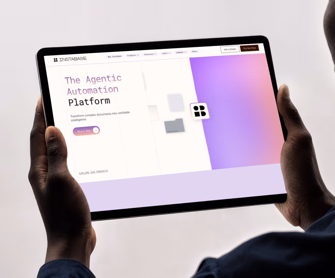


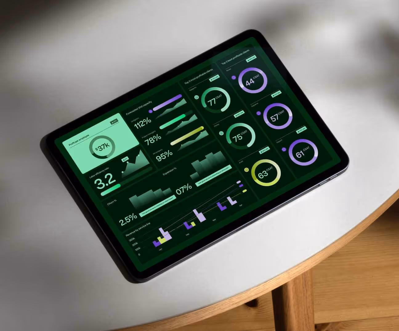


.avif)

.avif)
.avif)
.avif)
