.svg)


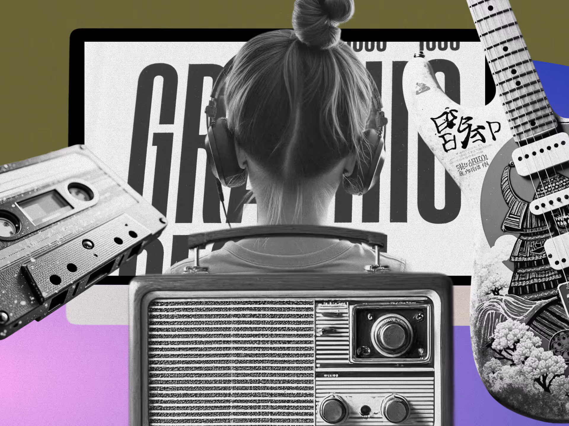
Great visuals catch the eye, but mastering ad copy is what makes people act. In graphic design, ad copy isn't just words on a page, it's strategic storytelling that transforms good designs into marketing magic.
Think about it: a stunning design might turn heads, but the right words make hearts race and wallets open. When both elements work in harmony, that’s when the magic really happens.
For design companies today, mastering this perfect blend creates a serious edge. When your imagery and messaging sync up perfectly, you're not just grabbing attention, you're igniting action. In this article, we’ll break down how to craft compelling ad copy that elevates your design work and drives real results.
The Importance of Mastering Ad Copy in Graphic Design
The partnership between eye-catching visuals and persuasive text creates marketing that sticks. Beautiful design pulls people in, but it's the ad copy that gives meaning and pushes them to act. Together, they create experiences that burn into memory—this is true marketing design synergy.
Visual design and ad copy serve distinct yet complementary functions: visuals evoke emotions, while copy offers guidance and information. This dynamic is supported by science—Richard Mayer's Cognitive Theory of Multimedia Learning demonstrates that combining text with visuals significantly enhances memory retention and engagement.
Minimalist design paired with concise, benefit-driven copy is a proven formula—clean visuals and punchy phrases consistently produce campaigns that both impress and persuade.”
Match Visual and Verbal Tone
Make sure your fonts, colors, and images work with your copy style. Minimal designs need concise, punchy language. When the visual elements reinforce what your words are saying, the entire message becomes more powerful and memorable, showcasing the importance of persuasive copy in design.
Find the Right Balance
Don't overcrowd your designs. Use visuals to catch the eye and communicate core ideas, while ad copy handles the details and persuasion. This balance prevents information overload and keeps your message clear and focused on what matters most. Tailoring your ads to specific platforms through platform-specific design ensures they perform optimally.
Tell a Cohesive Story
Authentic visuals combined with messaging that challenges common assumptions can create a powerful emotional impact and tell a cohesive story. When your visuals and copy tell the same story from different angles, you create a multi-dimensional experience that resonates on multiple levels.
Core Principles of How to Master Ad Copy
Want to create messages that hit home, communicate clearly, and make people act? Let's dig into how to master ad copy, especially for graphic design services, by effectively combining design with copy.
Understand Your Audience
Great ad copy starts with understanding client psychology. For design services, this means getting inside your potential clients' heads—what problems keep them up at night, and what would make their lives easier?
Do your homework: run surveys to get direct feedback, listen to social media conversations about design needs, and check out competitors to spot messaging gaps you can fill.
Once you know what makes your audience tick, speak directly to those needs. If you discover clients struggle with tight deadlines, focus your copy on how your design services save time.
Talk to readers like they're sitting across from you. Say "you" and "your" to make it personal. Instead of "Our design services are efficient," try "Your design projects, completed faster than ever."
Clarity and Simplicity
As a designer, you already know clean, clear communication works best. Your ad copy should follow the same principle. Skip the fancy industry terms that might confuse potential clients.
Keep descriptions brief but meaty enough to show you solve real problems: "Transform your brand with our sleek, modern designs. We turn complex ideas into clear, compelling visuals that capture your audience's attention."
This tells clients exactly what you do and what they'll get—no fluff needed. Apply the same minimalist principles to your writing that you use in design—include only what's necessary. Clear ad copy prevents confusion between your visuals and message.
Strong Call to Action
A strong CTA gets people moving and boosts conversions. For design services, make your CTA action-focused and create a sense of "now or never." Try CTAs like "Start Your Design Journey," "Transform Your Brand Today," or "Get Your Free Design Consultation." These tell people exactly what to do next.
How your CTA looks matters just as much as what it says. Use contrasting colors, bold fonts, or standalone positioning to make it pop. A bright button that stands out from the rest of your design can make all the difference. Weak or hidden CTAs kill conversion rates. Make your CTA impossible to miss and irresistible to click.
Crafting Compelling Narratives for Powerful Ad Copy
Stories sell. In design and advertising, the power of words in design connects with audiences on an emotional level, creating campaigns that stick in memory long after the first glance. Here's how to weave narratives into your ad copy that forge real connections with your audience.
We make decisions based on feelings, then justify them with facts. Tap into emotions specific to creative professionals—their passion, curiosity, and pride in their work. Use descriptive language that sparks imagination. Words like "discover," "transform," or "create" paint possibilities in your audience's mind.
Emotional Appeal Strategies
Norman's Three Levels of Emotional Design offers a framework for deeper emotional connection. The visceral level targets immediate, gut reactions to aesthetics. The behavioral level focuses on how natural and intuitive your offering feels. The reflective level connects to deeper values and identity.
Apple nails this approach with sleek product visuals (visceral), user-friendly interfaces (behavioral), and messaging that ties their products to creativity and personal expression (reflective). This multi-layered approach creates advertising that resonates on multiple levels simultaneously.
Benefit-Focused Messaging Techniques
Features tell, benefits sell. Focus on how your offering improves lives or businesses. Designers care more about boosting creativity and efficiency than technical specs. To create benefit-focused messages that land, identify pain points, position your offering as the solution, and paint the before-and-after picture. By focusing on transformation, you can craft messages that resonate deeply with your audience.
Instead of "Our software has a vast library of templates," try "Spark your creativity and save hours of design time with access to thousands of customizable templates." Frame benefits around specific pain points such as time pressure, technical hurdles, and creative blocks. Each benefit should directly address a challenge your audience faces regularly.
Narrative Structure Elements
Create a story structure that takes prospects on a journey. Start by acknowledging their current situation and challenges, introduce your solution as the transformative element, and paint a vivid picture of their improved future state. This classic story arc creates natural tension and resolution that keeps readers engaged. By crafting resonant messages, you can ensure your ads connect deeply with your audience.
By focusing on benefits rather than features, your ad copy speaks directly to what designers truly want—solutions that make their work better, faster, and more fulfilling. These storytelling techniques transform your ads from sales pitches into compelling narratives that capture imagination and inspire action.
Integrating Ad Copy with Visual Design
The magic happens when great words and visuals work together. As designers who often control both elements, knowing how to blend them effectively creates ads that truly perform. Let's explore how to master ad copy by creating harmony between copy and design for maximum impact.
Creating seamless ads means strategically combining ad copy with visual elements. With social media platforms heavily focused on visual content, aligning copy with visuals through strategic writing and design is crucial. Your words give meaning to your visuals, turning abstract designs into clear messages.
Creating Visual-Verbal Harmony
Match visual and verbal tone by ensuring your fonts, colors, and imagery support your copy style. Apple's clean visuals and short, powerful phrases like "Think Different" show perfect alignment between what you see and what you read. This creates a synergy between design and copy that amplifies your message. By maintaining visual harmony, you ensure that all elements of your design complement the message.
Find the right balance by not overwhelming your audience. Let visuals capture attention and convey main ideas, while ad copy fills in details and persuades. This balance prevents information overload and keeps your message clear.
Create emotional connection by using visuals and words together to trigger specific feelings. Dove's Real Beauty campaigns pair authentic photos of diverse women with messages that challenge beauty norms, creating powerful emotional impact.
Mastering Visual Hierarchy
Visual hierarchy guides readers through your ad in the right order. By using size, color, and typography strategically, you can highlight what matters most and create a clear path for the eye.
Create typographic contrast by using a bold, creative font for headlines with a clean, sans-serif font for body copy. This contrast draws attention to key points while keeping everything readable.
Use color strategically to make important elements like your call-to-action stand out with contrasting colors. Using bright, brand-aligned colors naturally draws the eye and can make key elements stand out.
Guide the viewer's journey by arranging elements to lead the viewer naturally through your ad—from headline to supporting copy to CTA. This flow ensures your audience absorbs your full message in the right order.
The best ads seamlessly blend compelling visuals with persuasive ad copy, creating a unified experience that grabs attention, communicates clearly, and inspires action. These principles create advertising that stands out in today's crowded marketing landscape.
Advanced Strategies for Mastering Ad Copy
Ready to take your copy from good to great? Let's explore advanced techniques that can sharpen your messaging for maximum impact. These strategies build on the basics but add sophistication through testing and data-driven refinement.
A/B testing strategies are your secret weapon for mastering ad copy improvement. This method lets you compare different versions of your ad to see what truly connects with your audience.
Effective Testing Methodologies
For design services, test elements like headlines, visuals, and CTAs to optimize the integration of persuasive copy and design. Setting up effective tests is straightforward: pick one element to test at a time, create two versions of your ad changing only that one element, run both versions to similar audiences simultaneously, and track metrics like click-through rates, conversions, and engagement to find your winner.
Many designers skip testing, missing chances to improve their ads' performance. Consistent testing and refinement is how good ad copy becomes great ad copy. Each iteration brings you closer to the perfect balance of messaging that resonates with your specific audience.
Data-Driven Persuasion Techniques
Concrete numbers make your claims more believable and persuasive. For design services, try including user stats, efficiency metrics, and client results. When using data, only use current, reliable statistics, present numbers visually in a way that fits your design aesthetic, and use data to support your main selling points rather than overwhelm with too many figures.
Instead of simply claiming "Our design software is fast," try "Designers report a 30% increase in productivity using our software, completing projects in record time." This specific claim backed by data carries much more weight and credibility with skeptical audiences.
Psychological Triggers in Copy
Understanding human psychology can dramatically improve your ad copy. Techniques like scarcity (limited-time offers), social proof (testimonials), and reciprocity (free resources) tap into fundamental human drives. When used ethically and strategically, these triggers can significantly boost response rates without feeling manipulative.
These advanced strategies help you create messaging that not only grabs attention but offers compelling, evidence-based reasons for clients to choose your design services. Refining your approach through consistent testing and audience feedback helps continuously improve performance.
Overcoming Common Mistakes in Ad Copy
As designers, we often focus on making things look amazing. But even the prettiest ads fail when the ad copy doesn't work. Let's tackle the most common copy pitfalls and how to fix them.
Design and Style Issues
Over-styling and visual overload happens when we try too hard to impress with design tricks, often ending up with ads that confuse rather than convert. Too many visual effects—gradients, shadows, unnecessary icons—overwhelm viewers and drown out your message. The solution is to embrace simplicity. Use white space strategically to highlight what matters and strip away everything that doesn't serve your core message.
Poor typography and font hierarchy can make or break your ad's readability and impact. Using too many fonts or failing to create clear hierarchies makes ad copy hard to read and understand. Stick to two fonts max, playing with weights and sizes to create structure. Maintain consistent spacing, clear kerning, and proper leading for better readability.
Content and Structure Problems
Excessive text content sometimes happens when we try to say too much in too little space. Ads that break the "20% text rule" look busy and turn viewers away. Say more with less by limiting text to one powerful headline and brief supporting content. Let your visuals do some of the talking.
Weak or missing calls-to-action lead to poor click-through rates. Vague CTAs like "Learn More" or visually buried CTAs don't drive action. Make your CTA stand out in your design and use action words paired with a sense of urgency or clear benefit.
Technical Considerations
Misalignment between visuals and message creates disconnect and reduces effectiveness. When your pictures and words tell different stories, confusion follows. Ensure your graphics reinforce your CTA and message, leaving no room for mixed messages. Test your ads to confirm visuals and copy work together.
Neglecting mobile optimization is a major mistake with most people viewing ads on phones. Ads not scaled for mobile can cut off text or make CTAs untappable on smartphones. Design with mobile in mind first and test your ads on various screen sizes to ensure they work everywhere. Use larger fonts and simpler designs for better mobile readability.
By addressing these common mistakes, you'll create more effective ad designs that don't just look impressive but actually drive results. Great ads blend beautiful visuals with clear, compelling ad copy that connects with your audience and inspires them to act.
Words and Visuals—The Ultimate Power Duo
Words and images need each other. The most beautiful designs fall flat without strategic ad copy, while even simple visuals become marketing powerhouses when paired with the right words.
The principles we've covered—knowing your audience, keeping things clear, crafting compelling CTAs, and creating emotional connections—form the backbone of how to master ad copy. Master these elements and pair them with your design skills, and you'll create marketing that truly works.
A great ad copy isn't set-it-and-forget-it. It demands ongoing testing, refinement, and adaptation. The best designers treat ad copy as a work in progress, using data and feedback to keep improving. This growth mindset separates designers who simply make things look good from those who deliver real communication value.
At NoBoring Design, we believe that stunning visuals deserve equally compelling words. Our integrated approach combines design excellence with strategic messaging, creating campaigns that capture attention and drive action. We don't just make things look good—we make them work hard for your business. Ready to transform your design work with powerful ad copy? Let’s turn your designs into conversion machines—reach out today!
Key Takeaways
- Ad copy and visual design work together to create marketing that drives results
- Effective ad copy speaks directly to audience needs while maintaining clarity
- Strategic integration of text and visuals creates harmony that guides viewers
- Testing and refining your approach leads to continually improving performance
FAQs
Why is ad copy important in graphic design?
Ad copy gives context and meaning to visual design, turning attention into action. While visuals grab the viewer's eye, it's the copy that communicates value, solves problems, and motivates engagement. Strong ad copy helps guide user behavior, highlights benefits, and reinforces brand messaging. When paired with compelling design, it creates a powerful marketing experience that resonates emotionally and logically. Without well-crafted copy, even the most beautiful design can fall flat. Mastering both elements ensures your campaigns are not just visually appealing but also strategically effective, resulting in higher conversions and lasting audience impact.
How do you balance visuals and text in graphic design ads?
Balancing visuals and text requires clarity, focus, and intention. Use visuals to attract and convey emotion, while ad copy should clarify the message and persuade action. Avoid overcrowding—each element must serve a purpose. Use white space and visual hierarchy to guide the viewer’s attention from headline to supporting copy to call-to-action (CTA). Match your design tone to the copy style for cohesion. Keep copy concise and benefit-driven to complement the design without overwhelming it. This strategic blend ensures your message is clear, your visuals shine, and your audience stays engaged.
What makes a strong call-to-action in ad copy for design services?
A strong CTA is specific, actionable, and visually prominent. It clearly tells the viewer what to do next, like “Book Your Free Consultation” or “Transform Your Brand Today.” Use active language and create urgency with phrases like “now” or “today.” Design-wise, make the CTA stand out using contrasting colors, bold typography, or isolated positioning. It should be one of the most visually distinct elements in your ad. A strong CTA removes friction, guides users, and increases conversions—turning viewers into customers by making the next step obvious and enticing.
How can storytelling improve ad copy in design marketing?
Storytelling adds emotional depth to ad copy, making it more relatable and memorable. Instead of just listing features, a great copy walks the audience through a journey—from their current challenge to a better future enabled by your service. This narrative arc creates tension and resolution, driving engagement. Use emotionally resonant language, focus on transformation, and align the message with visuals for a cohesive story. Storytelling taps into values, identity, and aspirations, especially for creative audiences, making your ad feel personal and compelling rather than transactional.

FAQ
We have the answers.
more content

That cluttered background in your photos is costing you opportunities, and you might not even realize it. Professional headshots, product images, and marketing visuals all share one common enemy: distracting backgrounds that pull attention away from what actually matters. Whether it's removing an awkward office setup from your LinkedIn headshot, isolating products for e-commerce, or creating clean graphics for presentations, background removal has become an essential skill in today's visual-first professional world.
The benefits go beyond aesthetics. Clean, isolated subjects create a stronger visual hierarchy, improve brand consistency, and make your content look intentionally professional rather than accidentally amateur. Learning proper Photoshop background removal puts you in control of your visual content and consistently delivers professional-quality results.
Ready to master the technique that will transform your amateur photos into professional assets? Our step-by-step article breaks down the entire process into manageable actions anyone can follow.
7 Steps for Quick Background Removal in Under 5 Minutes
Time is money, and these seven steps get you professional results without the professional timeline. When you need clean background removal quickly, whether for a last-minute presentation, an urgent social media post, or a client deadline, this streamlined workflow eliminates the guesswork. Instead of getting lost in Photoshop's endless options, this focused approach uses the most effective tools in the correct sequence.
Step 1: Launch Photoshop on either your desktop or iPad and open the image you want to work with.
Step 2: Find it in your toolbar or simply press 'W' on your keyboard for faster access.
Step 3: Use the Quick Selection Tool to paint across your subject, watching as Photoshop intelligently expands the selection to the edges.
Step 4: Click "Select and Mask" in the options bar to refine your selection with precision tools.
Step 5: Use the built-in sliders and brush tools to perfect those tricky edges, especially around hair or detailed areas.
Step 6: This preserves your original image while isolating the subject perfectly.
Step 7: Maintain your transparent background for maximum flexibility in future projects.
For even speedier results with simple backgrounds, try the one-click Remove Background feature. Just open the Discover panel (Cmd/Ctrl + F) and select "Remove background" from Quick Actions. The AI immediately identifies your subject and strips away the background with surprising accuracy.
Photoshop's Remove Background Quick Action works best when there is a clear contrast between your subject and the background. It excels with product photography, portraits against clean backgrounds, and most social media content.
How to Remove Backgrounds in Photoshop for People, Products, and More
Not all subjects are created equal when it comes to background removal, and using the wrong technique shows. Professional-quality results come from matching your technique to your subject. This section breaks down the specific methods that work best for different types of content, so you'll know exactly which tools to reach for, whether you're working with people, products, or complex objects with tricky edges.
Method 1: Simple Product Photography
Products shot against solid backgrounds with good contrast work best with AI-powered removal.
- Duplicate your background layer for non-destructive editing
- Use the Remove Background Quick Action through the Discover panel (Cmd/Ctrl + F)
- Let Photoshop's AI create the initial mask; it excels at products with precise edges
- Refine edges with a soft brush on the layer mask, black conceals, white reveals
- Address color fringing on reflective surfaces using Decontaminate Colors
- Final check: edges should look natural without background artifacts
When automatic selection fails, switch to the Quick Selection tool for more precise control over reflective surfaces or complex shadows.
Method 2: Portraits with Hair Details
Hair requires specialized techniques to preserve its natural appearance without compromising texture.
- Create baseline selection with Select Subject (Select > Subject)
- Open the Select and Mask workspace (Select > Select and Mask)
- Paint over hair areas with the Refine Edge Brush Tool; this captures fine strands that automatic selections miss
- Increase the Edge Detection radius gradually until hair separates naturally from the background.
- Use Smooth and Feather sparingly; too much destroys hair texture
- Enable Decontaminate Colors to eliminate background color spill
- Output to a new layer with a mask to preserve your original
Hair looks artificial: Reduce smoothing and manually brush the mask to restore natural texture. For color fringing, add an adjustment layer to neutralize unwanted color casts.
Method 3: Complex Objects with Intricate Edges
Jewelry, lace, and botanical subjects require hybrid approaches that combine precision with careful refinement.
- Map your strategy: identify hard edges (Pen Tool territory) versus soft areas (brush techniques).
- Create precise paths with the Pen Tool around geometric elements—manual precision beats automation for complex shapes.
- Convert paths to selections (right-click path > Make Selection) with appropriate feathering.
- Build complex selections gradually using Add to Selection mode for areas with clear color separation.
- Refine in Select and Mask for semi-transparent or delicate details.
- Manual cleanup at high magnification; use 1-3 pixel brushes for intricate work.
Create separate masks for sharp and soft areas, then combine them. Paint back lost details with the Mixer Brush Tool at high magnification. Simple products take 2-3 minutes, complex portraits or intricate objects require 15-30 minutes for professional results. Work with layer masks to refine without restarting.
How To Refine Photoshop Edges Like a Pro
The difference between amateur and professional background removal isn't the initial selection; it's what happens to those edges. Those rough, pixelated borders and unwanted color halos that scream "I used Photoshop" don't have to be your reality. Most people make their selection and call it done, wondering why their cutouts look obvious and unprofessional. The secret lies in edge refinement, where good selections become great ones, and where you'll invest the time that separates professional-quality work from quick-and-dirty edits that fool no one.
View Modes That Actually Matter
Switch between view modes based on your final destination. "On Black" reveals problems when placing subjects on dark backgrounds, "On White" catches issues for light backgrounds, and "Overlay" shows your selection as a red overlay for precise boundary checking.
Edge Detection Radius
Start with 1-3 pixels for complex backgrounds with hair and fur, then increase gradually. Wispy details require higher values, while hard edges require lower values. The tool analyzes contrast at the boundary, giving it enough room to work, but not so much that it gets confused.
Global Adjustment Sliders
Each slider fixes specific problems:
- Smooth (2-3 for portraits): Eliminates jagged edges
- Feather (0.5-1 pixel): Softens transitions without losing detail
- Contrast: Sharpens edge definition—push until you see artifacts, then back off
- Shift Edge: Moves the selection boundary in or out to eliminate background bleed
Refine Edge Brush for Hair and Fur
Paint over areas where the background shows through fine details. The brush rebuilds your selection by analyzing the regions painted against the underlying image data. Work in small sections and build coverage gradually, rather than painting in broad strokes.
Layer Mask Cleanup
Output your selection to a new layer with a mask, then zoom to 100% for inspection. Use a 1-2 pixel soft brush at 30-50% opacity on the mask itself. Black conceals, white reveals. Build up problem areas gradually rather than trying to fix everything in one pass.
Pre-Compositing Checks
Test your cutout against different colored backgrounds before calling it complete. Apply Curves or Levels directly to the mask to eliminate color fringing and ensure clean integration. Your edges should look natural regardless of what you place behind them.
Pro Techniques for Flawless Color Fringing and Lighting Matches in Photoshop
You've nailed the perfect selection and refined those edges to perfection, but your subject still looks cut-and-pasted rather than naturally placed. Those subtle color halos around hair, the green tint bleeding from the original background, or lighting that doesn't match the new environment instantly give away your edit to anyone with a trained eye. These finishing techniques separate professionals from hobbyists. Master these final polish steps, and your background removals will look seamlessly natural rather than obviously edited.
Decontaminate Colors Automatically
Photoshop's Decontaminate Colors feature, available in Select and Mask, works magic on contaminated edges. This tool intelligently strips away background color spill while preserving the natural tones of your subject. One click often solves what might take hours to fix manually.
Master Manual Edge Refinement
For precision work, layer masks with low-opacity brushes give you complete control. Soft brushes smooth overly crisp edges, while harder brushes restore definition to fuzzy areas. This technique creates that perfect balance between sharpness and natural blending that defines professional work.
Match Lighting Direction and Quality
Nothing exposes poor compositing faster than mismatched lighting. Your subject needs shadows and highlights that perfectly align with the new environment's light sources. Create clipped adjustment layers (such as Curves, Color Balance, or Hue/Saturation) to modify your subject without affecting the background.
Color temperature harmony follows a simple rule: warm backgrounds need warmer subject tones, cool backgrounds call for cooler adjustments. That Spider-Man costume looks perfect in golden sunset lighting, but requires significant color correction for a calm office environment.
Dodge and burn techniques reshape your subject's lighting patterns to match the scene. Pay attention to rim lighting, shadow direction, and highlight intensity; these small details transform obvious cutouts into seamless integrations that viewers never question.
Photoshop Background Removal: Common Problems and Quick Fixes
Missing Hair and Fur Details
Hair and fur demand specialized handling beyond basic selection tools. When automatic methods fail, switch to the Refine Edge Brush in Select and Mask mode. Paint over hair areas with a soft brush, then gradually increase the Edge Detection radius until fine details appear naturally without looking artificially cut.
Color Contamination and Fringing
Background colors bleeding onto your subject instantly destroy professional results. Enable "Decontaminate Colors" in the Select and Mask workspace, adjusting until the color spill disappears. For stubborn cases, create a new layer and use the Clone Stamp set to "Current & Below" to manually clean contaminated edges with precision.
Performance and Software Crashes
When tools become sluggish or unresponsive, restart Photoshop and check for updates. For persistent problems, reset tool preferences by holding Shift+Ctrl+Alt (PC) or Shift+Cmd+Option (Mac) while launching the application. This simple maintenance prevents frustrating interruptions during critical work.
Knowing When to Refine vs. Restart
When facing problems, ask yourself: Are the issues localized to specific areas, or does the entire selection look problematic? Isolated issues warrant refinement; widespread problems signal the need for a different approach. If you've spent more than 30 minutes refining without significant improvement, try a different selection method rather than forcing a flawed technique.
File Size and Compatibility Challenges
Large transparent PNGs often cause cross-platform issues and slow loading times. Use "Export As" rather than "Save As" for web-destined files. Create multiple versions: high-resolution masters for print and compressed variants for digital applications. This approach ensures your work displays perfectly across all platforms.
Advanced Skill Development
For complex subjects with transparent elements, reflective surfaces, or ultra-fine details, master advanced techniques like channel masking and automation workflows. Professional certification programs focusing on commercial retouching standards develop expertise that commands premium rates and attracts high-value clients.
When Time and Stakes Are Too High for Trial and Error
Learning to remove a professional background takes months of practice, and your business can't wait that long. Every day you delay launching that product catalog or updating marketing materials is lost revenue and missed opportunities. When your brand's visual credibility is on the line, whether for e-commerce, marketing campaigns, or client presentations, amateur-looking edits can damage your professional reputation faster than no images at all. Professional editors work efficiently, deliver consistent results, and understand the technical requirements that prevent costly revisions. Sometimes, the most intelligent business decision is investing in expertise rather than risking your brand's image on a learning curve.
Start Mastering Photoshop Background Removal Today
You now have multiple approaches for tackling background removal, from lightning-fast automated methods to sophisticated edge refinement techniques for challenging subjects. This knowledge transforms your workflow, cutting project time while delivering professional results that make your work stand out from the crowd.
The key to success lies in matching the proper technique to each image. Clean product shots need different approaches than portraits with intricate hair details or complex objects with transparent elements. With practice, you'll develop an intuitive sense for which tool to grab first and how to refine your work efficiently.
Stop wrestling with Photoshop tutorials when you could be closing deals. NoBoring Design delivers flawless product shots and marketing assets, enabling you to focus on what truly drives business growth. Contact NoBoring Design today!
Key Takeaways
- Use Photoshop's 7-step quick process or the AI Remove Background feature for fast results, utilizing the Quick Selection Tool and Select and Mask refinement for professional-quality results.
- Match your removal technique to the subject type: AI works well for simple products, specialized hair tools are ideal for portraits, and hybrid approaches are best suited for complex objects.
- Professional results come from edge refinement, not initial selection. Use the Select and Mask workspace with proper view modes and adjustment sliders to achieve quality.
- Fix color fringing with the Decontaminate Colors feature and match lighting direction using clipped adjustment layers to make cutouts look naturally integrated.
- The export format depends on the use: PNG-24 for web transparency, TIFF for print projects, and platform-specific sizing for social media applications.

A Facebook Event is a built-in marketing tool that lives right where your audience already scrolls, chats, and clicks. It lets you turn a date on the calendar into a full-blown experience, with space for visuals, updates, reminders, and community interaction. Whether you're hosting in-person or online, it's one of the easiest and most effective ways to rally interest and attendance.
Why does it matter? Because visibility equals engagement. A well-created Facebook Event boosts discoverability, keeps your event top-of-mind with automated reminders, and makes it easy for attendees to share the news with others.
In this article, we’ll walk you through how to create Facebook Events that are memorable and perform well. From setting the tone with the right visuals to optimizing for engagement and reach, consider this to be your step-by-step playbook for making an impact that lasts well beyond the RSVP.
The 5 Must-Haves To Create A Facebook Event People Actually Want to Attend
Most Facebook events get ignored because they’re rushed, vague, or forgettable. If you want people to actually show up, you need to treat your event like a product launch: clear, polished, and built for engagement. To achieve this, certain essential elements must be in play. These elements are the baseline for earning attention, building credibility, and making it easy for someone to say yes.
When creating a Facebook event that converts, certain fundamental elements serve as the foundation for all your promotional efforts. Getting these basics right signals professionalism and reliability to potential attendees.
1. Write a Clear and Clickable Title
Your title needs to be attention-grabbing, descriptive, and searchable. Aim for a title that balances SEO-friendly keywords with human appeal. For example, instead of "Annual Company Gathering," try "TechCo's 2025 Innovation Summit: Shaping the Future of AI."
Your event title is your first impression. It needs to captivate and compel action while striking a balance between clarity and intrigue. Try the action word + unique value + event type formula: "Master Data Science: Interactive Workshop with Industry Leaders." Or use the exclusive descriptor + topic + format approach: "Insider's Guide to Crypto: Live Q&A with Industry Experts."
Employing brand positioning strategies helps your event stand out from the crowd. Test your titles by asking, “Would I stop scrolling for this?” Ensure your title sets the right expectations, and that your event meets them. Nothing damages trust more than a spectacular headline followed by a forgettable experience.
2. Cover the When and Where (Without Making People Hunt)
Include the day of the week, date, start time, and end time. For multi-day events, clearly state the whole duration. Nothing frustrates potential attendees more than having to hunt for basic timing information.
For physical events, include the venue name, address, and any relevant parking or transportation details. For virtual events, specify the platform and how attendees will access it. Vague location information makes even the most exciting event seem disorganized.
3. Write a Description That Sells the Experience
Your event description should include a brief overview of what attendees can expect, key speakers or highlights, the value proposition, any special features, and ticket information. This is where you sell the experience, not just the logistics.
Open with a compelling statement or question that communicates the value of attending. Make them feel what they’ll miss out on if they don’t join. Highlight standout features, world-class speakers, interactive sessions, and exclusive takeaways, and use formatting to keep the content scannable, especially for mobile users.
Let your brand’s personality come through. If you’re quirky, lean into it. If you’re buttoned-up and sleek, reflect that. Create urgency without being pushy: “Early bird tickets available until Friday” is far more effective than all-caps hype. End with a clear next step, so your audience knows what to do and why they shouldn’t wait.
4. Choose the Right Privacy Settings
Determine whether your event should be public, private, or invite-only, taking into account your goals and target audience. Each option creates a distinct perception and attracts a different type of attendee.
The technical aspects of your Facebook event significantly affect its discoverability and reach. Public events are discoverable by anyone on Facebook and can be shared widely. Private events are only visible to guests, creating a sense of exclusivity. Select options based on your event's goals and target audience.
5. Optimize Setup for Discoverability and Conversion
Select the most specific categories that fit your event to improve discoverability. Facebook's algorithm uses categories to suggest relevant events to users. Update categories if your event evolves during the planning process.
Use Facebook's recognized venue locations when possible to improve discoverability in location-based searches. This also provides attendees with directions and additional venue information, eliminating the need for extra effort on your part.
Partner with complementary brands or influencers as co-hosts to expand your event's reach and audience. This can significantly increase visibility to new audiences and add credibility to your event through association. Avoiding common branding mistakes is crucial during your event setup to maintain professionalism and trust.
If selling tickets, integrate with Facebook's ticketing partners for a seamless purchase experience. This reduces friction in the conversion process, making it easier for people to commit to attending.
Why Smart Design Makes or Breaks Your Facebook Event
To be honest, poor design doesn't just make your event look unprofessional, it actively convinces people your event isn't worth their time before they even read your description. Every visual choice, from your cover photo to promotional graphics, either builds credibility and excitement or undermines it, and there's no middle ground on a platform where people make split-second decisions. When your design elements work seamlessly with your messaging, they create an experience that transforms casual scrollers into committed attendees.
Make Your Cover Photo Do the Work
Your event's cover photo is often the first visual element people see. To maximize its impact, use the optimal size of 1920 x 1005 pixels with a 16:9 aspect ratio to ensure your image appears crisp on all devices.
Select eye-catching imagery that reflects the tone and purpose of your event rather than generic stock photos. To make your visuals as impactful as possible, consider principles from strategic poster ad design.
Boring visuals = boring event (at least that's what people will assume). Keep the text on the cover image minimal, focusing on essential information such as the event title, date, and location.
Use contrasting colors for text overlays to ensure legibility, especially on mobile devices where most Facebook browsing happens. Consistently integrate your brand's logo, color palette, and fonts to reinforce brand identity and build trust. Utilizing elements like patterns can transform your brand identity. Your visual identity should be as recognizable as your best friend's laugh!
Create Graphic Graphics That Tell Your Story And Build Trust
Beyond the cover photo, develop a suite of visual content that supports your promotional strategy throughout the event timeline. Design graphics that work across different promotional contexts, from Facebook feeds to email campaigns and other social platforms.
Maintain visual consistency with your written voice, whether it's playful, professional, or edgy. Utilizing tools and techniques can help you elevate your brand visually. If your copy is fun and irreverent but your graphics look corporate and stuffy, you're sending mixed signals that confuse potential attendees.
Use graphics to amplify key messages without overwhelming your written content. Consider the power of typography in conveying your brand message. Create visuals that highlight speaker quotes, showcase event highlights, or present key statistics related to your event's theme.
Integrate elements of brand iconography to enhance recognition and appeal. Consider adopting creative approaches to your event design to make a lasting impression and stand out from the crowd.
Consider creating a series of countdown graphics to build anticipation as the event date approaches. Nothing builds excitement quite like seeing "Only 3 days left!" paired with an enticing image of what awaits attendees.
Partner With Design Professionals Who Actually Get Events
Contrary to what you might think, you don't have to figure it out your design solo. Professional designers who understand event marketing know exactly how to translate your vision into visuals that stop the scroll and start conversations, plus they handle all the technical requirements like file sizes and platform-specific dimensions that can make or break how your visuals appear.
The right design partner doesn't just make pretty pictures; they create strategic visual experiences that guide people from curiosity to commitment while you focus on what you do best. Whether you need a complete visual identity for your event or just want to elevate specific pieces, partnering with designers who specialize in event marketing can transform your promotional materials from forgettable to unforgettable.
How To Make Your Facebook Event Buzz Before, During, and After
Most Facebook events die a quiet death with zero engagement and empty seats, while others generate the kind of buzz that makes people genuinely excited to attend. The difference isn't budget or connections, it's treating your event page like the strategic marketing tool it actually is, not just a digital flyer. Your Facebook event becomes your first impression, ongoing conversation starter, and relationship-building platform that transforms casual browsers into committed attendees.
Know What To Say and When To Say It
A well-planned promotional timeline can make the difference between a packed venue and empty seats. Start 3-6 months before the event by creating your Facebook event page with preliminary information. Begin sharing teaser content to build awareness and launch "Save the Date" campaigns to generate early interest.
Two to three months before, increase posting frequency with more detailed event information. Implement early-bird ticket promotions and start engaging with your community through Q&A sessions or polls to gauge interest and gather feedback.
One month before, intensify your messaging with a sense of urgency. Share the finalized agenda and highlight key attractions. Launch retargeting campaigns for users who've shown interest but haven't registered yet.
Two weeks before, focus on last-minute registrations with countdown posts. Share practical information about the event like parking, what to bring, and other logistics. Leverage testimonials from past attendees to build trust and excitement.
During the event, post real-time updates and highlights. Encourage attendees to share their experiences using a specific hashtag. Use Facebook Live to broadcast key moments for those who couldn't attend.
After the event, share highlights and thank attendees. Collect feedback through polls or surveys and begin nurturing the community for future events. This post-event engagement helps maintain momentum and build a loyal following.
Build Recognition That Sticks Through Smart Messaging
Maintaining visual and verbal consistency throughout your promotional period is crucial for building recognition and trust. Develop a visual theme with a cohesive identity that can be adapted across all promotional materials, including a specific color palette, font choices, and graphic elements. Understanding the impact of strategic branding changes can help you maintain consistency.
Establish main themes or messages about your event. Rotate through these themes to maintain consistency while avoiding repetition that could bore your audience. Mix up your content types to keep things interesting—alternate between text posts, images, videos, and interactive content.
Encourage attendees from previous events or early registrants to share their experiences, adding authenticity to your promotion. People trust peer recommendations more than branded messages, so leverage this powerful form of social proof.
Strategically unveil new details about speakers, activities, or special features throughout your timeline to maintain interest. Think of it as a slow, tantalizing reveal that keeps people coming back for more! Develop a unique event hashtag and use it consistently across all promotions, encouraging your audience to use it as well.
Read the Room and Pivot When You Need To
Monitor engagement metrics throughout your promotional period and be prepared to adjust your approach based on what resonates with your audience. Pay attention to which posts generate the most likes, comments, shares, and click-throughs.
If certain content types or messages perform exceptionally well, create more similar content. Conversely, if some approaches fall flat, don't be afraid to pivot. This flexible approach ensures that your promotional efforts remain effective, rather than adhering to a rigid plan that isn't working.
Utilize Facebook's Event Insights to track response rates and attendance commitments. These metrics provide valuable insights into your audience's interests and behaviors, enabling you to refine your messaging for maximum impact.
Tips To Help You Stop Begging for Likes and Start Earning Loyalty
Authentic engagement isn't about tricks, giveaways, or manipulating the algorithm; it's about creating content so genuinely valuable that people can't help but interact with it. When you focus on delivering real value instead of chasing vanity metrics, something powerful happens: your audience stops treating you like just another brand and starts seeing you as a trusted resource they actually want to hear from. The strategies that work best don't feel like strategies at all, they feel like natural conversations between people who share genuine interests and goals.
1. Create Content Worth Sharing Without Asking
Focus on genuine value over explicit sharing requests. Solve real problems, create visually appealing content, offer exclusive behind-the-scenes insights, use compelling storytelling from past attendees, and provide practical resources. When content truly helps your audience, natural sharing follows.
2. Foster Real Connections That Go Beyond the Event Page
Build community through live Q&As, candid behind-the-scenes content, interactive polls for decision-making, user-generated content opportunities, and personalized responses. Make followers feel like insiders and stakeholders by showing the real people behind your event and actively engaging with comments.
3. Keep the Energy Alive Long After the Last Guest Leaves
Maintain post-event momentum with highlight reels, surveys, discussion threads, and personalized thank-you messages. Create recap content showcasing attendee participation while teasing future events. This converts non-attendees for next time and strengthens relationships for ongoing collaboration.
Turn Your Next Facebook Event Into the One Everyone's Talking About
Creating impactful Facebook events requires a strategic blend of compelling content, thoughtful design, and active engagement. The most successful events seamlessly blend professional presentation with authentic connection, creating experiences that begin the moment someone discovers your event online and continue long after they leave.
When you approach event creation as both a writing and design challenge, everything shifts. You're not just announcing details, you're creating complete experiences that begin the moment someone sees your event in their feed and continue long after the last attendee heads home. Your next event could become a defining moment for your brand, creating buzz, engagement, and lasting connections.
Don't let boring visuals convince people your event isn't worth their time, NoBoring Design creates scroll-stopping Facebook event graphics and social media assets that turn casual browsers into committed attendees. Partner with us today!
Key Takeaways
- Successful Facebook events combine compelling copy with strategic design elements to create a complete experience. Together, they guide people from curiosity to commitment.
- Timing your promotional content correctly helps build momentum and maintain interest. Get the timing wrong, and even great events can struggle to fill seats.
- Authentic engagement strategies drive organic sharing and community building. Real value creates natural advocates who share because they want to, not because you asked.
- Visual consistency across all event materials strengthens recognition and trust. Cohesive branding passes the crucial first-impression test that determines whether people take you seriously.

The custom t-shirt printing market isn't just growing, it's exploding! Creating and selling t-shirt designs online offers an exciting path to turn artistic talent into a consistent source of profit. With the right mix of creativity, strategy, and a solid understanding of your platform options, your work can reach enthusiastic buyers worldwide.
Whether you're a professional artist, a hobbyist with a sharp eye for trends, or simply looking to build a new income stream, the online t-shirt market has space for you. This article walks you through how to get started, what to consider, and how to make wise decisions that match your goals and resources.
Essential Steps To Understanding the T-Shirt Design Market
Before you sketch your next design, take a step back. Understanding your market is where clever branding begins. These next steps will help you identify your niche, create buyer personas, analyze competitors, and strike the right balance between trend-savvy and timeless.
Finding Your Perfect Niche
The custom t-shirt market brims with opportunity, but success demands focus. Start by analyzing current trends and finding gaps where your unique vision fits. Market research isn't just busywork; it prevents wasted effort and helps you focus on designs that will resonate with actual buyers.
Employing effective strategies for standing out can set your brand apart in a crowded marketplace. Look for underserved communities with passionate interests. The pet lover market might seem saturated, but what about designs specifically for exotic pet owners? The more specific your niche, the more devoted your audience.
Creating Customer Personas
Develop detailed customer personas to understand who will actually wear your shirts. Go beyond basic demographics like age and location, and dig into what makes them tick. What values do they hold? What makes them laugh? What would they proudly wear in public?
For example, a persona might be "Environmental Emma," a 28-year-old urban professional who values sustainability, supports conservation efforts, and wants her clothing to reflect these values without being preachy.
Understanding your audience deeply allows you to tailor your approach and convey your message effectively. These detailed personas will guide your design choices and marketing language.
Analyzing Your Competition Smartly
Study your competitors, not to copy them but to differentiate yourself. What are they doing well? Where are they falling short? Perhaps they have beautiful designs but poor-quality shirts, or maybe their marketing feels inauthentic.
Find the space where you can provide something unique. Remember, you don't need to reinvent the wheel, just make your version roll more smoothly. Competitive analysis should be an ongoing process, not a one-time task.
Balancing Trends With Timelessness
While chasing the latest trend might bring quick sales, building a sustainable t-shirt business requires balance. Create some designs that tap into current moments and others that remain relevant year after year. This approach ensures steady sales while allowing you to capitalize on trending topics.
Food art shirts might be hot right now, but classic themes like minimalist graphics continue to sell consistently over time. The sweet spot lies somewhere between the viral sensation and the enduring classic.
5 Proven Approaches To Creating Compelling T-Shirt Designs
Great t-shirt design doesn’t begin with a color palette; it starts with a game plan. If you want your graphics to do more than just look good, you need strategies that pack personality and purpose. These five proven approaches will help you create designs that turn heads, start conversations, and actually sell.
1. Embrace Strategic Simplicity
Simple designs sell, period. Complex graphics and dense text overwhelm potential buyers and make shirts less wearable. Focus on bold visuals that communicate instantly, like a visual punch that grabs attention.
A single impactful image or clever phrase will consistently outperform cluttered designs. Think about the shirts people wear repeatedly; they typically feature clean, straightforward concepts that connect immediately. Give your design the five-second test: if someone can't grasp it at a glance, it needs simplification.
2. Prioritize Technical Quality
The difference between amateur and professional t-shirt designs often comes down to technical execution. Use professional design tools to ensure your graphics look crisp and high-resolution across all sizes.
When choosing design tools, consider options that best suit your needs and skill level. Nobody wants to wear a blurry mess on their chest. Vector formats allow for scalability without quality loss, while proper color settings ensure your digital mockups match the final printed product.
3. Master Typography For Fabric
Typography for t-shirts follows different rules from digital or print media. Choose readable, stylish fonts that match your brand's personality without creating printing challenges.
Understanding how to choose the right font can significantly impact your design's readability and appeal. Sans-serif fonts typically read better from a distance, while script fonts can create production problems if too delicate.
Limit text to 2-3 lines maximum and consider how words will wrap around a three-dimensional body. Remember that shirt fabric moves and folds; what looks perfect on a flat mockup might become unreadable when worn.
4. Tell a Visual Story
People connect with meaning, not just pretty pictures. Your designs should tell stories or express values that resonate with your audience. Understanding the impact of creating emotional connections can enhance how your designs engage with customers.
An eco-conscious design might use earth tones and natural motifs that communicate environmental values without explicit messaging, utilizing strategic visuals to enhance your brand story.
Share your design inspiration through product descriptions, let customers understand the thought behind the art. This narrative approach transforms a simple shirt into a statement piece that customers feel personally connected to.
5. Create Strategic Urgency
Limited-edition designs trigger powerful buying psychology. When customers know a design might disappear forever, they feel genuine urgency that bypasses rational hesitation. These limited runs also build collector appeal and brand mystique.
Schedule regular special releases with clear timeframes to train your audience to check back frequently. This strategy creates buying momentum while allowing you to test new design concepts with less risk.
How To Choose the Right T-Shirt Sales Platform
Choosing where to sell your t-shirts is a logistical step and a major branding decision. The right platform affects everything from your margins to your customer relationships. This section breaks down the top print-on-demand options, how to own your online presence, and why blending both worlds might be your most brilliant move yet.
Compare Top Print-on-Demand Services for Smarter Selling
Print-on-demand has revolutionized the t-shirt business by eliminating inventory risks. Several services offer different advantages for designers. Printful delivers consistent quality with excellent mockup tools, though their base costs run higher than some alternatives.
Printify provides more pricing flexibility through its network of print providers, making it ideal for scaling and maintaining competitive pricing. Redbubble works well for beginners by putting designs in front of ready-to-buy customers, though at the cost of lower profit margins and less brand control.
Build Your Shop to Control the Brand Experience
Creating your online store gives you complete control over your brand experience and customer relationships. Platforms like Webflow offer the flexibility to design a fully custom storefront that reflects your creative vision while supporting ecommerce functionality and print-on-demand integrations.
While this route requires you to handle your marketing and traffic, it allows you to build a distinctive brand presence that stands apart from marketplace templates. For designers serious about long-term growth, owning your space online can be a decisive strategic move.
Use a Hybrid Approach to Balance Reach and Revenue
The most successful t-shirt businesses often employ a strategic hybrid approach. Start by testing designs on marketplace platforms to validate concepts while simultaneously building your branded store for long-term growth. This parallel path provides immediate feedback while developing lasting brand assets.
As you gather data about which designs resonate most strongly, you can gradually shift more emphasis toward your shop, where profit margins and customer relationships offer greater long-term value.
How To Turn T-Shirt Product Listings Into Conversion Machines
Think of product listings as your salespeople. Just like any great pitch, every element needs to contribute.
Optimizing your product pages from the first glance to the final click can turn casual browsers into loyal buyers. These four conversion-focused tactics will help you write smarter, show better, and sell with intention because great designs deserve a stage that actually converts.
Write Titles That Attract Clicks and Clarify Purpose
Your product titles need to work overtime, attracting search engines while enticing human customers. Pack them with helpful information and relevant keywords without sounding robotic. Include the shirt style, design theme, and target audience, like "Vintage-Inspired Mountain Hiking T-Shirt for Outdoor Enthusiasts."
This comprehensive approach tells the complete story, style, theme, and ideal customer in one concise package. Test different title structures to find what performs best with your specific audience.
Tell Product Stories That Speak to Your Buyers
Great descriptions tell stories that sell. Start with an attention-grabbing hook tailored to your target customer. Implementing powerful copywriting techniques can help you craft compelling product descriptions.
Tell the story behind your design, highlighting quality and materials while addressing practical concerns like sizing. Suggest ways to wear the shirt and include a clear call-to-action.
Use Mockups That Help Customers Picture Themselves
High-quality mockups transform abstract designs into tangible products that customers can visualize wearing. Show your designs on models representing your target audience or in contextual settings that spark imagination.
Different mockup styles serve various purposes. Lifestyle images create emotional connections, while detailed product shots build confidence in quality. Invest time in creating diverse mockups that showcase your designs from multiple angles and in various real-world scenarios.
Price Your Products to Boost Perceived Value and Sales
Strategic pricing significantly impacts purchasing decisions. Consider techniques like charm pricing (using $29.99 instead of $30) to create the perception of better value. Anchoring works by showing the original price alongside the sale price, making discounts feel more substantial. Bundle pricing encourages larger purchases by offering deals when customers buy multiple shirts.
Test different price points to find the optimal balance between perceived value and profit margins for your specific designs and audience.
Partner With Design Professionals
Don’t go it alone; teaming up with experienced website designers, copywriters, and photographers can turn good listings into great ones. Professionals bring fresh eyes and specialized skills that sharpen your message, enhance visual appeal, and ensure every detail serves your brand’s goals.
Whether it’s refining your product descriptions with persuasive storytelling, creating standout mockups that resonate emotionally, or optimizing SEO-friendly titles, collaboration amplifies impact.
Working with a creative partner like NoBoring Design can help you streamline this process, transforming your designs and product listings into powerful conversion engines that work hard. At the same time, you focus on growing your brand.
How to Grow Your T-Shirt Business Using the Right Marketing Channels
Marketing your t-shirts isn’t about throwing spaghetti at the wall, it’s about precision and impact. To turn browsers into buyers, you need a strategic mix of channels that connect directly with your ideal audience. Master these five proven channels, and watch your brand not just reach people, but inspire them to hit “Add to Cart.”
Master Targeted Paid Advertising
Strategic paid advertising can accelerate growth when you've identified your audience. Facebook and Instagram ads offer precise targeting based on interests and behaviors, starting with small daily budgets to test different visuals and audiences using A/B testing methods before scaling successful campaigns.
Pinterest advertising works exceptionally well for visual products like t-shirts, capturing users who often browse with purchase intent. Google Ads can capture people actively searching for shirts like yours when you target specific phrases relevant to your niche.
Build an Engaged Community with Organic Social Strategy
Build a following through consistent, valuable content that showcases your unique perspective. Use research tools to find popular hashtags and join relevant community discussions where your target customers gather. Ask satisfied customers to share photos wearing your shirts to generate authentic content.
Focus on quality over quantity; a smaller, engaged audience drives more sales than massive but disinterested follower counts. Share behind-the-scenes glimpses of your creative process to build connection and brand appreciation.
Create Valuable Content That Converts and Connects
Create content your audience genuinely values beyond just product promotion. This might include style guides, design insights, or cultural commentary related to your niche. This content establishes your authority while keeping your audience engaged between purchases.
For example, if your shirts feature music themes, create content about concert experiences or music history that resonates with your target audience. Distribute this content across channels to maintain a consistent brand presence.
Forge Authentic Partnerships to Expand Your Reach
Connect with complementary brands or influencers for collaborative promotions that introduce your designs to new audiences. Seek partners whose followers match your ideal customer profile but don't directly compete with your offerings.
These collaborations might include special edition designs, shared content, or joint giveaways. The key is finding partners who genuinely align with your brand values for authentic connections that benefit both parties.
Activate Customer Advocacy for Powerful Word-of-Mouth
Your existing customers represent your most powerful marketing asset. Implement a thoughtful referral program that rewards customers for bringing new buyers to your brand. Offer meaningful incentives for both the referrer and the new customer to encourage participation. Make the process simple and the rewards worthwhile. Actively collect and showcase customer reviews and photos, creating social proof that builds trust with potential new customers.
Take Your T-Shirt Designs To The Next Level
The t-shirt market offers a tremendous opportunity for creative designers ready to blend artistic vision with business savvy. Success comes not from following trends but from establishing your unique voice in a crowded marketplace. While the strategies we've explored provide a roadmap, your authentic perspective will ultimately determine your success.
Start small, test consistently, and let customer feedback guide your evolution. Remember that building a sustainable t-shirt business requires both creative excellence and marketing persistence. The most successful shirt designers aren't necessarily the most talented artists; they're the ones who understand their audience deeply and communicate consistently across all touchpoints.
Ready to transform your creative ideas into shirt designs that sell? NoBoring Design helps businesses and brands create standout designs that capture attention and drive sales. Book a meeting to get started!
Key Takeaways
- Understanding your specific target audience is the foundation of successful t-shirt sales.
- Simple, bold designs consistently outperform complex graphics in the online marketplace.
- The right sales platform choice dramatically impacts your profit margins and brand control.
- Strategic marketing across multiple channels creates sustainable growth for your t-shirt business.
The human brain is known to process visual information more quickly than text, making images a powerful tool for communication and engagement. This explains why strategic poster ad design packs such a punch in the market scene.
Incredible poster design isn't just about making something catchy; it's about crafting visual stories that grab attention, communicate value, and transform curious onlookers into loyal customers.
When art and business strategy tango, results happen. You get visual marketing that delivers real, tangible results. In this article, you will learn the principles to creating compelling posters that don't just occupy space but drive action and build brand recognition in ways that other marketing channels simply cannot match.
Understanding Strategic Poster Ad Design
Every effective poster campaign begins with a solid strategic foundation. Before touching design software or sketching concepts, you need to understand who you're speaking to and what you're trying to accomplish.
Target Audience Research and Analysis
Good audience research goes way deeper than basic demographics. Yes, age, location, and income help, but understanding what makes your audience tick emotionally is the golden ticket.
According to Harvard professor Gerald Zaltman and several neuromarketing sources, up to 95% of purchasing decisions are made subconsciously, with emotions playing a central role. Knowing your audience's values, dreams, and frustrations isn't just helpful, it's essential for creating visual marketing that hits them right in the feels.
Visual-specific personas should include media consumption habits, attention patterns, decision-making triggers, and aesthetic preferences. These insights fuel every design decision, ensuring your poster speaks directly to the people most likely to respond. Think of it as creating a visual love letter to your ideal customer, one they can't help but notice.
Defining Clear Campaign Objectives
Every design choice should support specific, measurable goals.
Different objectives need different approaches. Brand awareness posters need a distinctive visual identity and memorable imagery. Lead generation designs need prominent calls-to-action and value propositions. Event promotion needs clear date/time information and excitement-building visuals. Direct sales posters need to highlight product benefits and purchase information.
Write down your objectives using the SMART framework (Specific, Measurable, Achievable, Relevant, Time-bound). This clarity will be your North Star, guiding your strategic poster ad design.
Information Hierarchy and Message Prioritization
Strategic poster design leverages these patterns through deliberate information hierarchy, like creating a visual treasure map that leads straight to your message. Techniques used in creating impactful infographics can also enhance your poster's effectiveness.
Use the inverted pyramid approach for your poster content. Place your primary message with the largest size and highest contrast, positioned for immediate visibility. Secondary information should have medium emphasis, supporting the main message. Tertiary details can use a smaller size and lower contrast for necessary but less crucial information.
Test your hierarchy with the "5-second test." Show your design briefly and ask viewers what they remember. If they recall your primary message first, you're golden! If not, it's time to reshuffle your visual priorities.
Competitive Differentiation Strategy
In a crowded advertising landscape where people see thousands of messages daily, standing out in design isn't just important, it's everything.
Do a visual audit of poster designs in your industry. Look for patterns in visual style, color schemes, emotional appeals, and message framing. Find the "sea of sameness" in your category, then strategically break the pattern while staying relevant to your brand.
Apple's silhouette iPod campaign did this brilliantly, creating instant visual distinction in the cluttered electronics advertising space. They didn't just stand out, they made a visual language that became iconic. Your poster design should aim for this level of distinctiveness while maintaining alignment with your brand identity.
6 Poster Ad Design Elements That Drive Results
When your strategic foundations are in place, each design element must be selected and executed with purpose, boosting both visual impact and campaign effectiveness.
1. Choose Typography That Makes Brains Work Better
Font selection affects both readability and emotional response. Research from MIT found that good typography can boost reader engagement, mood, and cognitive performance. That's right, the right font for ads doesn't just look good, it literally makes people's brains work better!
When selecting typography, consider viewing distance. Posters seen from 10+ feet away need larger, bolder typefaces with good contrast. Minimum point sizes based on viewing distance: 1 inch letter height for every 10 feet of viewing distance.
Create typographic hierarchy through size contrast (title at least 2x larger than body text), weight variation (bold headings with regular body text), and style distinction (sans-serif headlines with serif body text, or vice versa). Test typography readability in actual viewing conditions and distances before finalizing designs.
2. Harness Color Psychology as Your Emotional Secret Weapon
Color is a powerful driver of attention and emotion, and research has shown that it can significantly impact initial product assessments.
Beyond basic color associations, consider industry color norms (and when to break them), the cultural context of your audience (color meanings vary globally), and environmental factors where posters will appear (contrast with surroundings).
Create purposeful color hierarchies that guide the eye and reinforce the importance. Use accent colors sparingly to highlight critical elements like calls to action. Think of color as your emotional secret weapon. Wealed wisely, it creates an instant connection and drives action.
3. Select Images That Become Your Messages
The right image enhances your message; it becomes your message. Choose pictures that create an emotional connection rather than just decorating. Exploring creative illustration types can inspire visuals that resonate with your audience.
Consider sourcing high-quality visuals from reliable platforms to enhance your poster's impact. Understanding the key differences between graphic design and illustration can help you select the most effective visual elements for your poster.
Ask whether this image communicates your core message if no text were present, whether your audience sees themselves or their aspirations reflected, and whether the imagery works at poster scale and viewing distance.
4. Design Strategic White Space That Boosts Comprehension
White space (negative space) isn't space; it's a crucial design element that improves comprehension. It's not what you don't add, it's what you intentionally leave out.
Use strategic white space to create breathing room around key messages, establish visual groupings that enhance understanding, direct eye flow through the composition, and build perceived value (luxury brands use more white space).
Design with viewing context in mind. Subway posters seen by moving passengers need simpler layouts than those in waiting areas, where viewers have more time to process information. Context isn't just a consideration; it's the stage that determines how your design performs.
5. Execute Technical Details That Make Your Designs Perform
Even the most brilliant strategy falls flat without proper technical execution. Technical considerations ensure your poster performs effectively in real-world conditions, not just in your design software.
High-resolution images are essential for print quality. Professional print providers and graphic design experts typically recommend a minimum resolution of 300 DPI for most printed materials to ensure sharpness and clarity. For large-format posters, vector-based elements, such as those in AI vector files, maintain crisp edges regardless of scaling.
Consider viewing distance when determining size requirements. Billboard-sized designs require simplicity and are viewable at 500+ feet. Street-level posters need details visible from 10-30 feet. Indoor posters can include finer details for close viewing.
Ensure color accuracy by using CMYK color profiles for print (not RGB), requesting print proofs before full production runs, and specifying Pantone colors for brand-critical elements.
Leveraging design tools like Google ImageFX can help streamline these technical processes and enhance quality control.
Here's the sixth section to complete your list:
6. Partner with Design Professionals to Maximize Your Investment
While understanding design principles empowers better decision-making, executing truly effective poster campaigns often requires professional expertise. Design professionals, like our team at NoBoring Design, bring strategic thinking that goes beyond individual elements to create cohesive campaigns that drive measurable results.
Professional designers understand how all these elements work together within your specific market context, audience psychology, and competitive landscape. They can identify opportunities you might miss and avoid costly mistakes that could undermine your campaign effectiveness.
When deciding whether to work with design professionals, consider the complexity of your project, the stakes involved, and your internal capabilities. A local event poster might be manageable in-house, but a major product launch or brand campaign benefits from professional strategic input and execution.
The best results often come from collaborative partnerships where your business knowledge combines with professional design expertise. This approach ensures your poster doesn't just look good, it performs strategically within your broader marketing objectives and delivers the results your business needs.
How To Measure Poster Campaign Success
The actual value of strategic poster ad design comes from measuring its impact against your predefined objectives. This allows you to refine your approach and improve results over time.
Measure Impact That Drives Your Next Campaign
Different campaign goals require different success metrics. Brand awareness campaigns might track aided and unaided recall through surveys. Direct response posters can measure QR code scans, website visits from custom URLs, or redemption of promotional offers.
Set up tracking mechanisms before launching your campaign. Custom URLs with UTM parameters help attribute website traffic to specific poster locations. Unique promotion codes for different poster variations let you compare performance. Mobile surveys can capture in-the-moment responses from people who have just viewed your poster.
The data collected becomes a powerful tool for optimizing current campaigns and informing future designs. Look beyond raw numbers to understand patterns, which design elements, locations, or messaging approaches drive the strongest results for your specific audience and objectives.
Turn Audience Insights Into Design Gold
The most successful poster campaigns evolve based on audience response. Gather qualitative feedback through social media mentions, comments from sales staff, or direct audience surveys. This human-centered information often reveals insights that numbers alone can't capture.
Create a feedback loop that informs your design process. What emotional responses did your poster generate? Which visual elements were most memorable? Did the audience understand the primary message in the way you intended? These insights help you refine both current and future poster designs.
Calculate ROI That Justifies Your Creative Investment
Calculate the actual return on investment for your poster campaign by comparing campaign costs against measured results. This analysis helps justify budget allocation and informs future campaign planning.
Look at both direct metrics (immediate responses) and indirect benefits (brand lift, social media mentions, earned media). Consider the lifetime value of customers acquired through poster campaigns, not just immediate conversions. This comprehensive view provides a more accurate picture of your poster campaign's actual impact.
Furthermore, selecting the right design partners plays a critical role in maximizing your campaign's effectiveness. Understanding the factors in choosing design partners can help optimize your budget and results.
Creating Impact That Sells With Poster Ad Design
Strategic poster ad design transforms ordinary visual communication into powerful marketing tools with measurable impact. This magic happens when you understand your audience deeply and align every design element with specific campaign goals. The best posters don't just catch the eye, they captivate minds and drive action with purpose and precision.
The most memorable poster campaigns strike the perfect balance between creative boldness and strategic thinking. They don't just look distinctive, they embody brand positioning and speak directly to their target audience's identity.
Ready to transform your brand communication through strategic poster design? At NoBoring Design, we erect monuments to extraordinary brands through designs that don't just occupy space; they capture imagination, drive action, and build lasting brand value. Reach out today to find out how!
Key Takeaways
- Strategic poster design combines audience research with clear business objectives to create visuals that drive specific outcomes.
- Effective posters utilize information hierarchy, brand consistency, and psychological principles to guide viewers from attention to action.
- Technical execution ensures your poster performs in real-world conditions, not just in design software.
- The most powerful poster campaigns balance creative boldness with strategic thinking to create a lasting impact.

Social media campaigns aren't just another marketing checkbox; it's the digital battleground where brands live or die. While everyone else plays it safe, the real winners are rewriting the rules of engagement.
The best social media campaigns blend perfectly into feeds while somehow compelling action. They catch eyes in milliseconds, touch hearts with authenticity, and yes, open wallets through laser-focused targeting.
This isn't just another roundup of pretty campaigns. We're getting into the masterpieces that delivered real results across every central platform. In this article, you’ll discover how five leading brands use raw storytelling, emotional connection, and clever tech to cut through the noise and deliver the metrics that matter.
5 Social Media Campaigns That Broke the Internet
These five mind-bending campaigns didn't just capture attention, they shattered expectations and rewrote the rules of engagement. From virtual mascot funerals to spreadsheets that drop beats, these brands didn't just think outside the box; they built entirely new boxes, then set them on fire.
Let's dig into the ads that transformed passive scroll-ers into passionate participants and see how you can spark your digital revolution:
1. Duolingo's "Duo's Death" Campaign: Immersive AR Experience
Duolingo's "Duo's Death" campaign leveraged cutting-edge augmented reality technology and motion graphics to create an immersive, emotionally charged experience that shocked social media.
Users could interact with a grieving virtual Duo family across Instagram, TikTok, and Snapchat, participate in memorial services, and complete language challenges to "resurrect" the beloved owl mascot. This innovative approach demonstrated how brands can use technology to create memorable, shareable moments that drive engagement and brand awareness through emotional storytelling.
The AR experience balanced entertainment and education brilliantly, showcasing animation's storytelling power while seamlessly integrating language lessons into the narrative. Users completed short language tasks to unlock different stages of Duo's "afterlife journey," effectively gamifying the learning process through an emotionally engaging storyline that kept users invested in the character and the platform. This clever integration made learning feel like play rather than work, potentially increasing user motivation while deepening brand connection through interactive storytelling techniques.
The campaign's success stemmed from creating genuine emotional connections by leveraging users' attachment to the brand mascot and transforming them from passive observers into active participants. The controversial nature of the "death" concept and easily shareable AR content created perfect conditions for virality while maintaining cross-platform consistency.
The impressive results, millions of user interactions, and increased app downloads during the campaign demonstrated AR technology's power for storytelling, brand building, and educational content delivery in today's digitally driven landscape.
2. Liquid Death: User-Generated Content Campaign
Liquid Death's "Pure Sugar" campaign emerged as a standout example of leveraging user-generated content in paid social strategy, blending satirical marketing with authentic customer participation.
The campaign started with a viral video introducing "Pure Sugar" water, followed by a hashtag challenge inviting users to create mock ads for "unhealthy" water. Strategic influencer partnerships amplified reach while maintaining authenticity, creating a structure that encouraged widespread participation while maintaining high-quality content that served advertising objectives.
The campaign's brilliance was mocking traditional sugary beverage advertising while positioning their water as a rebellious alternative, tapping directly into their audience's appreciation for irreverent humor and anti-corporate messaging.
Liquid Death's "Pure Sugar" campaign masterfully turned customers into creators by curating the best user-generated mock ads while maintaining its rebellious brand voice. By inviting fans to satirize sugary drinks through its creative lens, it transformed passive viewers into passionate advocates who deeply connected with the brand's irreverent ethos.
This approach perfectly aligns with modern consumers' hunger for authentic relationships, creating a community of loyal followers rather than just customers. Genuine connections and opportunities to co-create with brands they admire, creating lasting impact beyond the campaign's official conclusion.
3. Sephora: AI-Personalized Video Series
Beauty retailer Sephora revolutionized social media advertising with its AI-powered personalized video campaign that leveraged artificial intelligence to deliver highly tailored content at scale. The groundbreaking campaign utilized advanced AI algorithms to analyze individual user data, including purchase history, browsing behavior, and demographic information, to generate unique video content for each viewer featuring personalized product recommendations, application tutorials, and beauty advice.
The seamless integration across platforms meant Instagram users experienced AR filters for virtual product try-ons. At the same time, TikTok viewers received entertaining tutorials tailored to their skin type or makeup preferences.
Sephora’s campaign used advanced AI to deliver deeply personalized content by analyzing user behavior, skin tone, facial features, and trending makeup styles. Machine learning and computer vision worked together to recommend products and create relevant visuals for each user, while natural language processing helped interpret reviews and predict future needs. This wasn’t just intelligent matching; it was an AI-driven beauty experience tailored to each individual.
To maintain user trust, Sephora ensured transparency with an opt-in process and protected privacy using federated learning, which allowed better recommendations without storing personal data. Sephora’s Virtual Artist increased conversion rates by 11% and reduced product returns by 30%. It has also led to millions of downloads and significant engagement.
4. Spotify: Cross-Platform Narrative Campaign
Spotify's "Spreadbeats" campaign is a prime example of compelling cross-platform storytelling. This innovative approach transformed traditionally boring B2B marketing into an engaging, interactive experience that resonated across multiple social media channels.
The genius of Spotify's campaign lay in its ability to adapt a single core concept, turning spreadsheets into music-related experiences across various platforms, each tailored to the strengths of that particular medium.
On TikTok, Spotify created short, catchy videos demonstrating how familiar spreadsheet functions could be used to make beats and melodies. Instagram Stories featured interactive polls where users could "vote" on different cell formulas to compose a unique track.
Spotify’s “Spreadbeats” campaign turned dry B2B content into a creative, interactive experience. On LinkedIn it used case studies that morphed from spreadsheets into playlists, highlighting workflow improvements in a visually clever way. YouTube followed up with engaging tutorials on “spreadsheet music composition,” subtly promoting Spotify’s data management strengths while keeping the content entertaining and informative.
The campaign succeeded due to its cross-platform consistency paired with smart customization for each audience. It boosted B2B leads, improved brand perception among decision-makers, and delivered engagement far beyond standard enterprise content. Spreadbeats proved that even complex business solutions can feel fresh and human when presented with creativity and strategy.
5. IKEA: Social Commerce Innovation
IKEA has redefined the social shopping experience by integrating user-generated content into its digital marketing strategy. Campaigns like 'IKEA At Mine' and #LIKEA encourage customers to share photos of IKEA products in their homes, which inspire and influence other shoppers.
While IKEA has experimented with innovative social merchandising, such as using Instagram as a digital catalog with tagged products for discovery, there is no evidence of a fully integrated, cross-platform system where every user-generated photo is directly linked to a purchase on all social platforms.
IKEA’s approach makes the shopping journey more seamless by leveraging platform-specific features, such as Instagram stories with swipe-up shopping (where available) and using high-quality, mobile-friendly visuals to help products stand out in crowded feeds.
By showcasing real homes and real customer experiences, IKEA builds trust and helps customers visualize how products will look in their spaces, leading to higher engagement and conversion rates.
This strategy demonstrates how blending community, creativity, and convenience can create a more personalized and inspiring shopping experience for modern consumers.
Why These Social Media Campaigns Stand Out
The social media advertising landscape has become intensely competitive and sophisticated. As brands vie for attention in crowded digital spaces, specific campaigns break through the noise and achieve remarkable results. These standout ads share several key characteristics that set them apart.
Truth in Messaging Creates Real Impact
The most successful campaigns of 2025 embrace authenticity, sometimes to the point of being provocative. UNICEF Sweden's "Likes Don't Save Lives" campaign exemplifies this approach, challenging "slacktivism" with brutally honest messages like "Like us on Facebook, and we will vaccinate zero children against Polio." This truth-based marketing transformed passive engagement into meaningful action, generating global discussion about digital activism and shifting focus from vanity metrics to real-world impact.
Similarly, Liquid Death's "Pure Sugar" campaign used satirical marketing to mock traditional advertising clichés, resonating with audiences tired of conventional approaches. These campaigns demonstrate that brands willing to take calculated risks with provocative content can generate massive attention when executed skillfully.
Build Community Through Customer Participation
User-generated content has become a cornerstone of successful social media campaigns in 2025. Leading home furnishing brands, inviting customers to submit photos of their living spaces for potential inclusion in marketing materials, have seen remarkable engagement.
This approach showcases products in authentic environments, fosters community connections, and creates a more inclusive representation of diverse customer lifestyles and preferences.
Align Your Brand With Values That Transcend Metrics
Campaigns aligned with meaningful causes or social issues have demonstrated a significant impact this year. This purpose-driven approach connects with audiences seeking genuine brand values rather than promotional content.
Forward-thinking companies are proving that engagement metrics gain true significance when anchored to meaningful interactions that reflect shared values between brands and consumers.
Tailor Your Content to Each Platform's Strengths
The most successful campaigns of 2025 seamlessly integrate multiple platforms for maximum impact. Leading music streaming services have utilized platform-specific content strategies to create cohesive yet tailored experiences across different channels.
These cross-platform approaches demonstrate how thoughtfully adapted content can amplify reach and deepen engagement while respecting each platform's unique strengths.
Transform Contests into Brand-Building Experiences
Interactive contests have evolved beyond simple giveaways into brand-building experiences. Several travel and lifestyle brands have launched photo challenges that strengthen brand recognition while showcasing exceptional customer service through responsive social media interaction.
These engaging competitions transform casual followers into active community participants and brand storytellers.
Breaking Through the Noise: Your Social Media Campaign Future
Social media campaigns keep evolving at lightning speed. The winners aren't just those with fancy tech or big budgets, but brands mastering social media that embrace authenticity and build genuine connections with people. Success means more than jumping on the latest tech bandwagon; it requires finding the perfect balance between cutting-edge tools and honest human stories.
The future of social media campaigns centers on creating experiences that feel personal, add value, and spark real engagement. Whether through AI personalization, immersive AR experiences, or campaigns supporting causes your audience cares about, the key is staying authentic and putting people first.
Ready to create designs that will make your subsequent social media campaigns stand out? At NoBoringDesign, our bold design approach transforms ordinary campaigns into conversation catalysts, blending strategic thinking with unexpected creative twists that your audience can't help but engage with. Let's build something exciting together!
Key Takeaways
- Authenticity and provocative messaging create memorable campaigns that drive real action beyond mere engagement.
- User-generated content transforms passive audiences into active brand advocates.
- Cross-platform integration with platform-specific optimization maximizes campaign reach and impact.
- Personalization technologies create unique, tailored experiences that significantly boost conversion rates.
- Innovative social commerce approaches remove friction between discovery and purchase.
