
.svg)

The Complete Guide to Creating A Memorable Facebook Event

A Facebook Event is a built-in marketing tool that lives right where your audience already scrolls, chats, and clicks. It lets you turn a date on the calendar into a full-blown experience, with space for visuals, updates, reminders, and community interaction. Whether you're hosting in-person or online, it's one of the easiest and most effective ways to rally interest and attendance.
Why does it matter? Because visibility equals engagement. A well-created Facebook Event boosts discoverability, keeps your event top-of-mind with automated reminders, and makes it easy for attendees to share the news with others.
In this article, we’ll walk you through how to create Facebook Events that are memorable and perform well. From setting the tone with the right visuals to optimizing for engagement and reach, consider this to be your step-by-step playbook for making an impact that lasts well beyond the RSVP.
The 5 Must-Haves To Create A Facebook Event People Actually Want to Attend
Most Facebook events get ignored because they’re rushed, vague, or forgettable. If you want people to actually show up, you need to treat your event like a product launch: clear, polished, and built for engagement. To achieve this, certain essential elements must be in play. These elements are the baseline for earning attention, building credibility, and making it easy for someone to say yes.
When creating a Facebook event that converts, certain fundamental elements serve as the foundation for all your promotional efforts. Getting these basics right signals professionalism and reliability to potential attendees.
1. Write a Clear and Clickable Title
Your title needs to be attention-grabbing, descriptive, and searchable. Aim for a title that balances SEO-friendly keywords with human appeal. For example, instead of "Annual Company Gathering," try "TechCo's 2025 Innovation Summit: Shaping the Future of AI."
Your event title is your first impression. It needs to captivate and compel action while striking a balance between clarity and intrigue. Try the action word + unique value + event type formula: "Master Data Science: Interactive Workshop with Industry Leaders." Or use the exclusive descriptor + topic + format approach: "Insider's Guide to Crypto: Live Q&A with Industry Experts."
Employing brand positioning strategies helps your event stand out from the crowd. Test your titles by asking, “Would I stop scrolling for this?” Ensure your title sets the right expectations, and that your event meets them. Nothing damages trust more than a spectacular headline followed by a forgettable experience.
2. Cover the When and Where (Without Making People Hunt)
Include the day of the week, date, start time, and end time. For multi-day events, clearly state the whole duration. Nothing frustrates potential attendees more than having to hunt for basic timing information.
For physical events, include the venue name, address, and any relevant parking or transportation details. For virtual events, specify the platform and how attendees will access it. Vague location information makes even the most exciting event seem disorganized.
3. Write a Description That Sells the Experience
Your event description should include a brief overview of what attendees can expect, key speakers or highlights, the value proposition, any special features, and ticket information. This is where you sell the experience, not just the logistics.
Open with a compelling statement or question that communicates the value of attending. Make them feel what they’ll miss out on if they don’t join. Highlight standout features, world-class speakers, interactive sessions, and exclusive takeaways, and use formatting to keep the content scannable, especially for mobile users.
Let your brand’s personality come through. If you’re quirky, lean into it. If you’re buttoned-up and sleek, reflect that. Create urgency without being pushy: “Early bird tickets available until Friday” is far more effective than all-caps hype. End with a clear next step, so your audience knows what to do and why they shouldn’t wait.
4. Choose the Right Privacy Settings
Determine whether your event should be public, private, or invite-only, taking into account your goals and target audience. Each option creates a distinct perception and attracts a different type of attendee.
The technical aspects of your Facebook event significantly affect its discoverability and reach. Public events are discoverable by anyone on Facebook and can be shared widely. Private events are only visible to guests, creating a sense of exclusivity. Select options based on your event's goals and target audience.
5. Optimize Setup for Discoverability and Conversion
Select the most specific categories that fit your event to improve discoverability. Facebook's algorithm uses categories to suggest relevant events to users. Update categories if your event evolves during the planning process.
Use Facebook's recognized venue locations when possible to improve discoverability in location-based searches. This also provides attendees with directions and additional venue information, eliminating the need for extra effort on your part.
Partner with complementary brands or influencers as co-hosts to expand your event's reach and audience. This can significantly increase visibility to new audiences and add credibility to your event through association. Avoiding common branding mistakes is crucial during your event setup to maintain professionalism and trust.
If selling tickets, integrate with Facebook's ticketing partners for a seamless purchase experience. This reduces friction in the conversion process, making it easier for people to commit to attending.
Why Smart Design Makes or Breaks Your Facebook Event
To be honest, poor design doesn't just make your event look unprofessional, it actively convinces people your event isn't worth their time before they even read your description. Every visual choice, from your cover photo to promotional graphics, either builds credibility and excitement or undermines it, and there's no middle ground on a platform where people make split-second decisions. When your design elements work seamlessly with your messaging, they create an experience that transforms casual scrollers into committed attendees.
Make Your Cover Photo Do the Work
Your event's cover photo is often the first visual element people see. To maximize its impact, use the optimal size of 1920 x 1005 pixels with a 16:9 aspect ratio to ensure your image appears crisp on all devices.
Select eye-catching imagery that reflects the tone and purpose of your event rather than generic stock photos. To make your visuals as impactful as possible, consider principles from strategic poster ad design.
Boring visuals = boring event (at least that's what people will assume). Keep the text on the cover image minimal, focusing on essential information such as the event title, date, and location.
Use contrasting colors for text overlays to ensure legibility, especially on mobile devices where most Facebook browsing happens. Consistently integrate your brand's logo, color palette, and fonts to reinforce brand identity and build trust. Utilizing elements like patterns can transform your brand identity. Your visual identity should be as recognizable as your best friend's laugh!
Create Graphic Graphics That Tell Your Story And Build Trust
Beyond the cover photo, develop a suite of visual content that supports your promotional strategy throughout the event timeline. Design graphics that work across different promotional contexts, from Facebook feeds to email campaigns and other social platforms.
Maintain visual consistency with your written voice, whether it's playful, professional, or edgy. Utilizing tools and techniques can help you elevate your brand visually. If your copy is fun and irreverent but your graphics look corporate and stuffy, you're sending mixed signals that confuse potential attendees.
Use graphics to amplify key messages without overwhelming your written content. Consider the power of typography in conveying your brand message. Create visuals that highlight speaker quotes, showcase event highlights, or present key statistics related to your event's theme.
Integrate elements of brand iconography to enhance recognition and appeal. Consider adopting creative approaches to your event design to make a lasting impression and stand out from the crowd.
Consider creating a series of countdown graphics to build anticipation as the event date approaches. Nothing builds excitement quite like seeing "Only 3 days left!" paired with an enticing image of what awaits attendees.
Partner With Design Professionals Who Actually Get Events
Contrary to what you might think, you don't have to figure it out your design solo. Professional designers who understand event marketing know exactly how to translate your vision into visuals that stop the scroll and start conversations, plus they handle all the technical requirements like file sizes and platform-specific dimensions that can make or break how your visuals appear.
The right design partner doesn't just make pretty pictures; they create strategic visual experiences that guide people from curiosity to commitment while you focus on what you do best. Whether you need a complete visual identity for your event or just want to elevate specific pieces, partnering with designers who specialize in event marketing can transform your promotional materials from forgettable to unforgettable.
How To Make Your Facebook Event Buzz Before, During, and After
Most Facebook events die a quiet death with zero engagement and empty seats, while others generate the kind of buzz that makes people genuinely excited to attend. The difference isn't budget or connections, it's treating your event page like the strategic marketing tool it actually is, not just a digital flyer. Your Facebook event becomes your first impression, ongoing conversation starter, and relationship-building platform that transforms casual browsers into committed attendees.
Know What To Say and When To Say It
A well-planned promotional timeline can make the difference between a packed venue and empty seats. Start 3-6 months before the event by creating your Facebook event page with preliminary information. Begin sharing teaser content to build awareness and launch "Save the Date" campaigns to generate early interest.
Two to three months before, increase posting frequency with more detailed event information. Implement early-bird ticket promotions and start engaging with your community through Q&A sessions or polls to gauge interest and gather feedback.
One month before, intensify your messaging with a sense of urgency. Share the finalized agenda and highlight key attractions. Launch retargeting campaigns for users who've shown interest but haven't registered yet.
Two weeks before, focus on last-minute registrations with countdown posts. Share practical information about the event like parking, what to bring, and other logistics. Leverage testimonials from past attendees to build trust and excitement.
During the event, post real-time updates and highlights. Encourage attendees to share their experiences using a specific hashtag. Use Facebook Live to broadcast key moments for those who couldn't attend.
After the event, share highlights and thank attendees. Collect feedback through polls or surveys and begin nurturing the community for future events. This post-event engagement helps maintain momentum and build a loyal following.
Build Recognition That Sticks Through Smart Messaging
Maintaining visual and verbal consistency throughout your promotional period is crucial for building recognition and trust. Develop a visual theme with a cohesive identity that can be adapted across all promotional materials, including a specific color palette, font choices, and graphic elements. Understanding the impact of strategic branding changes can help you maintain consistency.
Establish main themes or messages about your event. Rotate through these themes to maintain consistency while avoiding repetition that could bore your audience. Mix up your content types to keep things interesting—alternate between text posts, images, videos, and interactive content.
Encourage attendees from previous events or early registrants to share their experiences, adding authenticity to your promotion. People trust peer recommendations more than branded messages, so leverage this powerful form of social proof.
Strategically unveil new details about speakers, activities, or special features throughout your timeline to maintain interest. Think of it as a slow, tantalizing reveal that keeps people coming back for more! Develop a unique event hashtag and use it consistently across all promotions, encouraging your audience to use it as well.
Read the Room and Pivot When You Need To
Monitor engagement metrics throughout your promotional period and be prepared to adjust your approach based on what resonates with your audience. Pay attention to which posts generate the most likes, comments, shares, and click-throughs.
If certain content types or messages perform exceptionally well, create more similar content. Conversely, if some approaches fall flat, don't be afraid to pivot. This flexible approach ensures that your promotional efforts remain effective, rather than adhering to a rigid plan that isn't working.
Utilize Facebook's Event Insights to track response rates and attendance commitments. These metrics provide valuable insights into your audience's interests and behaviors, enabling you to refine your messaging for maximum impact.
Tips To Help You Stop Begging for Likes and Start Earning Loyalty
Authentic engagement isn't about tricks, giveaways, or manipulating the algorithm; it's about creating content so genuinely valuable that people can't help but interact with it. When you focus on delivering real value instead of chasing vanity metrics, something powerful happens: your audience stops treating you like just another brand and starts seeing you as a trusted resource they actually want to hear from. The strategies that work best don't feel like strategies at all, they feel like natural conversations between people who share genuine interests and goals.
1. Create Content Worth Sharing Without Asking
Focus on genuine value over explicit sharing requests. Solve real problems, create visually appealing content, offer exclusive behind-the-scenes insights, use compelling storytelling from past attendees, and provide practical resources. When content truly helps your audience, natural sharing follows.
2. Foster Real Connections That Go Beyond the Event Page
Build community through live Q&As, candid behind-the-scenes content, interactive polls for decision-making, user-generated content opportunities, and personalized responses. Make followers feel like insiders and stakeholders by showing the real people behind your event and actively engaging with comments.
3. Keep the Energy Alive Long After the Last Guest Leaves
Maintain post-event momentum with highlight reels, surveys, discussion threads, and personalized thank-you messages. Create recap content showcasing attendee participation while teasing future events. This converts non-attendees for next time and strengthens relationships for ongoing collaboration.
Turn Your Next Facebook Event Into the One Everyone's Talking About
Creating impactful Facebook events requires a strategic blend of compelling content, thoughtful design, and active engagement. The most successful events seamlessly blend professional presentation with authentic connection, creating experiences that begin the moment someone discovers your event online and continue long after they leave.
When you approach event creation as both a writing and design challenge, everything shifts. You're not just announcing details, you're creating complete experiences that begin the moment someone sees your event in their feed and continue long after the last attendee heads home. Your next event could become a defining moment for your brand, creating buzz, engagement, and lasting connections.
Don't let boring visuals convince people your event isn't worth their time, NoBoring Design creates scroll-stopping Facebook event graphics and social media assets that turn casual browsers into committed attendees. Partner with us today!
Key Takeaways
- Successful Facebook events combine compelling copy with strategic design elements to create a complete experience. Together, they guide people from curiosity to commitment.
- Timing your promotional content correctly helps build momentum and maintain interest. Get the timing wrong, and even great events can struggle to fill seats.
- Authentic engagement strategies drive organic sharing and community building. Real value creates natural advocates who share because they want to, not because you asked.
- Visual consistency across all event materials strengthens recognition and trust. Cohesive branding passes the crucial first-impression test that determines whether people take you seriously.

Visual branding captivates attention and communicates in ways words simply can't. For brands looking to stand out, Google ImageFX is revolutionizing visual identities.
This AI powerhouse from Google Labs, running on Google DeepMind's Imagen 2 model, gives creative teams a design ally that transforms text descriptions into stunning, realistic images, bridging the gap between brilliant ideas and what you can show the world.
Ready to elevate your brand's visual identity? Discover how Google ImageFX is revolutionizing the way creative teams turn ideas into photorealistic, impactful images.
Understanding The Core Aspects of Google ImageFX
Google ImageFX stands as a powerhouse in AI-powered image generation. This tool converts text prompts into highly realistic images with features specially designed for brand strategists and designers.
Text-to-Image Excellence
At its heart, Google ImageFX excels at text-to-image generation, creating visuals directly from written descriptions. The quality stands out, with its photorealistic capabilities often outperforming other tools in creating lifelike images. This means your brand concepts translate into visuals that feel authentic and compelling, not like obvious AI art.
Intuitive Refinement System
The standout feature is Google ImageFX's prompt refinement system, which uses "expressive chips." This interface lets you adjust and enhance prompts quickly, encouraging creative exploration through subtle changes to style, color, lighting, and mood, without having to rewrite everything.
Responsible AI Approach
A key aspect of Google ImageFX is its responsible AI approach. All images carry SynthID, a digital watermark developed by Google DeepMind. This ensures transparency and helps prevent misuse of AI-generated content. Currently available in select regions, including the U.S., Kenya, New Zealand, and Australia, Google ImageFX is available as a free beta, making it attractive for brands that want to experiment without a financial commitment.
Google ImageFX represents a significant step forward in AI-powered image creation for branding purposes. Its combination of photorealistic quality, intuitive refinement tools, and ethical considerations makes it valuable for brands looking to streamline visual content creation while exploring new creative directions.
How Is Google ImageFX Revolutionizing Branding?
Google ImageFX is transforming brand storytelling by offering capabilities that help marketers create compelling visual narratives with unprecedented speed and flexibility. Let’s take a look at how it’s turning branding on its head:
Immediate Emotional Engagement
Google ImageFX generates visuals so realistic that they forge instant emotional connections with your audience. Gone are the days of settling for stock photos that feel generic and lifeless. Now, text prompts transform into scenes that feel authentic and emotionally charged.
When your camping gear brand needs images of hikers watching sunrise from mountain peaks, Google ImageFX delivers visuals that practically make viewers feel the crisp morning air, creating that emotional spark that turns casual browsers into loyal customers through visual storytelling.
Rapid Visual Concept Testing
What used to take weeks now happens in minutes. Google ImageFX allows your team to generate multiple versions of a concept faster than you can say "brand guidelines," enabling lightning-quick testing of different visual approaches.
Is your financial services rebrand more compelling with a warm, sunset color palette or a cool, confident blue scheme? Now you can know before investing in expensive photoshoots or design work. This visual experimentation superpower means you can enhance marketing campaigns to hit the mark more consistently, and your brand identity evolves with data-backed confidence.
Cohesive Brand Aesthetics at Scale
Google ImageFX's seed control feature maintains visual cohesion across all your generated content. By tweaking the initial conditions of the AI's creative process, you ensure all your generated images follow a specific visual DNA.
For multi-channel campaigns that span social media, print, digital advertising, and even incorporate motion design examples, this means maintaining a cohesive brand look without the usual headaches and resource drain. Your brand feels intentionally crafted across every touchpoint, because it is.
Personalization for Different Audiences
Creating visuals that resonate across diverse markets becomes remarkably straightforward. Google ImageFX allows brands to tailor visual content to specific cultural contexts or demographic groups with ease.
Your healthcare campaign can quickly generate imagery that reflects different communities, ages, or settings, all while maintaining your core brand essence. The result? Content that feels personally relevant to each segment of your audience, driving deeper engagement across your entire market.
Strategic Branding: 4 Approaches Using Google ImageFX
When using Google ImageFX for brand success, several approaches can maximize its potential. By integrating this AI tool into your broader brand strategy, you can create compelling visual narratives, enhance emotional appeal, and maintain a consistent brand identity across channels.
1. Visual Narrative Mapping
Google ImageFX transforms abstract concepts into visual journeys that captivate your audience. Input a series of prompts representing different chapters in your brand's story, and watch as Google ImageFX visualizes your narrative arc with stunning clarity. Is your sustainability initiative about transformation? Generate images showing the journey from industrial landscapes to thriving, green communities.
The expressive chips feature lets you fine-tune these stories with unprecedented ease, tweak lighting to create hopeful dawns or contemplative dusks, adjust color saturation to match emotional intensity, or shift architectural styles to reflect different eras in your brand's evolution. This isn't just image creation; it's visual storytelling that resonates on a deeper level with your audience.
2. Emotional Connection Building
People buy based on feelings. Google ImageFX creates images that tug at heartstrings and forge emotional connections with your audience. If your brand stands for freedom and adventure, Google ImageFX can generate breathtaking vistas that make viewers feel the exhilaration of exploration.
The hyper-realistic quality of these images breaks down barriers between your brand and your audience. Instead of staged stock photos, you get authentic-looking scenarios showing your brand values in action.
A financial services company can show the joy of retirement with images so realistic that viewers can practically feel the sand between their toes, making abstract concepts like "financial security" suddenly very personal and emotionally compelling.
3. Brand Identity Consistency
Brand consistency builds recognition and trust. Google ImageFX's seed control feature works like a visual DNA test, ensuring your images share core characteristics even as they explore different concepts. This keeps your visual identity solid across all touchpoints. The result? A cohesive brand experience that builds recognition with every visual impression is essential for effective rebranding strategies.
4. Real-Time Campaign Adaptation
When market trends shift or campaign data rolls in, Google ImageFX lets you pivot faster than before. The days of waiting weeks for new creatives are over; now you can generate and refine images in minutes, testing new approaches based on real-time feedback.
For your holiday promotion, you might create multiple versions with slight variations in gift highlighting, background atmosphere, or emotional tone. As engagement data reveals which elements resonate most, you can immediately iterate on winning concepts, amplifying what works and discarding what doesn't. This agility gives you a competitive edge in responding to market shifts and optimizing campaign performance on the fly.
Challenges When Using Google ImageFX
While Google ImageFX offers powerful capabilities, there are a few challenges to consider. Content moderation can occasionally block specific prompts, so it's essential to develop pre-tested, on-brand descriptions. Human representation limitations may require alternative approaches for diverse depictions, and maintaining brand consistency can be tricky due to the unpredictability of AI-generated images.
For businesses aiming to maintain a strong, unified brand identity, navigating these challenges effectively requires more than just technical know-how. Partnering with experienced branding professionals can ensure that your visual content aligns seamlessly with your brand's values and messaging.
With thoughtful oversight, the right strategy, and a clear vision, professional guidance can help you avoid the pitfalls of DIY tools, ensuring that AI-generated images elevate, rather than dilute, your brand’s impact.
Maximizing Impact with Google ImageFX
To get the most from Google ImageFX for brand success, master these advanced techniques. These strategies will help create more impactful, brand-aligned visuals while streamlining your workflow.
Expressive-Chip Mastery
The expressive chips feature lets you instantly experiment with different visual styles, moods, and effects, offering a fast way to explore creative variations. This tool helps you discover fresh visual directions, making it easy to quickly redefine your brand's aesthetic and explore new ideas without waiting.
Seed-Value Brand DNA
Seed values serve as the core visual DNA of your brand, ensuring consistency across all generated images. By saving and reusing specific seed values, you can create a cohesive brand identity, even as your visual style evolves. This approach guarantees that your AI-generated images build recognition without diluting your brand's essence.
Integrated Editing Workflow
Google ImageFX’s built-in editing tools streamline the creative process, letting you adjust visuals directly within the platform. This eliminates the need to export images to other software for tweaks, enabling faster production of polished, on-brand visuals that maintain quality and consistency across projects.
Team Empowerment Strategy
Empower your team by creating a prompt playbook with approved text descriptions and seed values for generating on-brand visuals. This reduces bottlenecks and enables non-design team members to develop custom visuals quickly, maintaining control over quality and accelerating content production across departments.
The Power of Google ImageFX in Brand Success
Google ImageFX is redefining branding by enabling brands to create photorealistic visuals quickly and efficiently. With intuitive controls, creative refinement features, and consistent branding capabilities, it’s a game-changer for modern branding.
While there are challenges like content moderation and maintaining visual consistency, the tool’s ability to generate compelling images in minutes makes it a must-have for forward-thinking brands.
Ready to enhance your brand's visual storytelling? Partner with NoBoring Design to bring your brand's success to life through creative, eye-catching designs. Let’s work together to achieve your goals. Get in touch with us today to learn more!
Key Takeaways
- Google ImageFX transforms text into photorealistic brand imagery, cutting production time from days to minutes.
- The tool's intuitive controls allow for real-time refinement of visual concepts without needing to start over.
- All images include SynthID watermarking, supporting transparent and responsible AI use in branding.
- Brands can maintain visual consistency while exploring creative variations through seed control features.
FAQs
Q: How does Google ImageFX help brands with visual storytelling?
A: Google ImageFX helps brands with visual storytelling by transforming text descriptions into photorealistic images that convey emotion and narrative. This tool enables creative teams to craft visuals that resonate deeply with audiences, creating authentic, impactful imagery that strengthens the emotional connection between the brand and its viewers.
Q: What are the key features of Google ImageFX?
A: The key features of Google ImageFX include its ability to generate images from text prompts, the expressive chips for effortless refinement of visuals, and seed control for maintaining consistency across creative projects. These features enable brands to create high-quality, cohesive visuals quickly, while ensuring ethical AI use through the SynthID watermark.
Q: Can Google ImageFX help with rapid concept testing?
A: Yes, Google ImageFX can help with rapid concept testing by generating multiple versions of a visual in minutes. This allows brands to test different design directions quickly, compare variations, and make informed decisions before committing to large-scale production or photoshoots, streamlining the creative process.
Q: What challenges should brands consider when using Google ImageFX?
A: Brands should consider challenges like content moderation and maintaining brand consistency when using Google ImageFX. Since the AI may block specific prompts and the generated images can vary in style, brands need to establish clear guidelines and carefully refine prompts to ensure the final images align with their brand identity.

The creative marketplace landscape has undergone a dramatic transformation in recent years. Online creative marketplaces have proliferated in recent years, but still represent a niche within the broader e-commerce sector.
The creative marketplace landscape has experienced significant growth, with platforms like Behance, Dribbble, Etsy, and Creative Market leading the charge. This expansion has led to increased competition, making it essential for creative agencies to differentiate themselves.
In this article, we'll discover and learn strategic approaches to help your agency stand out in the evolving creative marketplace. From crafting a compelling, unique selling proposition to leveraging advanced technologies, we'll provide actionable insights to enhance your agency's visibility and appeal.
Crafting a Unique Selling Proposition for Creative Marketplaces
A compelling, unique selling proposition (USP) sets the foundation for standing out in crowded digital marketplaces. The most successful creative agencies invest time and thought into developing propositions that genuinely resonate with their target audience.
Deep Market Intelligence
Begin by conducting thorough research to identify genuine client pain points. Understanding what frustrates potential clients about existing creative solutions opens the door to positioning your agency as the answer to their problems. Look beyond surface-level complaints to uncover deeper motivations and unmet needs.
Results-Focused Guarantees
Nothing communicates confidence like putting skin in the game. Creative agencies that make bold, ROI-focused guarantees instantly distinguish themselves from more cautious competitors. A strong example might be: "The ROI-focused digital partner, guaranteeing 3x return on campaign investments or your money back." This directly addresses clients' desire for measurable results and financial security.
Direct Creative Access
Many clients grow frustrated when they initially work with senior talent during the pitch process, only to be handed off to junior team members for execution.
Agencies that guarantee direct collaboration with senior creative professionals throughout projects can turn this common pain point into a powerful differentiator: "Direct collaboration with award-winning senior creatives on every project, no junior handoffs."
Vertical Specialization
Generalist agencies increasingly struggle in a marketplace that values deep expertise. Focusing on specific industries allows you to develop specialized knowledge, command premium rates, and become the go-to resource within your chosen vertical.
Healthcare, fintech, education, sustainable brands, and non-profits all represent sectors where specialized creative expertise carries significant value. Implementing non-profit web design strategies can, for example, firmly establish your agency within the non-profit sector.
Innovative Delivery Models
The way you package and deliver creative services can become a unique selling point in itself. Service models like affordable logo design, rapid-turnaround campaigns, flat-fee design subscriptions, or offerings such as creative brochure design ideas help clarify your agency's promise to potential clients. Connect these offerings directly to specific client needs for maximum impact and differentiation.
Leveraging Advanced Technologies in Creative Marketplaces
Creative agencies must embrace cutting-edge technologies to stand out in today's digital landscape. The right technological toolkit enhances both creativity and efficiency, delivering superior results for clients.
AI and Generative AI
AI-powered tools are revolutionizing copywriting, design automation, and campaign personalization. Generative AI accelerates ideation and execution, unleashing creativity and speed like never before.
Fashion brands use AI to create unique clothing designs and digital artwork, while marketers use it for personalized ad copy and targeted advertising. This technology helps agencies produce high-quality, tailored content at scale, cutting turnaround times and boosting output.
Virtual and Augmented Reality
VR and AR create gateways to captivating experiential marketing. These technologies bridge physical and digital worlds, crafting campaigns that mesmerize audiences. VR runway shows demonstrate how brands can engage global audiences virtually, breaking through the limitations of traditional presentations.
AR powers interactive product demos and branded filters that cement customer engagement, giving agencies innovative ways to craft brand experiences that resonate deeply.
Data-Driven Insights
Data analytics forms the backbone of today's digital marketplace success. Smart agencies harness data to track trends, segment their audiences, and optimize campaigns in real time. Predictive tools enable proactive campaign adjustments, maximizing engagement and return on investment.
This data-driven approach supports detailed personalization, helping agencies target consumers with the right message at precisely the right moment.
AI-Powered Visual Design
AI-driven design systems transform how we test and deploy visual assets. Real-time A/B testing and audience response modeling help designers fine-tune visuals for maximum impact, boosting both aesthetic appeal and functional effectiveness.
These tools accelerate the design process while ensuring creative decisions are backed by solid data, driving higher conversion rates and exceptional user experiences.
Building a Strong Brand Identity for Creative Marketplaces
Creating a resilient brand identity helps creative agencies stand out in today's digital landscape. The key lies in developing comprehensive visual systems and messaging frameworks that maintain consistency across all touchpoints while adapting to different contexts, focusing on the elements of a memorable brand.
Partner with a Brand Agency for Effective Positioning
To ensure your creative agency stands out, aligning your vision with a brand agency can be invaluable. A skilled agency can help refine your unique positioning, elevate your creative concepts, and ensure your visual language is consistent across all platforms.
Here, at NoBoringDesign, we specialize in helping businesses position themselves for success, ensuring your brand's identity is clear, consistent, and compelling. This alignment can make all the difference in how your agency connects with clients in the creative marketplace.
Comprehensive Visual Systems
Start with a detailed style guide that covers logo usage, embraces tech logo design principles, color palettes, typography, including considerations for tech brand typography, and imagery guidelines.
A well-defined visual system creates scalable asset libraries that work across different platforms and media. Regular refresh cycles keep your brand current without losing its core identity, ensuring recognition while staying relevant to evolving design trends and audience expectations.
Distinctive Brand Voice
A clear brand voice matters just as much as visual elements, relying on effective visual marketing copywriting. Create messaging frameworks for each channel, staying consistent while adapting to platform-specific needs.
This ensures your brand communicates consistently whether on social media, your website, or print materials. The most memorable creative agencies develop voices that reflect their personalities and resonate with their target audience.
Internal Brand Alignment
Strong external branding begins with internal clarity. Train team members to be brand advocates who understand and embody your values in their daily work. This creates a unified front in client interactions and strengthens your overall brand presence. When everyone from leadership to junior designers can articulate what makes your agency special, you create a powerful multiplier effect for your brand messaging.
Optimizing Your Creative Marketplace Profiles
Strategic profile optimization on platforms like Behance and Dribbble helps maximize visibility and attract potential clients. These digital storefronts often serve as the first impression for prospective clients, making their optimization a high-priority activity.
Curate a Targeted Portfolio
Select signature projects that best represent your agency's strengths and align with your target audience. Each project should tell a compelling story, highlighting the challenge, your creative process, and measurable outcomes. Use high-resolution imagery and mobile-responsive layouts to boost engagement and platform algorithm favorability.
Craft Compelling Case Studies
Transform your best work into in-depth case studies that emphasize your unique approach, strategic decisions, and tangible results achieved for clients. Include data visualizations, before-and-after comparisons, and client testimonials to provide social proof of your capabilities and impact.
Optimize for Search Discovery
Embed targeted keywords in project titles, descriptions, and tags to enhance search discoverability within each marketplace. Research trending keywords in your niche and naturally integrate them throughout your profile. Complete all profile sections thoroughly, including bio, website link, and contact information, to maximize your visibility potential.
Engage with the Community
Consistent community engagement drives both algorithmic and social visibility on creative platforms. Follow peers, comment on their work, and participate in platform-hosted challenges. Aim to engage with creators through meaningful interactions that showcase your expertise and creative perspective.
Showcase Industry Expertise
Demonstrate domain knowledge by creating industry-specific portfolios. For example, a healthcare-focused design agency might highlight projects emphasizing regulatory compliance and improved patient outcomes. This specialization signals to potential clients that you understand their unique challenges and requirements.
Monitor and Refine
Regularly analyze your profile performance using platform analytics. Identify which projects attract the most attention and use these insights to refine your content strategy and visual focus. This data-driven approach ensures your profile continues to evolve in alignment with audience preferences and platform algorithms.
Strategic Networking and Collaboration in Creative Marketplaces
Building relationships within creative communities expands your reach exponentially. These connections become invaluable resources for growth, referrals, and opportunities for collaboration.
Influencer Engagement
Connect with influencers and thought leaders by offering thoughtful comments on their work, sharing genuine feedback, and proposing collaborative tutorials or projects. This positions your agency as a valuable contributor to the creative ecosystem while increasing your visibility to new audiences. The most successful agencies approach these relationships with authenticity, focusing on mutual benefit rather than one-sided gain.
Community Participation
Jump into platform-hosted forums and participate in group challenges on Behance and Dribbble to showcase your expertise and expand your circle. These activities demonstrate your skills and put you directly in the spotlight for potential clients who search these platforms for exceptional talent. Consistent participation builds familiarity and trust with both platform algorithms and human audiences.
Complementary Partnerships
Team up with complementary service providers to create bundled offerings that enhance your agency's value proposition. Partnerships with UX specialists, copywriters, or videographers open new revenue streams and allow you to offer more comprehensive solutions to clients. These collaborations create win-win scenarios where each partner contributes their specialty while expanding their reach through shared networks.
Innovations in Marketing and Promotion for Creative Marketplaces
Modern marketing in creative marketplaces continues to evolve, offering new ways to capture attention and drive conversions, including impactful advertising strategies. Agencies that adopt innovative promotional approaches gain significant advantages in market visibility.
Embedded Commerce and Retail Media
The powerful blend of retail media, embedded commerce, and content marketing drives both engagement and conversions. Amazon's ad ecosystem demonstrates how embedded ads within a marketplace can dramatically increase conversion rates for featured sellers.
Forward-thinking agencies create in-platform content, such as educational blogs, problem-solving tutorials, and engaging webinars, to establish thought leadership that sets them apart from competitors.
Voice and Visual Search Optimization
As revolutionary interfaces transform how clients discover creative services, optimizing for voice and visual search becomes essential. Smart agencies adapt their portfolios and service descriptions for these emerging search modalities, ensuring they appear prominently when clients use voice assistants or image-based queries to find creative partners.
Programmatic Advertising
Machine-learning audience targeting enables precise promotion of service packages to ideal prospects. Agencies can showcase offerings like unlimited graphic design subscriptions or logo design services to specific audience segments, maximizing relevance and marketing ROI.
This targeting precision eliminates wasted advertising spend while increasing conversion rates from qualified leads, especially when designing effective social media ads.
Community-Powered Marketing
The most successful campaigns leverage user-generated content and community partnerships, amplifying reach and authenticity. By tapping into community power and social proof, agencies create marketing messages that resonate deeply with potential clients.
Client testimonials, collaborative projects, and community engagement all contribute to marketing that feels genuine rather than promotional.
Securing Your Future in the Creative Marketplace
The creative marketplace continues to evolve, offering unprecedented opportunities for agencies that position themselves strategically.
By developing distinctive selling propositions, embracing advanced technologies, building strong brand identities, optimizing platform profiles, cultivating meaningful relationships, and implementing innovative marketing approaches, creative agencies can carve out unique positions in competitive digital spaces.
Success in 2025's creative marketplace will belong to agencies that combine creative excellence with strategic acumen. Those who understand both the art of design and the science of marketplace positioning will attract the most valuable clients and command premium rates for their services.
Ready to transform your creative agency's marketplace presence? Starting from scratch and overwhelmed? At NoBoring Design, we make your business unforgettable with unlimited, high-quality design solutions. Contact us today to find out how!
Key Takeaways
- Buyers expect exceptional experiences with diverse options, competitive pricing, and dependable service.
- Subscription-based creative services have emerged as a robust business model for agencies.
- Agencies must develop distinct identities and leverage technology to stand out
FAQs
Q: What is a unique selling proposition (USP), and why is it important for creative agencies?
A: A USP defines what makes your agency distinct from competitors. It’s crucial because it helps attract clients who resonate with your specific approach. Crafting a compelling USP, whether through specialized services, ROI-focused guarantees, or direct access to senior creatives, sets your agency apart in competitive creative marketplaces like Dribbble, Behance, and Etsy.
Q: How can I identify the pain points of my target audience in creative marketplaces?
A: Start with deep market research to understand the unmet needs and frustrations of potential clients. Look beyond surface-level complaints to pinpoint challenges that are specific to their industries or goals. Once you identify these pain points, position your agency as the solution, ensuring that your creative approach addresses these issues more effectively than your competitors.
Q: What role does AI play in standing out in creative marketplaces?
A: AI is revolutionizing the creative landscape. From generative AI tools for content creation to real-time design testing, AI enhances both creativity and efficiency. Agencies that embrace AI can produce high-quality designs at scale, reduce turnaround times, and offer personalized services, giving them a competitive edge in platforms like Behance and Dribbble.
Q: Why should creative agencies specialize in a vertical?
A: Specialization allows agencies to develop deep expertise, cater to specific client needs, and command premium rates. Whether in healthcare, fintech, education, or non-profits, vertical specialization signals to clients that your agency understands their unique challenges and can deliver tailored, impactful solutions.

Purpose-driven graphic design has become a serious business asset, one that fuels growth, not just aesthetics. It’s no longer about creating visuals that look nice on a slide or website.
It’s about building design systems that communicate, connect emotionally, and inspire people to take action. When design decisions are tied directly to business objectives, visuals become tools for solving problems, not just adding polish.
Want to see how it works? This article explains how purpose-driven design can create a real business impact.
How Purpose-Driven Graphic Design Evolved
Graphic design's journey from artistic craft to strategic business function mirrors the evolution of commerce and communication over the decades. What began as decorative embellishment has transformed into a powerful driver of business success.
From Decoration to Strategy
Early commercial graphics primarily focused on eye-catching 19th-century posters, packaging, and print ads. These visuals grabbed attention but rarely connected to deeper business objectives. The term "graphic design" wasn't even coined until 1922, marking the beginning of more intentional approaches as mass advertising took off.
Technological Revolution
Advances in printing, photography, and later digital tools revolutionized what designers could achieve. The 1980s desktop publishing revolution and subsequent design software made professional-quality design accessible to businesses of all sizes, democratizing strategic visual communication.
Design Thinking Emerges
Modernist movements profoundly shaped the strategic trajectory of design. The Swiss/International Style introduced grid systems and clarity to visual communication. Meanwhile, the Bauhaus school taught that "form follows function," pushing designers to consider the purpose behind every visual choice rather than mere decoration.
Business Value Recognition
The real turning point came when design became recognized as a brand differentiator. Steve Jobs championed this idea at Apple, insisting that "Design is not just what it looks like and feels like. Design is how it works." This thinking elevated purpose-driven graphic design from decorative to essential in product development, user experience, and business strategy.
Digital Transformation
In our digital age, purpose-driven graphic design shapes everything from mobile interfaces to data visualization. Designers now solve complex business problems and drive innovation across industries, creating visual systems that work across multiple platforms and touchpoints. Recent examples of significant visual identity changes demonstrate how design continues to evolve in the digital era.
This evolution reflects how businesses now view purpose-driven graphic design, not just as decorative polish, but as a strategic asset that drives growth, enhances experiences, and improves the bottom line.
Essential Principles of Purpose-Driven Graphic Design
Purpose-driven graphic design does more than look good; it ties every visual element to business goals and user needs. These eight principles help create work that delivers real strategic value.
Deep Discovery & Purpose Identification
Start by uncovering the actual mission, values, and user needs behind your project. This foundational understanding shapes all subsequent design decisions, ensuring they connect authentically with your audience while advancing business goals. Taking time for thorough research prevents creating attractive but ineffective designs.
Strategic Business Alignment
Connect each visual choice to specific business objectives, such as increasing awareness, driving conversions, or building loyalty. This strategic design integration ensures design efforts contribute directly to organizational success rather than existing in an aesthetic vacuum. When design choices stem from business strategy and align with a strong brand identity, they become powerful performance drivers.
Meaning Balanced with Usability
Successful purpose-driven design balances visual appeal with clear functionality. Designs must be both beautiful and practical, serving real user needs while communicating brand values. This includes the strategic use of stock images to strike a balance between meaning and usability. This balance prevents creating either purely decorative or coldly functional designs that fail to engage audiences emotionally.
Empathy-Centered Approach
Base decisions on a deep understanding of your audience's context and needs. This includes knowing how to prioritize copywriting to reach your audience effectively. This human-centered approach anticipates how users will interact with your work and what will resonate with them on both practical and emotional levels. Design choices informed by empathy create more meaningful connections and drive better results.
Narrative-Driven Visual Communication
Use visuals to tell compelling brand stories that resonate with your audience and reinforce what your brand is all about. Strategic storytelling through design, including the use of contemporary illustration trends and techniques such as animation, creates emotional connections that drive engagement and loyalty, making your message more memorable and impactful than it would be with just information.
Collaborative Development Process
Involve stakeholders early and test designs frequently to refine and improve them. This collaborative approach ensures that designs align with business needs while working effectively in real-world contexts. Regular feedback loops prevent creating designs that look good in isolation but fail to perform.
Context-Appropriate Design Solutions
Adapt designs thoughtfully across platforms and environments, ensuring they work whether seen on the web, mobile, print, or in physical spaces. This includes careful consideration of typography in branding and understanding strategic design elements. This contextual awareness ensures consistent brand experiences while respecting the unique requirements of each medium or touchpoint, including the use of effective font combinations.
Evolutionary Design Approach
Plan for ongoing refinement from the start. Purpose-driven graphic design evolves with your business rather than being a one-time project. This principle acknowledges that business needs, user expectations, and visual trends change over time, requiring flexible design systems that can adapt to these changes.
These principles create designs that look great and effectively advance brand objectives, yielding meaningful and measurable results. Whether reimagining a website, developing a product, or creating a marketing campaign, they make purpose-driven graphic design a powerful strategic asset.
Ways to Integrate Purpose-Driven Graphic Design into Business Strategy
Ready to unleash design's full potential? Let's weave purpose-driven graphic design into your marketing, sales, and product processes with these four strategic approaches.
Objective Alignment Framework
Start with a comprehensive brand goal audit that maps design deliverables directly to your key performance indicators (KPIs). This ensures every visual supports specific business objectives, whether boosting awareness, increasing conversions, or building loyalty. When visual communication connects directly to business outcomes, it transforms from a cost center to a growth driver.
Create objective mapping documents that clearly show how each design element supports your broader business strategy. This transparent connection between visuals and goals helps secure executive buy-in and maintains strategic focus throughout the design process.
Cohesive Visual Identity System
Develop comprehensive style guides that maintain consistency across all channels, from your website and social media to print and packaging. A strong visual identity helps you stand out and builds customer loyalty through recognition and trust.
This system should include more than just logo usage rules; it should also address typography, color psychology, image styles, and how these elements work together to communicate your unique brand positioning and values. Regular audits ensure adherence to guidelines and identify opportunities to refresh assets that no longer align with your strategy.
Strategic Visual Storytelling Methods
Use infographics, videos, and compelling imagery to simplify complex messages and grab your audience's attention. Visual storytelling explains complex ideas quickly, which is essential in today's fast-paced world, where capturing attention is crucial to success.
Develop a documented visual narrative strategy that outlines how different visual formats support various stages of your customer journey. This strategic approach ensures that your visual content engages your audience and motivates them to take specific actions that help your business goals.
Methods for Measuring the Business Impact of Purpose-Driven Graphic Design
Curious if your design investments are paying off? You need both quantitative data and qualitative insights to show how purpose-driven graphic design drives engagement, elevates brand perception, and boosts conversions.
Engagement Measurement
Analyze page views, time on site, click-through rates (CTR), and social interactions to see how design affects user behavior. Engagement metrics signal how effectively your designs capture and maintain audience attention, a prerequisite for any conversion action.
Compare engagement patterns across different design implementations to identify which visual approaches resonate most with your specific audience segments. These insights help refine future design decisions for maximum impact.
User Experience Tracking
Monitor bounce rates and task completion metrics to evaluate how the design affects usability. A drop in bounce rate after a redesign often signals a more engaging or clearer design, while improved task completion indicates more intuitive user experiences.
Implement heat mapping and session recording to visualize exactly how users interact with your designs. These tools reveal where attention focuses, where confusion occurs, and which elements drive desired actions, providing concrete data to guide refinements.
Revenue Impact Analysis
Compare sales figures before and after design changes to spot correlations between visual updates and financial outcomes. While attribution can be complex, consistent patterns of improvement following design changes provide compelling evidence of a return on investment (ROI).
Segment revenue data by customer type, acquisition channel, and product category to identify where design changes have the most significant financial impact. This granular analysis helps prioritize future design investments for maximum returns.
Customer Sentiment Evaluation
Gather direct input through surveys, interviews, or focus groups to understand reactions to design elements. Tools like Net Promoter Score (NPS) help track how design changes affect feelings toward your brand over time.
Analyze social media sentiment and customer service interactions for unsolicited feedback about visual experiences. These organic reactions often provide more honest insights than formal research alone, revealing emotional connections created through purposeful design.
Comparative Testing Methods
Implement A/B testing to show two versions of a page or graphic to live users and compare performance across key metrics. This controlled experimental approach isolates the design's specific impact from other variables that might influence results.
Conduct multivariate testing for more complex design systems to understand how different elements interact to affect overall performance. This sophisticated approach identifies optimal combinations of visual components for maximum business impact.
These measurement methods provide compelling evidence of the value of purpose-driven graphic design as a driver of engagement, brand strength, and revenue growth. By consistently measuring and refining based on both data and human insights, you unlock design's full potential as a strategic business asset.
Overcoming Common Challenges in Purpose-Driven Graphic Design
Purpose-driven graphic design can transform your business, but several obstacles can hinder its effectiveness. Here's how to overcome the five most common challenges.
Solving Attribution Puzzles
Pinpointing exactly how much a design change impacts your bottom line presents significant challenges. Address this by implementing robust analytics with appropriate attribution models. Combine quantitative data with qualitative research for a more complete picture of the design's business impact.
Create controlled experiments where possible, isolating design variables from other factors that might influence results. This scientific approach builds credibility for design's contribution to business outcomes and helps secure ongoing investment in purpose-driven approaches.
Maximizing Limited Resources
Budget constraints often restrict design implementation. Start with targeted projects that demonstrate quick wins, then showcase these successes to unlock further investment. Even modest improvements in conversion rates or engagement can build a compelling case for broader implementation.
Develop modular design systems that allow for cost-effective scaling across multiple applications. This approach stretches limited resources while maintaining consistency and quality across all customer touchpoints.
Maintaining Scale Consistency
As your business grows, keeping design consistent becomes increasingly challenging. Build comprehensive asset libraries and implement regular style-guide governance processes. These tools help your purpose-driven graphic design stay cohesive, whether you're a team of five or five thousand.
Invest in template systems and design automation where appropriate, reducing the burden of maintaining consistency in high-volume content production. This approach frees design resources for more strategic work while ensuring that everyday communications remain on brand.
Overcoming Resistance to Change
Not everyone will immediately embrace purpose-driven design approaches. Win hearts and minds by showcasing success stories through interactive workshops and compelling demonstrations. Connect design changes directly to business outcomes that matter to stakeholders.
Involve potential resistors early in the design process, giving them ownership in the outcome. This participatory approach builds buy-in while ensuring diverse perspectives inform your purpose-driven design strategy, ultimately creating stronger solutions.
By tackling these challenges head-on, you'll develop a more resilient and purpose-driven graphic design strategy. The goal is to make every visual element reflect your brand's deeper purpose, creating authentic connections with your audience and driving measurable business results.
The Strategic Power of Purpose-Driven Graphic Design
Purpose-driven graphic design has evolved from an aesthetic nicety to a business necessity. By connecting visuals with strategic goals, you convert design from a cost center to a growth engine, driving engagement, building loyalty, and boosting revenue through purposeful visual communication.
The principles we've explored form the foundation of this approach. From profound discovery to evolutionary thinking, they create visual experiences that authentically connect with audiences while advancing business objectives.
When integrated throughout your organization and measured effectively, purpose-driven graphic design becomes your brand's most persuasive ambassador.
Ready to transform your approach to design? At NoBoringDesign, we focus on crafting brand designs and experiences that build emotional ties with your audience, ensuring they keep coming back. Book a meeting today to see how we can help!
Key Takeaways
- Purpose-driven graphic design aligns visual elements with specific business goals to drive measurable results.
- Strategic design has evolved from decorative afterthought to essential business function.
- Effective design implementation requires following the key principles and integrating across business functions.
- Measurement frameworks help quantify the design's impact on engagement, perception, and conversions.
FAQs
Q. What is purpose-driven design?
A: Purpose-driven design is the practice of aligning design elements directly with business objectives and user needs. It goes beyond creating visually appealing designs to producing visuals that communicate, connect emotionally, and inspire action. This approach integrates design with strategy to solve business problems, enhance user experience, and drive measurable outcomes, such as increased brand awareness or conversions.
Q. How does purpose-driven graphic design contribute to business success?
A: Purpose-driven graphic design drives business success by making visuals a tool for communication, not just decoration. By aligning design with business objectives, such as increasing engagement or driving sales, businesses can achieve measurable results. This approach ensures every design element contributes to the overall strategy, enhancing brand consistency and creating meaningful, emotionally resonant experiences that influence user behavior.
Q. What are the principles of purpose-driven graphic design?
A: Key principles of purpose-driven graphic design include profound discovery and purpose identification, strategic alignment with business goals, a balance between meaning and usability, an empathy-centered approach, and narrative-driven visual communication. These principles ensure designs are not only visually appealing but also functional, user-focused, and aligned with the broader business strategy, driving tangible results.
Q. How can businesses measure the impact of purpose-driven graphic design?
A: Businesses can measure the impact of purpose-driven graphic design through engagement metrics (e.g., page views, click-through rates), user experience tracking (e.g., bounce rates, task completion rates), revenue analysis, and customer sentiment evaluation (e.g., surveys, Net Promoter Score, or NPS). A/B testing and heat mapping help further identify which design elements most effectively contribute to business goals, providing data to refine strategies and improve results.
Visuals have a unique power to simplify complexity and spark instant understanding. That’s why infographics are so effective: they turn information into engaging visual stories that connect, clarify, and stay with us long after we’ve seen them.
Infographics grab eyeballs when paragraphs get ignored, breaking complex topics into delicious visual bites that people crave consuming. When information is visual, patterns and trends stand out immediately. You'll spot connections you might have missed in text form, leading to smarter decisions and deeper understanding.
In this article, we’ll learn how infographics unlock the true power of communication.
Core Objectives That Drive Effective Infographic Design
When creating infographics, focusing on key purposes shapes every design decision. Understanding these objectives helps create visuals that not only look good but also work.
Simplifying Complex Information
The foremost goal of any infographic is to distill complex data or concepts into easily digestible visual formats. A great infographic minimizes the work the viewer needs to do to understand an idea. This principle guides designers to prioritize clarity and accessibility in their visual representations, turning complicated datasets into insights anyone can grasp at a glance.
Telling Engaging Visual Stories
Compelling infographics go beyond mere data presentation; they weave information into compelling narratives, a vital component in marketing design for tech brands. Incorporating elements like animation in storytelling can enhance the emotional connection with viewers, making the content more memorable and impactful.
By using storytelling techniques, designers create emotional connections with viewers, making the content more memorable and impactful. This approach transforms dry statistics into narratives people actually care about and remember long after viewing. Exploring resources on mastering multimedia presentations can further enhance your ability to tell engaging visual stories.
Communicating Data Clearly
Clear data communication forms the heart of infographic design. Coupling strong visuals with effective visual marketing copywriting ensures that the message is both seen and understood. The visual elements should enhance understanding rather than obscure it.
Infographics should focus on communicating one central idea by layering and sorting information. This ensures that viewers quickly grasp the central message without getting overwhelmed by excessive details or confusing visuals.
Creating Visual Hierarchy
Strong infographics guide viewers through information in a logical and sequential order. By applying principles of UX design components and strategically using size, color, positioning, and subtle micro-interactions in web design, designers create a visual roadmap that guides the eye naturally from the most critical elements to supporting details. This hierarchy prevents confusion and ensures the core message lands with impact.
Establishing Brand Consistency
Infographics offer powerful opportunities to reinforce brand identity. When visual elements align with your brand guidelines, each infographic strengthens brand recognition. Consistent use of colors, fonts, and visual style turns standalone infographics into influential brand ambassadors that viewers instantly associate with your organization.
Approaches to Building Your Visual Language for Infographics
Creating standout infographics isn't about chasing trends; it's about crafting your distinct visual voice. Developing a signature style provides constant infographic inspiration and elevates your designs from forgettable to distinctive.
Develop Your Color Strategy
Start with 3-4 colors that become your visual signature. For environmental topics, you might use rich earth tones; for tech subjects, consider sleek blues and purples with a vibrant accent that stands out. Your palette becomes part of your identity, helping viewers recognize your work at a glance while setting the emotional tone for your information.
Craft Your Layout Architecture
Your layout choices form the backbone of your visual language. Whether you're using platforms like Webflow or WordPress, as discussed in Webflow vs WordPress, consider developing a consistent grid system that organizes your elements with invisible precision, strategic use of white space that gives your information room to breathe, and a signature way to divide sections or highlight key points that feels uniquely yours. Transitioning to new platforms, such as migrating from WordPress to Webflow, can influence how you craft your layout architecture. These layout patterns become your visual fingerprint, setting your work apart in the crowd.
Refine Your Visual Symbolism
Understanding the nuances between graphic design vs illustration can help you build a collection of icons and visual metaphors you return to regularly. Core shapes that form the building blocks of your designs, consistent ways to visually represent abstract concepts, and recurring visual elements tie your work together like old friends.
These repeated elements become visual shorthand for your audience, comfortable touchpoints in your communication that build recognition and trust.
Balance Consistency with Evolution
Your visual language should flex to accommodate different topics and client needs while remaining distinctly, memorably yours. Permit yourself to experiment while maintaining those core elements that define your style. Pay attention to what resonates with your audience and refine your approach based on their response. This balance between consistency and growth keeps your work both recognizable and fresh.
Infographic Strategies for Creative Blocks and Inspiration
We've all been there. Staring at the blank canvas, the cursor blinking impatiently, creativity seemed to have vanished into thin air. These proven strategies will help you break through when your creative well runs dry, providing the infographic inspiration you need.
Change Your Source of Inspiration
When you're stuck in a creative rut, look beyond your usual influences. If you're usually drawn to minimalist design, take a detour into the world of brutalism or retro aesthetics. This broadens your perspective and can ignite unexpected ideas for your projects.
Try exploring experimental typography from different eras; rule-breaking approaches might spark something fresh and exciting in your current work.
Mind Mapping for Nonlinear Ideation
For complex data challenges, grab a piece of paper and start mind mapping. Begin with your central concept in the middle, then let related ideas branch out organically like a visual explosion. This technique reveals connections you might miss when thinking in a straight line, opening new pathways when linear thinking hits a wall.
Embrace Rest and Digital Detox
Creativity rarely flourishes under pressure. Take regular breaks, walk outside, stretch, or simply gaze out the window. Often, solutions appear magically when you stop hunting for them. Try disconnecting from screens completely for a few hours. Many designers report that their best ideas come during or after these digital detox periods, when their brains have space to process information more effectively.
Break Routines with Monotonous Tasks
Sometimes mechanical activities unlock creative thinking in surprising ways. Organizing your desk, folding laundry, or digging in your garden can put your conscious mind on autopilot while your subconscious works brilliantly on design solutions in the background. These seemingly unproductive moments often yield the breakthrough ideas you couldn't force.
Seek Outside Perspectives
Discuss your project with others, even those who aren't designers. Explaining your challenge often clarifies your thinking, and fresh perspectives frequently lead to wonderful "aha!" moments. Someone unfamiliar with design might ask a simple question that unlocks your thinking or offer an analogy that completely transforms your approach.
Overcome Perfectionism with Action
Trust your instincts and embrace beautiful imperfection. Some of the most innovative infographics come from spontaneous creation rather than overthinking. Letting go of perfectionism frees your creative process and leads to more authentic designs that connect with people. Start creating something, anything, and the act of making will often lead you where you need to go.
Practical Tips to Elevate Your Infographic Designs
Ready to transform your infographics from good to exceptional? These practical tips will help you create visuals that both communicate clearly and look stunningly professional.
Optimize Your Color Palette
Pick 3-4 colors that work together harmoniously and serve specific purposes: a primary color that sets the tone for your background, a secondary color that highlights essential sections, and an accent color that makes critical information stand out on the page.
Remember color psychology in your choices, green suggests growth and possibility, blue conveys trust and stability, and red signals importance or grabs attention with urgency.
Maintain Typography Harmony
Stick to 2-3 fonts at most: sans-serif fonts create modern, clean headings, while serif fonts can add personality to body text (if needed). Make sure your fonts remain perfectly readable at all sizes and create a clear information hierarchy that guides the eye effortlessly. Typography should support your message while feeling cohesive and intentional across your entire design.
Apply Classic Design Principles
Use design principles as your creative compass: contrast to make essential elements stand out boldly, balance to distribute visual weight evenly across your design, emphasis to highlight key information with purpose, and white space to give your elements room to breathe and shine.
These timeless principles create designs that feel professional rather than amateur, guiding viewers through information with invisible elegance.
Prioritize Accessibility Features
Make your infographics available to everyone who might benefit: use sufficient color contrast that works for all viewers, don't rely solely on color to convey meaning, use multiple visual cues, and keep text at readable sizes. These considerations expand your audience while creating cleaner, more effective designs for everyone. Accessibility isn't just ethical, it's good design practice that benefits all viewers.
Common Infographic Pitfalls and How to Avoid Them
Even seasoned designers fall into these traps. Knowing what to watch for helps you create infographics that deliver results, not just take up space on your website.
Overloading with Text
When your infographic looks more like a textbook page with color, you've missed the boat entirely. Visual communication is the goal, not cramming paragraphs onto a pretty background. Distill your message to its most essential points, use brief, punchy headlines and concise descriptions that pack a punch, and let your visuals do the heavy lifting. That's why we're here! Remember, if people wanted to read walls of text, they wouldn't need an infographic.
Inconsistent Visual Language
Visual chaos confuses viewers and undermines your credibility faster than you can say "infographic." Jumping between different styles within one design creates a jarring experience that feels unprofessional.
Stick religiously to your chosen color palette, use only 2-3 font families that complement each other, and maintain a consistent icon and illustration style throughout. This cohesion creates the professional polish that separates amateur work from designs that command respect.
Misrepresenting Data
Nothing destroys trust faster than misleading visuals. Whether intentional or accidental, inaccurate data visualization damages your reputation, sometimes irreparably. Double-check all statistics and sources with obsessive attention, ensure chart scales accurately reflect the data without distortion, and avoid misleading visual comparisons that skew perception. Honest data visualization builds trust; manipulative representations destroy it.
Poor Multiplatform Performance
Let's face facts: most people will view your infographic on a phone screen while standing in line for coffee. If it becomes an unreadable mess on mobile devices, you've lost most of your audience before they even start.
Create vertical layouts that scroll naturally on phones, test text legibility on actual small screens, not just your desktop, and check your design on various devices before publishing. An infographic that works everywhere works harder for you.
Audience-Focused Approaches to Designing Powerful Infographics
The most gorgeous infographic in the world falls flat if it doesn't connect with its intended audience. Understanding precisely who you're creating for shapes every design decision you make, from color to complexity.
Design for Educational Settings
When creating for educational audiences, break complex concepts into simple visuals and step-by-step explanations that build understanding gradually. Use terminology appropriate for the knowledge level of students or learners, and focus on clear progression from basic to more advanced concepts.
Educational infographics work best when they spark curiosity rather than simply present facts, creating visual explanations that clarify rather than complicate the learning journey.
Craft for Professional Environments
Professional audiences expect sophisticated data presentation and appreciate industry-specific context. Include more detailed data and appropriate terminology that signals you speak their language, use sophisticated charts that professionals expect and enjoy, and cite reputable sources to build credibility instantly. Professional infographics should respect viewers' expertise while providing valuable new insights or perspectives they haven't considered before.
Create for General Audiences
When designing for a broader audience, avoid jargon like the plague, and use words that everyone understands without dumbing down the content. Use relatable examples that connect to everyday life experiences, focus on storytelling that creates emotional connections, and keep the information density appropriate, not overwhelming, but not insultingly simple either.
General audience infographics succeed when they make people feel smarter for having viewed them, not confused or talked down to.
Creating Infographics That Captivate and Communicate
Infographics remain one of our most powerful tools for making sense of complex information. They transform dense data into visual stories that resonate instantly, bridging the gap between confusion and clarity. The best infographics strike a balance between artistic creativity and clear communication, walking that fine line between visual delight and informational substance.
By focusing on strong core objectives, incorporating essential design elements, developing your unique visual language, and designing with your audience in mind, you create infographics that not only look good, they work. They change minds, inspire action, and make complex ideas accessible to everyone.
Ready to transform your information into visuals that connect with people? Let your data shine through a design that clarifies rather than complicates. At NoBoringDesign, we create brand experiences that captivate and resonate, building emotional connections that encourage repeat engagement. Reach out today to learn more!
Key Takeaways
- Well-designed infographics increase information retention and audience engagement.
- Visual storytelling creates emotional connections that plain text cannot achieve.
- Strategic design choices in color, typography, and layout have a significant impact on the effectiveness of infographics.
FAQs
Q: What is an infographic template?
A: An infographic template is a pre-designed layout that helps structure your content visually. It provides a framework for arranging data, icons, and text, making the design process faster and more efficient. Using an infographic template can simplify your design process by ensuring consistency and balance, allowing you to focus on content while maintaining a professional look.
Q: How can an infographic maker improve my design process?
A: An infographic maker is a tool that helps users create visually appealing and data-driven infographics without the need for complex design software. These tools often come with customizable templates, icons, and charts, making them user-friendly for both beginners and experienced designers. An infographic maker streamlines the process by allowing you to quickly drag and drop elements, choose color schemes, and add content, all while ensuring the final result is visually engaging and clear.
Q: What are the key considerations when creating an infographic design?
A: When designing an infographic, focus on simplicity, clarity, and visual hierarchy. Use a clean layout that guides the viewer’s eye through the content seamlessly. Keep your text concise and use visuals to support the message. Consistent use of color, typography, and icons can enhance brand identity and improve readability. The goal is to communicate complex information quickly and clearly, making sure that every visual element serves a purpose and reinforces the core message.
Q: How can an infographic AI generator streamline my design process?
A: An infographic AI generator can save you time and effort by automating many aspects of the design process. By inputting your data or concept, the AI quickly suggests design layouts, color schemes, and iconography tailored to your needs. This enables faster creation without sacrificing quality, helping you focus more on refining your message. With customizable templates and intuitive features, an AI-powered tool allows you to create professional-grade infographics that are visually appealing and effective in conveying your message, ultimately speeding up your workflow and boosting productivity.
Q: What makes a good infographic?
A: A good infographic is visually appealing, easy to understand, accurate, and tells a coherent story. It should simplify complex information without oversimplifying, using visuals to enhance comprehension. Effective use of color, typography, and layout guides the viewer's eye and emphasizes key points, making the information more memorable and engaging.
Q: How do I choose the right infographic style?
A: Selecting the appropriate infographic style depends on your content and audience. For statistical data, bar or pie charts are often effective. Process flows are best represented with step-by-step diagrams. Timelines are ideal for historical or sequential information. Matching the style to your message ensures clarity and enhances the infographic's impact.

Designers and startups are constantly on the hunt for knockout fonts that won't lead to legal headaches, giving them creative firepower for professional materials without incurring any costs.
Wise font choices are the secret weapon behind designs that stand out, helping businesses craft identities that resonate across every touchpoint and highlighting typography's role in branding.
However, not all free fonts deserve your time. You need to understand licensing terms and quality standards before they affect your commercial work. In this article, we've hand-picked the top free fonts for commercial use, matching passion for quality, creativity, and brand consistency.
What to Know About Font Licensing for Commercial Use
Understanding Commercial Usage Rights
When a designer labels their font "free for commercial use," they are essentially providing royalty-free rights for business purposes. This opens creative doors while protecting your projects from legal complications. However, each font comes with specific terms that require verification before implementation in any commercial work.
The Critical Importance of EULAs
Always read the End User License Agreement on the source website before using a font. This step isn't optional; it's the difference between smooth sailing and major headaches. Standard licenses for free commercial fonts include the SIL Open Font License (OFL), the Apache 2.0 License, and the Creative Commons Zero (CC0) license, typically allowing embedding, modification, and sharing with minimal restrictions.
Consequences of License Violations
Using fonts beyond their license is not just poor practice; it can have serious consequences. Font misuse can lead to DMCA takedowns, legal disputes, and substantial fines. Taking time to review font licenses carefully helps avoid unexpected costs and protects your work.
Finding Properly Licensed Fonts
Websites like FontSpace, Creative Fabrica, and 1001Fonts offer filters to locate commercial-use fonts quickly. When uncertain about terms, play it safe, contact the font creator directly or purchase a commercial license. Your peace of mind is worth the extra effort.
5 Criteria for Selecting the Best Free Fonts for Commercial Use
1. Popularity and Recognition
Widely used fonts with designer endorsements typically offer better reliability and compatibility. These typefaces have proven themselves across platforms and projects, making them safer bets for commercial work. Strike a balance between familiarity and uniqueness to create designs that feel both trustworthy and distinct.
2. Technical Quality and Precision
Examine fonts for precise kerning, balanced weight distribution, and robust glyph sets. Well-designed typefaces include accented characters and symbols for diverse content needs. Test how they display at different sizes and on various screens to ensure consistent appearance across all touchpoints, thereby enhancing design quality. Ensuring accessible typography enhances user experience. This is critical, especially when considering typography in ads, where small changes can significantly impact engagement.
3. Versatility Across Applications
Select font families with multiple weights and styles that work harmoniously for headlines, body text, and UI elements. A versatile typeface creates hierarchy and visual interest without requiring numerous font families, fostering a more unified brand presence.
4. Appropriateness
Match font types to your project's medium and purpose. Sans-serif fonts excel in digital interfaces, while serifs can add elegance to print materials. Consider readability in your intended context, whether for large headlines or small text in paragraphs.
5. Licensing Clarity
Checking free commercial rights remains the most crucial step. Trusted sources, such as Google Fonts and Font Squirrel, provide clear licensing information. Read agreements carefully to understand any restrictions or attribution requirements that might affect your usage rights.
Top Free Serif Fonts for Commercial Use
Playfair Display
Designed by Claus Eggers Sørensen, Playfair Display is a high-contrast transitional serif that excels in editorial headlines. Its elegant letterforms and dramatic thick-thin transitions make it perfect for luxury branding and magazine-style layouts. Available on Google Fonts with various weights and styles, it brings sophistication to any professional project.
PT Serif
Created by ParaType, PT Serif is a versatile typeface with slab-influenced details. Its significant character set and impressive multi-language support make it ideal for international projects. The balanced design works wonderfully for both body text and headlines, offering excellent readability across different sizes and mediums.
Butler
Butler adds a touch of luxury to designs with its modern Didone revival characteristics. Designed by Fabian De Smet, it shines in high-end branding and editorial work. The sharp contrasts and elegant forms stand out in headlines and logos while maintaining surprising readability in smaller sizes.
Bitter
Bitter, designed by Sol Matas, is a slab serif optimized for screen legibility. Its robust letterforms and careful attention to detail make it an excellent choice for digital projects where readability is paramount, especially when considering font size for readability. The font works exceptionally well for long-form content on websites and in e-books, making it a staple in eBook design essentials.
Aleo
Aleo, created by Alessio Laiso, is a contemporary slab serif with semi-rounded details. This font family excels in extended text, offering excellent readability while maintaining a distinctive personality. Its balanced design and comprehensive character set make it versatile for both print and digital applications.
Top Free Sans Serif Fonts for Commercial Use
Roboto
Designed by Christian Robertson for Google, Roboto has become a staple in digital design. Its mechanical skeleton and largely geometric forms give it a modern feel, making it ideal among fonts for tech brands, while allowing letters to settle into their natural width for a more natural reading rhythm. Variable font axes enhance their adaptability across design contexts.
Open Sans
Created by Steve Matteson, Open Sans is known for its neutral yet friendly appearance. Its large x-height and open forms contribute to excellent readability across different sizes and mediums. Extensive language support makes it a go-to choice for global brands and multilingual projects requiring clarity.
Lato
Łukasz Dziedzic's Lato strikes a balance between professionalism and warmth. Its semi-rounded details add a touch of friendliness without compromising clarity. The extensive weight range, from hairline to black, provides designers with ample flexibility for various design contexts and hierarchies.
Montserrat
Inspired by old posters and signs in the Montserrat neighborhood of Buenos Aires, Julieta Ulanovsky's creation brings an urban vibe to designs. Its geometric structure and high x-height make it excellent for headlines and short paragraphs, especially in branding and signage applications requiring presence.
Aileron
Designed by Sora Sagano, Aileron is a neo-grotesque sans-serif inspired by classics like Helvetica. Its extensive weight range and clean, modern appearance suit both body text and display purposes. Its neutrality allows it to blend seamlessly into various design contexts while maintaining a contemporary edge.
Top Free Script and Handwritten Fonts for Commercial Use
Nafta
Nafta offers a brush-style, hand-drawn look perfect for creating an informal, artistic vibe. Its bold strokes and natural flow make it ideal for logos, packaging, and social media graphics needing creative flair. Use it when you want to convey an authentic human touch in your commercial materials.
Great Vibes
For more formal and elegant script needs, Great Vibes delivers flowing curves and decorative flourishes. This font lends itself beautifully to wedding invitations, upscale product packaging, and sophisticated branding projects. Its legibility remains strong even with its decorative nature.
Alex Brush
Alex Brush strikes a balance between casual and refined qualities. This smooth cursive font works beautifully for logos, signatures, and short accent text where you want a personal, handcrafted feel without sacrificing legibility. Its controlled flow maintains a professional appearance.
Pacifico
Pacifico brings a retro-casual script style that's become increasingly popular. Its playful, bouncy character makes it a go-to choice for brands projecting a fun, approachable image, especially in the food and beverage industry. The font's warmth invites audience engagement while remaining readable.
When incorporating these scripts and handwritten fonts, use them sparingly for maximum impact. Reserve them for headlines, logos, or short phrases rather than body text. Ensure adequate contrast with backgrounds and pair them with clean sans-serif or serif fonts for body copy to create balanced designs.
Top Free Decorative Fonts for Commercial Use
Harmond
Harmond stands out for making powerful visual statements. This bold display typeface works perfectly for posters, headlines, and large-format designs demanding attention. Its strong, geometric shapes and clean lines give it a modern edge ideal for tech brands, event promotions, or projects conveying strength and innovation.
Illuma
Illuma shines as a high-impact signage typeface with its illuminated style. It creates eye-catching logos, storefront signs, and digital displays with distinctive character. The font's unique glow effect adds depth and dimension, making it particularly effective for nightlife venues, entertainment brands, or any project needing to radiate energy.
Now Typeface
For those seeking versatile decorative options, Now Typeface offers a fresh take on geometric design. This open-source font family brings modernity to branding projects with clean lines and balanced proportions suitable for both headlines and short paragraphs. It gives flexibility in layouts for contemporary brands and digital interfaces.
When using decorative fonts, remember that less is often more. Their distinctive qualities can quickly overwhelm a design if overused. Consider pairing them with simpler sans-serif or serif fonts for body text to achieve a balanced and professional look. Always check the specific licensing terms, even if they are labeled as free for commercial use.
Tips for Integrating Free Fonts into Design Projects
Establish a Clear Hierarchy
Assign decorative or distinctive fonts to headings where their attention-grabbing qualities set the tone. For body text, choose neutral, highly legible fonts that make it easy to read longer passages. This contrast creates a visual rhythm that guides viewers through your design while maintaining professionalism and clarity.
Create Complementary Pairings
Pair serif headings with sans-serif body text, or vice versa, for pleasing contrast while maintaining readability. For example, use a bold serif font like Playfair Display for headlines, paired with the clean lines of Open Sans for main content.
This approach creates visual interest while ensuring each font serves its proper function, highlighting the role of typography in design. For more insights on font pairing strategies, consider the balance between aesthetic and readability.
Ensure Cross-Channel Consistency
Define clear rules for size, weight, and spacing in your brand guidelines. This ensures typography remains consistent across all platforms and media. Whether appearing in print brochures, websites, or mobile apps, your fonts should convey the same brand personality, strengthening recognition and trust.
Adapt to Context
Different environments may require typographic adjustments. You may need to adjust the letter spacing or font size when moving from desktop to mobile displays. Similarly, print materials often benefit from different typographic choices than digital designs. Maintain the essence of your brand voice while optimizing for each medium.
Font Choice Is Brand Choice
Quality free fonts for commercial use unlock creative potential while upholding legal and aesthetic standards. The typefaces showcased here offer a solid foundation that meets strict criteria for professional design, empowering you to create polished materials without compromising on compliance or visual appeal.
Typography goes beyond aesthetics, it's a strategic decision affecting how audiences perceive and interact with your designs. Choosing high-quality, legally sound fonts demonstrates professionalism and boosts credibility.
Ready to transform your brand's typography? At NoBoringDesign, we don’t just create memorable brand experiences, we forge emotional connections that keep customers returning. Let’s talk about how we can elevate your brand!
Key Takeaways
- Free commercial fonts require specific licensing verification through End-User License Agreements (EULAs) before use in business projects.
- Evaluate free fonts based on criteria such as technical quality, versatility, and functionality.
- Different font categories, such as serif, sans-serif, script, and decorative, serve distinct purposes in professional design.
- Creating complementary font pairings with clear hierarchy enhances brand cohesion across all platforms.
FAQs
Q: Which Microsoft fonts are free for commercial use?
A: Fonts pre-installed with Microsoft products, like Arial, Times New Roman, and Calibri, are licensed for commercial use within Microsoft software. However, redistributing or embedding them in commercial products may require a separate license. Always review the End User License Agreement (EULA) to confirm your usage rights, especially outside Microsoft’s ecosystem.
Q: Which Google Fonts are free for commercial use?
A: All fonts in the Google Fonts library are free for commercial use under open-source licenses like SIL Open Font License (OFL) or Apache License 2.0. These licenses allow you to use, modify, and distribute the fonts in professional projects. Always check each font’s license on its detail page to confirm it meets your specific requirements.
Q: Which Canva fonts are free for use in commercial projects?
A: Canva offers a selection of free fonts for commercial use, available through both the Free and Pro plans. Fonts marked as “Free for commercial use” can be used in marketing materials, social media, and merchandise, following Canva’s Content License Agreement. Be sure to check each font’s license or Canva’s licensing page to ensure compliance with commercial use terms.
Q: Which Windows fonts are free for commercial use?
A: Fonts included with Windows, such as Segoe UI, Georgia, and Verdana, are licensed for commercial use within Windows applications. You can use them in documents, presentations, and internal materials, but redistributing them (e.g., embedding in apps, websites, or branding) may require a separate license. Always check the Windows EULA or consult Microsoft’s typography licensing resources to confirm your rights. For external commercial products, consider open-source fonts with clear commercial licenses, such as those from Google Fonts or Font Squirrel.

Instagram is a visual platform with over 1 billion active users, making it an ideal way to create connections through design. With a high engagement rate, mastering Instagram ads isn't just smart, it's essential.
For businesses with an eye for design, Instagram ads offer a direct line to audiences who genuinely appreciate your creative vision, turning casual scrollers into loyal customers through strategic placement in ad design and creative messaging.
In this article, we’ll walk you through everything you need to know to master Instagram ads and leverage their full potential for your brand.
How Instagram Ads Fit Into Your Marketing Strategy
Instagram ads work best when they’re part of a broader, purpose-driven marketing ecosystem.
The Customer Journey Connection
Instagram ads aren't standalone promotions; they're strategic touchpoints along your customer's path. At the awareness stage, visually striking images and video ads introduce your brand to potential customers.
As they move to consideration, carousel ads or Instagram Stories showcase your products in action, highlighting features and benefits. Finally, in the conversion stage, shoppable posts and targeted ads with compelling calls to action drive sales.
The Omnichannel Symphony
Think of Instagram advertising as one instrument in your marketing orchestra. It plays beautifully with your website, driving qualified traffic through clickable ads and bio links. It harmonizes with email marketing, helping you grow your list while retargeting existing subscribers. And it amplifies your organic social efforts, giving your best-performing content extended reach through paid promotion.
The Results Roadmap
When executed with purpose, Instagram ads deliver tangible business outcomes. They capture potential customer information through lead generation formats, drive direct purchases through shopping features, and foster community engagement that builds lasting brand loyalty. Your investment transforms into measurable results, from website traffic to online sales to key brand awareness metrics.
Is Instagram Advertising Right for Your Business?
Not every business thrives on Instagram. Here’s how to tell if it aligns with your brand and goals.
Audience Alignment
Success on Instagram begins with audience compatibility. The platform shines brightest for brands targeting users between 18 and 34 years old, with a slight female majority. If your ideal customers fall into this demographic sweet spot, you're starting with an advantage. However, don't discount Instagram if your audience skews older – the platform's fastest-growing segment is the 55+ age group.
Visual Storytelling Potential
Instagram thrives on visual appeal. Products with inherent aesthetic qualities naturally perform well, but even less visually appealing products can find success through creative presentation. A cleaning product might not seem Instagram-worthy until you show the satisfying before-and-after transformation. Think about how your offerings could be visually reimagined to capture attention in a crowded feed.
Resource Readiness
Creating compelling Instagram content requires resources, both creative and financial. You'll need high-quality visuals, such as photos, videos, or graphics, and the ability to refresh this content regularly. If in-house resources are insufficient, consider effective web design outsourcing to meet your creative needs.
On the budget side, while you can start small, be prepared to invest in both content creation and ad spend to see meaningful results.
Strategic Fit
Consider how Instagram advertising aligns with your overall marketing goals. The platform excels at building brand awareness and community, but can also drive direct sales through shopping features. Your success will depend on setting realistic expectations that match Instagram's strengths with your specific business objectives and brand positioning strategies.
Crafting an Effective Instagram Ad Strategy
A well-structured strategy ensures your ad efforts are aligned with your business objectives and audience.
Objective Setting
The foundation of Instagram advertising success lies in clearly defined objectives. The platform offers various campaign goals, including brand awareness, reach, traffic, app installs, engagement, video views, lead generation, and conversions.
Your selected objective influences everything from ad delivery to performance metrics, so choose carefully based on your marketing priorities.
For design-focused businesses, objectives like brand awareness and engagement often yield strong initial results, creating the recognition that later drives conversions. When your creative work speaks for itself, allowing people to experience it through video views or engagement can be particularly effective.
Audience Definition
Instagram's targeting capabilities allow for remarkable precision in reaching your ideal customers. Beyond basic demographics like age, gender, and location, you can zero in on specific interests, behaviors, and connections. The key lies in developing detailed buyer personas that guide your targeting parameters.
Start with broader audience definitions for testing, then refine based on performance data. The platform's audience definition tool helps gauge your reach, ensuring your targeting isn't too narrow or too broad. Remember that the most successful campaigns balance reach with relevance, casting a wide enough net while maintaining message resonance.
Format Selection
Instagram offers various ad formats, each suited for different objectives and types of content. Photo ads provide a clean and simple way to showcase products with a single, striking image. Video ads bring your offerings to life through motion and sound, particularly effective for demonstrating products in action.
Carousel ads display multiple images or videos in a single ad, perfect for telling stories that unfold across frames or highlighting different features of a product. Story ads create immersive, full-screen experiences that appear between users' stories, ideal for time-sensitive offers or behind-the-scenes content. Finally, Reels ads tap into the popularity of short-form video, capturing attention with quick and entertaining content.
The Creative Process: Approaches to Designing Compelling Ad Content
Strong visuals and messaging are the foundation of high-performing Instagram ads.
Mobile-First Mindset
Successful Instagram ads embrace mobile optimization from concept to execution. This means designing in vertical (9:16) aspect ratios that maximize screen real estate while keeping text concise and readable. Capture attention within the first three seconds using eye-catching imagery or motion graphics in marketing, and ensure all elements remain visible on smaller screens.
Remember that most viewers will encounter your ad while scrolling through their feed, often in public places with sound disabled. Design with this context in mind, using visual storytelling techniques that communicate even without audio support.
Brand Consistency
Your Instagram ads should feel like natural extensions of your overall brand identity. Incorporate your signature colors, fonts, and visual style consistently across all ad creatives, adhering to your practical brand guidelines. This consistency builds recognition and trust with your audience, creating a cohesive experience across touchpoints.
The trick lies in balancing your brand guidelines with Instagram's native aesthetic. Ads that feel too corporate or out of place will struggle to perform. Aim for content that honors your brand while feeling authentic to the platform, polished but not overly produced, professional yet still approachable.
Emotional Resonance
The most memorable Instagram ads forge emotional connections with viewers. They tap into aspirations, solve problems, or simply bring a smile to someone's face. Consider what emotional response you want to evoke: confidence, nostalgia, excitement, relief, and craft visuals that trigger that feeling.
Showcase benefits, not just features, by demonstrating how your product or service improves people's lives. Show real people experiencing real results. This human element creates relatability that static product shots alone can't achieve, turning your ad from an interruption into a welcome discovery.
Managing Instagram Ad Budgets
Understanding how to plan and optimize your budget can dramatically affect your ROI.
Cost Understanding
Instagram advertising costs vary based on several factors, including your industry, target audience, ad placement, and campaign objectives. Competition plays a significant role – targeting highly sought-after demographics during peak shopping seasons will naturally drive costs higher.
Rather than focusing solely on minimizing costs, think in terms of value. A higher cost-per-click might deliver better returns if those clicks represent highly qualified prospects. Track metrics like cost per result and return on ad spend to gauge the actual effectiveness of your investment.
Budget Strategy
When embarking on your Instagram advertising journey, start conservatively with test budgets of around $5-$ 10 per day to gather initial performance data. This approach allows you to experiment with different targeting and creative combinations without significant financial risk.
Consider implementing a tiered budget approach that allocates more resources to campaigns closer to conversion points. Awareness campaigns might receive smaller budgets than retargeting campaigns targeting users who have already visited your website or engaged with your content.
Optimization Techniques
Maximize your budget efficiency through continuous testing and refinement. A/B test different ad elements to identify what drives the strongest performance, and don't be afraid to pause underperforming ad sets or reallocate budget to winners in real-time.
Look beyond surface-level metrics to understand the actual impact of your ads. A campaign with a high cost-per-click might still deliver superior return on investment if it attracts higher-quality leads. Set up proper conversion tracking to measure actions that truly matter to your business, from filling out lead forms to making purchases.
Advanced Instagram Advertising Tactics
Understanding how to plan and optimize your budget can dramatically affect your ROI.
Retargeting Magic
Reconnect with interested users through strategic retargeting. By installing the Meta Pixel on your website, you can track visitor actions and create tailored ads for these warm leads. Show related products to browsers who didn't purchase, or upsell complementary items to recent customers.
The beauty of retargeting lies in its efficiency; these audiences have already demonstrated interest in your offerings, making them more likely to convert than cold prospects. Create specific messages that acknowledge their previous interactions, moving them naturally to the next step in your funnel.
Audience Expansion
Extend your reach to new prospects through lookalike audiences based on your existing customers or engaged followers. This powerful tool leverages Instagram's vast data to identify potential leads who share similarities with your best customers.
Start by creating a source audience of your highest-value segments – perhaps email subscribers, repeat purchasers, or website visitors who viewed specific pages. Then, let Instagram's algorithm find similar users, adjusting the percentage match to balance reach with precision. This approach combines the efficiency of targeted marketing with the scale needed for growth.
Creative Refreshing
Combat ad fatigue through regular creative updates. Even the most compelling ads lose effectiveness when shown repeatedly to the same audience. Establish a cadence for introducing fresh visuals, testing new angles, and evolving your messaging.
This doesn't always mean creating entirely new campaigns. Simple variations such as changing background colors, updating headlines, or refreshing imagery can extend a campaign's life while maintaining brand consistency. Monitor frequency metrics closely and prepare new creative before fatigue impacts performance.
Standing Out: How to Differentiate Your Instagram Ads
To rise above the noise, your ads need to be distinctive, authentic, and emotionally resonant.
Focus on Authentic Connection
Today's Instagram users have finely-tuned authenticity detectors. They crave genuine content that feels real, relatable, and honest. Incorporate user-generated content, behind-the-scenes glimpses, or "imperfect" moments that humanize your brand and build trust.
This doesn't mean abandoning professional standards. Instead, it's about finding the sweet spot between polished presentation and relatable humanity. Show the people behind your products, celebrate your community, and create content that feels like it was made with care, specifically for your audience.
Prioritize Value-First Messaging
The most effective Instagram ads offer clear value before asking for anything in return. Whether that's entertainment, education, inspiration, or practical advice, lead with something genuinely valuable for your audience. This value-first approach earns attention and builds goodwill.
For design-focused businesses, this might mean sharing quick design tips, color palette inspiration, or before-and-after transformations. When you consistently deliver value through your advertising, your promotions become welcome rather than intrusive.
Think About Story Integration
Humans are hardwired for stories. We process narrative information differently from raw facts or sales pitches. Integrate storytelling elements into your Instagram ads to create emotional connections and make them more memorable.
This doesn't require elaborate productions; even simple ads can incorporate mini-narratives. Show a problem and a solution. Create before-and-after sequences. Feature customer journeys. These story structures give viewers something to connect with beyond product features or discounts.
Maximizing ROI: The Complete Instagram Ads Playbook
Instagram advertising success comes from intentional strategy, intense creativity, and continuous optimization. When your campaigns are aligned with clear business goals, whether it's building awareness, generating leads, or driving sales, you create a framework where every element, from targeting to design, serves a purpose.
Visual quality remains essential. Your ads must grab attention quickly and communicate your message in a scroll-stopping format. Invest in engaging visuals that reflect your brand and resonate with Instagram’s fast-moving, image-first culture.
The most effective advertisers treat each campaign as an experiment, testing, learning, and refining based on real results. This mindset fuels long-term improvements and ensures your strategy evolves with your audience.
Ultimately, Instagram advertising isn't just about conversions; it's about building genuine connections.
Ready to transform your Instagram advertising from ordinary to extraordinary? NoBoringDesign specializes in creating brand experiences that form deep emotional connections, not just surface-level attention. Get in touch with us today to learn more!
Key Takeaways
- Visual storytelling is the cornerstone of effective Instagram advertising
- Strategic targeting capabilities allow precise audience segmentation
- Combining creative design with data-driven optimization maximizes ROI
FAQs
Q: Will my Instagram ads show on Facebook automatically?
A: Yes, your Instagram ads can show on Facebook automatically if you use Meta Ads Manager. By default, Meta selects automatic placements, which include Facebook, Instagram, Messenger, and Audience Network. To control where your Instagram ads appear and avoid Facebook, choose “Manual Placements” during setup and uncheck Facebook.
Q: Can I run the same ad on Instagram and Facebook at the same time?
A: Yes, you can run the same ad on Instagram and Facebook simultaneously using Meta Ads Manager. While the system streamlines ad creation and budget management, it's best to tailor creative assets for each platform's unique style for better engagement and performance. Consistency in messaging, with format-specific adjustments, will help maximize results.
Q: Why do my Instagram ads also show on Facebook?
A: Your Instagram ads show on Facebook if “Automatic Placements” was selected in Meta Ads Manager. This feature optimizes delivery across platforms like Instagram, Facebook, and Messenger. If you prefer Instagram-only exposure, manually select placements to limit ads to that platform for better alignment with your brand’s visual style.
Q: How do I prevent my Instagram ads from appearing on Facebook?
A: To prevent your Instagram ads from appearing on Facebook, go to the “Placements” section in Meta Ads Manager, select “Manual Placements,” and uncheck Facebook options. Only select Instagram placements like Feed, Stories, Reels, or Explore. This ensures your ads target Instagram’s audience while maintaining consistency with your brand’s visual style.

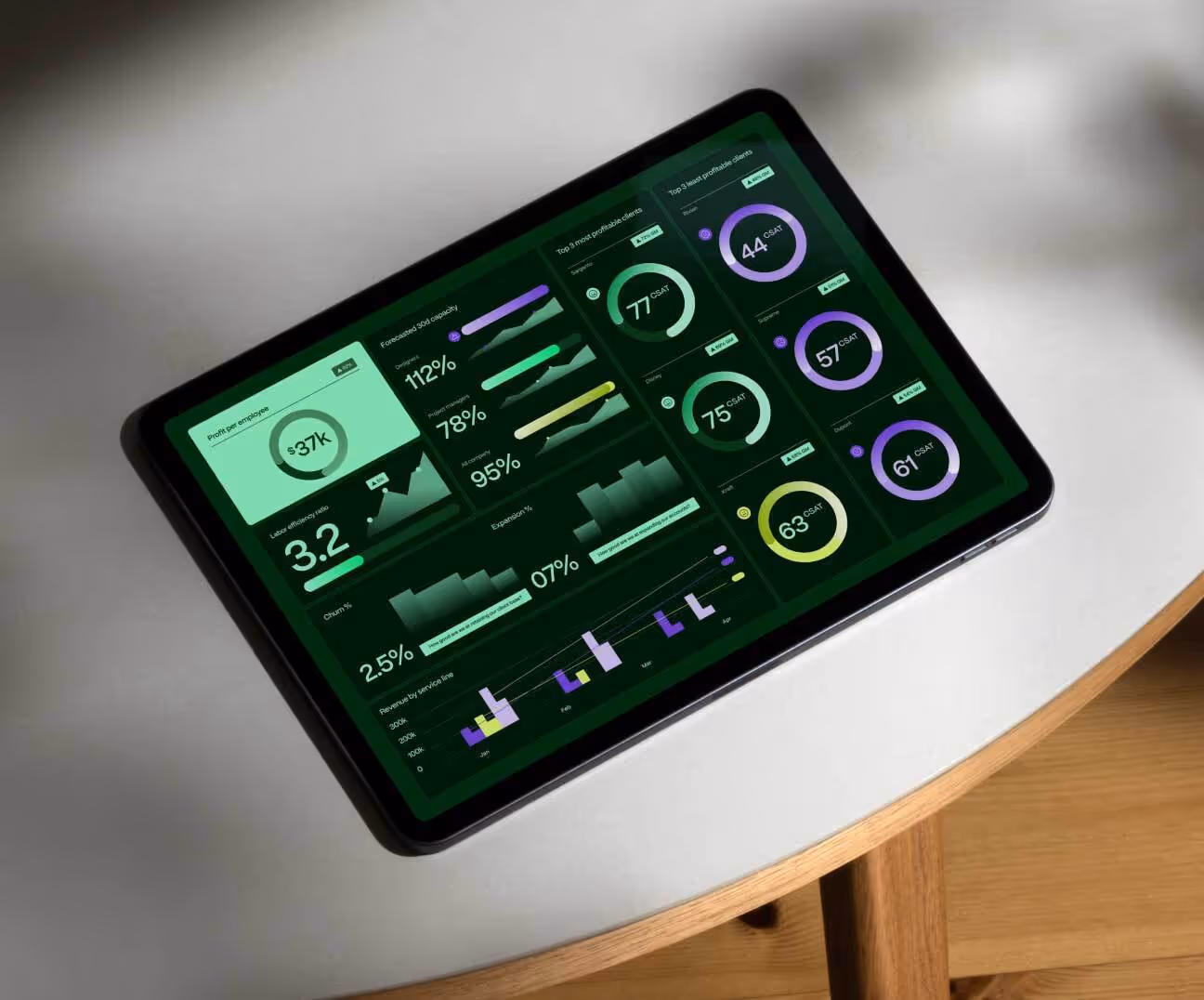


.avif)

.avif)
.avif)
.avif)

