.svg)


Logo design has transformed dramatically over the decades, offering fresh insights and trends that shape visual branding today. What began as ornate emblems has evolved into adaptive marks that work across every screen and context.
This journey reflects changing tastes, technology, and how brands communicate with their audiences. From the mid-century shift toward streamlined corporate identities to shape-shifting digital marks, logos tell powerful brand stories in increasingly sophisticated ways.
The most effective logos balance artistic expression with strategic thinking, creating marks that capture attention, communicate values, and adapt to our multi-platform world. In this article, we’ll break down 10 key trends shaping modern logo design, each revealing how brands can stay distinctive, relevant, and ready for anything.
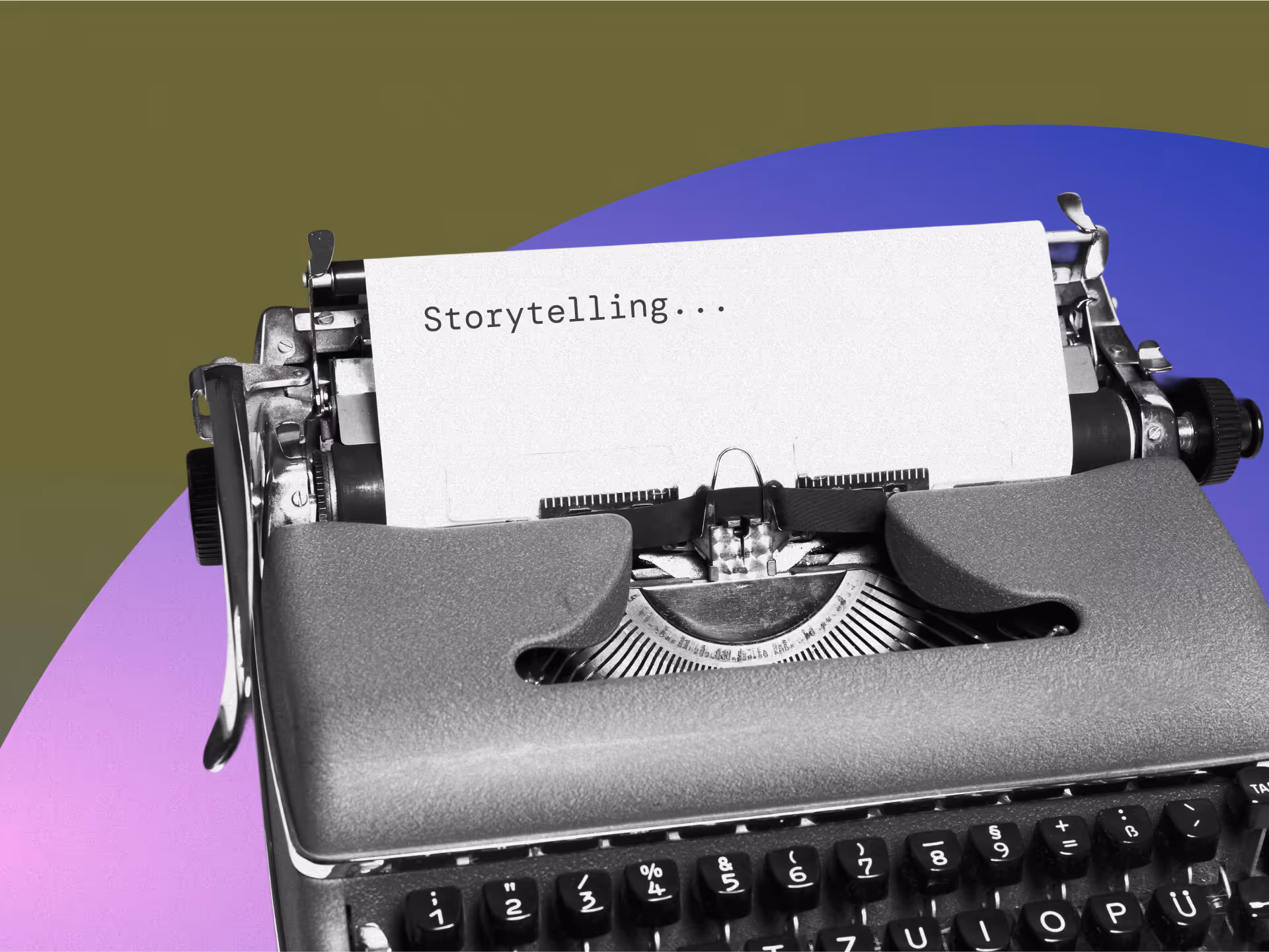
10 Logo Design Insights and Latest Trends Shaping Visual Identity
Today's logo design landscape blends artistic expression with strategic thinking to create marks that stand out in our crowded visual environment. These insights reflect how designers respond to technological changes and evolving consumer expectations.
1. Bold Neon and High-Contrast Palettes
Electric greens, yellows, and pinks are cutting through digital clutter, boosting brand visibility and energy. Companies across sectors have embraced these vibrant hues as their primary colors, moving away from the muted earth tones of recent years.
These bold color choices can raise click-through rates by up to 25% in digital ads, making them particularly effective online. The strategic use of high-contrast color combinations creates stopping power in feeds and timelines where attention is increasingly scarce.
2. Concept-Driven Minimalism
Minimalism continues to reign, but with a narrative twist. Today's logos use geometric shapes, simple lines, and limited color schemes while telling subtle stories. Recent redesigns from major brands showcase this trend with cleaner lines and more geometric forms.
These designs prove that "less" can indeed carry "more" meaning, balancing simplicity with brand storytelling. The focus has shifted from stripping away elements to ensuring each remaining element carries maximum conceptual weight.
3. Playful, Ornamental Typography
Typography has become both a focal point and a creative playground in contemporary logo design. We're seeing "serifs with a twist"—traditional serif fonts given unexpected flourishes. Custom ligatures, overlapping colors, and unusual negative spaces transform simple initials into evocative symbols, examples of inspiring logo design.
Studies show that 75% of consumers recall distinctive logotypes more easily, boosting brand memorability. This approach treats letters as carriers of verbal meaning and visual elements with emotional resonance.
4. Spatial Storytelling Through Negative Space
Logos increasingly use space to highlight brand aspects, telling stories through clever arrangement and negative space. This technique leverages Gestalt principles in design to create multi-layered meanings that reward viewers who take a second look.
Negative space can communicate brand values, suggest product benefits, or create surprising visual moments that enhance memorability. The best examples achieve this without compromising on clarity or immediate recognition.
5. Dynamic Adaptability Across Platforms
Today's logos need unprecedented flexibility. They must shape-shift across platforms, from tiny app icons to billboard-sized displays, from social media avatars to AR filters, demonstrating how modern logo design trends emphasize adaptability and flexibility. Sometimes, strategic animation is incorporated into logos to enhance engagement.
This has sparked responsive logos that morph and adapt based on context while maintaining their distinctive personality. The logo is no longer a fixed mark but a system of related elements that can expand or contract while preserving brand recognition.
6. Asymmetrical Balance and Composition
Breaking away from traditional symmetry, modern logos embrace dynamic asymmetrical compositions that create visual interest. These designs feel more organic and contemporary while maintaining a sense of balance.
Asymmetrical designs now account for some top global logos, moving from rigid formality to more expressive visual identities. This approach creates logos that feel more human and accessible while still projecting professionalism.
7. Nostalgic References With Modern Execution
Brands are increasingly tapping into collective nostalgia while avoiding retro clichés. Modern logos reference past eras through subtle color choices, typography, or compositional approaches updated for contemporary contexts.
This nostalgic sensibility creates immediate emotional connections with audiences while maintaining current visual standards. The trick is to evoke the feeling of a particular era without directly mimicking its aesthetic limitations.
8. Strategic Use of Animation and Motion
Static logos give way to marks with subtle motion elements that enhance brand personality, embracing the animation trend in logos. These animated versions appear in digital contexts while maintaining static versions for traditional applications. Motion allows logos to tell more complex stories, direct attention, or create memorable moments that static designs cannot. The key is ensuring that motion enhances rather than distracts from core brand recognition.
9. Stripped-Down Wordmarks With Character
Text-based logos have evolved beyond simple type treatment to become distinctive brand assets. Designers transform ordinary words into proprietary visual assets by customizing letter forms, adjusting spacing, or incorporating subtle graphic elements.
These wordmarks work particularly well for brands with distinctive names or those seeking to simultaneously establish verbal and visual recognition. The approach prioritizes readability while adding enough unique characters to stand apart.
10. Conscious Color Selection Based on Psychology
Color choices now reflect deeper strategic thinking about psychological impact and cultural associations. Brands select palettes based on the specific emotions and perceptions they want to evoke, moving beyond personal preference or industry conventions.
This psychology-informed approach ensures logo colors support broader brand positioning and communication goals. The most successful examples demonstrate an understanding of universal color associations and culturally specific meanings.
How Has Logo Design Evolved Over the Years?
Understanding today's logo design trends requires appreciating their historical context. The journey from ornate emblems to adaptive digital marks reveals why specific approaches resonate with contemporary audiences.
Shift from Decorative Logos to Clear, Recognizable Marks
In the mid-20th century, logo design transitioned from ornate, heraldic-style crests to streamlined corporate identities. This shift favored simplified wordmarks, establishing minimalist principles prioritizing clarity and instant recognition, laying the groundwork for modern branding.
Use Bold Colors to Build Emotional Connection
The late 20th century brought an explosion of color and creativity. Bold hues and playful shapes emerged alongside consumer culture and personal computing.
Logos became more expressive, often using gradients, dynamic elements, and 3D effects to stand out in an increasingly visual world. This period demonstrated how color could become a primary identifier for brands seeking to establish emotional connections with audiences.
Design Logos That Thrive in Digital Spaces
When digital platforms and mobile devices took over, logo design embraced flatness and simplicity. Small screens demanded clarity, pushing designers to strip away excess details in favor of clean lines and solid colors.
This flat design trend prioritizes on-screen legibility and quick loading times, essential for digital success. The constraints of digital media ultimately pushed logo design toward greater versatility and adaptability, as seen in notable examples like the Twitter rebranding case study.
How Does Technology Influence Modern Logo Creation?
Integrating new tools and technologies reshapes how logos are conceived, created, and implemented. These technological advancements offer opportunities and challenges for designers seeking to develop distinctive brand marks.
AI to Expand Creative Possibilities
Design software now offers AI-driven tools that generate hundreds of logo variations based on initial parameters. These tools don't replace human creativity but expand the exploration phase by suggesting combinations and approaches designers might not immediately consider.
The AI logo design sector continues to grow as brands seek efficient ways to explore visual options. The most successful applications use AI as a collaborative partner rather than a replacement for strategic thinking.
Sped Up Revisions with Real-Time Testing
Advanced design software has dramatically sped up the revision process. Designers can test logo variations instantly, reducing revision cycles. This rapid iteration allows for a more profound exploration of concepts and faster alignment with client visions.
The ability to quickly visualize alternatives makes the design process more collaborative and evidence-based, leading to stronger, thoroughly vetted final outcomes.
Applying Advanced Effects Without Slowing Down
Textured grains, metallic sheens, and micro-gradients that once required work days are now available as built-in features in modern design software. This democratization of complex effects lets designers focus more on concepts and strategy than technical execution.
The result is a more diverse visual landscape where distinctive effects are accessible to brands of all sizes, not just those with extensive design resources.
More intelligent, Scalable Brand Systems
As logos must function across expanding contexts, technology now supports systematic platform implementation. Design systems and brand guidelines have evolved into dynamic digital resources that ensure consistency while allowing appropriate flexibility.
These systems help brands maintain recognition while adapting to the specific requirements of different media and platforms, from social media icons to physical signage.
Balancing Trendiness and Timelessness
The art of logo design lives in finding that sweet spot between contemporary relevance and lasting recognition. The most successful logos don't chase every trend but selectively incorporate elements that enhance their core message.
They're built on foundational principles, clarity, memorability, and versatility, key aspects in creating memorable logos while remaining open to evolution. The best designs feel current and enduring, making immediate connections while building long-term recognition.
Ready to create a logo that captures attention today and builds recognition for years to come? At NoBoring Design, we transform brands through strategic visual identity that connects and converts. Our logo design process combines deep brand understanding with creative exploration to develop marks that stand out in crowded markets, using practical design strategies.
Key Takeaways
- Modern logo design emphasizes adaptability across digital platforms while maintaining brand recognition.
- Color psychology is crucial in creating memorable visual identities that evoke specific emotions.
- Minimalist approaches focus on concept-driven simplicity rather than decorative elements.
- Typography has evolved from purely functional to becoming a central creative element in contemporary logos.

FAQ
We have the answers.
The latest trends in logo design for brand identity include bold neon palettes, concept-driven minimalism, playful typography, and dynamic, adaptive marks that work across digital and physical platforms. Designers use these approaches to create logos that stand out, communicate stories, and stay visually consistent across social media, websites, and packaging.
Logo design evolved from intricate, heraldic emblems to streamlined wordmarks and minimalist forms starting in the mid-20th century. Today’s modern logos prioritize clarity, adaptability, and instant recognition, reflecting changes in technology, branding, and consumer expectations for visual identity that works on any screen or medium.
Color psychology is vital in logo design because it shapes emotional responses and brand associations. Strategic color choices in logos help companies build stronger visual identities, influence customer perceptions, and evoke desired feelings such as trust, excitement, or innovation, making color selection a foundational element in effective logo branding.
Technology has transformed modern logo design by enabling AI-driven creativity, real-time revisions, advanced effects, and scalable brand systems. Design software now allows for rapid prototyping, animation, and responsive logos, making it easier for brands to create compelling visual identities that adapt across digital platforms and devices.
more content

Let's face it, we're drowning in visuals every day. Graphic design is your secret weapon for brand differentiation. The right design choices transform your brand from forgettable to unforgettable, from wallflower to showstopper.
These strategic design approaches work as your toolkit. From the essentials like logos and colors to the magic of digital interactions and the power of visual marketing copywriting, each design type tells a piece of your unique story.
In this article, you will master these design disciplines and brand positioning strategies and create visual stories that stick with your audience like glue.
9 Types of Graphic Design That Dares to Differ
Strategic design isn't just pretty packaging; it's your battle plan against invisibility. These nine design battlegrounds give you the firepower to create experiences that competitors can't copy and customers can't forget.
1. Brand Identity Design: Creating Your Visual Foundation
Brand identity design is how people see you in the marketplace. It's a complete visual element system that shows your brand's personality, values, and position. This includes your logo, colors, typography, and other fundamental visuals that instantly set you apart from competitors.
The magic of great brand identity is consistency. Understanding logo design best practices ensures that these elements appear the same everywhere, building recognition and trust. Think about how quickly you spot a Coca-Cola product, an Apple device, or a powerful brand identity at work.
A complete brand identity system includes several key pieces: primary and secondary logos, color palettes, typography, imagery style, and graphic elements. Each element should be chosen to communicate what makes you different. Your colors might evoke specific feelings or industry associations, while your typography can show personality traits like professionalism, friendliness, or innovation.
Your brand identity needs to be flexible enough to look great everywhere, from business cards to billboards, websites to apps. To keep everything consistent, you need detailed brand guidelines. By creating a branding kit, you establish rules for how your visual identity should be used, covering logo usage, color specs, typography rules, and imagery guidelines.
Your visual identity needs to match who you are as a brand. If you stand for innovation and cutting-edge tech, your visuals should reflect that through modern fonts, sleek colors, and forward-thinking logo design.
2. Packaging Design: Converting at the Shelf
Your packaging is often the first physical encounter customers have with your brand. Innovative packaging design blends function, beauty, and brand messaging to create shelf impact that drives consumer preference and purchases.
Like innovative brochure design ideas, intelligent packaging blends function, beauty, and brand messaging to create an impact that drives consumer preference and purchases.
Good packaging does more than protect what's inside; it actively tells your brand story. Packaging elements like size, shape, material, graphics, typography, and imagery all affect how people perceive products.
Brands try fresh approaches that break category norms to grab attention on crowded shelves. Unique materials like eco-friendly options and strategies in disruptive graphic design get noticed and show what you value. Distinctive shapes create instant differentiation; you'd never mistake Toblerone's triangular chocolate bar in the candy aisle.
Interactive elements like color-changing labels or QR codes that launch augmented reality experiences create memorable brand moments. Some brands use their packaging to tell stories about their values or origins, building deeper customer connections.
When creating disruptive packaging, balance innovation with function and brand recognition. The best designs keep core brand elements while introducing new ideas that grab attention and show your unique value proposition in ways competitors can't easily copy.
3. Web Design & Digital Experience: Differentiating Online
Your website and digital experiences have evolved from simple information pages to complete brand touchpoints. Good web design creates digital spaces that reflect your brand's personality and values, helping you stand out in crowded online environments.
User experience (UX) has become a major differentiator as people navigate an increasingly complex digital world. When you focus on intuitive navigation, fast load times, and smooth interactions, you create digital experiences that don't just satisfy users, they delight them. This positive feeling transfers directly to how people see your brand.
To lift your digital presence from functional to unforgettable, focus on creating signature moments that align with your brand strategy. Custom cursor effects replace the standard cursor with a branded element that responds to user interactions, reinforcing your visual identity with every mouse movement.
Parallax scrolling creates depth and visual interest by moving background elements at different speeds, pulling users into your brand's world. Interactive storytelling guides users through your brand story using elements that reveal information as they engage with your site.
When using these techniques, always balance creativity with usability. The goal is to create memorable experiences that enhance, not hinder, the user's journey.
By thoughtfully including these elements in your web design and digital experiences, you create a unique online presence that builds stronger connections with your audience. For more insights, consider our tech web design guide.
4. Environmental Graphic Design: Branded Spaces
Environmental graphic design transforms physical spaces into immersive brand experiences through strategic visual elements. Retail stores, offices, and public areas become influential touchpoints connecting customers with your brand identity.
The secret lies in translating your visual identity into three-dimensional spaces people can interact with. This approach goes beyond logos on walls; it creates atmospheres embodying your brand's unique personality.
Creating immersive environments requires engaging multiple senses through sight, sound, touch, and smell. Custom fixtures, materials, and architectural elements should reflect your brand identity.
Interactive displays and touchscreens encourage engagement and create memorable brand experiences. Cohesive wayfinding systems reinforce your brand through consistent color, typography, and iconography.
Implementation strengthens identity and values across various organizations, including nonprofits seeking engagement. Environmental design doesn't require completely renovating spaces, especially for smaller businesses.
Identify key impact areas, reception spaces, product displays, or branded meeting rooms. Even small touches like custom wall graphics significantly enhance the overall brand experience.
5. Motion Graphics & Animation: Dynamic Brand Expression
Motion design adds a dimension to brand expression that static design simply cannot match. In today's digital-first world, motion graphics have become essential for creating engaging experiences.
Brands express personality through timing, pacing, and movement across various platforms. This dynamic expression reinforces brand attributes, connecting emotionally with audiences.
Studies show that viewers remember 95% of messages when watching a video versus 10% when reading text. Creating a cohesive motion system requires defining attributes that match your brand personality.
Develop guidelines for timing, easing, and transitions to ensure application consistency. Build a library of reusable animation components that can be applied across various contexts.
Consider how motion adapts across different screen sizes while maintaining consistent experiences. Balance distinctive animation with usability. Motion should enhance and not distract from core content.
Document motion guidelines, including timing specifications and approved movement behaviors. Thoughtful incorporation creates more engaging, memorable experiences that differentiate your brand.
6. Social Media Design: Standing Out in the Feed
Creating a distinctive social media presence is crucial for brand differentiation in crowded platforms. Platform-specific design strategies maintain brand consistency while optimizing for each environment.
The key is developing cohesive visual systems that adapt effectively across different platforms. This approach balances trend awareness with unique brand identity elements for maximum recognition.
Catching attention in fast-scrolling feeds requires strategic use of signature color palettes. Distinctive typography should reflect brand personality while remaining legible on small screens. Consistent imagery style, whether illustrations, photography, or mixed media, creates visual cohesion.
Template systems provide recognizable structures while allowing for content variety and freshness.
Adapting design across platforms requires tailoring content for each platform's preferred dimensions. For native engagement, utilize platform-specific features like Instagram carousels or Twitter polls.
Maintain a consistent brand voice even when visual elements adapt to different platform requirements. This balanced approach ensures your brand remains recognizable across all social environments.
7. User Interface (UI) Design: Functional Brand Differentiation
UI design has become critical in creating brand differentiation throughout digital spaces. How interfaces look and feel significantly impacts user perception, engagement, and business results.
The best brands know UI isn't just about usability; it creates memorable digital interactions. When UI and brand strategy work together, digital experiences become powerful market differentiators.
Creating distinctive UI elements balances usability with meaningful brand expression. Interface components' colors, typography, and imagery should reflect overall brand aesthetics. Custom animations and transitions can become signature elements associated with your brand. Comprehensive design systems ensure consistency across products and digital platforms.
Micro-interactions, small, delightful animations or feedback, reinforce brand personality daily. The balance between innovation and usability remains crucial for effective brand differentiation. Interfaces should be unmistakably tied to your unique identity without sacrificing ease of use.
Signature components aligned with brand values create exceptional experiences in crowded spaces.
8. Illustration & Custom Imagery: Ownable Visual Worlds
Custom illustration and imagery create unique visual territories that competitors cannot easily replicate. These visuals express complex brand attributes and build emotional connections when used consistently.
Strategic illustration across touchpoints, from websites to packaging, maintains a cohesive brand identity. Distinctive illustration styles craft visual worlds that differentiate brands in crowded markets.
Well-developed illustration systems adapt for everything from simple icons to complex storytelling. This versatility maintains visual consistency even as messaging and contexts continuously change.
Effective systems require clear guidelines defining line weights, textures, and character styles. Color palettes and environmental elements should follow consistent usage rules across applications.
Consider scalability across media, from small icons to large environmental implementations. Visual metaphors should align with core brand attributes to reinforce your positioning message. Create libraries of reusable elements, ensuring consistency across applications and designers. Establish review processes to maintain quality and brand alignment throughout the visual system.
9. Typography Design: The Art of Strategic Text
Typography design is more than just choosing fonts; it’s the strategic crafting of text to be readable, visually appealing, and aligned with a brand’s identity. It involves creating comprehensive systems that reflect personality and values, transforming typography into an intentional brand experience.
At its foundation, good typography establishes a visual hierarchy that guides readers through content. Through deliberate choices in typefaces, spacing, and alignment, typography enhances clarity and brand consistency, ensuring the right messages stand out.
Distinctive typography sets brands apart. From Coca-Cola’s iconic script to Netflix’s custom typeface, recognizable typography reinforces identity and builds emotional connection across every interaction.
To stand out, brands must balance visual creativity with functional readability. Unique typographic scales, custom fonts, and consistent hierarchy form a proprietary style that’s hard to mimic, making typography a strategic tool for differentiation and brand memorability.
Why the Right Graphic Design Is Essential for Brand Differentiation
Thoughtful graphic design creates visual distinctions that help your brand rise above the noise. When these elements work together, they form a recognizable system that communicates your brand's unique personality, values, and promises before a single word is read. Here are some reasons why graphic design is so crucial for your brand:
To Create a Distinctive Visual Fingerprint That Cuts Through the Noise
Good design isn't just decoration, it's shorthand that instantly tells people who you are. When your logos, colors, and typography dance together in harmony, they create a visual fingerprint that's uniquely yours in a sea of sameness.
To Build Trust and Recognition
The psychology behind consistent design packs a serious punch. Research shows color alone boosts brand recognition by up to 80%. Customers who see familiar design elements across different touchpoints develop trust and warm feelings about your brand.
Distinctive design carves out your territory in customers' minds. When everyone's shouting for attention, your unique visual identity gives people something to remember you by. This matters even more today when we're all bombarded with countless brand messages daily.
Serve Different Goals
Different design types serve other goals. Your packaging might grab attention on a shelf, while your interface design shapes how people interact with your products. Motion graphics bring your story to life, and environmental design creates immersive brand spaces.
When you strategically use various types of graphic design for brand differentiation, you build a visual language that communicates your unique value at every customer touchpoint. This isn't just about looking good, it's about creating meaningful differentiation that drives real business results.
Finding Your Brand's Perfect Visual Voice
Finding the right design approach for your unique brand positioning requires specialized expertise. Professional designers bring creative vision and strategic understanding to help you determine which design styles and elements most effectively communicate your brand's essence.
Design agencies like NoBoring Design work with brands to navigate this discovery process, facilitating the development of authentic visual expressions that connect with target audiences while establishing meaningful differentiation in the marketplace.
Your Brand, Designed Differently
These nine strategic types of graphic design transform your brand from forgettable to distinctive in the marketplace.
By thoughtfully applying brand identity, packaging, web design, environmental graphics, motion graphics, social media design, UI design, and custom illustration, you create a visual language that communicates your unique value at every touchpoint. This comprehensive approach turns every interaction into a chance to reinforce who you are and what makes you different.
True brand differentiation goes beyond just looking different. It's about finding the balance between standing out and staying true to yourself.
Ready to find the best design style that suits your brand? At NoBoring Design, we help brands find that sweet spot where distinctiveness meets authenticity and bring your unique brand vision to life. Let's work together to ensure your brand stands out in all the right ways. Reach out today!
Key Takeaways
- Strategic graphic design creates meaningful brand differentiation that drives business results.
- Consistent visual elements across touchpoints build recognition and trust.
- Each design type serves specific functions in your overall brand experience.
- A comprehensive approach turns every interaction into an opportunity to reinforce your brand's uniqueness.

Patterns do the heavy lifting for your brand identity. While your logo takes center stage, patterns quietly create recognition that sticks with your audience.
Logos make direct statements, but patterns communicate your brand's personality across every visual identity element, from packaging to social posts. A strong pattern becomes visual shorthand, and customers recognize you before seeing your name.
Brands with distinctive pattern systems enjoy higher recognition rates than logos alone. These patterns aren't just decorative touches but powerful differentiators that create unforgettable brand experiences in our visually saturated world. This article will cover some of the most exciting patterns you can explore to transform your brand identity.
10 Powerful Patterns For An Unforgettable Brand Identity
Each pattern approach offers unique emotional resonance while working practically across multiple touchpoints. They're not mere decorations but strategic visual assets that instantly communicate your brand's personality, even without your logo.
1. Geometric Minimalism
Clean lines, simple shapes, and limited colors create sophisticated, modern identities that communicate precision and clarity. Apple pioneered this with subtle gray-on-white patterns that reinforce their commitment to simplicity.
These patterns excel in branding for tech companies, financial institutions, and modern luxury brands seeking to convey expertise. The key is restraint, limiting your pattern to 2-3 geometric shapes and maintaining consistent proportions.
Geometric minimalist patterns signal trustworthiness and competence to consumers. For best results, try subtle tone-on-tone applications with occasional bold color accents highlighting key touchpoints. Select the right typography for your brand and ensure you pair fonts effectively to complement your geometric patterns.
2. Biomorphic Abstractions
Flowing, organic patterns inspired by natural forms create warm, approachable identities that feel intuitive rather than constructed. These patterns feature curved lines, irregular forms, and natural movement that trigger positive emotional responses.
Wellness brands often use biomorphic patterns to convey calm and balance, and food brands frequently employ leaf-inspired patterns to reinforce natural positioning.
When using these patterns, maintain a consistent line weight and color palette while allowing organic variation. This balance creates both recognition and the pleasant unpredictability that makes natural forms engaging.
3. Heritage-Inspired Patterns
Drawing from cultural and historical motifs adds depth and storytelling to your brand. Heritage-inspired patterns instantly communicate tradition, craftsmanship, and authenticity. They connect to visual languages developed over centuries.
The key is evolution rather than imitation, respectfully adapting historical motifs to create something distinctive yet rooted.
Heritage patterns can act as powerful trust signals, suggesting proven quality and continuity over time.
These patterns often communicate shared values and reliability within a community, especially in contexts where tradition is highly valued. However, the effectiveness of heritage as a trust signal depends on cultural context and the meanings attached to those patterns.
Focus on elements relevant to your brand story, simplifying traditional motifs for modern use while preserving their essential character.
4. Dynamic Gradients and Color Fields
Through subtle color transitions, contemporary gradient patterns create depth, movement, and visual interest. They transform brand identity by creating emotional resonance through color relationships.
Color psychology research and design theory suggest that gradient patterns can evoke more nuanced and complex emotional responses than flat colors, potentially creating richer brand associations.
When implementing gradients, focus on thoughtful color selection that reflects brand personality. Warm-to-cool transitions create different emotional responses than light-to-dark ones.
Test extensively and establish precise technical specifications to ensure your gradients remain reproducible across all mediums. The strongest gradient patterns maintain recognition even when simplified for challenging reproduction contexts.
5. Playful Geometric Repeats
Repeating geometric elements with unexpected colors or arrangements creates memorable, energetic identities that feel approachable and innovative. This approach embraces personality through playful arrangement and vibrant color combinations.
Playful patterns can increase brand engagement, particularly among younger audiences who value creativity and self-expression. When developing these patterns, design best practices recommend establishing a consistent 'shape vocabulary' of 3-5 elements while allowing for creative arrangement and color application.
This creates a system that is immediately recognizable and infinitely adaptable across touchpoints. The playfulness of these patterns allows brands to maintain recognition while adjusting energy levels for different contexts.
6. Textural Patterns
Patterns mimicking physical textures add a tactile dimension to brand identity, creating sensory associations even in digital applications—textural patterns such as leather grain, fabric weave, and handmade paper texture trigger touch memories.
Luxury brands excel with textural patterns. Coffee brands often use bean textures across their visual system, reinforcing product quality through visual texture cues.
Sensory branding shows texture patterns can increase perceived value by triggering multisensory responses. When implementing textural patterns, focusing on high-quality reproduction that maintains detail even when scaled is essential, ensuring a consistent and impactful multisensory experience.
Consider where actual texture (embossing, specialty papers) can complement visual texture patterns for maximum impact across physical and digital applications.
7. Data-Driven Patterns
Innovative patterns created from brand-relevant data visualization transform information into a distinctive visual identity. Data-driven patterns make abstract concepts tangible while creating aesthetic appeal with genuine meaning behind the design.
Patterns based on meaningful data create deeper engagement than purely decorative designs. Data-driven visuals help users interpret information, make connections, and retain knowledge more effectively.
Then, visual systems will be created that transform this data into aesthetically pleasing patterns without sacrificing accuracy. The result combines beauty with meaning, creating patterns that reward closer inspection and demonstrate your brand's commitment to substance beyond style.
8. Disruptive Grid Patterns
Patterns that intentionally break grid structures create memorable, distinctive identities that stand apart from conventional design. Disruptive grid patterns create visual interest through controlled disruption of expected visual norms.
Moderate pattern disruption increases attention and memory formation. When creating disruptive patterns, establish clear rules for how and where disruption occurs.
This controlled approach ensures the pattern remains recognizable while maintaining its attention-grabbing power. The goal is strategic disruption rather than random chaos, creating patterns that capture attention through intentional breaks from visual predictability.
9. Narrative Illustration Patterns
Incorporating illustrated elements that tell brand stories creates engaging, distinctive visual identities with built-in storytelling. Narrative illustration patterns combine the recognition benefits of pattern with narrative depth.
Narrative elements in visual branding increase emotional connection and brand recall. When developing narrative patterns, focus on simplified illustrations that maintain clarity at different scales.
Create a system where individual elements can stand alone while working together in larger pattern applications. This flexibility allows consistent storytelling across diverse touchpoints, from tiny app icons to expansive environmental graphics.
10. Dynamic Motion Patterns
Patterns designed for movement and animation create contemporary, engaging brand experiences, particularly across digital touchpoints. Dynamic motion patterns maintain static recognition while incorporating elements like brand iconography that come alive through animation.
According to UI/UX research, animated patterns increase user engagement. When developing motion patterns, create systems that work in static and animated states.
Establish motion principles that maintain brand personality- subtle (gentle pulses, slow transitions) or energetic (rapid movement, playful interactions), and consider incorporating micro-interactions to enhance user engagement. Animations should enhance, not distract from, the core brand experience.
Why Patterns Matter in Modern Branding
Standing out is everything in the creative marketplace. Patterns help you shine by maintaining visual consistency without boring your audience with logo fatigue.
Just look at the pattern pros! Target's brilliant red bull bull's-eye extends far beyond its logo. Burberry's check pattern is so iconic that it's won legal battles based solely on pattern recognition.
Why do these patterns work so beautifully? They create a memorable brand by being instantly recognizable yet incredibly flexible. They cover spaces where logos would feel overwhelming, creating immersive brand experiences while keeping your identity intact.
The Psychology Behind Pattern Recognition
Our brains are pattern-hunting machines. We evolved this way to survive, spotting friends from foes and safe foods from dangerous ones. This hardwired system makes patterns exceptional branding tools that speak directly to our subconscious.
When customers repeatedly encounter your distinctive pattern, they form unconscious associations that zip past rational thought, aiding in effective brand positioning strategies.
These associations tap into what Carl Jung called brand archetypes, universal character models that resonate across cultures. A geometric pattern with clean lines might trigger the "Ruler" archetype, signaling expertise. Organic patterns might evoke the "Caregiver," suggesting warmth and support.
How to Implement Cool Patterns Across Key Brand Touchpoints
Successful pattern implementation requires strategic planning across all brand touchpoints. Start by creating a pattern system, not just individual patterns, with clear guidelines for application across contexts.
Consider creating primary and secondary patterns that work together, a signature pattern for immediate recognition, and supporting patterns for various applications, document scale relationships, showing how patterns should appear at different sizes and across different media.
Physical Applications
Physical applications demand careful consideration of material properties and production methods. Patterns that work brilliantly on smooth surfaces may lose definition on textured materials. Consider how lighting affects pattern perception in environmental applications, patterns visible in daylight might disappear under artificial lighting.
Production constraints also matter significantly. Consider how patterns will distort when applied to different shapes and sizes for apparel applications.
Scale relationships become critical in physical applications. A pattern perfect for business cards might overwhelm large-format applications like retail environments. Create scale variants that maintain recognition while adapting to different physical contexts.
Digital Applications
Digital pattern implementation requires consideration of technical constraints and responsiveness across devices. File size significantly impacts load times—overly complex patterns can slow websites and apps, frustrating users.
Develop responsive pattern systems that adapt to different screen sizes without losing recognition. Consider creating simplified versions for small screens and more detailed versions for larger displays. Integration with website navigation best practices ensures that your patterns enhance rather than hinder user experience.
Accessibility remains essential. Test patterns for sufficient contrast to ensure visibility for all users. The best digital pattern systems enhance brand experience while remaining technically efficient and accessible to all users.
Brand Collateral
Your brand collateral, from business cards to presentations, represents prime territory for pattern implementation. These materials directly communicate your brand story and deserve thoughtful pattern application.
Create guidelines for pattern positioning that complement rather than compete with essential information. Consider how patterns perform at different print quality levels. Will your pattern maintain its impact on both premium and standard prints?
Pattern variations across collateral can create collectible appeal. Some brands create subtly different pattern versions for other materials, encouraging customers to notice and collect the variations.
Working with Professionals
While many brands implement patterns in-house, engaging specialists often delivers superior results, especially for complex systems or multi-channel deployments. Graphic designers bring a valuable perspective on visual harmony and technical limitations, while UI/UX designers ensure digital patterns enhance user experience.
Production specialists provide critical insights into material constraints and manufacturing processes, preventing costly mistakes. When selecting professionals, look for industry-specific experience and pattern system expertise. Then, establish a collaborative workflow where their technical knowledge complements your brand vision, resulting in distinctive patterns that perform flawlessly across all touchpoints.
Your Next Pattern Steps
Those brands you recognize from a distance? They use pattern systems that speak directly to your brain before conscious thought even kicks in. From subtle geometry to iconic checks, these visual systems create instant recognition that transcends logos. Your brand deserves this same superpower.
Take a fresh look at your current brand identity. Does it feature distinctive patterns that spread your visual magic across all touchpoints? Even simple pattern systems, when strategically deployed, can dramatically boost how people recognize and remember you.
At NoBoringDesign, we create design systems that capture your brand's essence and transform it into visual identity systems that work tirelessly across every customer touchpoint. Ready to transform your brand identity with patterns that truly connect? Let's create something remarkable together!
Key Takeaways
- Patterns create brand recognition that works alongside and beyond your logo.
- Visual pattern systems boost brand recognition by up to 37% compared to logos alone.
- Pattern-based branding speaks directly to our brain's hardwired pattern recognition systems.
- The right pattern system can become your brand's most distinctive and flexible visual asset.

AI hasn't just changed the visual identity game; it's flipped the table entirely. DALL-E and Midjourney stand ready to electrify your brand's visual presence, each bringing its creativity.
Choosing between them isn't about which makes prettier pictures. It's about finding your creative match, the tool that resonates with your brand's voice, aesthetic needs, and workflow demands.
These AI powerhouses don't just spit out images. They ignite possibilities. They breathe life into concepts that once lived only in your head. They transform how your brand connects visually in ways traditional design never could. This article will help you decide which creative tool is best for your creative project, allowing you to move from hours of pixel-pushing into moments of pure inspiration for your brand.
Understanding the Tech Behind DALL-E and Midjourney
DALL-E and Midjourney generate images using advanced diffusion models, but their approaches and outputs differ significantly, affecting how they enhance your brand's visual storytelling.
DALL-E: Text to Visual
DALL-E is an AI image generation system developed by OpenAI that creates images from textual descriptions. Built on diffusion model technology, DALL-E processes text prompts and gradually refines random noise into coherent photos that match the specified description.
Its integration with ChatGPT creates a conversational interface for image generation, allowing brands to describe their visual needs in natural language and receive matching outputs. DALL-E specializes in interpreting complex prompts and generating images accurately representing detailed concepts and ideas.
Midjourney: Art That Feels Human
Midjourney is an independent AI image generation tool that transforms text descriptions into visually striking images. It has gained recognition for producing images with artistic quality and distinctive style using diffusion technology.
The platform operates primarily through Discord and emphasizes aesthetic richness in its outputs. Midjourney has become particularly popular for creating visually impactful, emotionally resonant imagery, combining technical precision and creative flair.
These tech differences matter for your brand in practical ways. Do you need to show complex ideas or maintain tight visual guidelines accurately? DALL-E's precision makes it your go-to for digital assets that communicate exactly what you intend.
Are you trying to create memorable campaigns with a distinct visual personality? Midjourney's artistic approach delivers emotionally charged imagery that sticks.
The secret is matching the tool to your visual goals. Pick your weapon based on your brand's needs, not just what looks cool in your portfolio.
DALL-E vs Midjourney: 5 Key Differences
1. Brain vs. Beauty: How Each Tool Processes Your Ideas
DALL-E prioritizes semantic understanding and conceptual accuracy. Its neural networks excel at interpreting relationships between objects and environments, making it perfect for complex scenes with multiple elements. Your brand gets literal visualization with contextually appropriate visuals.
Midjourney favors aesthetic impact over literal interpretation. Its algorithms emphasize composition, lighting, and artistic merit, often creating dramatic, cinematic visuals that might deviate from exact specifications. Choose this when emotional impact matters more than perfect accuracy.
2. Picture Perfect: Quality That Speaks For Your Brand
Midjourney delivers photorealistic, detailed images with stronger artistic expression and emotional resonance. It's your go-to for creating powerful visual connections, especially in industries where visual impact is everything: Fashion, luxury goods, and entertainment.
DALL-E creates high-quality visuals with a more standardized appearance that maintains consistency. It excels with complex directions, producing intricate details that align with nuanced prompts. It is perfect for communicating complicated ideas while maintaining visual cohesion across marketing materials.
3. Drive the Wheel: Control Systems That Keep You in Charge
DALL-E's conversational interface intuitively creates and refines images. Tell it what you want in plain language, then fine-tune through natural dialogue, no technical expertise required. This is perfect for quickly visualizing abstract ideas without wrestling with parameters.
Midjourney rewards those willing to learn its technical controls with unprecedented precision. With extensive parameter settings, fine-tune everything from color palettes to composition. Its reference image feature lets you incorporate brand elements, ensuring new visuals feel like authentic extensions of your visual identity.
4. Platforms That Welcome Your Team
DALL-E lives everywhere: in web interfaces, mobile apps, and API integration. This flexibility helps teams of any size or technical ability easily incorporate it into existing workflows without disruption.
Midjourney operates primarily through Discord, creating a vibrant community where your team can collaborate and learn from others in real-time. Its advanced parameter controls offer greater customization options for maintaining brand consistency, though with a steeper learning curve.
5. Cover Your Assets: Commercial Rights That Protect Your Brand
DALL-E offers enterprise indemnification options, giving risk-conscious brands valuable legal protection against potential copyright claims. This alone can be the deciding factor for businesses concerned about legal implications.
Midjourney allows commercial use with fewer explicit safeguards, but provides "Stealth Mode" for privacy when working on confidential projects. The U.S. Copyright Office ruled AI-generated images cannot be copyrighted in their raw form, a crucial consideration for brand asset protection
DALL-E vs Midjourney: Things to Consider When Choosing
Invest Wisely: Get More Bang For Your AI Buck
DALL-E offers a more accessible entry point with its free tier, letting brands experiment with AI-generated imagery without initial investment. This appeals to startups or small businesses enhancing visual content on tight budgets.
For more extensive usage, DALL-E is available through a ChatGPT Plus subscription at $20 per month, which includes access to other AI-powered tools in the OpenAI ecosystem.
Midjourney operates on a subscription-only model, starting at $10 per month. While this requires an upfront commitment, it provides access to Midjourney's powerful image generation capabilities, which many brands find valuable for creating consistent, high-quality visual content.
When evaluating value, consider direct costs and potential savings in time and resources. For example, when budgeting for logo design, Midjourney's advanced customization features may justify its cost for brands requiring precise control over visual identity. DALL-E's integration with ChatGPT can offer a more comprehensive content creation solution for brands looking to streamline text and image generation.
Before committing to either platform, try DALL-E's free tier or Midjourney's trial period to test how each tool aligns with your brand's visual needs. This hands-on experience provides valuable insights into which platform offers the best return on investment for your unique branding requirements.
Seamless Integration: Make AI Work For Your Team
When choosing between these tools for team integration, assess your team's technical proficiency and preferred working style. DALL-E's more accessible interface and broader platform availability may suit teams seeking quick adoption and ease of use.
Midjourney's community-driven approach and advanced controls might better fit teams that value collaborative experimentation and detailed customization.
Consider how each tool fits with your existing design ecosystem. DALL-E's integration with the broader OpenAI platform may offer advantages for teams already using ChatGPT for content creation. Midjourney's Discord-based platform creates a unique collaborative environment but might require additional adjustments to current workflows.
Many creative teams find value in using both tools, DALL-E for initial concept generation and brainstorming, then switching to Midjourney for refining and producing high-fidelity, brand-consistent visuals.
The secret is matching the tool to your team's workflow and capabilities. DALL-E for teams that value accessibility and straightforward integration. Midjourney is for teams willing to invest in learning a more technical but ultimately more customizable system.
Power Moves: Implement AI That Works
Create prompt templates that speak your brand language. Bake in your specific tone, colors, and positioning to ensure every AI-generated asset screams "you" without saying a word. Consistency is key for brand recognition.
Extend your style guide to include AI-specific guidelines. Define acceptable color palettes, artistic styles, and visual must-haves. Use Midjourney's advanced controls or DALL-E's descriptive prompts to keep everything on-brand, every time.
Set up a no-fail review process: AI generation → human quality check → refinement → final approval. This maintains control while still harnessing AI speed. Then, organize assets with consistent naming conventions and smart tagging for easy searching and repurposing.
Cover Your Assets: Stay Legal, Sleep Well
For social media and digital marketing, many brands use AI-generated images as a starting point, then have designers modify or enhance them. This approach helps establish a unique visual identity while potentially creating copyrightable derivative works.
When choosing between platforms, consider your brand's risk tolerance and the nature of your visual content needs. DALL-E's indemnification options may be worth the additional cost for brands with higher risk profiles or those operating in legally sensitive industries.
Develop a clear strategy for maintaining compliance with evolving regulations around AI-generated content, including when integrating stock images. This might include documentation practices, modification workflows, and clear guidelines on how AI-generated assets can be used across different marketing channels.
While AI tools offer exciting possibilities for brand visuals, they don't replace human oversight in maintaining brand standards and ensuring legal compliance. Understanding these commercial and legal considerations helps you use the creative power of AI image generation while protecting your brand's interests and maintaining compliance with evolving regulations.
The secret is balancing innovation with protection. Choose DALL-E when legal safeguards matter most to your business. Choose Midjourney when creative flexibility outweighs potential legal concerns, and you can implement protective measures.
Jumpstart Your AI Visual Journey
DALL-E and Midjourney deliver game-changing visual power, but each shines in different scenarios. Not every brand can test-drive both platforms, so consider the factors we've unpacked, such as processing approach, image quality, control systems, platform interface, and commercial rights, to find your perfect match.
Start with a focused approach, implementing your chosen tool within established brand guidelines. This strategic method maintains your visual identity while leveraging AI's creative firepower. While these tools enhance your creative process, they don't replace your brand's distinctive voice or the importance of consulting design experts.
Ready to transform your brand's visual identity? At NoBoring Design, we help brands create unique and powerful visual identities based on their creative needs. We'll guide you to the perfect technological power and brand authenticity balance. Reach out today to learn more!
Key Takeaways
- DALL-E prioritizes conceptual accuracy for complex visual ideas while Midjourney emphasizes artistic impact and emotional resonance.
- Midjourney delivers photorealistic, dramatically artistic imagery while DALL-E creates high-quality visuals with standardized consistency ideal for brand cohesion.
- DALL-E features an intuitive conversational interface requiring minimal expertise, whereas Midjourney offers deeper customization through technical controls with a steeper learning curve.
- DALL-E integrates across multiple platforms (web, mobile, API) while Midjourney operates primarily through Discord, creating a community-based collaborative environment.
- DALL-E offers stronger legal protections with enterprise indemnification and a free tier entry point, while Midjourney provides a subscription-only model with privacy features but fewer explicit safeguards.
Disruptive Graphic Design: 9 Bold Brand Shifts
Bold designs cut through noise while traditional approaches fade to background static. Disruptive graphic design doesn't just tweak edges, it makes gutsy choices that redefine possibilities.
Audiences form brand impressions in just 50 milliseconds; bold design makes it count. These rule-breaking visuals capture attention in make-or-break moments, supercharging brand recall and emotional connection.
Audacious typography, bold color choices, and unconventional layouts instantly help brands express complex ideas. The result? Designs don’t just stand out, they create real connections, hold attention longer, and spark the kind of word-of-mouth that builds lasting communities.
Want your brand to speak louder than words? It starts with bold design choices that stop the scroll and spark conversation. Here are 9 disruptive graphic design examples to inspire work that grabs attention and leaves a lasting impression.
Disruptive Graphic Design: 9 Examples That Transformed Brands
These case studies showcase how strategic rule-breaking delivers measurable brand gains, examining the creative approach and business outcomes for each example.
1. Coca-Cola's "Share a Coke"
The campaign replaced Coca-Cola's iconic logo with personalized names, disrupting traditional beverage packaging norms. This bold yet straightforward move transformed bottles into social objects, driving a 2–6% sales lift in key markets and generating massive social media engagement. The campaign proved how disrupting visual tradition could breathe new life into a century-old brand.
2. Apple's Minimalist Packaging
Apple's ultra-simple, whitespace-driven unboxing experience shattered tech industry packaging norms. In contrast to the cluttered, information-heavy boxes typical of the tech sector, Apple's approach reinforced its premium positioning. It significantly boosted the unboxing share culture, extending the brand experience beyond the purchase moment.
3. Burger King's Retro Rebrand
Burger King revived its classic identity with a 2021 rebrand that traded synthetic gloss for nostalgic authenticity. The retro visual system resonated with younger audiences seeking more genuine experiences, sparking widespread social media engagement and reaffirming the brand’s relevance in a saturated fast-food market. The campaign highlighted how revisiting heritage can reconnect a brand with modern values.
4. IKEA’s Sustainable Visuals
IKEA reinforced its commitment to sustainable living through campaigns that blended earthy palettes with eco-conscious messaging. These visual choices supported the brand’s positioning as a leader in accessible sustainability, building stronger emotional resonance with environmentally aware consumers.
5. Instagram’s “Yours to Make” Campaign
Instagram’s “Yours to Make” campaign championed Gen Z self-expression through vibrant 3D visuals and mixed media. The campaign amassed millions of impressions, reinforcing Instagram’s identity as a platform for authentic digital exploration.
6. Notion’s Minimalist Rebrand
Notion introduced a cleaner, more minimalist design system built on refined typography and thoughtful white space. This visual clarity aligned with its functionality-first ethos, establishing a distinctive brand presence in a crowded productivity market.
7. Duolingo’s Character Universe Expansion
Duolingo extended its visual identity by expanding mascot Duo into a whole character universe, enriching its storytelling across social platforms. The playful visual strategy supported significant engagement gains, helping transform Duo into a pop culture symbol while boosting user retention.
8. Discord’s Brand Refresh
In 2024, Discord redesigned its brand to reconnect with its gaming roots. The update featured a refined Clyde mascot, sharper typography, a more vibrant Blurple, and a new Onyx dark mode. A refreshed game overlay introduced in-overlay streaming and performance-optimized widgets.
9. Liquid Death’s Punk Marketing Visuals
Liquid Death carved out a distinct space in the $350 billion beverage industry with aggressive, anti-establishment branding. From viral social content to a cheeky Super Bowl ad, its irreverent identity, centered around the slogan “Murder Your Thirst,” helped it stand out in a saturated market. The strategy paid off: the brand jumped from $2.8 million in revenue in 2019 to a projected $130 million in 2022, proving the power of visual attitude and social virality.
What Makes Disruptive Graphic Design Transform Brands?
Disruptive graphic design captivates audiences and transforms brands through five key elements that challenge visual conventions. These components combine to create memorable brand experiences that traditional approaches simply can't match.
Shatter Visual Conventions with Rule-Breaking Aesthetics
Disruptive graphic design abandons symmetry and harmony, embracing tension, contrast, and unexpected elements to create captivating designs. This visual discord stops viewers, making them pause and process what they see.
From "ugly" typography to intentionally imbalanced compositions, these designs force audiences to linger longer with your message, burning stronger impressions into their minds.
Harness the Power of Experimental Typography
Typography takes center stage in disruptive design through warped letters, radical spacing, and glyphs that slow reading to emphasize key messages. Designers blend global influences, like sci-fi, with Japanese calligraphy to create bold, attention-grabbing visual signatures.
Create Dynamic User Experiences with Innovative Interaction
Disruptive design transforms interfaces from static information displays into dynamic experiences, utilizing innovative web design strategies.
Features like infinite scrolling, micro-interactions, scroll-triggered animations, and parallax effects create game-like experiences that captivate users. These interactive elements surprise and delight, extending engagement time and making brand experiences memorable.
Generate Engagement with Purposeful Friction
While traditional design aims for frictionless use, disruptive graphic design sometimes introduces deliberate friction or ambiguity. This calculated difficulty forces users to work harder to understand the meaning or navigate content.
Stir Emotions with Bold Visuals
The most powerful disruptive designs trigger strong emotional reactions, surprise, discomfort, delight, or intrigue, which make experiences unforgettable. Bold visual metaphors and unexpected interactions, even in formats like email design ideas, spark feelings that create lasting impressions. These emotional connections transform passive viewing into active engagement with your brand.
The Business Impact of Disruption in Graphic Design
Disruptive graphic design delivers tangible business results by transforming first impressions into lasting connections. These strategic visual choices drive measurable outcomes across multiple business metrics.
Make Your Brand Stand Out Visually
Disruptive graphic design crafts visual "mental shortcuts" in as little as 200ms, while conventional visuals blend into background noise. This instant recognition cuts through clutter and captures precious mental real estate with your audience.
Tell Richer Stories Through Bold Visuals
Disruptive visuals pack complex narratives into single, jaw-dropping compositions. By challenging expectations, as seen in the X logo rebranding, brands communicate layered messages that connect on emotional and intellectual levels simultaneously, creating deeper, more meaningful audience relationships that standard approaches can't match.
Signal Innovation with Disruptive Graphic Design
Embracing disruptive graphic design positions brands as forward-thinking mavericks, attracting early adopters and media attention by leveraging marketing design trends. This perception extends beyond visuals to influence how people view products, services, and overall market position, creating a halo effect that benefits the entire brand ecosystem.
Increase Engagement with Interactive Design Elements
Thoughtful friction points and visual surprises increase site time, spark sharing, and generate buzz. When consumers pause to explore unexpected elements, they dive deeper into content and engage more meaningfully with brand messages, creating valuable connections that translate to business results.
Build a Strong Community Through Disruptive Visuals
Bold, disruptive visuals ignite conversation and inspire user-generated interpretations, often shared on creative platforms. Consumers form vibrant communities around brands when they discuss, share, or recreate visual content. These engaged communities become powerful brand advocates, extending reach and influence beyond paid media channels.
Things to Consider When Looking at Disruptive Graphic Design for Your Brand
The most effective disruptive graphic designs share key principles that drive their impact beyond mere attention-grabbing. These core elements make disruptive designs compelling in connecting with audiences and achieving business goals.
Start with What Your Users Care About
Significant disruption starts with deep user understanding, not aesthetic preferences. Successful disruptive designers dig into real user needs, pain points, and aspirations, using these insights to fuel every design choice.
By prioritizing copy, this approach ensures even the wildest visual elements serve a clear purpose for the end user, creating meaningful connections rather than empty visual stunts.
Turn Your Creative Roadblocks Into Design Breakthroughs
Limitations spark creativity when viewed correctly. Whether facing budget restrictions, technical constraints, or tight timelines, disruptive designers transform these challenges into creative opportunities. Working within constraints often leads to breakthrough ideas that wouldn't emerge in unlimited creative environments, proving that boundaries can enhance creative thinking.
Break the Rules Without Breaking Your Brand
Effective disruption amplifies brand essence rather than diluting it. Using unique elements like free fonts, the best disruptive designs break conventions in ways that strengthen core brand values and positioning. This strategic approach ensures designs stand out while remaining authentically aligned with brand identity, creating purposeful, rather than random, visual disruption.
Test Bold Ideas Before Going All In
Testing small-scale disruptions before full implementation minimizes risk while maximizing impact. Quickly prototyping and gathering user feedback allows designers to polish disruptive elements based on real reactions. This iterative approach combines bold, creative thinking with practical validation, resulting in disruptive designs that connect effectively with target audiences.
Make Disruption Feel Like a Better Experience
Every disruptive element should add tangible value through increased utility or emotional connection. Successful disruptions elevate the user experience, making interactions more engaging, memorable, or meaningful. This focus on experience quality ensures disruption serves a purpose beyond mere attention-grabbing, creating lasting positive associations with your brand.
Where to Start? Applying Disruption to Your Brand's Graphic Design
Adopting disruptive principles requires structured, strategic processes rather than random acts of rebellion. These practical approaches help brands implement disruption effectively and meaningfully.
Spot the Gaps Everyone Else Is Ignoring
Mapping industry visual conventions reveals opportunities ripe for disruption. Analyzing competitors' designs uncovers common elements and patterns you can strategically break or reimagine. This groundwork helps identify where disruption can make the most significant impact while still connecting with audience expectations and needs.
Mix Minds, Not Just Mediums
Combining diverse teams, marketing, design, psychology, and tech creates creative collisions that spark innovative thinking. These varied perspectives ensure disruptive elements align with business objectives while benefiting from multiple creative viewpoints.
High-energy workshops and structured brainstorming sessions can ignite cross-disciplinary creativity, leading to breakthrough visual concepts.
Let Real Reactions Shape Your Next Move
Creating quick mockups of disruptive elements and testing with small user groups provides valuable reality checks before full implementation. These tests gauge honest reactions and allow for refinement based on user feedback rather than assumptions. This approach balances creative boldness with practical validation, leading to disruption that resonates with target audiences.
Launch Loud, but Start Smart
Launching core disruptions on main channels before expanding to secondary touchpoints allows for measurement and adjustment. This progressive approach lets you assess impact and refine your strategy based on real-world results. Beginning with primary platforms before extending to other materials creates momentum while effectively managing risk.
Give Your Team Permission to Break Things (Wisely)
Developing "disruption guidelines" defines when and how to break rules while maintaining brand integrity. These frameworks permit creative teams to push boundaries within strategic parameters, ensuring consistency across touchpoints while allowing creative freedom. Transparent governance processes maintain brand coherence during disruptive implementations.
Track What Matters, Then Make It Matter More
Quantitative metrics (dwell time, interaction rates) and qualitative feedback help optimize disruptive elements over time. Regular assessment of your approach's effectiveness enables data-driven refinements that maximize impact. This ongoing optimization creates disruptive designs that continuously evolve to meet changing audience needs and market conditions.
Collaborate with Experts to Amplify Your Disruption
To maximize the impact of disruptive design, it’s essential to collaborate with experienced professionals who can guide your strategy and execution. Partnering with a team of experts ensures your creative decisions are grounded in insights that matter, allowing you to break boundaries while staying true to your brand’s essence.
At NoBoring Design, we specialize in turning bold ideas into actionable, meaningful designs. With a strategic approach, we help brands harness disruption, keep them relevant and resonant with their audiences, and ensure that every move you make in your design journey adds value.
The Power of Strategic Disruption
Disruptive graphic design isn’t about being loud for the sake of it; it’s about standing out with purpose. The best brands use bold visuals not just to catch eyes, but to express who they are in a real and intentional way.
Breaking visual norms while staying true to your brand is a decisive advantage. Brands that get this right don’t just get noticed; they build loyalty, spark conversations, and create lasting impact.
Ready to disrupt the status quo with your brand's visual identity? At NoBoringDesign, we specialize in creating strategic visual disruption that captures attention and drives results.
Our team of creative rebels combines bold thinking with business strategy to craft designs that make your brand unforgettable in all the right ways. Connect with us to discover how!
Key Takeaways
- Disruptive graphic design captures attention in milliseconds, critical in the overcrowded visual landscape.
- Rule-breaking visuals forge deeper emotional connections than traditional design approaches.
- Strategic visual disruption translates to measurable business outcomes across multiple metrics.
- Elements like experimental typography and purposeful friction extend engagement time.
FAQs
Q: What is disruptive graphic design, and how does it help brands stand out?
A: Disruptive graphic design breaks traditional design rules using bold color choices, experimental typography, and unexpected layouts. By capturing attention in milliseconds and creating memorable brand impressions, it helps brands stand out in crowded markets and forges strong emotional connections with audiences that conventional design often cannot achieve.
Q: How can bold visual choices increase customer engagement with your brand?
A: Bold visual choices, such as striking graphics and dynamic layouts, increase customer engagement by encouraging longer interaction times and sparking curiosity. Disruptive graphic design encourages audiences to linger, explore, and share, leading to higher dwell time, greater word-of-mouth, and stronger brand loyalty in today’s competitive landscape.
Q: What are some real-world examples of disruptive graphic design transforming brands?
A: Real-world examples include Coca-Cola’s “Share a Coke” campaign, Apple’s minimalist packaging revolution, and Burger King’s 2021 retro rebrand. Each case shows how disruptive graphic design, through visuals that challenge norms, can revitalize brand identity, boost market relevance, and generate viral customer engagement.
Q: What steps can brands take to effectively apply disruptive graphic design principles?
A: Brands can apply disruptive graphic design principles by researching audience needs, embracing creative constraints, testing bold visuals in small campaigns, and blending diverse perspectives. These steps ensure that disruption is strategic, aligns with brand values, and translates to measurable business results rather than random visual stunts.
Great ad copywriting transforms visuals into results-driving powerhouses. The strategic voice connects stunning design with business growth, turning "nice campaigns" into measurable success stories.
When mastered, ad copywriting becomes the bridge between catching attention and inspiring action, the difference between forgettable advertising and campaigns that generate real returns.
While breathtaking design might stop someone from scrolling, the carefully crafted words convince them to click, sign up, or purchase. Excellent copy doesn't just communicate, it persuades, building the crucial pathway from initial impression to conversion.
Ready to transform your campaigns into conversion machines? Let's learn about the art and science of ad copywriting that drives real results.
What Is Ad Copywriting?
Ad copywriting is more than just writing to sell; it creates focused, fast-impact messages that move people to act. This section will explain what sets ad copy apart from other content formats, how it works with design, and the critical elements that drive performance.
Use this as a roadmap to sharpen your messaging, align it with visual strategy, and ensure every word works toward a measurable goal.
The Action-Oriented Nature of Ad Copy
Think of ad copy as a condensed sales conversation. While blogs and social content build relationships gradually, ad copy operates in a compressed timeframe.
Studies show users form a first impression of a website in as little as 0.05 seconds, and it takes about 2.6 seconds for their eyes to settle on the area that most influences that impression. This reality requires precision, clarity, and persuasive power in every word.
The Critical Partnership Between Copy and Design
Effective ad copywriting is in perfect harmony with design elements. Headlines grab attention and communicate value immediately. Supporting visuals create an emotional connection. Body copy builds desire for the product or service. Calls to action trigger the conversion moment.
When these elements work together, they create a seamless experience that guides prospects naturally toward the desired action.
This synergy creates something greater than either copy or design could achieve alone. Prioritizing copy before design can lead to more cohesive campaigns where the messaging drives the visuals. The visuals might stop the scroll, but strategic copy transforms that initial attention into meaningful engagement and action.
The Fundamentals of Effective Ad Copywriting
Before you can write high-performing ad copy, you need a solid foundation. This means knowing exactly who you're talking to, what you're offering, and how you say it.
The fundamentals below will help you align your messaging with audience needs, sharpen your value proposition, and create a voice that builds recognition and trust over time. Use these principles to guide every line you write.
Know Your Audience
Start by building detailed personas using actual customer data rather than assumptions. What language does your audience use? What problems keep them up at night?
Create a single sentence capturing who your ideal customers are, what they want, and their primary obstacle. For example: "Marketing directors who need to prove ROI but lack reliable analytics."
This depth of understanding ensures your copy speaks directly to genuine needs rather than presumed ones.
Clarify Your Offer
Distill what makes your offer valuable into one compelling sentence. This isn't your slogan; it's why someone should choose you over alternatives.
A strong value proposition answers three key questions: What specific benefit do you provide? Who finds this benefit particularly valuable? How are you uniquely qualified to deliver it?
Writing persuasive copy that converts becomes much easier when your value proposition resonates with clarity and specificity.
Stay Consistent
Develop tone guidelines that reflect your brand's personality across all touchpoints. Whether your brand voice is authoritative, playful, supportive, or straightforward, consistency builds recognition and trust.
This voice should remain recognizable while adapting slightly to different contexts and platforms. The right tone connects emotionally while reinforcing your brand identity, just as consistent typography does, so consider resources like free fonts for commercial use to maintain brand consistency across all materials.
5 Key Strategies for Persuasive Ad Copywriting
Strong ad copy isn’t just about catchy headlines but intentional strategy. These five techniques will help you write purposefully, connect with your audience emotionally, and guide them toward action with clarity and confidence.
1. Write Hooks That Grab Attention
Your first few words determine whether anyone reads the rest. Effective hooks might include questions that target a pain point ("Tired of wasting ad spend?"), surprising statistics ("Only 12% of leads ever convert. Here's why."), or bold statements that challenge assumptions ("Your current landing page is costing you customers.").
The best openers create immediate interest and suggest that valuable information follows. They prompt the reader to continue engaging with your message.
2. Use Emotional Triggers That Move People
Research from Wharton and other leading institutions confirms that emotions influence decision-making, often shaping choices in ways that logic alone cannot explain. Marketers can tap into emotional triggers such as fear of missing out, desire for belonging, and curiosity to drive engagement and action.
Emotional triggers can be especially effective in various channels, such as email marketing campaigns. Utilizing compelling email design ideas along with persuasive copy ensures your message not only reaches your audience but also resonates on an emotional level.
When copy resonates emotionally, it creates connections that purely rational messaging cannot achieve.
3. Build Trust with Social Proof
Remove buying hesitation with evidence. Most consumers regularly read online reviews when considering local businesses, and most rely on Google as their primary tool for evaluating them.
Incorporating customer testimonials with specific results, data on user growth or satisfaction, and recognition from industry authorities builds trust and reduces perceived risk.
4. Write Clearly with Active Voice
Cut through noise with direct, simple language. Short sentences with strong verbs propel readers toward your call to action. The active voice creates a sense of movement and immediacy that passive constructions lack.
Remember that confusion leads to abandonment. When prospects clearly understand what you offer and how to get it, conversion becomes the natural next step.
5. Drive Action with Strong CTAs
The culmination of your ad copy should guide prospects to take a specific action. Effective CTAs create urgency, use action verbs, and remove ambiguity about next steps. They make the desired action seem both valuable and easy to take.
Tailor Your Ad Copy to the Right Channel
No two platforms speak the same language. What gets clicks on Google may flop on TikTok. To write ad copy that performs, you must align your tone, structure, and timing with how people use each channel.
Below, you’ll find practical strategies for optimizing your copy for social platforms, search ads, video, and email, so you can meet your audience where they are and move them to act.
Adapt the Copy for Each Social Media Platform
Different social environments require tailored approaches:
- Facebook posts perform best when benefits and emotional hooks appear within the first 125 characters to capture attention quickly.
- Instagram favors concise captions, typically under 125–180 characters, complementing strong visuals.
- LinkedIn thrives on a professional tone with industry-specific value statements tailored to its business-focused audience.
- Twitter requires front-loaded messaging within the first 40–50 characters to engage users scrolling rapidly through their feeds.
- TikTok resonates with conversational, authentic, and direct copy that matches its informal, personal style.
The key is matching your language to how people use each platform. Someone in "LinkedIn mode" responds differently than when scrolling Instagram or TikTok.
Sharpen Your Search Ad Copy
Google Ads headlines allow up to three headlines of 30 characters each, while descriptions permit two lines of up to 90 characters each. Tight character limits demand extreme precision. Including primary keywords in your headlines improves ad relevance, boosts Quality Score, and potentially reduces cost-per-click.
Headlines should communicate your principal value, while description lines expand on benefits and incorporate secondary keywords. Every search ad should include at least one specific call-to-action that aligns with the search intent to maximize engagement and conversions.
Structure Video Scripts for Immediate Impact
With attention spans averaging 8 seconds, front-loading your key message becomes essential.
The first 5 seconds should hook viewers with a problem statement or a surprising fact. The middle section develops a single core message with supporting visuals. Final frames deliver a clear, actionable CTA that builds on what came before.
Write Email Copy That Feels Personal
Email copy works differently from ads on other platforms. Subject lines must entice the opening without misleading. Preview text should complement rather than repeat the subject line. Opening paragraphs need to deliver on the subject line promise quickly.
Compelling email copy maintains a conversational tone while guiding readers toward a single, explicit action. The copy should feel like a continuation of a relationship rather than an interruption.
What to Avoid in Ad Copywriting
Even experienced writers sometimes make choices that weaken otherwise strong campaigns. These missteps can reduce clarity and stall conversions from unclear messaging to inconsistent tone. The points below will help you stay sharp and write copy that moves your audience to act.
Ditch the Jargon: Use Simple, Clear Language
Technical terms create confusion, not credibility. Research from Nielsen Norman Group shows that even highly educated experts prefer plain language, clear, concise, and easy-to-scan information-over jargon or complex terms.
Plain language improves comprehension and usability for all audiences, including specialists, international users, and those with English as a second language. Writing is not talking down; effective communication builds trust and clarity..
Replace jargon with clear explanations that demonstrate understanding while remaining accessible. The goal is communication, not impression.
Make Your Calls-to-Action Specific
Generic directives like "Learn More" perform worse than specific actions like "Start Your Free Trial" or "See Pricing Plans." Your CTA should tell prospects exactly what happens next and why it matters.
The more specific your CTA, the less mental effort is required to take action, and the higher your conversion rate.
Protect Your Credibility: Proofread to Avoid Errors
Misspellings are common in search queries, making accurate spelling correction essential for improving user experience and search relevance.
A robust proofreading process protects your campaigns from these preventable issues that can silently destroy performance.
Test, Don't Guess: Measure What Works
Don't guess what works, know for sure with methodical testing approaches. Test one variable at a time (headline, CTA, offer). Run tests until you reach statistical significance (typically 100+ conversions per variation). Document learnings in a central playbook for future campaigns.
A disciplined approach to testing can significantly improve conversion rates over time.
How to Align Your Ad Copywriting with Your Brand Strategy
Aligning your ad copy with your brand strategy ensures every message feels intentional and consistent. This section breaks down how to maintain that alignment across tone, visuals, and messaging, so your campaigns build trust and recognition at every touchpoint.
Build a Strong Message Architecture
Create a hierarchy of messages that support your core value proposition. This framework includes your primary claim (what you promise), supporting points (how you deliver on that promise), and evidence statements (why people should believe you).
With this architecture in place, all ad copy reinforces your central message while maintaining flexibility for different contexts and audiences.
Integrate Copy and Design Seamlessly
Establish guidelines for how ad copy and visuals work together harmoniously. Headlines should complement rather than merely describe images. Color psychology should reinforce the emotional triggers in your copy. Typography should reflect the tone of your written message.
When ad copywriting and design tell the same story from different angles, the impact multiplies exponentially.
Adapt Your Brand’s Voice and Tone Across Channels
Develop rules for how your brand voice flexes across different contexts while remaining recognizable. The same brand might be more formal on LinkedIn, more conversational on Instagram, and more direct in search ads, while maintaining consistency in core values and personality.
A recent example of voice and tone adaptation is Twitter's rebranding to 'X', reflecting a shift in brand identity while maintaining recognition.
This adaptive approach ensures your brand remains authentic while meeting audience expectations in each environment.
Ad Copywriting: Focus on Continuous Improvement
Exceptional ad copywriting isn't static; it evolves through deliberate practice and measurement. To keep improving, you must evaluate what’s working and refine what isn’t. Consider these points as guideposts for continuous improvement in your copywriting.
Analyze Your Campaign’s Performance
Develop a structured approach to evaluating what worked and what didn't in each campaign. Consider how responsive and mobile-first web design affect user experience and engagement with your ad copy.
Look beyond simple metrics like clicks to examine the entire conversion journey. Which headlines generated interest? Which body copy created engagement? Which CTAs drove action?
This analysis reveals patterns that inform future campaigns and build institutional knowledge.
Develop a Testing Methodology to Optimize Copy
Create a systematic approach to testing copy variations. A/B test headlines, value propositions, emotional appeals, and calls-to-action. Run tests long enough to achieve statistical significance. Document learnings in a centralized resource.
Over time, this disciplined testing transforms subjective preferences into objective knowledge about what resonates with your audience.
Commit to Skills Development and Stay Current
The best copywriters continuously sharpen their skills. They stay current with platform changes, audience trends, and emerging techniques. They study successful campaigns across industries and practice writing in different voices and formats.
This ongoing development ensures your copywriting remains fresh, relevant, and effective in a changing marketplace.
The Lasting Impact of Exceptional Ad Copywriting
Great ad campaigns go beyond just visuals; they rely on compelling copy that turns attention into action. When messaging is clear, timely, and aligned with audience needs, it bridges design and business outcomes.
Compelling ad copy respects the audience. It avoids fluff, clarifies the value proposition, and builds emotional and rational appeal in equal measure. Rather than just sounding clever, it guides people naturally toward a desired action, without feeling forced.
Want to make your ad copy work even harder? NoBoring Design brings the visual strategy that elevates strong messaging into scroll-stopping campaigns. We create design systems that enhance your copy’s clarity, emotion, and impact, so your ads don’t just get noticed, they get results.
Key Takeaways
- Effective ad copywriting converts attention into action, working in harmony with design elements to create a seamless path to conversion.
- Understanding your audience deeply and crafting clear value propositions form the foundation of persuasive copywriting.
- Different platforms demand tailored approaches to copywriting; what works on LinkedIn may fall flat on TikTok or search ads.
- Testing and refining copy systematically leads to continuous improvement and higher conversion rates.
FAQs
Q: What is ad copywriting, and why is it essential for digital marketing?
A: Ad copywriting is crafting persuasive messages that drive action in digital ads. Effective ad copywriting bridges design and business outcomes, turning initial attention into clicks, sign-ups, or purchases. Mastering ad copy ensures your campaigns generate measurable results.
Q: How does understanding your audience improve ad copywriting results?
A: Understanding your audience helps tailor ad copywriting to speak directly to their needs, language, and pain points. Detailed personas and customer data let you create ad copy that resonates and drives conversions, making your advertising significantly more effective.
Q: What are the key strategies for writing persuasive ad copy?
A: Persuasive ad copywriting relies on compelling hooks, emotional triggers, social proof, clear value propositions, and strong calls-to-action. Using active voice and plain language also increases clarity and boosts engagement, leading to higher conversion rates.
Q: Why should ad copywriting be tailored for each advertising platform?
A: Ad copywriting must be platform-specific because users engage differently on Facebook, Instagram, LinkedIn, Twitter, and TikTok. Tailoring copy ensures your message matches the style, expectations, and attention spans unique to each social media or search platform.
